2020 Font Trends for Designers to Use this Year
There is little risk in using classic typefaces in your projects. You can’t go wrong with Frutiger Next, Garamond or Brandon Grotesque. These classic typefaces are like a basic black dress or a navy-blue blazer.
But what if your project calls for something typographically up-to-the-minute? What if you want something that’s part of a raising typographic trend – a typeface that will ensure that your graphic or interactive designs are fresh, stylish and hip? Read on.
Even with what seems like hundreds of new typefaces being released on a daily basis, the hippest new font designs fall into five categories for 2020:
- Geometric Sans
- Swashes & Alternative Characters
- Soft Fonts & Friendly Faces
- Inlined, Engraved and Delightful
- Square Sans
Font Trend #1: Geometric Sans
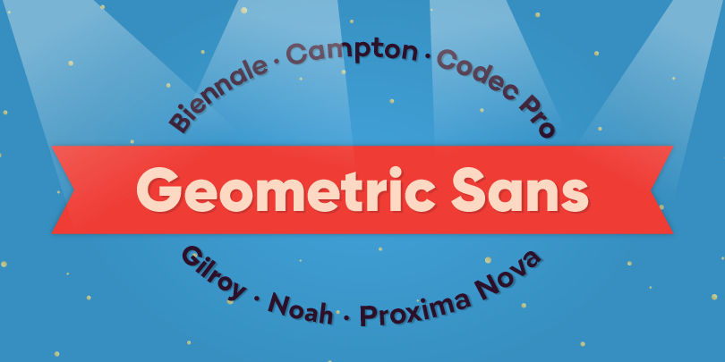
No frills geometric sans have been trending for some time – and for good reason. They speak with clarity and authority. Many also benefit from a wide and deep range of weights and proportions making them ideal for everything from wordmarks and branding to headlines and signage. Minimalism is personified in designs like Gilroy, Biennale and Codec Pro. While others, like Campton, are softened with a subtle calligraphic influence. This calligraphic undertone is even stronger in designs like Noah and Proxima Nova.
Thanks to their large x-heights, open counters and simple character shapes, these designs enable companies and products to seamlessly express their brand everywhere an audience can engage with it, including websites, advertisements, corporate messaging, packaging – and more. Choose from any of these designs and you’ve added a powerful, trending, and sure to be classic typeface to your design toolbox.
- Biennale from Latinotype
- Campton from Rene Bieder
- Codec Pro from Zetafonts
- Gilroy from Radomir Tinkov
- Noah from Fontfabric
- Proxima Nova from Mark Simonson
Font Trend #2: Swashes & Alternative Characters
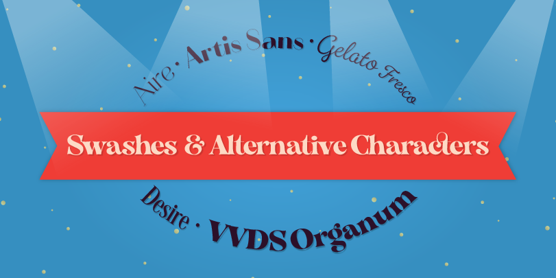
Swashes & alternative characters are all about customization and personalization. They create one-of-a-kind headlines, banners and are also perfect for navigational links, sub-heads and packaging. They’re ideal choices for those special occasions that call for more than just words on paper. Some, like Aire and Artis Sans, are sophisticated with sensuous swashes and swelling flourishes. Desire has the prominence of a classic serif typeface and is chock full of alternates, ligatures, swashes and even catchwords! Gelato Fresco is as inviting as hand lettering, while VVDS Organum is seven weights of stately Didone with a jaunty demeanor. Its many discretionary ligatures and stylistic alternates easily creates bespoke typography.
- Aire from Lián Types
- Artis Sans from Wiescher Design
- Desire from Borges Lettering
- Gelato Fresco from Schizotype
- VVDS Organum from Vintage Voyage Design Supply
Font Trend #3: Soft Fonts & Friendly Faces
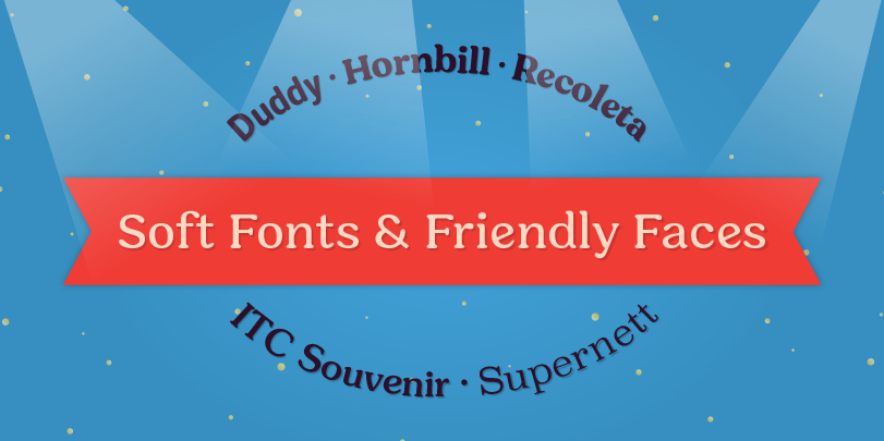
Soft fonts and friendly faces invite readers into ads, publications, web pages, games. Some like, ITC Souvenir, are delightful confections while others, like Supernett, have a charmingly naive quality that is just naturally friendly. Duddy’s rounded terminals are subtle in the lighter weights but grow in stature as strokes become heavier. The Hornbill family is the perfect design for when you want a type typeface that’s friendly and inviting – but not cuddly or cute. Spanning 64 designs, the family is also large enough to take on virtually any project. Recoleta charms readers with a soft Art Nouveau mien.
- Duddy from Letritas
- Hornbill from Eko Bimantara
- Recoleta from Latinotype
- ITC Souvenir from ITC (A Monotype Foundry)
- Supernett from FaceType
Font Trend #4: Inlined, Engraved and Delightful
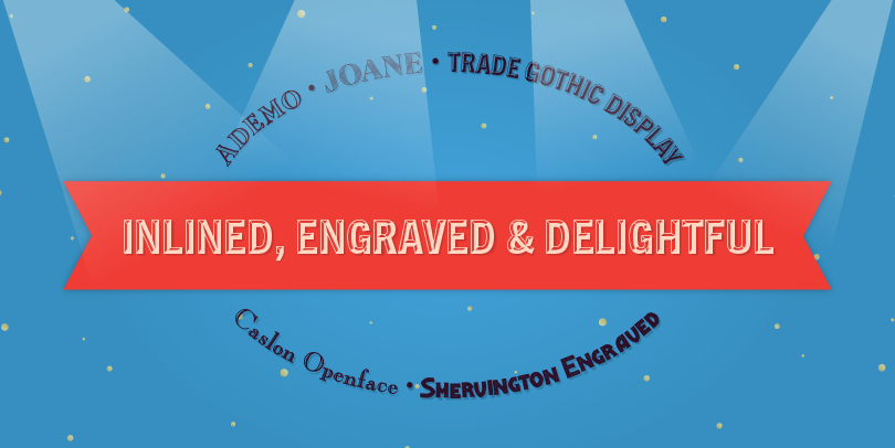
Inlined, engraved and textured designs stand out in a crowd! They get attention. They’re excellent choices where noticeability is important: when you want headlines to be seen, packaging to stand out on a shelf, brochures to be picked up and web pages to be sticky. They tend to be cultured and chic like Ademo, Caslon Openface or the Joane twins of “Deco” and “Engraved,” but can also be rough and tumble like Shervington Engraved. The inline fonts in the Ambiguity and “Layered” Trade Gothic Display families are stalwart and commanding.
- Ademo from astype
- Caslon Openface from Bitstream (A Monotype Foundry)
- Joane from W Foundry
- Shervington Engraved from Greater Albion Typefounders
- Ambiguity Inline from Monotype (A Monotype Foundry)
- Trade Gothic Inline
Font Trend #5: DIN Forget Square Sans
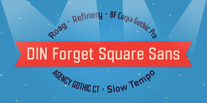
Square sans serif typefaces have been around since the 19th century, so you might think they’re done trending. Well, a whole new crop of square sans serif typefaces have begun to show up in everything from wearables to wayfinding. Why? Because they’re space economical, approachable – and ready to tackle jobs both big and small! In addition, the squared character shapes take maxim advantage of pixel real estate on large and small screens.
Agency Gothic CT breathes new life into the venerable 1930s hand-set metal typeface and expands the family into a handy suite of designs. BF Corpa Gothic Pro packs more words than you would think possible into the smallest of spaces, while the 85 designs in the Refinery family make it a virtual Swiss Army Knife® of fonts. Roag and Slow Tempo are full-bodied and bring a weapons-grade vibe to headlines and small blocks of text copy.
- Agency Gothic CT from CastleType
- BF Corpa Gothic Pro from Brass Fonts
- Refinery from Kimmy Design
- Roag from The Northern Block Ltd
- Slow Tempo from Dharna Type
