Select this license type when you are developing an app for iOS, Android, or Windows Phone, and you will be embedding the font file in your mobile application's code.
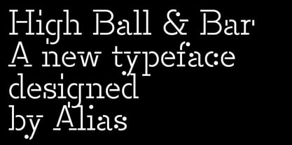
High™
by Alias
Licenses from $60.00
Complete family of 6 fonts: $125.00
High Font Family was
designed by
Gareth Hague and
published by
Alias. High contains
12
styles and family package options.
More about this family
- Aa Glyphs
-
Best ValueFamily Packages
- Individual Styles
- Tech Specs
- Licensing
-
High Bar Light
-
High Bar Medium
-
High Bar Bold
-
High Ball Light
-
High Ball Medium
-
High Ball Bold
Per style:
$20.83
Pack of 6 styles:
$125.00
High Bar & Ball Medium
2 fonts-
-
Per style:
$30.00
Pack of 2 styles:
$60.00
High Bar & Ball Light
2 fonts-
-
Per style:
$30.00
Pack of 2 styles:
$60.00
High Bar & Ball Bold
2 fonts-
-
Per style:
$30.00
Pack of 2 styles:
$60.00
About High Font Family
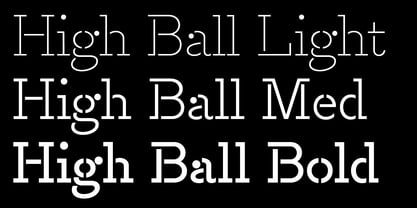
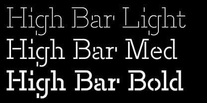
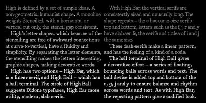
High is defined by a set of simple ideas, or constraints. A non-geometric, humanist shape. A monoline weight. Stencilled, with a horizontal or vertical cut only, the stencil gap consistent — so positioned where that is possible. High’s letter shapes, which because of the stencilling are free of awkward connections at curve-to-vertical, have a fluidity and simplicity. By separating the letter elements, the stencilling makes the letters interesting, graphic shapes, making decorative words. High has two options — High Bar, which is a linear serif, and High Ball — which has a circle-serif, like a ball terminal. The circle of HighBall suggests Didone typefaces, High Bar more utility, modern, slab serifs. With High Bar, the vertical serifs are consistently sized and unusually long. The shape repeats — the c has same-size serifs top and bottom, letters such as the f, j, r and y have slab serifs, the serifs and tittles of i and j the same size. These dash-serifs make a linear pattern, and has the feeling of a kind of a code. The ball terminal of High Ball gives a decorative effect — a series of floating, bouncing balls across words and text. The ball device is added top and bottom of the c, the g, j and y to ensure balance and rhythm across words and text. As with High Bar, the repeating pattern give a codified look.
Designers: Gareth Hague
Publisher: Alias
Foundry: Alias
Design Owner: Alias
MyFonts debut: May 23, 2018
High™
is a trademark of Alias.
About Alias
Alias was formed in 1996 by Gareth Hague and David James initially to develop into typefaces the bespoke lettering designs produced for their record cover and book projects. As well as typeface design, Alias has produced logotype designs for clients including Ghost, L.K.Bennett, MCQ, Jennifer Lopez for Kohl's, Lane Crawford, Calvin Klein Beauty fragrance and Prada Candy fragrance. For Prada Candy this included the development of the Prada logo into a full typeface. Typeface designs include headline typefaces for the 2012 Olympic Games and Sunday Times Magazine, and typeface and layout design for Another and Another Man magazines. Alias also works with design agencies and advertising agencies on typefaces for corporate clients and advertising campaigns. Graphic design includes music and arts related projects and book design for clients including Phaidon, Jake and Dinos Chapman and Tate Modern.
Read more
Read less
- Choosing a selection results in a full page refresh.