About Pantera Font Family
ROARRR!
THE STYLES
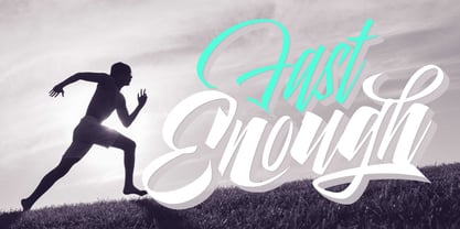
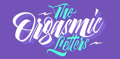
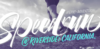
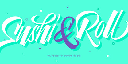
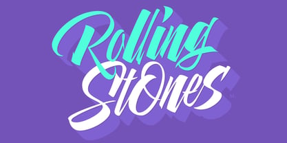
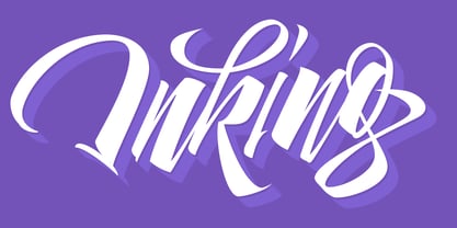
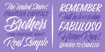
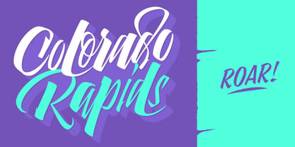
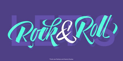
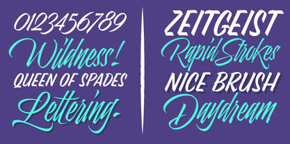
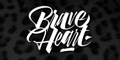
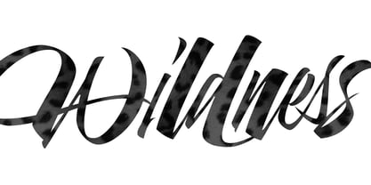
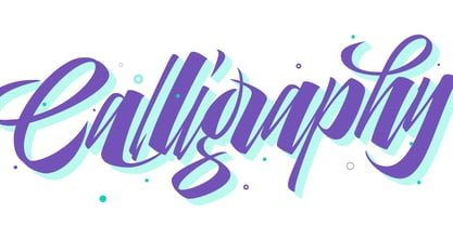
-Pantera Pro is the most complete style, and although its default look is mono-rhythmic it gets really playful and crazy like the examples of the posters by just activating the Decorative Ligatures button in the Open-type Panel of Adobe Illustrator. However, I recommend using also the Glyphs Panel because there you'll find much more variants per letter.
Pantera Pro is in fact, coded in a way the combination of thicknesses will always look fantastic.
-Pantera Black Left, and Pantera Black Right are actually “lite” versions of Pantera Pro: They have very little Open-Type code, so what you see here is what you get. Pantera Black Left has its left strokes thick, while Pantera Black Right has its right strokes thick.
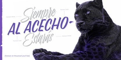
-Pantera White is a lovely member in this family that looks lighter and airy, hence its name. With the feature Standard Ligatures activated (liga) the font gets very playful.
-Pantera Caps is based on sign painters lettering and since it follows the same pointed brush rules as the other styles, it matches perfectly.
-Pantera Claws like its name suggests, is a set of icons that were done by our dear panther.
THE STORY
It is said that typography can never be as expressive as calligraphy, but sometimes it can get close enough.
I tend to think that calligraphic trials, in order to work well as potential fonts, need first to go through very strict filters before going digital: While calligraphy is synonym of freedom (once its rules are mastered), type-design, in the other hand, has its
battlefield
a little tighter and tougher.
When I practice pointed brush lettering, there are so many things happening on the paper. And most of them are delicious. The ones who know my
work
may see that although many of my fonts are very expressive, my handmade brush trials are much more lively than them.
With that in mind, this time I tried to go further and rescue more of those things that are lost in the process of thinking type when first sketches are calligraphic. I wondered if I could create something wild, hence its name Panther, by understanding the randomness that sometimes calligraphy conveys and turning it to something systemic: With Pantera, I created an ordered disorder.
Like it happens a lot in many kinds of lettering styles, in order to enrich the written word the scribe mixes the thickness of the strokes and the width of the letters. Like one of my favorite mentors say (1), they make
thoughtful gestures
Some lively strokes go down with a thick, while some do that with a thin. Some letters are very narrow, meaning some of them will need to be very wide to compensate. Why not?. The calligrapher is always thinking on the following letters, and he/she designs in his head the combination of thicks and thins before he/she executes them. He/she knows the playful rhythm the words will have before writing them. It takes time and skill to master this and achieve graceful results.
Going back to the font, in Pantera, this combination of varying thicknesses and widths of letters were Open-Type coded so the user will see satisfactory results by just enabling or disabling some buttons on the glyphs panel.
I'm very pleased with the result since it’s not very easy to find fonts which play with the words' rhythm like Pantera does, following of course, a strong calligraphic base.
I believe that if you were
on the prowl
for innovative fonts, this is your chance to go
wild
and get Pantera!
NOTES
(1) Phrase by Yves Leterme. In fact, it’s the title of a
book
by him.
EPILOGUE
Esta fuente está dedicada a mi panterita
Pantera
About Lián Types
“As my favorite Argentinian rock singer, Gustavo Cerati, says: Buenos Aires is “La ciudad de la furia” — the city of fury,” Maximiliano Sproviero said of his home, one of the main centers of type and lettering in Latin America, in his Creative Characters interview. “This city has so much to offer, whether at daytime or during the night. It’s always on the move and, if you are susceptible enough, it can fill your mind with ideas.” Maximiliano first discovered his love for typography while studying graphic design at Universidad de Buenos Aires, Argentina. As an innocent font hobby turned to addiction, his type design career matured at an incredibly rapid rate, due much to his fascination with calligraphy. He founded Lián Types in 2008 and it took him only two years thereafter to develop his own approach to the art, mixing his interest in calligraphy with a growing skillfulness in digitizing the most challenging of curves. “The truth is that I’m also doing my best to be a good calligrapher, and I don’t like making fonts which I can’t do myself by hand. My letters are me!” Inspired by many styles of calligraphy, Lián Types is now among the most successful foundries specializing in script fonts and ornamented display type. “Designing script faces is not a game,” he said. “They’re not ‘the easy ones.’ They’re not for beginners, as some may think. A well-made script is like a marvel you just can’t stop staring at.” Maximiliano has won prestigious awards and his fonts have been adopted by some of the best designed publications around. His bestselling typefaces include Selfie, Brand and Heroe. “Like history tells us: the written word can be as precious as any other art work.”
Read more
Read less

