Select this license type when you are developing an app for iOS, Android, or Windows Phone, and you will be embedding the font file in your mobile application's code.
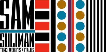
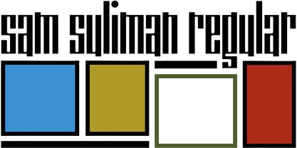
Sam Suliman
by K-Type
Individual Styles from $20.00
Complete family of 6 fonts: $20.00


Sam Suliman Font Family was
designed by
Keith Bates and
published by
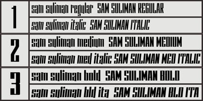
K-Type. Sam Suliman contains
6
styles and family package options.
More about this family
- Aa Glyphs
-
Best ValueFamily Packages
- Individual Styles
- Tech Specs
- Licensing
Per style:
$3.33
Pack of 6 styles:
$20.00
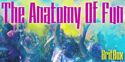
About Sam Suliman Font Family
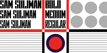
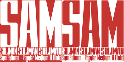
Sam Suliman is a condensed display face supplied in three weights – Regular, Medium and Bold – plus a set of handy italics (obliques). All six fonts are included in the value family pack.
The fonts are inspired by lowercase lettering on a Sarah Vaughan album cover designed by Sam Suliman in 1962, a style which contrasts sharp tight outer corners with soft rounded counters. The letters were perhaps influenced by a Solotype font called Herald Square, but without that font’s aversion to diagonals, and adding distinctive perky ascenders/descenders on the lowercase r, a, u, g and n. The Sam Suliman fonts also add the nubs to d, m, p, and q.
Suliman was born in Manchester, England in 1927. After working for McCann Erikson in London, he moved to New York where he took on freelance work designing album covers, particularly celebrated are his striking minimalist designs for jazz records. He moved back to England in the early 1960s, designing many book jackets, film titles and fabrics, also working in Spain and India before settling in Oxford in the 1980s.
Designers: Keith Bates
Publisher: K-Type
Foundry: K-Type
Design Owner: K-Type
MyFonts debut: Aug 18, 2020
Sam Suliman

About K-Type
K-Type is a small, independent type foundry based in Manchester England, offering a unique range of high quality fonts which are modestly and simply priced for designers, small businesses and large organisations.In addition to creating new typefaces resulting from formal experimentation, many K-Type fonts show the influence of inspirational artists and designers, many exploring the mix of insular and eclectic that has forged the typographical landscape of Britain and America.K-Type is also keen to make affordable fonts from styles which possess cultural currency or an existing social presence, generally redrawn to include comprehensive character sets containing a full complement of Latin Extended-A glyphs. New, previously unavailable weights and italics are often designed and added.
Read more
Read less
- Choosing a selection results in a full page refresh.