About Sealt Font Family
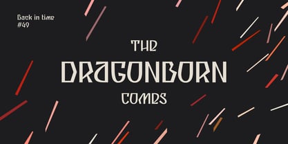
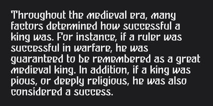
Sealt Typeface is inspired by the oldest saltworks in Eastern Europe, founded in 1390 in Drohobych. Sealt means salt in Old English, so most letters are rough and sharp like salt crystals and seem to be carved out of the rock.
View PDF Specimen: https://michaelrafailyk.com/typeface/specimen/Sealt.pdf
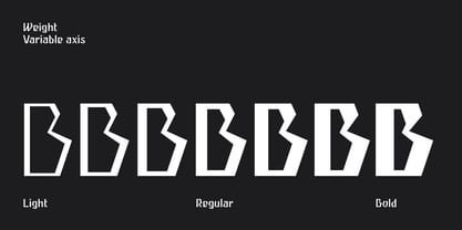
Variable font: Sealt VF has weight axis and includes hundreds of weights ranging from Light (300) to Bold (700), so feel free to choose the most accurate weight that you need, using a slider.
Localized Forms: 47 character substitutions for Azeri, Bulgarian, Catalan, Dutch, German, Kazakh, Moldavian, Polish, Romanian, Tatar, Turkish.
Glyph Composition/Decomposition (Diacritics): Full Latin and based Vietnamese set of diacritics (561 characters). Precomposed.
Ordinals: adehnorst.
Superscript, Subscript, Numerator, Denominator: 0123456789.
Fractions: ¼½¾⅐⅑⅒⅓⅔⅕⅖⅗⅘⅙⅚⅛⅜⅝⅞⅟ (precomposed). Any other fractions (even those typed through a slash) will also be displayed correctly, with the automatic replacement to Numerator + fraction + Denominator.
Slashed Zero: All 0 figures, including Lining, Superscript, Subscript, Numerator, Denominator, and Fractions.
Contextual Alternates: ΆΈΉΊΌΎΏ. Greek uppercase accented characters lose their tonos accent and retain only dieresis in All Caps mode. Turned on by default. If you need tonos accents in All Caps then turn off Contextual Alternates (calt) feature.
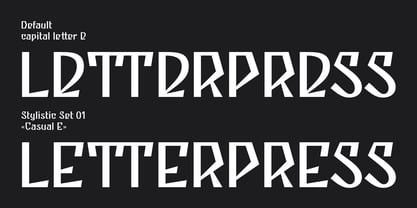
Standard Ligatures: OO TT tt fi. Turned on by default.
Language count: 480+.
Kerning Class pairs: 4295.
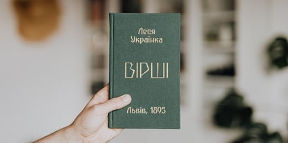
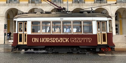
The promo images used photos of Albin Berlin, Hervé Piglowski, Karolina Grabowska, Scott Webb from Pexels and Dollar Gill from Unsplash.
Sealt
About Michael Rafailyk
Michael Rafailyk is a Type Designer from Ukraine specialized on Latin, Greek, Cyrillic scripts. He like to take strange and unpopular ideas and make them usable. Thanks to many years of experience working with branding, Michael is well aware of the role typefaces play in the communication between the brand and the customer. At the same time, his experience in musical composition came in handy in the sense of rhythm and the overall visual harmony in the text.
Read more
Read less