About Rahere Roman Display Font Family
Rahere Roman Display is an elegant design with flared stems and subtle old style features, influenced by Berthold Wolpe’s wonderful Albertus font and (to a lesser extent) fonts based on Roman square capitals. It’s a classic design for the modern age, appealing to serious typographers, graphic designers and anyone looking for a beautiful, multipurpose font that also offers value for money.
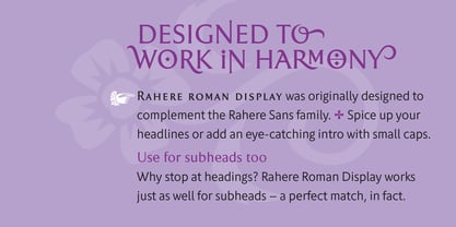
Originally conceived as a display companion for the Rahere Sans typeface family, Rahere Roman harmonizes perfectly with its sans counterpart: use it for headings, sub-headings or pull-out quotes. Want an eye-catching introduction? The small caps have been sized to optically align with the x-height of Rahere Sans or start a paragraph with a swash drop cap. There are also ornaments and devices on hand to spice things up.
Of course, Rahere Roman Display works beautifully as a standalone font too.
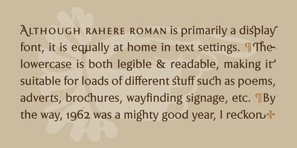
Although predominantly a display font, with a quick flick of its lowercase switch, Rahere Roman transforms effortlessly into a readable text font. Like a Swiss Army Knife, this is a hugely versatile font, capable of conveying different messages from classic and romantic to historical and modern. It’s suitable for a wide range of applications including: branding, posters, advertising, packaging, labels, signage, wedding stationery, museums, art galleries and book covers.
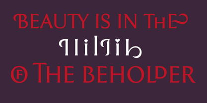
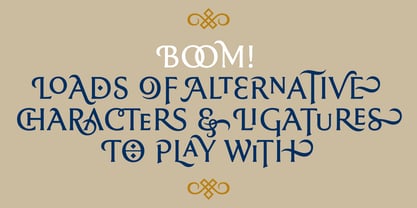
Weighing in at well over 2,000 glyphs, Rahere Roman contains a myriad of alternative characters (mostly capitals) including two sets of small caps that allow certain letter combinations - such as RO, LA, LI, TY, etc. - to mimic ligatures. The advantage of this is that if letter spacing is increased or decreased, the letter combinations aren’t fixed and can move too, which helps the space between letters to remain even.
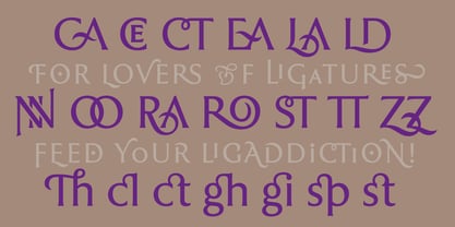
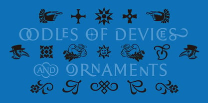
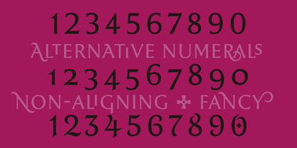
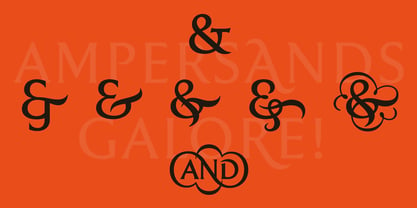
However, for lovers of ligatures there is still a bucketload of goodies to play with, including the obligatory ‘OO’ ligature. If that’s not enough, the font also contains start & end swashes, alternative numerals, seven ampersands, ornaments and devices.
.ss01 - Initial swash capitals
.ss06 - Superior small capitals (aligned to the cap height)
.ss07 - Small capitals (sitting on the baseline)
Rahere Roman Display
About ULGA Type
ULGA Type is a small type foundry run by Michael Gills and based near Norfolk in the East of England. I design predominantly display fonts sprinkled with the occasional multi-weight typeface family (when time permits). ¶ My typeface families and fonts are generally characterised by designs that are well-crafted with a pinch of quirkiness, versatile and provide extensive European language support. For my display fonts, I try to inject some fun into the designs, adding lots of alternatives, ligatures and symbols . ¶ Alongside type design, my range of work encompasses monogram & logo designs, custom font designs, hand lettering and a bit of calligraphy.
Read more
Read less