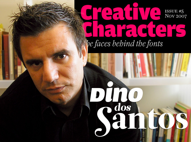
Based in Porto, Portugal, DSType is one of those one-person font foundries that have more or less grown up together with MyFonts. Designer Dino dos Santos began designing custom typefaces for magazines and corporations in 1994; he felt confident to start up his own collection of retail fonts after his first experiments with distributing through MyFonts had proved successful. Dino dos Santos is a hard working designer, and DSType is one of the fastest growing libraries around. It includes striking experiments, charming display type and, most notably, an amazing collection of well-wrought, extensive text families. Several of our readers have asked us to interview the man behind these faces, and we’re very happy to comply.
When did you start thinking about specializing in type design? Was there a specific occasion that sparked off your type designing activities?
I’m a self-taught type designer; my education is in graphic design. I began designing typefaces in the early ’90s because there weren’t many typefaces available to us in those days, just the Macintosh system fonts and dry transfer sheets from Letraset and Mecanorma. So I started designing fonts that matched the new typographic experience. To me, graphic design was never about taking a picture and then just choosing one of the available typefaces. I felt the need to design my own stuff – very strange stuff I must say – and to achieve that I learned Fontographer. Now I am a full-time type designer. I try hard not to do any graphic design at all. But I do pay attention to what is being done on the international design scene. I need to know if my typefaces are keeping up with the changing circumstances.
You studied at ESAD Art College in Matosinhos, near Porto, Portugal, where you have also taught for more than ten years. What kind of school is ESAD, and how would you describe its position in the Portuguese design landscape?
ESAD was founded in late ’80s, and since its inception played a major role in the development of Portuguese design. Part of ESAD’s philosophy was the idea that the school was to establish a close alliance with the industry. It was understood that the client is a very important partner – not a monster that will destroy creativity. ESAD also distinguished between art and design, while in most fine arts institutions the two used to be treated as a single subject. I have taught computer graphics, multimedia projects, and design theory, among other disciplines. In order to face the new challenges ESAD has incorporated a new discipline called typographic studies, which I now teach. Its aim is to provide the students with typographic knowledge, both theoretical and practical, understanding the relevance of type design and typography in the graphic environment.
There’s a small group of young, prolific type designers from Portugal who are internationally known – people like Mário Feliciano and yourself – but was there an “older generation” before you? When starting out, where did you look for your role models?
There is not much of a type design history in Portugal. People are now getting more interested and some new type designers have emerged, which is a good thing. When I first started, Emigre was one of my favorite models, and so were the typefaces they published. It seemed very natural that I should start doing something like that – vernacular stuff, blending typefaces from different periods, using them in my own graphic design work. I have since learned about type designers from “older” generations who designed non-digital typefaces, but in those days I wasn’t too interested. What I wanted was to do things like those that were shown in books like Typography Now. I just wanted to do cool and fashionable stuff, especially things that no one would be able to read (David Carson was an idol then). Now I’m very interested in what has been done in Portugal by older generations of type designers and calligraphers. I want to understand what happened, how things worked back then, and expose the world to some lesser-known work.
Ventura
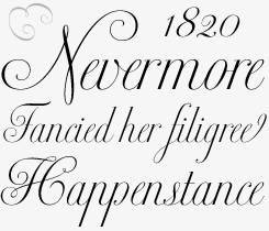
Published earlier this year, Ventura is Dino dos Santos’ latest typeface – a fine script based on the early 19th-century work of Portuguese calligrapher Joaquim José Ventura da Silva. You can read more about the font’s history in the interview. The typeface comes as an OpenType font loaded with gorgeous extras, such as elegant alternates and an amazing collection of ligatures.
Estilo & Estilo Script
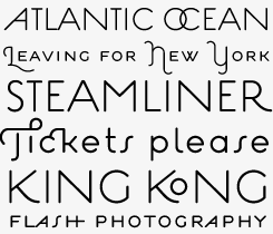
Estilo and Estilo Script were inspired by that special style of lettering from the Art Deco period that mixes geometric construction with an eagerness to please. Designer Chris Rugen, who chose Estilo as one of Typographica’s Favorite Fonts of 2006, wrote, “Set a few headlines to see Estilo’s stylish and classy moves: alternates, ligatures, swashes, Greek, all in a handy contextual OpenType package. And it’s easy on the wallet, so get swingin’.”
In Portuguese cities, the lettering on historical buildings is often stunning. I imagine that this kind of context can be a great source of inspiration to type designers. Has this been the case for you?
Yes! But not only in Portugal. I’m influenced by every country I visit. For example, I started designing Greek typefaces after I had been to Cyprus, and designed Kartago after visiting Tunisia. I find it very important to get the feeling of a particular place – to understand its cultural processes and get in touch with the local lettering. I’m currently developing a typeface inspired by the lettering on one of the most important monuments in Portugal. I was really amazed by that lettering, because it’s a block of text mostly composed of ligatures, very vernacular but pretty cool. I’m trying to take those letters out of context in order to provide them a very contemporary and fresh look.
Five years ago, you received a Master’s degree in Multimedia Arts with a thesis on Digital Typography in the Multimedia Environment. You designed the Monox type family as part of that project. Could you tell us something about the topic of your thesis – and about the role of the Monox typeface?
Well, my thesis was about legibility in multimedia systems and about how typography, when used dynamically, can present us with different levels of understanding that go far beyond its own meaning. Monox was presented as part of the research on monospaced typefaces and mechanical aspects of readability, but is was also the subject of all the dynamic and interactive interfaces that I developed to present to the jury. Monox was also my first attempt to interpolate two extreme letter shapes in order to generate new weights. That was very useful for some of my latest releases, like the many styles of Leitura.
When asked for a piece of “essential type advice” by Computer Arts magazine, you wrote:
Link the past to the present. Connect history and technology. History reveals some of the greatest typographers and calligraphers, and in their work it is possible to find the path that leads us to new typefaces. That’s why redesigning history is a step towards designing the future.
Could you say more about the role of technology in updating or adapting old letterforms?
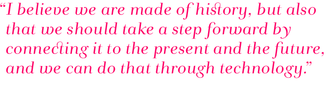
History is often seen as something that passed away, and that’s it. But for me history is one of the most relevant aspects of type design. The modernist movement rejected history as part of the design process, with the results that we know. I believe that we do need to understand history in order to understand ourselves. I believe we are made of history, but I also believe that we should take a step forward by connecting it to the present and the future, and we can do that through technology. With OpenType we can now bring back historical forms, ligatures, swashes and alternate characters into one single file. Since the early days the history of type has always been full of avant-garde ideas, and it is possible to introduce old letterforms to the future generation of readers and designers.
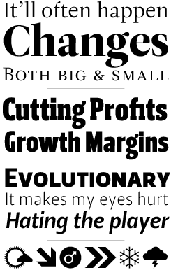
Andrade Pro
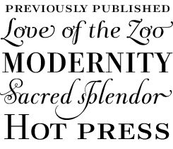
Dos Santos described Andrade as “my tribute to Portuguese typography and to the work of Manoel de Andrade de Figueiredo in particular.” Andrade de Figueiredo was a typographer and calligrapher who was active in the early decades of the 18th century; his 1722 manual is one of forgotten treasures of Portuguese typography. It contains several early specimens of letterforms which we would now label as “transitional” (the style halfway between “baroque” and “classicist”) which in Portuguese is called “leitura.” Andrade is a brilliant reinterpretation with lots of ligatures and swashes.
Ezzo
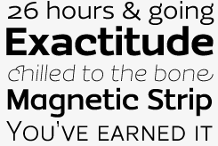
Ezzo came into being as a custom font for a design agency, and it shows. It has the simplicity and clarity usually associated with modernity and cool. Yet its smart details, such as the loop on the lowercase c, the alternate g, y and a, and much more, lend it an unmistakable personality. It comes in six weights and has a wealth of OpenType features, including small caps and swashes.
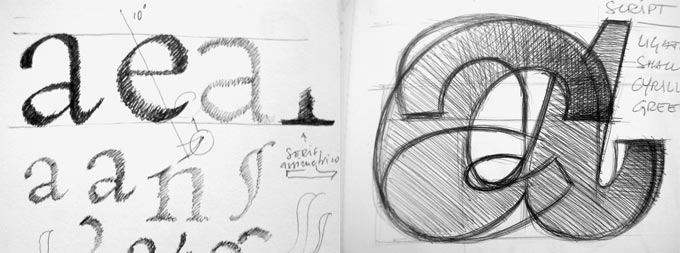
Pages from Dino’s notebooks showing letter sketches.
State-of-the-art type production technology is no guarantee that the fonts made with it look contemporary. Would you agree that a lot of type designed today has a touch of nostalgia? Can a font be based on historic sources and still be truly contemporary?
Nostalgia seems to be at the center of the contemporary society and I don’t agree with that. In my opinion there are two different ways of seeing this matter. One way is to accept nostalgia as a kind of post-modern condition (that seems easy: we are not obliged to think about it and just accept it). The other way is to research history, in order to interpret our own era, redefining it and redesigning it. I believe I achieved a very Art Deco feeling with Estilo and Estilo Script without doing a revival and without making it look too dated. I also didn’t design Andrade or Ventura out of nostalgia, but because I felt the need to open people's eyes to two amazing calligraphers, and Portuguese calligraphy in general.
Your latest font is Ventura, a “roundhand” script typeface based on an alphabet by a calligrapher named Joaquim José Ventura da Silva. Could you tell us more about the original and its designer?
Ventura da Silva was a Portuguese calligrapher and teacher from the nineteenth century, who in 1820 published an excellent book titled Regras methodicas para se aprender a escrever os caracteres das letras Ingleza, Portugueza, Aldina, Romana, Gotica-Italica e Gotica-Germanica (in English: Methodical rules for learning to write letters in the English, Portuguese, Aldine, Roman, Italian Gothic and German Gothic styles). It was the second edition of an 1803 book that was mainly about English script lettering.
Ventura’s work was influenced by English calligraphers like Charles Snell and George Shelley. At the time the British influence in Portugal was truly profound. The British army had defended Portugal from the Napoleonic invasions, and the gratitude for that support was visible in every aspect of daily life. Calligraphy was no exception.
However, in 1820 Ventura published this new version, which included samples of what he called the Portuguese Script. The Ventura font is a revival of those samples from the nineteen century, staying as close as possible to the original. The OpenType format allowed me to put in a single typeface several variations of the character shapes he designed, along with plenty of ligatures.
Leitura Type System:
Roman, Sans, News, Display, Headline, & Symbols
Leitura is an elegant, versatile type system that comes in four varieties: a crisp roman, a stylish sans serif, a News version specially designed for newspaper body text, the beautifully drawn Leitura Display, and finally Leitura Headline. In addition, there’s a clever set of symbols. With its many variants Leitura is a versatile and beautifully designed toolbox for restyling a magazine, designing a corporate identity, or making a complex book.
What do you think is the most important thing your students learn from you?
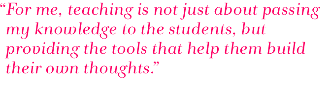
I usually say to my students that they need to enjoy what they do, that design is not just a profession but a daily attitude. In my classes everything can and should be questioned, even the teacher himself, but in an honest and thoughtful kind of way. For me, teaching is not just about passing my knowledge to the students, but providing the tools that help them build their own thoughts about design, type design and, above all, about the world they live in.
What typeface by another designer do you wish you’d designed yourself?
That’s a tough one! So many wonderful typefaces around there, but I have a special affair with Gerard Unger’s Swift.
What are your big projects for the coming years?
Next year I will publish two workhorse typefaces for editorial purposes: a neutral sans named Prelo and a serif named Glosa. I will also try to finish a book I’m writing about the history of calligraphy in Portugal.
MyFonts offers all your retail fonts, and we’re proud of that. Has the collaboration with MyFonts been important for DSType’s development as an independent type foundry?
The collaboration with MyFonts was not just important but fundamental. It was only when I put my first typefaces for sale at MyFonts and saw the results (not just the income, but also the visibility and the feedback from the customers) that I decided to go forward with type design; otherwise I would have kept doing graphic design. What else can I say?
We’re honored to have played a part in your career as a type designer. Thank you so much for your time Dino; we eagerly await the release of your future projects!
Boldina
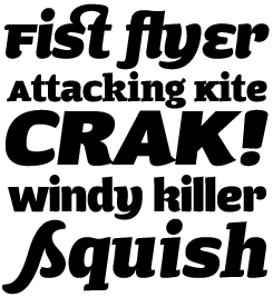
All fonts in the Boldina family have the same weight – pretty heavy – but they have distinctive styles. There’s Boldina One, Two and Three, each with its own personality. There’s Boldina Serif, with two slightly different italics. And there are two fancy varieties called Script and Ligatures. All of these fonts can be mixed, letter by letter if you wish, to create a headline or logo with a unique look. But watch out! The capitals are really small caps – which makes the outcome even more adventurous. Boldina comes in wide range of character sets, including versions for Greek and Cyrillic. A family to play around with.

Who would you interview?
Creative Characters is the new MyFonts newsletter dedicated to people behind the fonts. Each month, we will be interviewing a notable personality from the type world. And we would like you, the reader, to have your say.
Which creative character would you interview if you had the chance? And what would you ask them? Let us know, and your choice may end up in a future edition of this newsletter! Just send an email with your ideas to [email protected].
If you’re curious to know which type designers we’ve already interviewed as part of past Creative Characters newsletters, have a look at the archive.
Credits
This month’s interview was conducted and edited by Jan Middendorp and designed by Nick Sherman.
Supporting fonts
The Creative Characters masthead is set in Amplitude and Farnham; the intro image features Dino’s Boldina and Leitura Display; the pull-quotes are set in Andrade; the large question mark is set in Farnham, and the small URL at the top is set in Unibody 8.
Unsubscribe info
This message was sent to:
[email].
It is never our intention to send unwanted e-mail. If you no longer wish to receive this newsletter, you may change your subscription settings at: www.myfonts.com/MailingList
Comments?
We’d love to hear from you! Please send any questions or comments about this newsletter to [email protected]