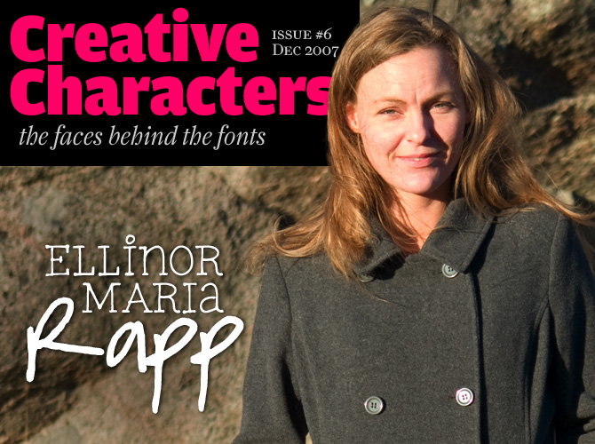
There are several things that are special about the MyFonts sales model, and one of its most unique characteristics is its openness. Like a good local bookshop, MyFonts offers products from big companies as well as one-person outfits. Some of MyFonts’ success stories are truly remarkable. Take Font Garden from Sweden: they arrived at MyFonts five months ago with a basketful of spirited handwriting fonts – and those began selling like crazy, making them the most successful new foundry on MyFonts. To Ellinor Maria Rapp, the person behind Font Garden, the success came as a very nice surprise. But for now, she has no intention to give up her day job.
You seem to have a long-lasting love affair with handwriting fonts. How did it start?
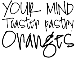
It was probably some weird experience in my childhood, as it usually is... but it really started with me getting an internet connection in 1997. Fonts were fascinating and beautiful, and still hard to find then. So I started collecting them, and built an online collection of free fonts, which I still have and work on. It has changed names quite a few times, but now it’s Font Garden. And to me, the best and most beautiful fonts were always the handwritten fonts.
I had, and still have, major problems writing anything on the computer without changing the font a hundred times, then not getting the essay, letter or whatever finished on time because I was busy changing fonts all the time.
Later on I got curious to see if it was possible to make my own fonts, and after experimenting with quite a few programs, I ended up with the application I still use today – ScanFont. Then after I had digitized all possible variants of my own boring handwriting, I started to make fonts of other people’s handwriting. First in my neighborhood, then over the internet, for free. When it grew more popular, it developed into an online business. That’s where I am today.
Have you had any formal training as a graphic designer or type designer? If not, would you have liked to?
No I don’t have an education as a graphic or type designer. I would have loved to, but I didn’t realize I could work as one, so I chose a laboratory education instead. But it’s never too late, right?
On your website you mention that you can be reached after working hours. Does that mean you have a day job as well?
I work at Örebro University Hospital at the microbiological laboratory as a biomedical scientist. I work part-time to try to keep up with the font jobs and my other online sites and hopefully I will be able to keep on doing that.
FG Nina
Nina is a cheerful and cheeky. The handwriting it was based on is pretty interesting: although the letters lean backward a bit, it still has a forward-pushing energy. The alphabet was drawn at Ellinor’s request by a Font Garden customer for whom she’d “fonted” another sample of handwriting: Amanda. As we’ve written before, Nina’s best feature is its lowercase g. It looks like a cartoon character about to make a witty remark.
On the Font Garden website, many fonts and dingbats are given away for free. Is that out of idealism or is there some kind of plan behind it?
When I started collecting the fonts and redistributing them, it was pure love and obsession. I wanted to share them with the world and also point Font Garden’s visitors to the font foundries where they could buy more fonts, so I could help the font foundries get some business.
Now that you’re “in business” yourself, you’re free to determine your own prices. Font Garden fonts are among the most affordable fonts on the MyFonts website. What’s the reason for that?
I think type should not be that expensive, it leads to piracy and redistribution of commercial fonts. I also determine the price on the amount of time spent on the font, and compare the font to the competition. I think everyone should be able to afford buying ten Font Garden fonts to have a few to chose between – that’s more fun than to spend a fortune on one font and realize it doesn’t work for the project.
It sounds as if you have two jobs at once. You’re also a home maker and a mother, aren’t you? How do you manage to combine all these activities?
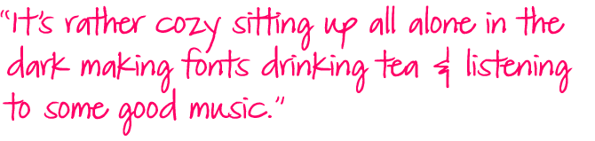
Yes, it’s actually three jobs... I have a hard time finding the time to manage everything. The kids take up most of the time and they should! But often the fonting gets behind, so I have a bunch to do when I get to it. Then I sit up all night and work – it’s the time when I am most likely to get something done. It’s rather cozy sitting up all alone in the dark making fonts drinking tea and listening to some good music.
Do you see any overlap or similarity between your work as a scientist and your font-making endeavors?
I get to see lots of doctors’ handwriting on the clinical data slips, and I’m quite good at deciphering their cryptic scrawls. (Not all doctors have bad handwriting; there are a few doctors who have readable writing actually.) I get a lot of good ideas for new fonts from nurses’ handwriting, which tends to be beautiful and neat – although there are exceptions there as well, of course. Characters here and there can sometimes turn into a complete font – like FG Ellinor, which is partly based on a receipt written by a nurse.
FG Jennifer
With its regular flow and connected, supple strokes, Jennifer appears to be a script from an “older generation”. The original handwriting came from another of Font Garden’s visitors who order custom fonts for their own use. This one required a little more “fonting” work than usual, says Ellinor, as the alphabet had to be carefully modified in order to connect the letters.
FG Rebecca
Rebecca is Font Garden’s best selling typeface on MyFonts. Apart from its pricing there must be a special quality about it that attracts font users. It may simply be that it looks so normal – a natural, no-frills handwriting that is not particularly sloppy or elaborate and therefore extremely usable. Up to now, its character set was very limited, but there’ll be an update soon.
Page from Ellinor’s sketchbook showing multiple versions of letters to be used as source material for her font Adam.
Do you think you would ever consider giving up your job to work only on fonts?
I think I would be alone too much if I didn’t have my job at the laboratory and I simply love that work too much to let it go – even if I probably could make a living making fonts. I also have wonderful colleagues to chat with at work but when I make fonts, I only have myself to talk to and that’s rather scary sometimes.
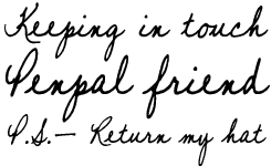
One of your services is to make people’s handwriting into fonts. Do you get a lot of requests? Is this also how you collect samples of handwriting for your retail fonts?
I do get a lot of requests, and they usually arrive all at once. So I have a full schedule making fonts during the weekends. I promise to deliver within ten days and I manage to do that most of the time. I sometimes have a rush order – then I let go of everything to create the font. I let the customer decide whether or not they think it’s a good idea to make money off their handwriting or get it exclusively made just for them. Many agree to let me sell them online and they get a commission on each sale – at the moment it’s 25% of the revenue. But the most fun part is when someone sends in scans of old letters or recipes or diary notes from their great-grandmother or from an old uncle who has lost his writing abilities. Then I extract the font from those notes and create the missing characters to complete the character set. It’s very time-consuming, but really fun.
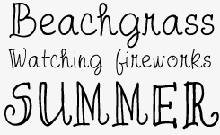
FG Saga
We love the power and the pace of Saga. It has a strong personality, but some quirky features as well. Some letters, notably the capital K and R, may be hard to recognize in certain contexts – but as long as that doesn’t create any confusion, Saga is a great choice if you want something that has a kind of nervous energy about it.
How about the names of the fonts -- do they usually refer to the people who’s handwriting you used?
Sometimes. Other times it’s just a name that suits the font. I started out with Swedish names during my first years of business, now I’m at English names. I don’t know if I will change the naming to something different. I thought of naming fonts after viruses and bacteria – but who would ever want to use a font named “FG Staphylococcus” or “FG Porphyromonas”?
Which type designers or graphic designers inspire you?
Early on I got most of my inspiration from the Astigmatic One Eye font foundry, Font Diner and Chank Diesel. Ray Larabie is someone I am in awe of. How can he produce so many typefaces?
Now there are so many foundries to get inspiration from. For one, Ronna Penner produces lovely, whimsical, useful fonts. Perhaps one day I’ll get that good at it! I could probably do it, but I lack the amount of patience it takes, so the handwritten font arena suits me better.
A technical question: We noticed that most of your fonts have complete latin character sets, while a few follow the shareware model and have very few accented letters or special signs. That doesn’t seem to bother the users: your bestseller on MyFonts is Rebecca, which doesn’t even have the diacritics needed to write Swedish. How do you decide about the completeness of your fonts?
The fonts I draw myself are always complete, but sometimes customer-submitted handwriting is lacking the special characters. I usually make them before the font hits the shop, but sometimes the font is so sweet I can’t wait and Rebecca is one of those; made from customer samples. I created the special characters in all the fonts I submitted to MyFonts but I didn’t put them in Rebecca – I had no clue Rebecca was going to be that popular! I am adding special characters though, so watch for it in December.
Have you ever considered designing a larger family of display or text fonts?
As stated above, I have to admit I am a bit impatient. I want things to be done quickly, and to design a family it will probably take three months. When I get that much time on my hands I’m going to give it a go. For now I think it’s more fun making fonts directly for people – they get really excited when they see the result and it gives so much feedback. The closest I got to designing a font family is with Norah and Jacky.
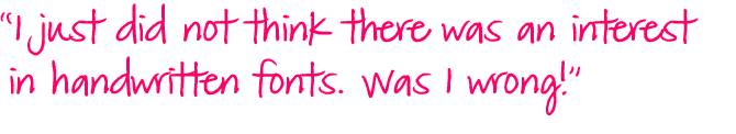
You signed up with MyFonts earlier this year, but Font Garden has been running for almost ten years now. Had you been thinking of joining before? And were you surprised with the success?
I first requested the forms to fill out in February 2004, but didn’t complete them, and tried one more time in 2006, but didn’t get around to doing it then either. I just did not think there was an interest in handwritten fonts. Was I wrong! To my surprise several fonts hit the best selling list. That certainly proves there is a market for these fonts. Several ad agencies use them for personal advertising. In Sweden I find handwriting fonts on milk cartons, TV commercials, potato chip bags, greeting cards – they’re everywhere!
Thanks for your time Ellinor! Keep up the work, and we'll keep our eyes peeled for your upcoming fonts.
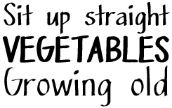
FG Matilda
Matilda is one of Font Garden’s most readable and robust handwriting fonts. It began existence as another custom-made alphabet. “I usually have no idea what people want these fonts for,” confesses Ellinor, “I don’t know what they do with them.” Besides a full character set, Matilda has a couple of ready-made words (“the”, “of”) written in a more cursive hand.
FG Norah
As Ellinor states in the interview, Norah is about as close as she’s come to a type family. It’s got three weights, and looks more ordered than most of her faces. In spite of its well-behaved regularity, it still has a handwritten feel to it.
FG April
April is based on a hand-drawn alphabet by Ellinor Maria Rapp. Although it looks informal and nonchalant, it is reminiscent of the kind of elaborate lettering that could have been done for a book cover or invitation in the 1950s. The double strokes of the capitals combined with the curly single strokes of the lowercase create a colorful visual rhythm.

Who would you interview?
Creative Characters is the new MyFonts newsletter dedicated to people behind the fonts. Each month, we will be interviewing a notable personality from the type world. And we would like you, the reader, to have your say.
Which creative character would you interview if you had the chance? And what would you ask them? Let us know, and your choice may end up in a future edition of this newsletter! Just send an email with your ideas to [email protected].
If you’re curious to know which type designers we’ve already interviewed as part of past Creative Characters newsletters, have a look at the archive.
Credits
This month’s interview was conducted and edited by Jan Middendorp and designed by Nick Sherman.
Supporting fonts
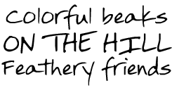
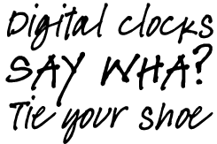
The Creative Characters masthead is set in Amplitude and Farnham; the intro image features Ellinor’s Typical and Matilda; the pull-quotes are set in Matilda; the large question mark is set in Farnham, and the small URL at the top is set in Unibody 8.
Unsubscribe info
This message was sent to:
[email].
It is never our intention to send unwanted e-mail. If you no longer wish to receive this newsletter, you may change your subscription settings at: www.myfonts.com/MailingList
Comments?
We’d love to hear from you! Please send any questions or comments about this newsletter to [email protected]