|
|
|
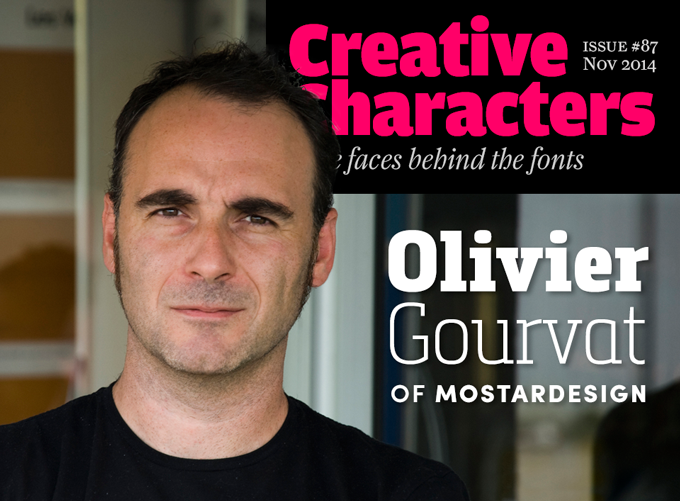
This month’s interviewee is from France. He’s not based in Paris (where Parisians tend to think “everything” in culture and communication happens) but in the beautiful South West. His splendid isolation hasn’t stopped his company Mostardesign from being a big success. Since signing up with MyFonts in 2009, he has had some huge hits, including the ubiquitous Sofia Pro. His typefaces have graced global campaigns for soft drinks and body care products, as well as graphic identities for tech companies, museums and the 2013 Oscars. Plus, he does so much more besides type design. Meet the talented Olivier Gourvat, our man in… Cubjac.
|
|
|
In recent years you have published about three large font families per year. But you seem to do much more than create new fonts. Could you describe your daily work as a designer?
I am pretty eclectic in my work — I like being involved in all graphic disciplines, including 3D illustration, graphic design, motion graphics, advertising and typography. The past few years I’ve focused more on my core business: type design and everything that revolves around it, such as lettering and custom font design, which involves some branding.
In my daily work I tend to alternate the various projects I’m working on. I try to rotate graphic design and type design projects in order not to “wear myself out”, because type design projects are so time-consuming. Whenever I can, I start my day with a look at the latest graphic trends and the online news concerning graphic design, type and communication. This is an important moment for me because it allows me to get a feel for the potential needs of communication professionals. Other than that my days are quite similar to those of other designers, spending an important part of my time scratching my head to find new ideas.
Why did you decide to focus more on type design? And who taught you the craft?
I spent much of my childhood surrounded by billboards, signs and hand-painted letters, because my father owned a signpainting and decoration workshop. It was pretty obvious that I would choose a job related to that. As a child I soon acquired a taste for drawing. My father stimulated me, and taught me a lot about the different techniques of drawing and lettering. As a teenager, I enrolled in the curriculum of graphic and typographic design at the Ecole de Toulouse-Lautrec in Bordeaux. I learned graphic design and especially to draw my first constructed lettershapes with a Rotring pen and a compass.
After working in agencies as a graphic designer for several years, I created my own company, Mostardesign, in 2004. With this studio, I wanted to experiment and explore things like illustration, 3D, motion graphics and type. I created my first experimental typeface in two weights (called Visoko) in Fontlab to try out the software. I immediately found great pleasure in creating on-screen what I had already learned to do by hand in college. From then on, I never stopped making ever more fonts.
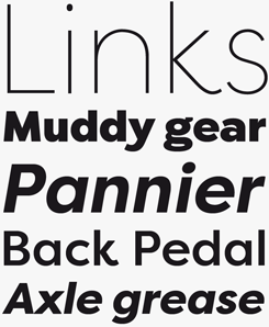
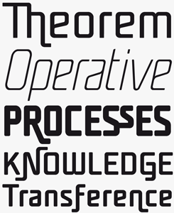
The key adjectives that come to mind when looking at your recent work are words like technological, minimalist, geometric. Are these the qualities that you particularly enjoy in a typeface?
Yes, those are criteria that I like to see in a professional typeface. When I look at the many fonts that are created today, my eye is often attracted by fonts that look contemporary and lucid. The other thing that is a crucial aspect of a good typeface family for me is versatility. As a graphic designer and user of typefaces, I know how frustrating it is not to have a generous choice of weights at one’s disposal. These are the reasons why I try to develop rather modern typefaces with a balanced range of different weights. Having understood that graphic designers and web designers often work on projects that are very eclectic in their artistic directions, I try to design font families that take these needs into account. I also try to design fonts with which I would personally like to work.
|
|
|
|
|
|
|
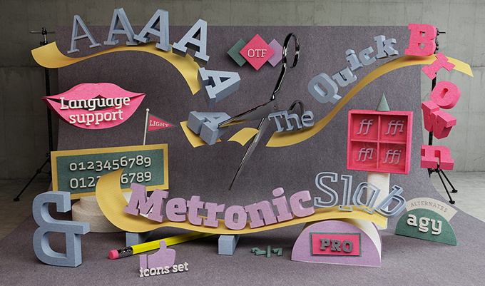
Gourvat’s spectacular three-dimensional construction to show off the many faces of his Metronic Slab family.
|
|
|
|
Your graphics are colorful and rather capricious — almost the opposite of the sobriety and rigor of your fonts. Do you have plans to develop any fonts that have a similar playfulness as those images?
It is true that there is a strong contrast between my illustrations and my type designs. Making type requires a lot of care and precision, and I attach great importance to this.
In contrast, the work on the various images I have produced is like a kind of relief from my type design activities. I need a “break” between type projects because it is a very exciting but also very demanding job. That’s why I just let off steam through these illustrations that often have often surreal themes. I certainly don’t think these two worlds will mingle in my mind one day to create a whimsical or surreal typeface! For me, these are two completely different worlds, and I hope it stays that way.
The French typographic world is quite compact and centers primarily around Paris. You live in Cubjac, a small village in Dordogne, several hours from the capital. What are the advantages and disadvantages of working in a place that is so isolated?
I am very fortunate to live in southern France in a beautiful little village in the Perigord region, of which I am a native. The South West is a truly unique area with fabulous historical sites, the Atlantic Ocean, and a cuisine that is unique in the world. Being able to live and work here has always been a blessing for me, and has not caused me any professional problems yet. I would probably have had more job opportunities if I lived in the capital, but I have prioritized my lifestyle over my work. I can basically do the same here as in Paris — living there wouldn’t change much because the majority of my customers live abroad. So the main disadvantage of living far away from the capital is not being able to see the big exhibitions and major events that I’m interested in.
But I would like to take the opportunity to add a few words here about type and typography in France. The majority of French foundries are located in Paris because in typography, as for many other things, everything seems to happen in one place only — Paris. It is a shame that with the current means of communication, commission-givers and buyers often fail to trust providers who work outside the capital. It’s beginning to change very gradually but changes take a long time to be implemented here. We don’t really have a typographic culture like those in other countries such as Germany, Switzerland and the United States. Type design is still an unknown profession to most people, and very uncommon.
In type design or lettering, do you have examples or heroes?
Certainly. I think the complete body of work produced by Jonathan Hoefler and Tobias Frere-Jones during the years of their collaboration is truly exceptional, both in the diversity of their designs and the quality of execution. Paradoxically, I find that they have continued and revived tradition while also bringing a lot of contemporary thinking to typefaces such as Gotham and Vitesse. But I also have great respect for people who are much closer to me and have taught me my love for this profession — such as my father, or the teachers I had throughout my schooling. They have really influenced me in all that I create today. Yet I also feel close to today’s graphic world, to designers like Rudi Meyer or Arnaud Mercier who, through their various projects, prompt you to think about the concepts of design and typography in today’s communication.
Twentieth-century type design in France has had some unique personalities, each with a very individualist style — from Cassandre to Excoffon to Jacno. Do you feel in any way part of, or inspired by, this tradition?
I am sure that this there must be some unconscious influences, because typefaces like Antique Olive and Choc (by Excoffon for Fonderie Olive) are still very much present in our daily lives, through advertisements, books, posters and lettering in public places. Many of us aren’t aware of who created these fonts and graphics, but they are part and parcel of our collective consciousness. It’s a bit different for me, as I’ve been always ultra-conscious of these types that my father used a lot in his work. A typeface like Banco was his absolute favorite typeface to copy in his hand-painted lettering — I saw it used all over his studio.
|
|
|
|
|
I remember that in the villages and small towns in the South West of France there were still a lot of signs and lettering on roadsides and in public spaces. Is it still like that — and has that influenced you as well?
Yes, I think it’s become a new tradition here! Along the roads there are myriads of small panels for shops and other local services. The proliferation of these signs has reached a point where, a few years ago, a regulation came into force to protect the environment from the visual impact of all these signs. Despite this, there’s still a lot of “wild” posting going on and there is a kind of uncontrolled growth of billboards on roadsides… it’s actually a shame because it often spoils the landscape. No, that does not really influence me. These signs are often just there for information purposes and are not intended to appeal to the eye with wonderful lettering or beautiful typographic compositions.
For your illustration, applied typography, 3D and motion design work, what type of clients do you have?
My portfolio of clients is quite varied — from the computer consulting business via institutions to cultural organizations. The projects are very different, and that’s what I like in this business.
My work in motion design is quite experimental and underground. My latest project was a music video commissioned by the independent Scottish label Bulb Records for the artist David Kempston (aka Clatterbox). The clip was then released as part of a DVD with other motion design artists. The project took a long time, but this collaboration with a musician and a label was very interesting for me. I’ve realized quite a few projects in motion design because I want this to remain a “playground” where I can really make what I want and where I can be in total control.
|
|
|
|
|
|
|
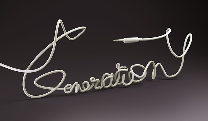
Gourvat has not published any script fonts yet — but he did construct this witty “Generation Y” logo from a virtual sound cable.
|
|
|
|
In type design, does it often happen that customers get in contact to make bespoke fonts, or customize existing type families?
As for developing custom fonts: yes — I’ve done a few. And I have more and more requests for customizing fonts. I think more and more companies today want a truly comprehensive identity for their global communications through a font or font family of their own.
Several of your font families — especially Sofia Pro — are bestsellers at MyFonts. Has this success surprised you? Has it allowed you to do things that you otherwise would not have been possible?
Yes, this infatuation with Sofia Pro has been a great surprise — it never ceases to amaze me! Every week I receive links to graphic projects made with Sofia Pro and I am often astounded by what professionals are able to do with this typeface. Large companies as well as small design studios use this family for their communication, their website, their apps … it’s really great to see the huge variety of projects made with this typeface!
(By the way, if you are a graphic designer or web designer, you are cordially invite you to send your work, whether large or small, to my e-mail address.)
The success of Sofia Pro is directly linked to MyFonts and the extent to which its site appeals to communication professionals across the world. It is clear that without it I would not have had the professional opportunities that I owe to the success of my typeface.
Have you received or seen examples of applications that you have your fonts particularly striking or surprise?
Yes, I have seen things that I really liked. There are a few that pleasantly surprised me. The first is a booklet with a poem illustrated only with Sofia. I found that the designer has really used the font very well to give an epic ambience to this book while enabling the reader to be immersed in the text of the poem through the typographic work. On the other hand, big companies like Pepsi and Unilever also use Sofia Pro for their marketing and products and it’s really cool to see my typeface on consumer products!
More recently, there’s been the book project Wizards and Robots by the comics artist Will.i.am with the illustrator Brian David Johnson, made with the UNicod Sans Pro family. The book and its packaging have a really futuristic look and I found that the font was a perfect fit with the world of these comics.
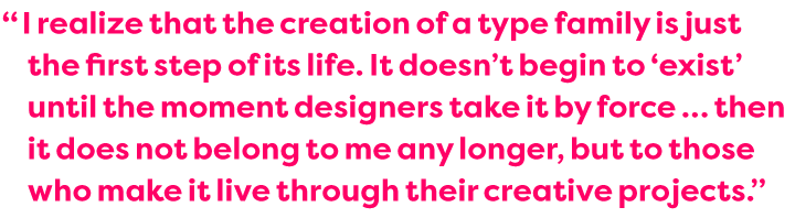
With hindsight and with all these different jobs, I realize that the creation of a type family is just the first step of its life. It doesn’t begin to “exist” until the moment designers take it by force … then it does not belong to me any longer, but to those who make it live through their creative projects.
Many thanks, Olivier, for your insights, and keep up the good work!
|
|
|
MyFonts on Facebook, Tumblr, Twitter & Pinterest
Your opinions matter to us! Join the MyFonts community on Facebook, Tumblr, Twitter and Pinterest — feel free to share your thoughts and read other people’s comments. Plus, get tips, news, interesting links, personal favorites and more from the MyFonts staff.
|
|
|

|
Who would you interview?
Creative Characters is the MyFonts newsletter dedicated to people behind the fonts. Each month, we interview a notable personality from the type world. And we would like you, the reader, to have your say.
Which creative character would you interview if you had the chance? And what would you ask them? Let us know, and your choice may end up in a future edition of this newsletter! Just send an email with your ideas to [email protected].
In the past, we’ve interviewed the likes of Sibylle Hagmann, Sumner Stone, Typejockeys, Charles Borges de Oliveira, Natalia Vasilyeva, Veronika Burian, and Michael Doret. If you’re curious to know which other type designers we’ve already interviewed as part of past Creative Characters newsletters, have a look at the archive.
|
|
Colophon
This newsletter was edited by Jan Middendorp and designed by Anthony Noel.
The Creative Characters nameplate is set in Amplitude and Farnham; the intro image features Metronic Slab and Sofia Pro; the quote image is set in Filson Pro; and the large question mark is in Farnham.
|
Comments?
We’d love to hear from you! Please send any questions or comments about this newsletter to [email protected]
|
Subscription info
Had enough? Unsubscribe immediately via this link:
www.myfonts.com/MailingList
Want to get future MyFonts newsletters sent to your inbox? Subscribe at:
MyFonts News Mailing List
|
Newsletter archives
Know someone who would be interested in this? Want to see past issues? All MyFonts newsletters (including this one) are available to view online here.
|
|
|
|
MyFonts Inc, 500 Unicorn Park Drive, Woburn MA 01801, USA
MyFonts and MyFonts.com are registered service marks of MyFonts Inc. Other technologies, font names, and brand
names are used for information only and remain trademarks or registered trademarks of their respective companies.
© 2014 MyFonts Inc
|
|
<
|