|
|
|
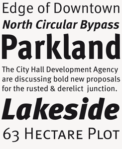
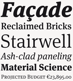
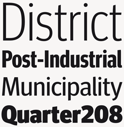
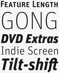
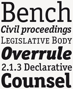
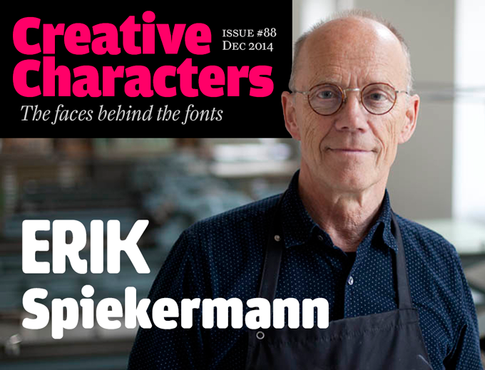
Erik Spiekermann is one of the world’s best known faces in graphic design. As a co‑founder of international design companies such as MetaDesign, United Designers and Edenspiekermann he has been directing corporate design and signage projects for the likes of Volkswagen, Bosch and the German railways. He founded FontShop and the hugely influential FontFont typeface library. As a type designer he has always been the ultimate team player, involving younger, single-minded talents in the development of modern classics such as the ITC Officina, FF Meta and FF Unit type families. At an age when others retire to the countryside, he is now back where he once started out: having fun with metal and wood type in his own letterpress printing shop in downtown Berlin. A conversation with a remarkable man.
|
|
|
Erik, Gestalten publishers has just brought out your book “Hello I am Erik” — the first comprehensive overview of your life and work as a designer.
It’s not exactly my book. Somebody else made it! It was not even my idea; it was Johannes Erler’s idea. So I can claim innocence — I took no part in editing it. I employed an assistant who went through my non-existent archives, I delivered the materials, I put Johannes in touch with people, I checked some of the facts. And I designed a new typeface for it: Real. Johannes selected the people who wrote articles, and I had to learn to keep out of it. Of course, he knows me well; he worked with us at MetaDesign in the nineties.
What surprised you most about this self-portrait done by another person?
I was surprised at how interested Johannes was in things that weren’t directly work-related. I could have refused to go along with that, and say: I’m not going to talk about my childhood. But I thought of books that I’ve liked about other designers, and realized I was never very fond of portfolio books. Most of the projects I’ve done have been very complex, and you cannot really do them justice in a book. I am jealous sometimes of people who mainly design posters or record covers. These things work at any size. But if you design a signage system or a corporate identity or a brand, it doesn’t live comfortably in a few pages.
Most of my achievements have not been purely visual, but rather in bringing people together, in persuading clients, in making things happen. So you have to tell people stories. If I were to read about another designer, I would like to know: how did this happen? Or: why didn’t that happen? What went wrong? Because you learn more from what went wrong, in your own practice or with other people, than from the glossy results.
Looking back at your beginnings… would you say that something “went wrong” with your career as a student of art history and English literature?
Nothing went wrong really, although I would like to have pursued it better. But I had a family very early on, and I had to work. Our son Dylan was born when I was 21, just after I had started studying. The first year and a half I went to university three or four times a week, but then I simply got too busy. At some point I realized I hadn’t been to college in a month. And so I stopped going altogether and after about four years they just wrote me off.
When you had to decide to work full-time, was designing and printing the first thing that came to mind?
It wasn’t a choice. It was simply what I had always been doing. I’d done bits and pieces of printing and typesetting basically all my life. I had a little printing press, which I received on my twelfth birthday as a gift from our neighbors, the University press. When I was fifteen, sixteen, I began making stuff for friends. I edited the school magazine and a boy scouts’ magazine, both of which I also designed, although I didn’t know what graphic design was. I became the guy that the neighbors came to asking for a business card or letterhead. That’s how I learned how to design.
So after I quit my studies, everything I did was somehow connected to graphics. I designed, I printed, and I ran a poster distribution service for a British company together with my English wife Joan.
Throughout my twenties I kept collecting machines and typefaces. After some back and forth between Berlin and London, we decided to move to the UK permanently. I borrowed a huge truck from a band and took all my printing equipment. My idea was to run my own printing press and work as a kind of fine arts printer for artists in London. This was, of course, way before letterpress came back into fashion. In a way it was still letterpress. Many printing shops were closing down, so foundry type was sold for pennies. I once gave an auctioneer five pounds, and took home a large amount of beautiful big Gill Sans display type, made of plexiglass!
I put all my stuff in storage — this was in the summer of 1977 — and we went for a holiday in Italy with the family. When we came back four weeks later, all my equipment and my type had completely burned down. There had been a fire in the car repair shop next door.
At that point I had no choice but to become a proper graphic designer. I became a consultant to the Wolff Olins agency, and a few years later we founded MetaDesign. So I went into corporate design, but always with this typographic background. Whenever I conceive a corporate design, I always think of the visual voice first — and for me, that’s the typeface.
|
|
|
|
|
|
|
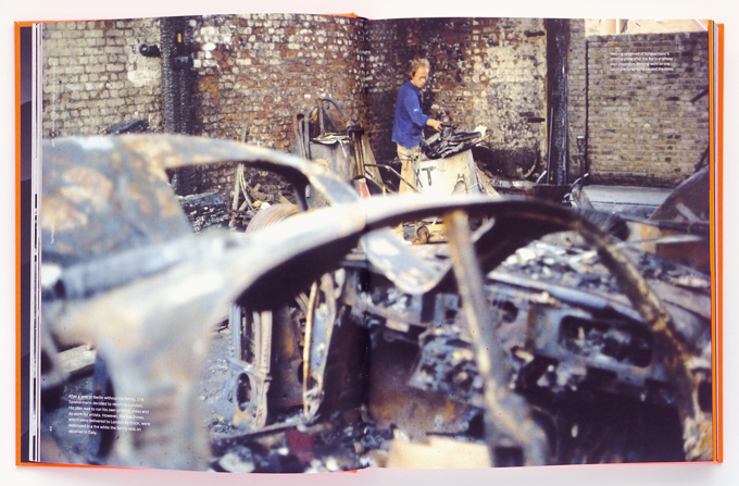
A decisive moment in Spiekermann’s career: cleaning up the smoldering remains of his letterpress workshop and metal type after the 1977 fire. A double page spread from Hello I am Erik, Gestalten publishers.
|
|
|
|
Until the late 1970s, you were a kind of artisan, making one-off things with your own hands. From there you went to talking in meeting rooms to corporations, convincing managers. That seems like a huge step.
It did not happen that suddenly. I learned corporate design very gradually, and it took me more than ten years to be comfortable doing it. For about three years I was a kind of production assistant — I called myself a type consultant. Initially at Wolff Olins I was in charge of implementing their German projects. The two cultures are very different, as you well know, and they had major issues with their German clients. The Brits were great at concepts, but not so good at getting things done. I was the practical guy, who supervised the production of custom typefaces for identity projects. I knew people at Linotype and Berthold A.G. and also at URW, where they had just introduced the Ikarus type digitizing system. So I was a kind of intermediary between the designers and the technology. Most designers don’t like technology, but I was always very interested in any technology related to type design and typesetting.
In the same period I began working for type companies: Linotype, Berthold, Autologic, Stempel, Scangraphic. I was the type specimen designer for most of the typographic companies for about ten years.
At Wolff Olins I learned how to deal with corporate design by watching them. Finally they suggested I take over their identity project for the BfG Bank in Frankfurt. Designing forms and adverts for a German bank did not seem very sexy to British designers. I’d moved back to Berlin by then; that’s when I got four people together and in 1979 we started up MetaDesign.
And you also began designing typefaces.
In 1977 I spoke to Berthold about reviving some of their early 20th-century display types. In my workshop, I used to have their Lo-Schrift in a few sizes of metal type, but when the warehouse burned down all of that was gone. So I went to Berthold’s type director Günter Gerhard Lange, whom I knew, and said: wouldn’t it be nice if those great faces were available for phototypesetting? He said: why don’t you draw them for us? So in ’78-’79 I did Lo-Type, Block and Berliner Grotesk.
As a type designer in those days, all you did was to make large drawings; I drew the characters, 120mm high, based on enlarged copies of printed specimens. Mr Lange patiently corrected the proofs, and the Berthold studio made the drawings into final artwork.
Luckily, working with somebody else’s original design, I had a lot of constraints. Of course I had to find an average shape, as in metal type all the sizes look a bit different; some characters did not exist so I had to make them up; and I designed a few new weights that had never existed. But there was no artistic expression involved: it wasn’t my own typeface. The best exercise when doing a revival like that is to imagine: if I were Louis Oppenheim and I had to do Lo-Type for photo-typesetting, what would it be like? I still think that’s the best training for a budding type designer. If someone had said to me: design a new typeface, I would have been scared witless.
Are constraints always crucial when working on a typeface?
Absolutely. One of our early jobs after starting MetaDesign was to design the identity for the German Post Office. At some point we decided we wanted a custom typeface for it — the typeface that later became FF Meta. But it was not because I was so eager to do a new typeface. We had started out by looking at what was available, we analyzed twenty typefaces, anything that might be suitable for the Post Office — small sizes, bad paper — and we realized that nothing really hit the brief: it was too wide, too dark… So we realized: damn, we have to do our own.
By that time we knew what we needed: the weight, the width, the optical issues… I looked at faces like Letter Gothic, finding out how they managed to squeeze so much into that narrow shape; that’s where the top-left curves come from. It wasn’t my invention, I just gathered all those things from what was out there. So again, it wasn’t me being an artist — the design was a response to constraints.
|
|
|
|
|
In 1989 you founded FontShop, entering the world of font retail.
That was again a by-product. As a designer and consultant for companies like Adobe and Apple, I often traveled to San Francisco and Palo Alto. I always brought floppy disks and diskettes with new typefaces back to Berlin. In Europe there was no distribution for digital type, so my fellow designers kept asking me things like: “Next time, can you bring us a disk of Palatino?” At some point I thought: wait a minute, I’m smuggling this stuff in, and I’m probably losing money on the exchange rate. So I created FontShop as a distribution company to solve my own problem. Other people in the German type industry were giving me a hard time because they didn’t believe in personal computers — “ach, give ’em another two years and they’ll be gone.” They thought it was some fancy craze, like the hula-hoop. They didn’t have the vision. But I had met John Warnock and the people who had developed PostScript, and I knew that this was major.
So we opened a shop downstairs from where the MetaDesign office was, put in a steel door so that nobody could break in, and I convinced Joan to leave the company she was working for and bring her friend and secretary, Petra Weitz, who later became the CEO of FontShop International. We had no money at all, but because I knew everybody in the business we did not have to pay for the fonts upfront — we got them on consignment. We received a couple of copies of each font from Monotype, Adobe, Emigre, Compugraphic. It was all mail order, and at the time people paid cash on delivery — there was no PayPal. So we had cashflow quickly and we could pay those foundries. And then we had a business. But it wasn’t premeditated, I never had a business plan. It was just something that worked.
(The rest, as they say, is history. The year after FontShop was founded as a retail company, Spiekermann and British star designer Neville Brody decided that publishing their own fonts was the next logical step. Both designers had unpublished typefaces, and Spiekermann had met a group of talented Dutch type designers who were looking for a home. FontShop published the experimental “random font” Beowolf by Just van Rossum and Erik van Blokland to test the waters. In 1990 the company launched the FontFont label, which quickly became one of the world’s most influential type libraries. For many years, their bestseller was FF Meta — the Spiekermann design that had started life as “PT”, the German Post Office Typeface that was never finalized.)
Before we started this conversation, we decided it wouldn’t be very exciting to discuss your typefaces in detail. But I do have one question about the way you design your fonts. Most of your type designs are collaborations — they’ve involved co-designers such as Just van Rossum, Lucas de Groot, Ole Schäfer, Christian Schwartz, Ralph du Carrois, and others. Why is that so? Are there typefaces you have designed completely by yourself?
You’re right: I seldom work completely on my own. The stuff gets boring to me at some point, so I farm it out. Even in the early days, I’d ask designers to make me some drawings; I then gave them corrections… It has always been collaborative because I like it that way. And today it’s inevitable, because there is so much technology involved. I’m not going to go into Robofont programming or Glyphs interpolating. So yes, I still draw stuff myself, but I’m so slow. It would be foolish not to let anyone else touch my work.
I’m not somebody like Peter Schoeffer, who made the type for Gutenberg and probably engraved his own matrices. I’m more like Stanley Morison — he was an art director, and I have never pretended to be otherwise. I can work the tools, but I’m so bad at them that it would be silly to do it all by myself. I drew the wood typeface for the Hamilton Museum, then called Hard, by myself. But then Richard Kegler at P22 did the letterspacing and added more characters for their digital version, called Artz. I also drew the first version of Real, the family used in the book; but I just did 90 characters or so, and then gave it to Ralph to complete and produce.
Many designers who came to Berlin to work with you have stayed here, and eventually started their own studio. That has to some extent helped change the face of the city. With dozens of full-time type designers, Berlin may be the number one type design city in the world today.
It’s amazing, isn’t it? Well, yes, maybe I’m partly to blame. We certainly started it with MetaDesign and then FontShop, and as that grew it attracted other people — people like yourself — and eventually that created a kind of economy of scale in the type world. There are so many good people here, you almost cannot not come to Berlin. There must be about a hundred type designers here. Some concentrate on doing custom type for corporate clients, others work mainly for retail and bring out a new type each week. And I’m very pleased that it works for so many of them and somehow they all have work.
All in all, I’m very happy here. Berlin is totally my place.
|
|
|
|
|
|
|
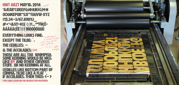
Proofs of HWT Artz, Spiekermann-style. The typeface was produced as wood type at the Hamilton Wood Type Museum, then digitized for the HWT collection by P22’s Richard Kegler. Spiekermann now prints letterpress posters with his own font.
|
|
|
|
Last summer it was announced that FontShop International had been acquired by Monotype — MyFonts’ mother company. You also sold the rights to your own typeface designs in the FontFont library. What was the motivation behind this surprising move?
The main reason we took that step was that my ex-wife Joan and I, the owners, were more or less ready to retire. I’m 67, she is 68. Monotype was seriously interested, and there were a couple of things that convinced me that they were the right party. A couple of years ago they acquired Design by Front in Belfast, who had made the Typecast design tool. I’d been talking to them a while ago and found them very cool; they were doing something that was quite unusual and weird and wonderful. Then as we started our talks with Monotype they also acquired Mark Boulton Design from Wales, which I thought was extraordinary because he was known in certain circles but not in the type world. To me that was proof that Monotype was really serious about trying new things, moving beyond the narrow retail and custom type business. It looked like they had a clever agenda, and that got my respect. As for my typefaces: in a way, they are my pension; because otherwise, I have none. And instead of waiting for the royalty check each month, I decided to sell them the rights. It seemed the least complicated thing to do.
With your new printing workshop in central Berlin, you’ve almost come full circle back to a mechanical way of producing graphics — and you’re not the only one playing about with these old technologies.
I think it’s very appropriate to discuss the new interest in analog technologies, and the ways that young people are now finding to combine the analog and the digital. In fact, the difference between the two is disappearing. As type specialist Indra Kupferschmidt also remarked recently — there’s no longer any reason to make things for the screen that look worse than designs made for print. Anybody who does layouts for the screen must know about type and typography just as well as someone who designs for paper. So what counts is, just like before, how to get the message across. We have the technology, there is no more excuse for a job badly done.
What I find very interesting is the movement of people who are savvy in digital design but are genuinely interested in analog techniques. It is now more than a passing trend; there must be a deeper motive why we are newly interested in the hand-made and the haptic, material and three-dimensional aspects of type and design.
What are the tangible take-aways for the digital generation when they get their hands on this equipment?
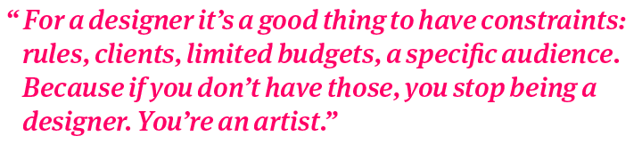
I’ve found that people who come to work here — like the designers from Edenspiekermann whom I’m expecting later today — work with moveable type for two or three hours and then don’t want to go home. There’s the play element, of course — it’s a bit like LEGO. But what I think is more meaningful is that people with solid design skills discover that something like the grid, which they celebrate in their digital designs, is something that’s naturally built into letterpress printing. They realize that a crude grid is more efficient than a fine one. They also learn that letters are something that you can touch, and hold: they’re objects. There are now generations of graphic designers to whom type is just something virtual — a digital file, pixels, in no way different from an image. That has its advantages, because everything is possible. It also has a disadvantage, because anything is possible. And as I said before: for a designer it’s a good thing to have constraints: rules, clients, limited budgets, a specific audience. Because if you don’t have those, you stop being a designer. You’re an artist.
Those constraints teach you that as a designer, you must not always work until you get the smallest detail right. It is also important to get the job done in time, to go home at some point, to stop a bit earlier because you have to clean up the workshop. Those are disciplines that we tend to forget when we’re in front of the screen all the time. People who live with and for the computer tend to forget that there’s still a normal life out there. A machine like a press weighs a ton. You can’t put it in your rucksack to take it home in the evening when you’re not done with your work. You have to get real, and plan your day.
Amen! Thanks, Erik, for your insights.
|
|
|
|
|
|
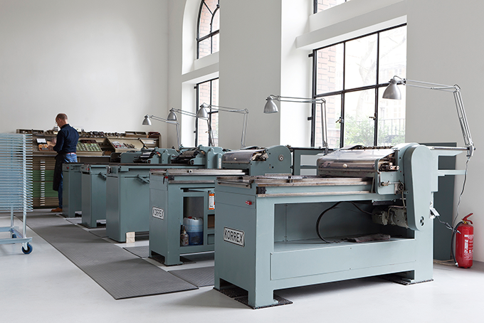
Spiekermann in the letterpress workshop he recently set up, P98a, situated in the courtyard of Potsdamer Strasse 98a in Berlin — across from the Edenspiekermann agency.
|
|
|
MyFonts on Facebook, Tumblr, Twitter & Pinterest
Your opinions matter to us! Join the MyFonts community on Facebook, Tumblr, Twitter and Pinterest — feel free to share your thoughts and read other people’s comments. Plus, get tips, news, interesting links, personal favorites and more from the MyFonts staff.
|
|
|

|
Who would you interview?
Creative Characters is the MyFonts newsletter dedicated to people behind the fonts. Each month, we interview a notable personality from the type world. And we would like you, the reader, to have your say.
Which creative character would you interview if you had the chance? And what would you ask them? Let us know, and your choice may end up in a future edition of this newsletter! Just send an email with your ideas to [email protected].
In the past, we’ve interviewed the likes of Maximiliano Sproviero, Sumner Stone, Typejockeys, Charles Borges de Oliveira, Natalia Vasilyeva, Ulrike Wilhelm, and Laura Worthington. If you’re curious to know which other type designers we’ve already interviewed as part of past Creative Characters newsletters, have a look at the archive.
|
|
|
|
MyFonts Inc, 500 Unicorn Park Drive, Woburn MA 01801, USA
MyFonts and MyFonts.com are trademarks of MyFonts Inc. registered in the U.S. Patent and Trademark Office and may be registered in certain other jurisdictions. Linotype, FF, Meta, Info Display, Unit and Beowolf are trademarks of Monotype GmbH registered in the U.S. Patent and Trademark Office and may be registered in certain other jurisdictions. Info Text is a trademark of Monotype GmbH and may be registered in certain jurisdictions. ITC Officina is a trademark of Monotype ITC Inc. registered in the U.S. Patent and Trademark Office and may be registered in certain other jurisdictions. Palatino is a trademark of Monotype Imaging Inc. registered in the U.S. Patent and Trademark Office and may be registered in certain other jurisdictions. Typecast is a trademark of Monotype Ltd. registered in the U.S. Patent and Trademark Office and may be registered in certain other jurisdictions. Stempel is a trademark of Monotype GmbH and may be registered in certain jurisdictions. Block, Berliner Grotesk and Lo-Type are trademarks of Berthold Types Limited.
Other technologies, font names, and brand names are used for information only and remain trademarks or registered trademarks of their respective companies.
© 2014 MyFonts Inc
|
|
|