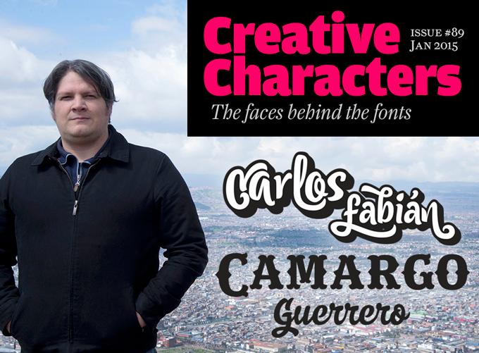
Photo © Joyce Rivas Medina
|
|
|
Now in its eighth year, Creative Characters has been taking us to places that few of us may ever visit. We’re well aware, though, that many parts of the world remain unexplored, font-wise, and we try to do something about that — one country at a time. Or two, when we’re lucky. This month’s interviewee has his roots in two countries on the South American continent that we hadn’t yet visited. He has lived between Venezuela and Colombia, tapping into the colorful visual cultures of both countries. Having joined MyFonts in 2006 with his Andinistas foundry, he has gradually abandoned the streetwise, sassy grunge style of his early days for a series of energetic and personable scripts and display fonts; Cereal, his latest, is one of his biggest successes to date. Meet Carlos Fabián Camargo Guerrero, our man in Bogotá.
|
|
|
Carlos, you studied in Venezuela. How did you end up in Bogotá, Colombia?
I’ve lived in both countries — my mom is Venezuelan and my dad Colombian. I was born in Venezuela but my childhood happened in Colombia. I went to Venezuela to study graphic design in San Cristóbal and Mérida, and worked in advertising agencies in Caracas for five years. Then I got an ideal opportunity to move back to Bogotá, where I continued my career as an art director for three years. Then one day I decided to try my luck working full-time at building up Andinistas.
So I have absorbed the visual cultures of both countries, and I am proud of both — they have been an inexhaustible source of ideas to me. It has also influenced me when I made the big decision to quit my job at the advertising agency and become a full-time type designer. In 2006 I was possibly the first designer in Colombia and Venezuela able to make a living designing exclusive fonts for clients in the USA, Europe and elsewhere.
The name of your foundry, Andinistas, roughly translates to “people devoted to the Andes.” Why did you choose that name?
In 1998 my brother Alex, my friend Lennyn Salinas and I lived in Mérida, Venezuela, at the foot of the Andes mountain range. Andinistas is the word used there to describe the people who climb the slopes of Pico Bolívar, the highest mountain in Venezuela. The word appeared in newspaper articles about mountaineers reported missing in the snows of the Bolívar. We found the name interesting because of its resonance and relationship with the unknown, so we appropriated it for our website that offered my early fonts for free.
Today I feel that the word Andinistas also has a valuable meaning for me personally. It took long years of work before I slowly received some recognition for my foundry, and it has required profound conviction and the will to surpass oneself. So the word combined concepts like spectacular beauty and adventure with the idea of overcoming challenges and getting to the top with work and creative effort.
Could you tell us something about your early influences?
I have loved drawing as long as I can remember. I owe this to my paternal grandfather, who spent his life in the backyard designing and building things. He built a full-size wooden helicopter, a Ferris wheel, a carrousel, a car, etc. My grandfather’s passion for invention and mechanics made me want to imitate him from when I was eight years old. That’s why my toys were notebooks and pencils with which I drew inventions such as robots, aircrafts and spacecrafts.
When at school, the areas I liked most were related to art and music. I spent entire days imitating Billy White Jr. and Robert Williams’ illustrations on the covers of Guns N’ Roses albums as well as drawings by Derek Riggs for Iron Maiden. At a very young age I started teaching myself to draw letters and logos. From when I was about 13, my hobby was hand-tracing logos like the one for Thrasher skateboarding magazine, designed with Roger Excoffon’s Banco typeface, or the logos for Peavey, Marshall, and Fender equipment and heavy metal acts like Metallica, Ozzy Osbourne, Def Leppard, Poison, Mötley Crüe, etc.
In my university days I had three teachers who influenced my initial training. The first and most influential was the Colombian graphic designer Fabio Godoy, who taught me graphic design methods used by art directors from Caracas and Maracaibo before the advent of computers. The second was the Venezuelan illustrator Osvaldo Barreto who motivated me to study artists like Jack Kirby and collect comic books. The third was my art history professor, who encouraged me to study the work of the Renaissance painter Piero Della Francesca. I later made my own discoveries, such as Dada, with artists such as Tristan Tzara, Hugo Ball, Francis Picabia, Marcel Duchamp and Man Ray; and modern Venezuelan artists like Marisol Escobar, Nedo Mion Ferrario, Gerd Leufert, Carlos Cruz Diez, etc.
But even in my college there was no question of studying lettering design in any formal way, first because we lacked teachers and secondly because of the lack of books. I learned from magazines I bought; with the advance of the internet I managed to talk to some people who knew the subject. It was not easy because when you’re self-taught, you learn designing fonts by making mistakes and that’s a hard and winding road.
|
|
|
|
|
|
|
Lettering designed by Carlos Fabián Camargo for JWT Caracas. Letters with retro look for TV and print advertising campaign that highlighted the new back camera on the Ford Explorer 2011. The campaign won a Cannes Shortlist 2012
|
|
|
|
Before focusing on type design, you had a career in advertising…
My first job in advertising was the logo and packaging for a coffee company from Norte de Santander; I went on to design posters, flyers, brochures and banners for small firms in Mérida. After I moved to Caracas, I worked as a trainee at the Venezuelan-French agency Publicis 67 working for such brands as Firestone, British Airways, and Renault, and then worked as a graphic designer for various companies. I then landed a job as an art director at McCann Erickson Venezuela, where I did print and TV design for clients ranging from Goodyear and General Motors to Quatro drinks and Stayfree hygiene products. My last job in Caracas was as an art director at Leo Burnett Venezuela. I was then hired by OgilvyOne in Bogotá, and went on to the Colombian-American advertising agency SSABates. Finally I was hired by Silva Publicidad, working with brands like Jeep, Roche, Varta, and more.
That’s quite an impressive list! What was it that intrigued you about advertising?
I was interested in its processes — its role in generating arguments that influence people and make them eager to buy something. In order to pull that off, you have to say little, think hard and use visual and auditory strategies, mixing creative disciplines such as music, typography, graphic design, makeup, poetry, theater, drawing, photography and marketing. I was fascinated by this imaginative approach, and it was all very captivating to me.
Why did you choose to quit advertising to become independent again?
In my early days in Venezuela we did not have internet access and the wealth of information available today. So to concentrate on type design was not obvious, because there was no immediate stimulus. In the early days of the Andinistas website I happened to be a pioneer in Venezuela without really trying, making available fonts for free. Andinistas was my oasis in the desert of repetitive and routine advertising work, and so I dedicated all my free time, my nights and weekends to the project. That’s how I designed my earliest fonts, which found their way into my own designs and the work of those who downloaded my fonts. Today I still meet people telling me they used my fonts 15 years ago. I find it amazing how during those early years there were many who, like me, were not satisfied with the tools provided.
Today the situation is completely different. I’m aware that there are plenty of customers who are waiting for what I’m going to produce; they form an interested audience that gives me constant encouragement and helps me work with great joy and with great pleasure. |
|
|
|
|
Your earlier fonts were all very grungy and “destructive”. What were your influences?
When I was 19 I wanted to imitate the letters and effects made by the Romanian Dada artist Tristan Tzara. I used ink, paper, scissors, glue, copier, scanner and a Power Macintosh 7200 to modify different alphabets from a Mecanorma catalogue I’d found in a thrift shop in Merida. I expanded the pages to tabloid size using a photocopier. I subsequently processed those photocopies by ruining them with sandpaper, burning them, wetting them and drying them in the sun to produce various effects of distress and destruction. I generated striking experimental fonts by redrawing those alphabets and mixing them using ink and scissors, and gluing them together with other, speedball-drawn letters. My love for these alphabets was a bit like someone who wants to make music but does not have a clue how to and can’t explain why or for what. So as I didn’t understand what I was doing, my intuitive solution was to use my scarce resources to express myself.
Then one day I got a magazine that included CD with demos of FreeHand and Fontographer. This allowed me to digitize my alphabets to TrueType files, with strange names to create differentiation, and make them available for download on andinistas.com.ve. When I discovered MyFonts.com, I modified those old files in FontLab 3 and invented new ones with the same grunge style.
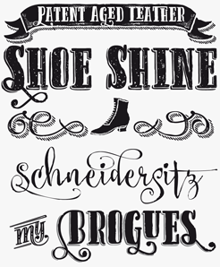
These fonts were inspired by all kinds of sources. To mention a few: Cazon and Gancho Petare were both based on an empanadas sale sign in Petare — a Caracas suburb — combined with sheets from a Speedball catalog. Panamericana refers to a Manu Chao song. When making Navaja, I was thinking about football, and Rosadelia refers to deeds found in my paternal grandparents’ house.
With every project I learn new things. Hopefully I will never retire from designing fonts, since I have many plans for new font design, and a lot of enthusiasm for what I do. To finish a new font design gives me infinite pleasure, so it would be hard to give up, even when some ideas aren’t successful.
From a very coarse grunge style, you’ve developed towards a more restrained approach of display and script typefaces. Could you describe the path that took you there?
As I said before, the circumstances have forced me to be a self-taught type designer. For that reason I try to analyze the work of my favorite type designers, as if scrutinizing these typefaces with a magnifying glass. I admire the fonts of Roger Excoffon, Robert E. Smith, Doyald Young, Hermann Zapf, Morris Fuller Benton, and Rudolf Koch. Studying them gives me a better understanding of what else I need in order to design expressive typographic solutions, in hopefully unexplored directions.
|
|
|
|
|
|
|
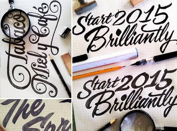
Work in progress sketches.
|
|
|
|
How has working with MyFonts influenced your development as an independent type designer?
MyFonts has been a significant factor that allowed me to take charge of my business, which has been my main source of income since 2006. Thanks to MyFonts my work reaches buyers whom I would never have been able to reach otherwise. This has led me to aspire after continuous improvement — I want each typeface published to be better than the last one.
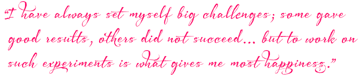
I have always set myself big challenges; some gave good results, others did not succeed. Many of my ideas for fonts took me years to realize, for example Chef Script, Nemocón and Citronela. With Acustica, Bemol, Cereal and Bengala I explored Roundhand and Speedball scripts, which I find amazing. I am sure that many users preferred to buy other fonts, but to work on such experiments is what gives me most happiness — and that’s been largely possible thanks to MyFonts.
Could you say something about your recent work as a university teacher?
Continuing with the spirit of research from 2009 to mid-2014 I was a teacher of calligraphy and lettering in the Graphic Design course at the Universidad Piloto de Colombia in Bogotá. During these years I tried to be the “best student in the class” because being a teacher taught me how difficult is to be a student.
Throughout this period my students taught me that every time you study, the more you realize how little you know. Through my teaching work I became more aware of the difference between calligraphy and lettering on one hand, and typography and fonts on the other. Calligraphy and lettering are letters made to write static, one-off messages that cannot be changed. For instance, the type drawn for the logo of Rolling Stone magazine, or the calligraphy on a diploma were both made to function in that particular context, and the font cannot be replaced by a different one. By contrast, typographic letters (fonts, typefaces) are mobile and interchangeable. The typeface family in which you are reading this page was made to write endless words, phrases and texts; a type designer must be aware that any typeface should be designed with the purpose to work in an infinite variety of possible combinations and contexts.
Has there been a change in students’ attitudes to typography and lettering since you were at university?
I find that the changes are radical. When I was a student in Venezuela in the late nineties, the academic point of view was discouraged. Information on typography was scarce and it was difficult to follow one’s vocation as a type designer. I think that the more influences students can have, the more productive and full of possibilities they can be. In other words, having multiple references is very beneficial. The complex thing is to learn to sort and assimilate them, to build up knowledge and wisdom about how to do things; that happens when you study, compare, and review many different artists and authors. Good students learn from the older teachers, especially when it comes to researching methods and references.
In typeface design we can never say we have learned enough, because when looking at old classics we realize that what we need to learn is inexhaustible. We never get anything definitively. So the fonts I publish are merely attempts to make what I thought was something extraordinary, and realized halfway that I was not going to get to the end. That’s how life is for a self-taught type designer like me. When you look back at the portfolio of all the fonts you have done, you realize you are always trying to do your best, and have been leaving a trail of attempts.
Many thanks, Carlos. You have indeed come a long way. Enjoy the view!
|
|
|
MyFonts on Facebook, Tumblr, Twitter & Pinterest
Your opinions matter to us! Join the MyFonts community on Facebook, Tumblr, Twitter and Pinterest — feel free to share your thoughts and read other people’s comments. Plus, get tips, news, interesting links, personal favorites and more from the MyFonts staff.
|
|
|

|
Who would you interview?
Creative Characters is the MyFonts newsletter dedicated to people behind the fonts. Each month, we interview a notable personality from the type world. And we would like you, the reader, to have your say.
Which creative character would you interview if you had the chance? And what would you ask them? Let us know, and your choice may end up in a future edition of this newsletter! Just send an email with your ideas to [email protected].
In the past, we’ve interviewed the likes of Maximiliano Sproviero, Sumner Stone, Typejockeys, Charles Borges de Oliveira, Natalia Vasilyeva, Ulrike Wilhelm, and Laura Worthington. If you’re curious to know which other type designers we’ve already interviewed as part of past Creative Characters newsletters, have a look at the archive.
|
|
Colophon
This newsletter was edited by Jan Middendorp and designed by Anthony Noel.
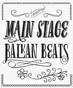
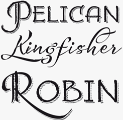
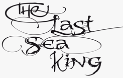
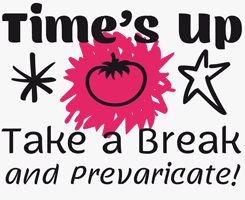
The Creative Characters nameplate is set in Amplitude and Farnham; the intro image features Citronela and Nemocón; the quote image is set in Bemol Script; and the large question mark is in Farnham. Body text, for users of supported email clients, is set in the webfont version of Rooney Sans.
|
Comments?
We’d love to hear from you! Please send any questions or comments about this newsletter to [email protected]
|
Subscription info
Had enough? Unsubscribe immediately via this link:
www.myfonts.com/MailingList
Want to get future MyFonts newsletters sent to your inbox? Subscribe at:
MyFonts News Mailing List
|
Newsletter archives
Know someone who would be interested in this? Want to see past issues? All MyFonts newsletters (including this one) are available to view online here.
|
|
|
|
MyFonts Inc, 500 Unicorn Park Drive, Woburn MA 01801, USA
MyFonts and MyFonts.com are trademarks of MyFonts Inc. registered in the U.S. Patent and Trademark Office and may be registered in certain other jurisdictions. Other technologies, font names, and brand names are used for information only and remain trademarks or registered trademarks of their respective companies.
© 2015 MyFonts Inc
|
|
|