|
|
|
|
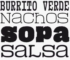
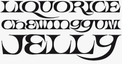
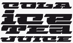
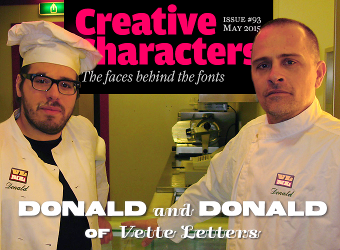
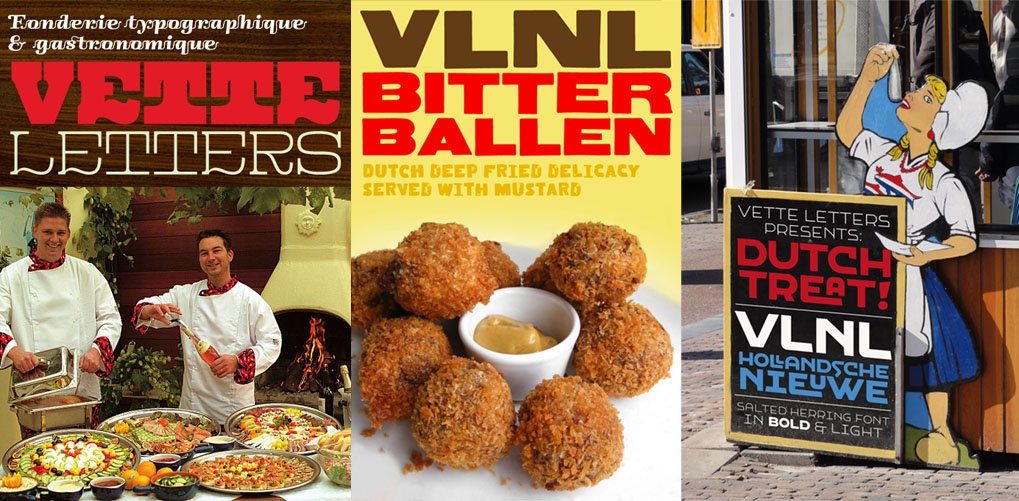
In all probability, there is no other type foundry in the universe quite like Amsterdam-based VetteLetters. Run by two seasoned professionals in web, logo, film title and packaging design, the foundry’s products and marketing have a recurring theme — fast food. With that in mind, it’s hard to believe that these (tongue in cheek) “CEOs” are really both called Donald. But it’s the truth: Donald Roos and Donald Beekman are their real names. They have invited other designers with names like Martin and Jacques to join their adventure. Their typefaces are the results of geometric construction, historical research, and experiments with duct tape and potatoes. Needless to say, a unique sense of humor is a common thread in their fonts as well as the visuals. Oh, and “Vette” is Dutch for greasy, fat, impressive and cool. Meet our two chefs in Amsterdam, the Netherlands.
|
|
|
Donald and Donald, you had both been working as graphic designers for considerable time when you began working together as VetteLetters. Could you tell us something about your respective backgrounds? Donald Beekman — you worked as a musician alongside your graphic career, didn’t you? What came first?
DB I have always done both: music and design happened in parallel. I’ve played the guitar since I was six; around age fourteen, when girls suddenly became quite interesting, I seriously considered becoming a rock’n’roll musician for some time. Simultaneously, from when I learned how to hold a pencil, I loved drawing and wanted to do something with that. After high school I tried to combine music and graphic work by making animations for television, but I found it frustrating that you always needed a team of people to get things done (this was before powerful personal computers). So I went to art school — and then discovered graphic design as a possible job.
And you started to design for bands and music labels?
I was experimenting with Freehand, my vector graphics application of choice at the time, creating repetitive, abstract patterns. This was in the mid-to-late 1980s, when acid house became wildly popular in Europe. Through my work as a musician I knew quite a few DJs who became house producers. These guys preferred being anonymous musicians and did not want their heads on record covers. So they needed a new visual language for posters and packaging. For a while designers experimented with the cut-and-paste anti-aesthetic borrowed from punk, in combination with a lot of yellow smileys. But that was a very limited idiom. Dutch producers liked my geometric, psychedelic patterns — somehow these visuals had a lot in common with their music. And so I became a kind of specialist in that field.
However, as a musician, I always preferred hiphop to house or techno. I’ve played the bass in hiphop bands for fifteen years; but music has taken a back seat now.
How about you, Donald Roos?
DR When I turned eight or nine, a designer friend of my parents gave me a huge pile of Letraset sheets for my birthday — he had just bought his first Mac. The mother of a friend of mine happened to own a typewriter, so we had everything needed to make our own newspaper. Every few months we produced a paper in fifteen copies, five of which were distributed through the newsstand in our village. They once even sold one! In high school, I had a seat on the student council and I was constantly organizing events. Each of these things became a reason to design something. For school theater performances I made the sets and designed the posters. Later I kept having ideas to start small companies, but I’m not sure what I liked better: the company itself, or designing the logo. It was a small step to start studying graphic design at the Royal Academy of Art (KABK) in The Hague in 1997 — not that I knew what typography or type design was. But I liked the work I saw in their student exhibition.
Being really fond of type, I started a two-man student association with my classmate Onno Bevoort: The Sociable Type Society (Letterdispuut in Dutch). We decided that everything we did would be about letter shapes — a great way to avoid having to come up with any deep concepts. We turned every assignment into a typographic commission. As part of our graduation project we created a fictional type foundry of three-dimensional fonts, producing a series of letter sculptures. After leaving school we each went our own way, but I knew I wanted something similar to the Sociable Type Society. Which became VetteLetters.
|
|
|
|
|
|
|
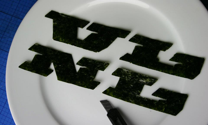
Possibly this is how the VLNL Wasabi Turbo font was designed. With seaweed. Wasabi Turbo fan-art by Sebastiaan.
|
|
|
|
You started VetteLetters on your own. How did the foundry become a duo?
Well, we both became members of the Dutch type designers’ band Wolfraam — with Just van Rossum and Peter Verheul on guitars and the two of us on bass and saxophone. Wolfraam first played during the presentation of the book Dutch Type in 2004 with Henk Lamers on computer, and has continued to give concerts occasionally, adding a live drummer to the lineup. And so… the circumstance of two type designers who both live in Amsterdam and are both called Donald, playing in the same experimental band seemed such a freak coincidence — a chance of one in a billion — that we simply had to work together.
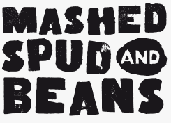
The Dutch name “VetteLetters” means both “Greasy Letters” and “Cool Type”, and your concept has a lot to do with eating, mostly snacks. Was this a joke that turned into something serious?
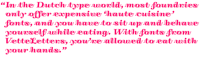
DR No, actually it was something serious that became a joke. We’re hard-working members of the Dutch type world, where most foundries only offer “haute cuisine” fonts. Some are quite expensive, and you have to sit up and behave yourself while eating. With fonts from VetteLetters, you’re allowed to eat with your hands. That doesn’t mean they are of inferior quality — just because they are snacks. We take enormous pride in our work. Every type design is a gem in our book.
To be honest, our main ambition with VetteLetters is to have a place where we can play around. Sometimes the playing is pretty serious, at other times we’re just having fun. It’s a side project… a kitchen garden where I work on a Sunday morning, doing some new pages for the website or sketching a font. We hardly have any corporate clients at VetteLetters, so we can do whatever we want. Although it is true that some clients come to us because of our fonts and the way they are presented. Usually these are clients who are looking for our typical mixture of know-how and fun.
DB I’ve published several font families in the FontFont library, and will continue to work with them, but the requirements their fonts have to meet are pretty high. Those fonts have to support many languages, and wait for review. In the case of VetteLetters, it’s us who set the rules — we decide when a font is ready, and we publish it. We can do as we please and when some crazy idea comes up, we just go ahead and do it. No restrictions. We can move fast — if we want, we can have a font online within a week, which can be quite gratifying.
DR In that sense it’s an advantage that VetteLetters doesn’t really have strong commercial intentions. Most of the typefaces we publish have already been produced for a client or as personal projects. It not crucial to make money with them. It’s a pity if a font doesn’t sell, of course, but then it’s always there for our own use.
|
|
|
|
|
Tell us something about your day jobs. Donald Roos, your studio Bureau Donald specializes in websites and identities, doesn’t it?
DR Well, lately I’ve being doing more and more film titles. This began in 2010 when the guys at Planet X FX, a visual effects studio in my office building, came to me because they needed animated type and graphics for a music video. The artist was singer Caro Emerald, who had a #1 album with Deleted Scenes from the Cutting Room Floor. It was inspired by movies from the 1950s, so for the single ‘That Man´ they wanted a video referencing animated opening titles from that era by Saul Bass and others. It worked well [reader, take a look — it’s excellent], and so we began a more structural collaboration. Planet X works a lot for Dutch movies and TV drama productions. Our recent joint project is ScreenInvaders, a company that creates fictional digital content for film sets — allowing content on computer screens and smartphones to be filmed live with the actors, without having to “fix it in post”. So much of what I do now is about type in motion.
Donald Beekman, what is your latest project?
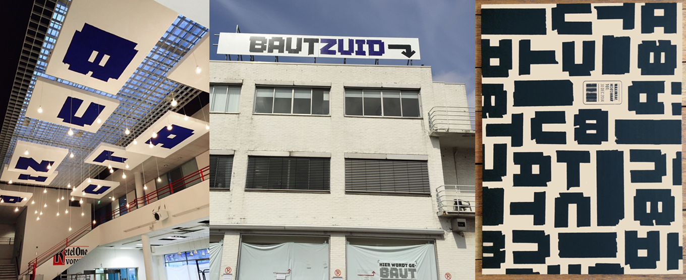
DB Three years ago I began working for a temporary restaurant called Baut. It began with their logo and menus and tablecloths. I imagined the owner of a pop-up restaurant sticking his name to the shop window with duct tape. That’s how the idea came about to use duct tape for the lettering and for patterns across the space. Last April, the restaurant was renamed Baut Zuid (Baut South) and moved to a new temporary location — a former car showroom next to the Olympic Stadium. It’s a huge space, which was furnished and decorated in two weeks. They had to move all the equipment — the kitchen, air conditioning, exhausts — from the old location to the new in that same timeframe. I worked with builders, technicians, painters, and street artist to fix up that space. I started as a graphic designer, but ended up being a kind of art director of the project. It was incredibly hectic, but fantastic fun. Meanwhile. I’ve started on the design for the next edition a more permanent restaurant that’s being built on the old location, working with architects and builders to design lettering and patterns for three-dimensional objects and space.
Oh, and of course the duct tape font that was designed for Baut restaurant is for sale from VetteLetters: VLNL Duct.
A question about your side activities, Donald B. During the past ten years you’ve been quite a prominent presence in the type world. You presented a few editions of TypoBerlin, Europe’s largest typography conference; and you’re probably best known as a co-founder and co-presenter at TypeRadio, together with graphic designer Liza Enebeis. How did that come about — and is it still going strong?
DB TypeRadio is a series of podcast interviews with type designers and other people in the world of design. We are guests at conferences, where we’re often given our own studio, and question designers about the ins and outs of their life and work. Liza and I are both terribly curious. We want to find out what these designers are like as people, and what the ideas are behind their work. In magazines and on websites you can usually find plenty of information about designers’ work and — if they have any — their theories, but we’re interested in more personal things: their background, their parents, their attitude towards life.
We originally started doing this in 2004 with our friends from Underware. It was conceived as a one-off thing at TypoBerlin; we had rented an FM frequency and handed out tiny free radios to receive us at the conference site. But the radio permits required immense organization, and after three of these events we stopped transmitting. As people had immediately started saving the sound files from the live stream and forwarding them to each other, we decided to make the archive available as free downloadable files. We now have an online archive of about 300 interviews. We’re still continuing, although Liza has recently become a mother; and so TypeRadio is kind of on the back burner at the moment. But it’s still cooking, and it’s still great fun to do. We’re doing up to three conferences a year.
|
|
|
|
|
|
|
Bautzuid, a temporary restaurant in Amsterdam South, for which the interior decoration was produced in just over two weeks in April 2015. Donald Beekman did the corporate and graphic design, and art-directed the operation.
|
|
|
|
Have you guys ever considered focusing exclusively on type design?
DR Not really. We’re both really interested in type and lettering, but we would find it a bit boring to do only type design. Letterforms are a basic ingredient of just about everything we do, but to concentrate only on on that would be too restrictive. What is fun is to draw letters that can turn into an animation, or become part of a bigger project.
DB There is a big difference between the way we work, and the practice of full-time type designers. As a type designer, you are not making an end product. A typeface is a semifinished product, to be used by other designers to make beautiful things. To me as a graphic designer, that kind of piques my pride. I want to make these beautiful things myself. So I think it’s nice to be able to use my own fonts, and I certainly don’t mind making them available to others. But I’m not going to agonize over the details of my typefaces, to make them as useful as possible for the largest possible user group. In order to do that, you have to put so much blood, sweat and tears into things like OpenType programming… it’s out of my league. I make what I need, and of course I complete the character set. But I don’t mind if their usability is limited.
DR Exactly. But then again… I just produced the website for the Dutch foundry Bold Monday. Its principals Paul van der Laan and Pieter van Rosmalen are total type geeks and it was fascinating to work with them. It was a pleasure for me to dive into serious type design again, working for the competition, so to speak, and making a website that is many times more sophisticated than the VetteLetters site.
A big difference is, of course, that we never wanted to make our own site into a web shop. We’re quite content redirecting the users to MyFonts or FontShop, and let you guys do the work. It doesn’t matter much to us that the distributors receive a chunk of the sales, because it would be so much more costly to invest in our own sales system.
And as I said before, we don’t see ourselves as very commercial and we’re certainly not planning to become the biggest foundry in the world — think of all the administrative hassle! So we promote our fonts with witty visuals that would make a serious marketeer a bit nervous.
|
|
|
|
|
|
|
Some of VetteLetters’ witty food-themed advertisements.
|
|
|
|
Humor is a pretty important factor for VetteLetters, isn’t it?
DB It is crucial! We are having fantastic fun with this thing. That’s the whole point of it. One of us may bring a crazy idea to the table, and if we think it’s worth trying out we just go ahead and do it. We don’t need to call a meeting or ask others for their opinion. But some people are a bit confused by the humor in our work: we’re not always taken quite seriously as a font foundry. As the work is presented in a tongue-in-cheek way, some people tend to not take our fonts seriously. But the work is quite professional: the fonts are well-made. They have to be.
Tell us about your work with outside type designers.
DB We’ve worked with Jacques Le Bailly, a Dutch designer, and with Barcelona-based Martin Lorenz, both of whom also studied at The Hague. We have a typeface by Henning Brehm, a Berlin-based designer of graphics for the film world. We’ll soon present VLNL Wurst, a blackletter family by a young designer called Alexandre Saumier Demers, based on the shapes of sausages; so that was perfect for VetteLetters. But finding suitable fonts by others is not easy. Designers come to us with fonts that they think are pretty funny, but not everything is funny in the same way. We hope to find the golden mean — amusing, but not banal or corny, and visually spot-on.
Donald Roos, you mentioned you graduated from the KABK Royal Academy — a school that is now world famous for its TypeMedia program. You seem to have always had a somewhat ironic attitude towards the seriousness of an academic education. Was it useful for you nevertheless?
It’s been essential. I learned an incredible amount there, and I am very pleased that I now teach there myself. At some point the school seemed to have developed some aversion against typography and craft — everything had to be conceptual, otherwise the students would run away. This has changed now: type and lettering are allowed again. This year I’m teaching calligraphy to first-year students; but I want to make sure they learn that making letters is not only about doing things right, but also about having fun with letterforms, and exploring ideas about form. What is great about The Hague is that they combine craft and classic typography with coding and programming. The idea is to be aware of tradition, but also look to the future.
That sounds like a good morsel to end on. Many thanks — and enjoy your lunch!
|
|
|
|
|
|
|
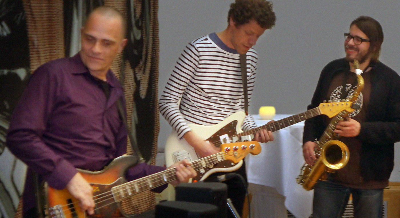
Left to right: Donald Beekman, Just van Rossum and Donald Roos in action as (half of) Dutch type designers’ band Wolfraam at the 2012 Robothon conference in The Hague.
|
|
|
MyFonts on Facebook, Tumblr, Twitter & Pinterest
Your opinions matter to us! Join the MyFonts community on Facebook, Tumblr, Twitter and Pinterest — feel free to share your thoughts and read other people’s comments. Plus, get tips, news, interesting links, personal favorites and more from the MyFonts staff.
|
|
|

|
Who would you interview?
Creative Characters is the MyFonts newsletter dedicated to people behind the fonts. Each month, we interview a notable personality from the type world. And we would like you, the reader, to have your say.
Which creative character would you interview if you had the chance? And what would you ask them? Let us know, and your choice may end up in a future edition of this newsletter! Just send an email with your ideas to [email protected].
In the past, we’ve interviewed the likes of Maximiliano Sproviero, Sumner Stone, Typejockeys, Charles Borges de Oliveira, Natalia Vasilyeva, Ulrike Wilhelm, and Laura Worthington. If you’re curious to know which other type designers we’ve already interviewed as part of past Creative Characters newsletters, have a look at the archive.
|
|
|
<
|
MyFonts Inc, 600 Unicorn Park Drive, Woburn MA 01801, USA
MyFonts and MyFonts.com are trademarks of MyFonts Inc. registered in the U.S. Patent and Trademark Office and may be registered in certain other jurisdictions. Mister K is a trademark of Monotype GmbH and may be registered in certain jurisdictions. FF is a trademark of Monotype GmbH registered in the U.S. Patent and Trademark Office and may be registered in certain other jurisdictions. Other technologies, font names, and brand names are used for information only and remain trademarks or registered trademarks of their respective companies.
© 2015 MyFonts Inc
|
|
|