|
|
|
|
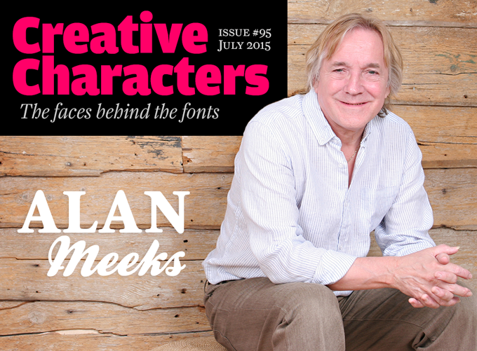
If he calls himself “a bit of a dinosaur”, it’s because type designers like Alan Meeks are indeed becoming rare. He is a trained lettering artist, a craftsman who used to make letter shapes strictly by hand. He was then hired by Letraset, and helped build a huge type library designed for dry transfer sheets, a democratic pre-personal-computer system that allowed everyone to set display type by rubbing single letters onto paper. He was one of a select group of designers trained to make type using a unique hand-cutting method. His contributions to Letraset’s pre-digital typeface collection were substantial, and many of his typefaces got a second life as part of the ITC, Letraset and Linotype digital libraries. He’s been an independent type designer since 2008, and has just set up his own label. Meet Alan Meeks.
|
|
|
You started out as a type designer in pre-digital times. You must have decided to study lettering at a very young age. How did that career choice come about?
Like many people, I feel that I fell into my career rather than chose it. Certainly at school I was the kid in class who was good at art so it seemed quite natural that one day I would have a career in art or design. My father had the most beautiful handwriting and although he was a bookkeeper his accounts books were beautifully written and laid out so I suspect my interest in typography grew from there. At that stage I did not realize there was any such thing as a typeface designer, I thought that typefaces were just there and it did not occur to me that someone had to design them.
I left school at 18 with no formal training in art and design, but managed to find a job in a design studio in London. The studio supported a typesetting and dry transfer lettering company and only consisted of two people. In my interview I had shown an interest in lettering so was given the job as a trainee in drawing and producing final artwork for typefaces. The faces I was drawing at that time were sourced from old type books. I would enlarge each character to 150mm, trace it, make corrections and then cut a stencil in Ulano, which is a kind of red masking film.
You became a Senior Designer and Studio Manager at Letraset. For the younger generation, could you explain what Letraset dry transfer sheets were, and how they were used?
Letraset were pioneers in the development of dry transfer lettering. In 1959 two printers developed a wet water slide transfer product where letters on an alphabet sheet could be cut out with scissors, soaked in water and then transferred to paper making a simple type layout, rather like model airplane transfers. This sounds rather crude now, but it was a lot cheaper and easier than hand lettering.
This method later developed into the Letraset Dry Transfer process where letters are printed in reverse onto the back of a polyethylene carrier sheet then overprinted with a low tack adhesive allowing anybody with a ballpoint pen to apply careful shading pressure over the selected letter and rub down onto paper or card. A typical sheet of Letraset was 25 x 38 centimeters (9.4" x 15"), contained a full alphabet with a carefully worked frequency of characters (ten of e, eight of a, four of h, one of x, and so on) and the sheets came in various point sizes. Initially the most popular metal fonts were used but eventually new typefaces were developed.
At Letraset, you worked with a design and production system that was unique in the world, and which involved hand-cutting letters from Ulano film. Please give us some insight into this intriguing process.
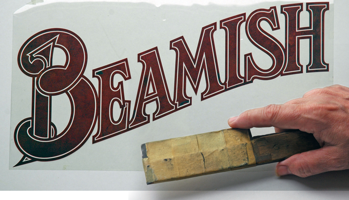
The technique of stencil cutting was developed at Letraset in the early 1960s. By 1963 Letraset had 35 standard typefaces in their range but decided they needed to improve the definition and the quality of their artwork. A South African named Gary Gillot developed a method previously used in silk screen printing, of cutting out letters from a sheet of Rubylith film (also known as Ulano film, or simply red masking* film). Rubylith is composed of a thin layer of red film attached by a light adhesive to a clear polyester base. Once the red film had been cut, it could be peeled away leaving a perfectly clear base and a precisely defined character.
The knives needed for this method did not exist so each stencil cutter had to make their own. This normally consisted of a piece of wood with a single edged razor blade attached to one end with Sellotape. Attached to the top of the piece of wood would be a small piece of lead, this allowed the blade to cut through the red film without applying pressure but not so heavy that it would cut through the clear film base. The process of cutting out the letters was done entirely freehand. The Ulano was taped to a drawing of the character and the knife would carefully follow the shape of the letter whilst the other hand would twist the letter to allow the cutting hand to go as far around it as possible without stopping. To achieve accuracy you could only cut a curve in one direction, so the outside of an ‘o’ would be one cut but an ‘s’ would require two cuts — the skill being to join the two curves perfectly.
I stayed at my first design studio for five years learning the above techniques under Gary Gillot. Obviously, drawing and cutting typefaces all day led to me developing typefaces of my own. My first font design was called Virgin Roman, appropriately enough, which is still around somewhere. In 1974 I joined Letraset, along with Colin Brignall.
|
|
|
|
|
|
|
Meeks’ homemade knife alongside a hand lettered logo cut in Rubylith film.
|
|
|
|
In the 1970s, Letraset absorbed and influenced fashions in type and lettering. How did the company decide what styles to embrace, and which typefaces to adapt for the Letraset system?
Colin and I were approached to join Letraset in 1974 because they wanted to be taken more seriously as a type company. Up to that point all the new designs were sourced from submissions from all over the world. Aside from a few exceptions, the quality was generally inferior and although often original not really typographically sound enough. So we set out to produce the kind of fonts we felt the market needed, seeking and commissioning fonts from established designers.
We generally avoided text faces and concentrated on headline and display fonts. We still received hundreds of submissions each year but only a few were taken up. In this way we could respond to trends in the market and often set trends ourselves. This, for me, was a period of frantic typeface designing and in general, I feel, very successful.
After you left Letraset in the mid-1980s, you continued designing fonts for them as a freelancer while working in branding and packaging. Was that a gratifying arrangement for you?
Definitely. Designing typefaces every day became boring so during the evening I would do freelance artwork and lettering for design groups and agencies. Whilst I love creating new letterforms and building up a new design in words (I always work in words initially and look at crafting the individual letters later) once the basic alphabet and numerals are done, producing the 80 or so incidental characters is tedious and then going through five other weights, italics and condensing can become mind-numbing. As I never trust the font interpolation tool I draw everything individually in Illustrator before converting to Fontographer to make the font.
The beauty of logos and packaging is that you can see the final result in days or weeks whereas a finished font family can take over a year.
After many years of hand-drawing and freehand letterform cutting, was it difficult to switch to digital design? Has your experience with the methods and tastes at Letraset influenced your later work?
I resisted digital artwork for some time as I had a unique skill which was gradually being made redundant. I would present a stencil cut to a client, but then they would ask me for digital data, meaning that I had to learn to use a Mac, dispense with the Ulano cuts and digitize directly from my drawings.
Soon I stopped cutting altogether and started to digitize everything from my drawings. Over the years I have drawn less and less and now tend to draw directly on screen. The only time I use pencil and paper now is to draw scripts or casual hand-drawn fonts. Also over the years the pencils I use have changed. To produce a stencil cut, the drawing had to be very precise so I usually used an 9H pencil. But as I’ve grown older, I find it almost impossible to work with such a hard grade, and I am now down to a softer 2H.
It took me a few years to really become comfortable with digital drawing, however I did appreciate the convenience of what the computer can do, specifically outlines. Until computers came along, I would have to draw an outline shape, go around it with a piece of paper making little marks maybe a millimeter apart, and then have to cut it accurately. It was massively time consuming and tedious; the computer can do such things so easily. Also, once a stencil cut was produced it was very difficult to change. Digitizing the outline makes it easier to edit but also to be more accurate in the first place. It’s not nearly as impressive to look at as a stencil cut, but it’s much easier on the eyes. Twenty five years of drawing and cutting, however, have given me an invaluable understanding of curves and shapes. It is hard to understand how any student, these days, could get that kind of training.
Your body of work for Letraset, ITC and Linotype shows amazing variety, and many have historical roots. Do you think of yourself as a letterform historian — and do you have a collection of vintage lettering and ephemera?
I am certainly not a type historian. In fact I am quite embarrassed about my lack of knowledge of the history of type, although having been in the game for so long I probably know more than I realize. In my early days I would go through old type specimen books looking for inspiration for new designs. My favorite was a 1964 edition of the Encyclopaedia of Type Faces which I still occasionally refer to, finding the odd gem that I have never noticed before. I have a few books in my collection but I rarely refer to them. The variety of my designs came from necessity. In my early days at Letraset there were relatively few designs available compared to today, so my job was to create a library of designs and styles, to fill as many gaps in style as possible and to create trends as well as follow them. As much as I love old type books I’d say the internet is a much easier resource to use for me.
|
|
|
|
|
|
How do you decide what kind of typeface to work on? Do you have favorite styles or genres?
I never sit down and think, “what shall I design next?” New designs usually develop from a logo I am working on, like Astoria for example. That came out of a logo I was working on for a firm of lawyers, however I did not like a few of the characters so I altered all those I was not happy with, and added a minimal amount of serifs. I was happy with the final result so decided to complete the face and produce five more weights.
I don’t have a particular favorite style, I like to keep my styles as varied as possible. In my early years at Letraset virtually everything I designed would be for headline or at least sub-headline so there was really no point in designing text faces as dry transfer lettering was not appropriate for this. When I left I wanted to design text faces, not so much book faces but faces that look good in limited text.
What were the main reasons for starting up your own foundry in 2008?
Being the owner of a foundry gives the impression I have a large studio with a number of artists and designers running around after me, producing my creations and bringing me coffee all day. Unfortunately it’s only me and a computer and a coffee machine. Creating a foundry just seemed a simple way of grouping all my work together. Also it makes me look like a full-time type designer rather than someone who designs a typeface in their spare time.
Type design technology has advanced these past ten or fifteen years; OpenType allows you to build larger character sets with alternates and larger language coverage; and partial automation makes it easier to design families with a greater range of weights. Has this made your life and work easier — or more cumbersome?
I’m afraid I am a bit of a dinosaur when it comes to technology. I still consider type design and lettering as a craft and not a technical exercise. My attempt to learn FontLab failed after about two days so I tend to design how I want and rely on advice from people like yourselves to help me with any problems. I was approached recently by UEFA to adapt one of my designs for a corporate multi-language font, I did consider doing the whole thing but it would have meant getting out the FontLab manual and I couldn’t face that, so I designed all the relevant characters and got my friends at Fontsmith to do the rest.
I know that designing a light weight and a heavy weight and letting the font program interpolate the rest is the most efficient way to design, but I do not feel comfortable designing that way. My computer is very clever but still not quite as clever as me.
After all these years in type design — do you have any unfulfilled ambitions?
Now I have been chosen for Creative Characters, what else is left?
So no, I don’t have any real ambitions in type design. Fortunately I am never short of ideas. I normally have about three designs on the go, I have my logos and artwork to do, there is my guitar to play, beer and wine to drink, food to eat and places to visit so I am quite content, but still up for any design challenge.
|
|
|
|
|
|
|
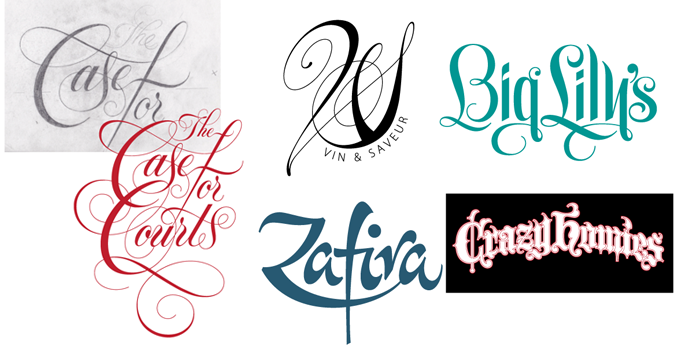
A selection of Meeks’ hand lettered logos
|
|
|
* Anyone who has ever wondered why Photoshop’s masking mode is pink, now knows why↩
|
|
MyFonts on Facebook, Tumblr, Twitter & Pinterest
Your opinions matter to us! Join the MyFonts community on Facebook, Tumblr, Twitter and Pinterest — feel free to share your thoughts and read other people’s comments. Plus, get tips, news, interesting links, personal favorites and more from the MyFonts staff.
|
|
|

|
Who would you interview?
Creative Characters is the MyFonts newsletter dedicated to people behind the fonts. Each month, we interview a notable personality from the type world. And we would like you, the reader, to have your say.
Which creative character would you interview if you had the chance? And what would you ask them? Let us know, and your choice may end up in a future edition of this newsletter! Just send an email with your ideas to [email protected].
In the past, we’ve interviewed the likes of Maximiliano Sproviero, Sumner Stone, Typejockeys, Charles Borges de Oliveira, Natalia Vasilyeva, Ulrike Wilhelm, and Laura Worthington. If you’re curious to know which other type designers we’ve already interviewed as part of past Creative Characters newsletters, have a look at the archive.
|
|
Colophon
This newsletter was edited by Jan Middendorp and designed by Anthony Noel.
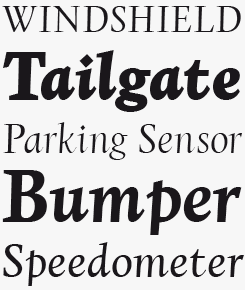
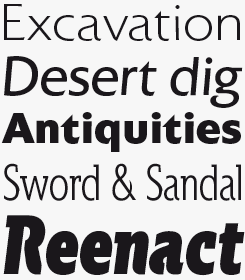
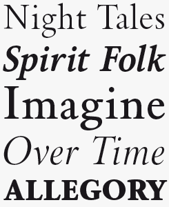
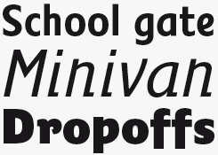
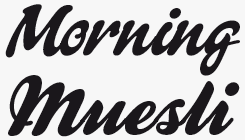
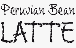
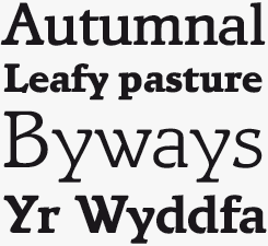
The Creative Characters nameplate is set in Amplitude and Farnham; the intro image features Brigade and Kestrel Script; the quote image is set in Vatican; and the large question mark is in Farnham. Body text, for users of supported email clients, is set in the webfont version of Rooney Sans.
|
Comments?
We’d love to hear from you! Please send any questions or comments about this newsletter to [email protected]
|
Subscription info
Had enough? Unsubscribe immediately via this link:
www.myfonts.com/MailingList
Want to get future MyFonts newsletters sent to your inbox? Subscribe at:
MyFonts News Mailing List
|
Newsletter archives
Know someone who would be interested in this? Want to see past issues? All MyFonts newsletters (including this one) are available to view online here.
|
|
|
|
MyFonts Inc, 600 Unicorn Park Drive, Woburn MA 01801, USA
MyFonts and MyFonts.com are trademarks of MyFonts Inc. registered in the U.S. Patent and Trademark Office and may be registered in certain other jurisdictions. Algerian Condensed, Bramley and Candice are trademarks of Monotype ITC Inc. and may be registered in certain jurisdictions. Times is a trademark of Monotype Imaging Inc. registered in the U.S. Patent and Trademark Office and may be registered in certain other jurisdictions. Bembo is a trademark of The Monotype Corporation registered in the United States Patent and Trademark Office and may be registered in certain jurisdictions. Other technologies, font names, and brand names are used for information only and remain trademarks or registered trademarks of their respective companies.
© 2015 MyFonts Inc
|
|
|