|
|
|
|
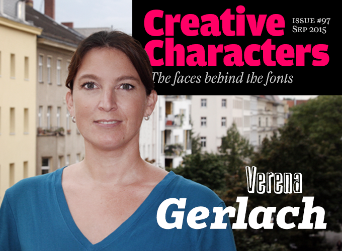
Berlin-born Verena Gerlach has been designing type since the mid-nineties. She has also designed much, much more. Music packaging and club flyers; movie titles and music videos; corporate identities for cultural institutions and for a liquor store specializing in absinthe; shelves full of art and architecture catalogues; a cookbook suitable for blind people; monumental lettering for art installations. She’s been teaching and lecturing across Europe, and worked with local students and local techniques in places like Algeria and India. Her typefaces, some staggeringly idiosyncratic, some supremely usable, explore extremes and pay homage to the quirks of Berlin lettering. Meet Verena Gerlach — a true original.
|
|
|
Verena, you started your graphic design studies in the early nineties, shortly after the reunification of Berlin — your home town. When did you get interested in type and typography?
At sixteen, I took a job as an usher in a theater, an arthouse cinema in southwest Berlin, because I wanted to stick the letters into the marquee sign. That was my main motivation. I wanted to hang the posters, and set the film titles into the letter board. I just loved being poised on a ladder and handling those big plastic letters. My spelling was terrible but there was always somebody down there who corrected me. So in a way that was the start of my career — but it’s not really true because I’ve always been interested in letterforms.
Did you decide to study graphic design right from the start, or was there a time when you wanted to be a fine artist?
Never. I always knew I wanted to be a graphic designer; to make graphic work, and use lettershapes. I had no idea that you could make typefaces yourself; I only became aware of that during my studies. When they told me that, I was delighted.
You became a student at Weissensee Academy, the former East Berlin art school, one of the first young people from West Berlin who chose to study in the East. Wasn’t that in 1990-1991, the first year of unification?
No, not right away: my career as a student took some unusual turns. I first became a kind of guest student at the University of the Arts in West Berlin. They’d rejected me for Graphic Design, but after enrolling at the Art History department I simply pretended to be a design student. I did a lot of work in the photo lab, and was then invited to become an assistant at the photography department — so I became a tutor before having studied anything.
I observed how they taught graphic design there and decided it wasn’t right for me. So I moved to Scotland in 1992 to study at the Glasgow School of Art. That, too, was disappointing. As a student it seemed you were obliged to either copy the teachers or the famous designers. Independent thinking was not appreciated. After weighing my options, I decided to take up the place at Weissensee I had already been offered the year before, and I moved back to Berlin. After all, Berlin was going through one of the most exciting periods in its history, and it would have been silly not to be part of it. I have never regretted that decision.
The Graphic Design department at Weissensee had a focus on type and typography — the main reason I’d chosen to apply there. I loved that school. The great thing about it was that it was totally off the beaten track. There was nothing happening in that part of town, and it wasn’t so easy to get there. In the northeast, beyond Helmholzplatz, you were in the middle of nowhere. The place didn’t have a copy shop back then, no café, nothing. Which was perfect. We went there and stayed in the school all day. We had a great exchange with other departments. At some point we didn’t even go home any more. It was exactly the right place for me.
And around you, the city of Berlin was also reinventing itself.
Exactly. There was plenty of space; all of us were meeting and working together in artists’ communities. After the disintegration of the GDR, a lot of East German government buildings had been abandoned. And when big buildings remain empty, that’s an invitation to vandalism. They had to somehow heat and light those buildings to keep them intact, so the government of Berlin’s Mitte (Central) district decided to rent some of them out very cheaply. So everything was possible and it cost virtually nothing.
After graduation you ended up at the Haus des Lehrers — House of the Teacher — at Alexanderplatz, where you had a studio. That was a kind of an epicenter of the new creative scene, wasn’t it?
Yes. There was a Foundation of Contemporary Art that started doing window exhibitions in the mid 1990s. They invited artists to work at this place and had parties in the building’s foyer. After the city government finally recognized these activities as a significant contribution to Berlin’s image, they began renting out the entire building. One of the first Club Transmediale festivals took place there, and finally we had a studio community of up to forty people on twelve floors. A large part of Berlin’s subculture was concentrated in that building. It was fantastic.
Was it possible to really work there, with all the parties going on?
We worked day and night. You know, that’s what a lot of people think: that we did just like a certain breed of Berlin hipster does today — party around the clock, and sleep out. Of course we partied like crazy and didn’t come home from work until 1 at night. But we did show up at the studio at 9 or 10am and worked really, really hard. We had jobs with deadlines that had to be respected. That was the thing: at least half the people that worked there were professionals working for real clients. We were designers, musicians, architects, film-makers, photographers, theater people, artists. Several have become big names.
Did you often work for these people as a graphic designer, or did you work for different kinds of clients?
Between studio mates, it was more a question of collaboration. Helping each other out. At the time, I’d already begun working for more established clients. I did graphic design for a large publisher. There were also quite a few major advertising agencies that opened offices in Berlin, and that knew nobody here. So you could make good money as a freelance graphic designer in advertising. And then there were the clubs — all those flyers that had to be designed. They actually paid for that kind of work, at the time. I often chose not to meet a client at the studio: that would have looked unprofessional. Although the people from the music industry found it totally cool to be invited to the Haus des Lehrers.
|
|
|
|
|
|
|
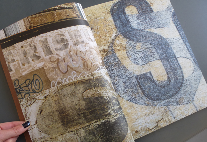
Double page spread from the Karbid book, showing a few of Verena Gerlach’s color photos of ghost lettering on East Berlin walls in the early 1990s. More of Gerlach’s type sightings can be found over on her Instagram account.
|
|
|
|
How did you get to letterforms and to type design?
Making letters has always been there, as a parallel activity. I began making typefaces at art school, and when I didn’t have a job that needed to be finalized, I gave over most of my free time, evenings and holidays to making fonts. I believe my visual thinking works in a peculiar way. I used to draw and paint a lot, but using modular systems. I drew tiny mass scenes with lots and lots of people, filling them in like modules: first all the pink heads, then all the pink hands, green trousers, green sweaters. I think that’s very similar to the way you work in type design. Some say it’s a kind of autistic mindset. I like to think I have a bit of a programmer’s brain. It doesn’t matter whether you use it in a digital or an analog environment; it’s simply a very structured way of thinking.
Several of your typefaces are informed by the visual language of Berlin. When the eastern part of the city opened up in 1990, you were one of the first to notice the hand-made lettering in the streets that had long disappeared in the West. You immediately began documenting it.
I am not so sure if I realized how quickly it was going to go away. I simply photographed it because I found it fascinating. It was about the moment. I found those old letterforms very beautiful and took pictures of them because in West Berlin there were so few of them around. Sure, they tore down entire neighborhoods in the East, too, but in West Berlin the destruction of old buildings went on until the mid-eighties.
Whereas in many places East Berlin time had somehow stood still, and you found small typographic treasures everywhere.
It was a very special combination of circumstances. When you get an opportunity like that, right while you’re being trained at an art school, while you’re being taught how to observe, you look at things differently. You absorb it all, like a sponge. And so I took photographs. Today we all have smartphones with which we can make good pictures and upload them; back then, taking pictures was quite costly. But I mostly worked in black and white, developed my own photos at college, and was lucky to have found a stash of cheap photographic paper and chemicals left over from East German times.
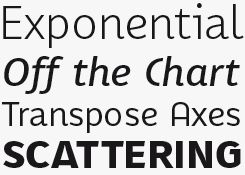
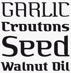
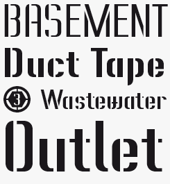
And then you began working on the typeface that became FF Karbid — based on letterforms found in dozens of mid-century lettering pieces, mostly in East Berlin.
Yes. I presented the first version of the typeface, together with my photos, as my graduation project. It may sound absurd now, but the idea behind it was that these walls I had photographed, which would eventually be renovated and painted over, would become immortal if taken into a new medium, if people could use those letters as a typeface, and write with them. I didn’t want it to become a kind of ransom letter font — making it into an alphabet of incongruent lettershapes in different weights, and so on. I wanted it to be a kind of synthesis of all that I discovered and observed. I asked myself: what is specific for that period, what kind of style is this, what are its quirks — and out of that I then made a type family. I had to find a way to throw out the most exuberant shapes while retaining some of the eccentricity, making it into something harmonious.
Who taught you how to make type?
My first typography teacher was Matthias Gubig. Then Luc(as) de Groot began teaching a type design course at Weissensee; I think we were his very first students in Germany. At first we had no clue. But then when I got to know the Fontographer software, I realized: this is great! I can make my own fonts! I totally dived into Fontographer. In 1996 none of us had a computer at home, and I had never worked with one. So I ruthlessly took possession of one of the computers at school and hardly ever left the room. My classmates always asked very respectfully where Verena was, and whether they could have some time on the computer.
|
|
|
|
|
|
You got your first fonts published even before graduation…
Well, I regard them as sins of my youth now. Well-made sins, but nevertheless… I made Pide Nashi, an Arabic lookalike, as an homage to the Neukölln district, where I lived; to my Arabic neighbors. It was published by Linotype as a result of their Take Type competition. Amazingly, it still sells. But I like to think that my first real typeface was Karbid.
The Karbid type family first came out in 1999 as two sub-families — Karbid Display, the most eccentric version, and Karbid, a more regular typeface. Twelve years later, in 2011, you presented a completely reworked Karbid, with a harmonized redesign of the original subfamilies, plus a version for Text, and a slab-serif. Then finally, the whole project was documented in a great book you made together with writer Fritz Grögel.
To be honest, the first version of Karbid was not very good — it was full of beginners’ mistakes. So I was really happy when FontShop invited me, ten years later, to redesign the family. I realized the concept had a lot more potential than I’d seen initially. Also, I now had OpenType features at my disposal.
Your fascination for letterforms found in Berlin did not stop after Karbid. Several of the fonts you published in the early 2000s were based on public lettering, such as Trafo, Tephe and Vielzweck.
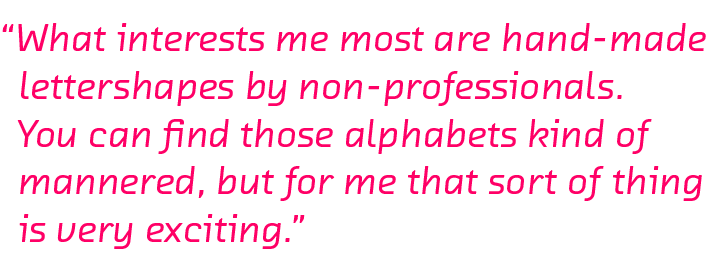
That’s how I love to work. In those former public buildings in East Berlin where I worked and which I visited, I found all kinds of signs and plastic display letters; and what interests me most are hand-made lettershapes by non-professionals. You can find those alphabets kind of mannered, but for me that sort of thing is very exciting. I don’t belong to the kind of people who sit down and say: I need such and such a typeface, which is technically able to do this and that and visually works so and so… others can do that much better, and I totally admire them, but I prefer to make those interpretations. I’m currently making a whole bunch of them, which I’m going to show in a lecture at the BITS conference in Bangkok in November. Making digitizations of stuff I’ve found in the south of France, north Africa and India, and seeing how far you can go — I’m having a lot of fun.
Of course, there’s quite a big hype around hand-lettering right now. I had the luxury of being more or less alone in the room when I started out. I could have fun with found letterforms without people thinking “isn’t everybody doing that?” That was a big advantage.
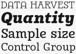
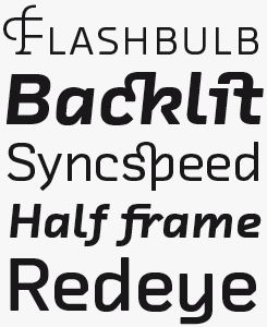
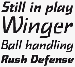
Not all of your font families are based on idiosyncratic lettering, though. In 2008 you published FF Chambers Sans, which is a very regular design, and a very usable text family, although its shapes are personal and unusual. Did you plan it as a text face at the time?
Yes, it was structured to be usable for body text. But it was also an experiment, combining certain historical letterforms I had found. It began with the type in a book from 1668 about fleas and other insects which I came across at the Museum of Natural History. I fused that with the alphabet used for the enamel street signs in Basel, Switzerland. I set myself a time limit, in order not to get lost in the details (like I did with Karbid) and with the scope to make a very usable family with different varieties. So yes, it works fine in longer texts — I’ve even used it myself for some books.
Even so, you work very differently from other type designers who concentrate on text faces. The differences between new text face designs and classic faces are often quite subtle, and many designers feel the need to formulate reasons why it was necessary to design this typeface. Self-justification is a recurring theme in type design.
Yeah, I find that kind of fatuous sometimes.
But when I look at your typefaces, I often see ideas and shapes that until then simply did not exist in digital type. Your stuff is very personal, and often very original.
That’s very nice of you to say — thanks! It is true that everything has been done. What is important is to find new combinations. As for justifying my work… I design my typefaces because it’s enormous fun. It’s also financially rewarding. That’s my justification.
|
|
|
|
|
|
|
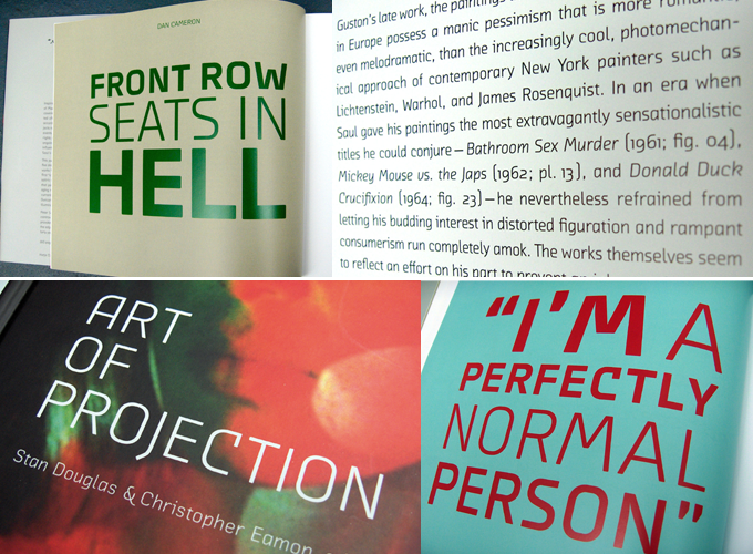
A couple of Gerlach’s book designs for Hatje Cantz publishers, both featuring Chambers Sans. Above: Peter Saul, 2008. Below: The Art of Projection, 2009.
|
|
|
|
In spite of your fondness for letterforms, you never chose to exclusively be a type designer.
No… that would have been too boring. I like dealing with content now and then. Also, I would argue that I could not make typefaces if I didn’t know how to use them; and I can only use typefaces when I know how they work. So I’ll go on making books — but not right now. I am now in one of my type design phases.
It’s not just books, is it? I know no other type designer who has done such a diverse range of projects. You’ve built sets for music videos, designed opening credits for films, taught type and graphic design, worked with Indian villagers on textile projects, produced lettering pieces for such artists as Olafur Eliasson, Slater Bradley, Sophie Tottie and Lars Ramberg…
When I work with artists, I simply provide a service: I regard them as normal clients. The credits for each project go to them; I realize their ideas in a typographic form, just as if I was extending a glyph set for someone else’s font. I always say: I make letters in all sizes and dimensions.
But I find working for visual artists very fascinating. I get to deal with materials and dimensions that I would never get to work with otherwise. For instance, maybe I’m asked to provide a solution for a monumental text in a huge space — what material should we use, how should we produce and mount it? Right now I’m working with neon. I have learned everything there is to know about neon tubes — things I did not know a thing about before. I love the technical aspect of things. When I produce a book I want to know how each type of binding works, which machine is right for which job, what special colors I can use. With neon I want to know exactly what color you get when you combine this kind of gas with that kind of glass tube, what kind of wiring you need and how it’s fixed to the wall.
I’m trying to imagine how you manage, each time, to pass from one situation to another. Isn’t it an abrupt change sometimes, having worked for days or weeks with a group of people in a large space, realizing things on a huge scale, to return to your computer screen and concentrate on tiny shapes, single pixels? Don’t you miss the spatial dimension?
I don’t think there’s a contradiction. Real, physical space stops being relevant when you’re at the computer screen. When you work in a font editor, you are in a three-dimensional space somehow. You are constantly zooming in and out. While you’re designing a typeface, your mind has to keep track of the entire system. It is as if you have an enormous structure in your head; you constantly go from one corner to another as you change something. So I really like not having to talk to anyone for a while, just sitting at the computer screen and listening to music.
Being part of the art world and going to all those events is actually hard work, you know. It’s a refreshing contrast to attend conferences and hang out with the techies, the programmers. I like them, there’s no pretension with them.
Thanks, Verena, for a great conversation.
|
|
|
|
MyFonts on Facebook, Tumblr, Twitter & Pinterest
Your opinions matter to us! Join the MyFonts community on Facebook, Tumblr, Twitter and Pinterest — feel free to share your thoughts and read other people’s comments. Plus, get tips, news, interesting links, personal favorites and more from the MyFonts staff.
|
|
|

|
Who would you interview?
Creative Characters is the MyFonts newsletter dedicated to people behind the fonts. Each month, we interview a notable personality from the type world. And we would like you, the reader, to have your say.
Which creative character would you interview if you had the chance? And what would you ask them? Let us know, and your choice may end up in a future edition of this newsletter! Just send an email with your ideas to [email protected].
In now past, we’ve interviewed the likes of Sibylle Hagmann, Melle Diete, Typejockeys, Veronika Burian, Natalia Vasilyeva, PintassilgoPrints, Ulrike Wilhelm and Laura Worthington. If you’re curious to know which other type designers we’ve already interviewed as part of past Creative Characters newsletters, have a look at the archive.
|
|
|
|
MyFonts Inc. 600 Unicorn Park Drive, Woburn, MA 01801, USA
MyFonts and MyFonts.com are trademarks of MyFonts Inc. registered in the U.S. Patent and Trademark Office and may be registered in certain other jurisdictions. FF is a trademark of Monotype GmbH registered in the U.S. Patent and Trademark Office and may be registered in certain other jurisdictions. Cst Berlin and Chambers are trademarks of Monotype GmbH and may be registered in certain jurisdictions. Karbid is a trademark of Monotype GmbH registered in the U.S. Patent and Trademark Office and may be registered in certain other jurisdictions. Other technologies, font names, and brand names are used for information only and remain trademarks or registered trademarks of their respective companies.
© 2015 MyFonts Inc.
|
|
|