|
|
Fresh Faces & New Designers
Issue #1 | May 2017
|
|
|
|
|
Nicky Laatz started her career in graphic design, ultimately taking more and more time away to pursue her interest in type. She explained in introducing herself to me: “Type and typography formed a huge part of the creativity and variety in graphic design for me, as I enjoyed how simply changing the type in a project could give the design a whole different feel. For me, the ‘power’ of fonts and type was just fantastic.” The South Africa based designer made a great splash this spring at MyFonts, arriving with her library of seven casual handwritten script faces and within a few weeks becoming one of our most successful foundries.
|
|
|
|
|
How did you get started in type design?
After about ten years in the graphic design industry I had worked up a considerable clientele, and found myself feeling quite exhausted with non-stop deadlines. Creativity, and the joy you get from it, is jeopardised when you find yourself constantly under too much pressure — so I started taking a little time off my busy days just for me, for my own creative wishes (not someone else’s). I started designing graphics, graphics that were easy and soothing for me to doodle and create — things that other designers might find useful — and I posted them up for sale. Slowly over time, my graphics started generating a side income that gave me even more free time, and I started wondering how hard it would be to make a font. Well, that, as they say, was tickets for me. It was the most satisfying and rewarding achievement for me EVER. My mind was giddy with all the possibilities — so many different letters to make, so many different fonts to make, so many possibilities — is there enough time in this lifetime!?
I started taking time away from my client work to make fonts — because it was just WAY too much fun, and client work was just so dull now in comparison.
Eventually, my side income grew to the point where I could phase out client work, and I could focus all my time, love and attention on my favourite thing — creating an endless array of beautiful letters. Pure heaven. Every day.
I released my very first font in May 2014 called Cookies and Cream, a casual handwritten monoline I designed in FontForge. It was a very steep learning curve for me, having to figure it all out on my own — but learning that way has always worked best for me — through trial and error.
|
|
|
|
|
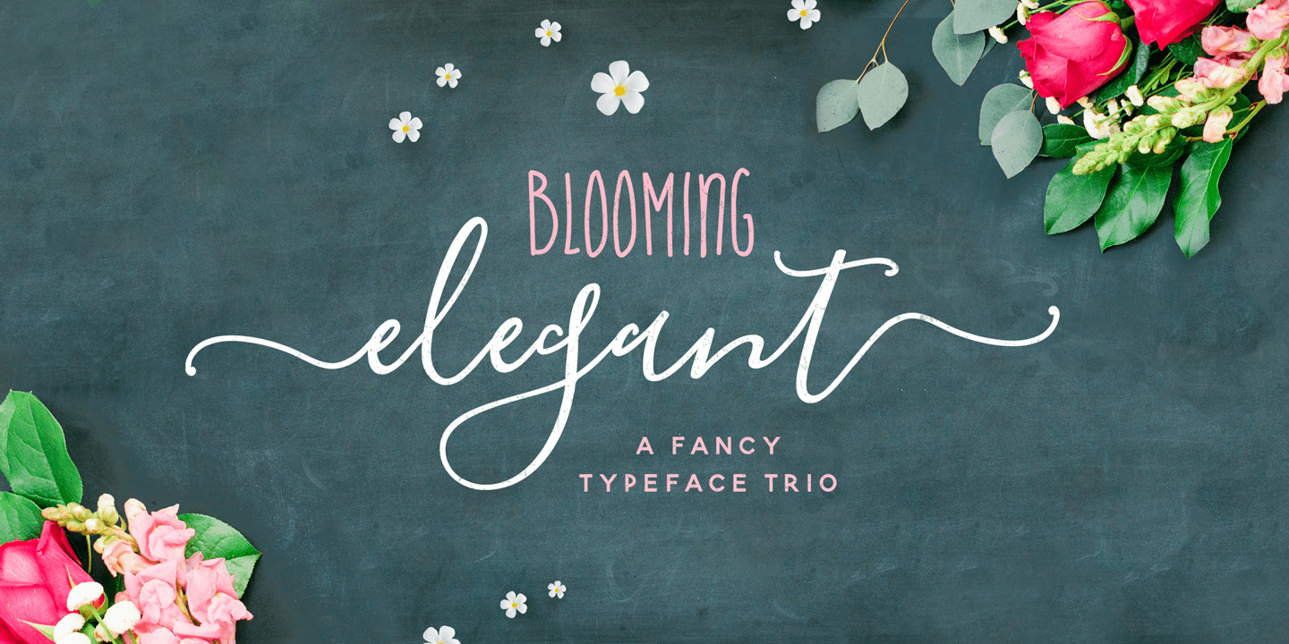
Left: Born Ready is an energetic handwritten script with pronounced speed in its strokes. The design explores axis variation with Upright and Slanted styles, with a regular style in between.
Center: Blooming Elegant creates a much more lyrical texture. Its soft, tendril-like strokes train the flowing typographic structure to the page, along with a set of hand-drawn elements.
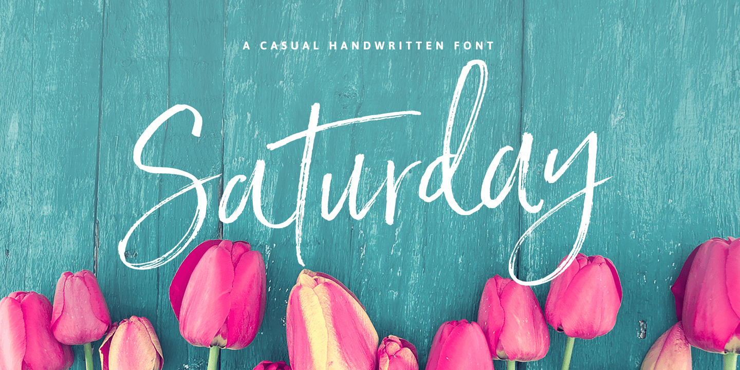
Right: Saturday Script makes use of dynamism in its character widths, as well as an irregular baseline to achieve a relaxed and confident feel. Includes modestly sloped and oblique styles.
|
|
|
|
|
One of the more notable formal details in your work is the impressively realistic streak texture within the strokes. Did an auto-traced scan just happen to turn out this way and you pursued the look? Is it a manual/digital technique you perfected? Somewhere in between?
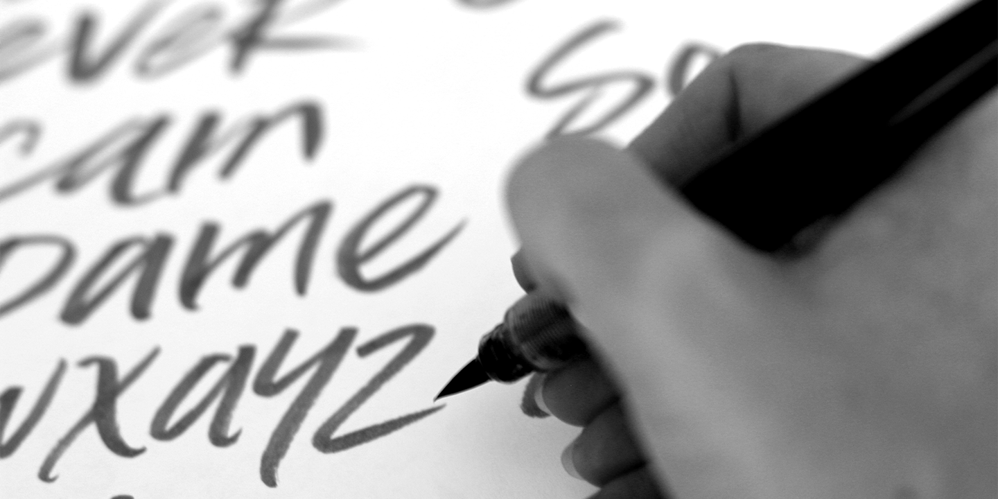
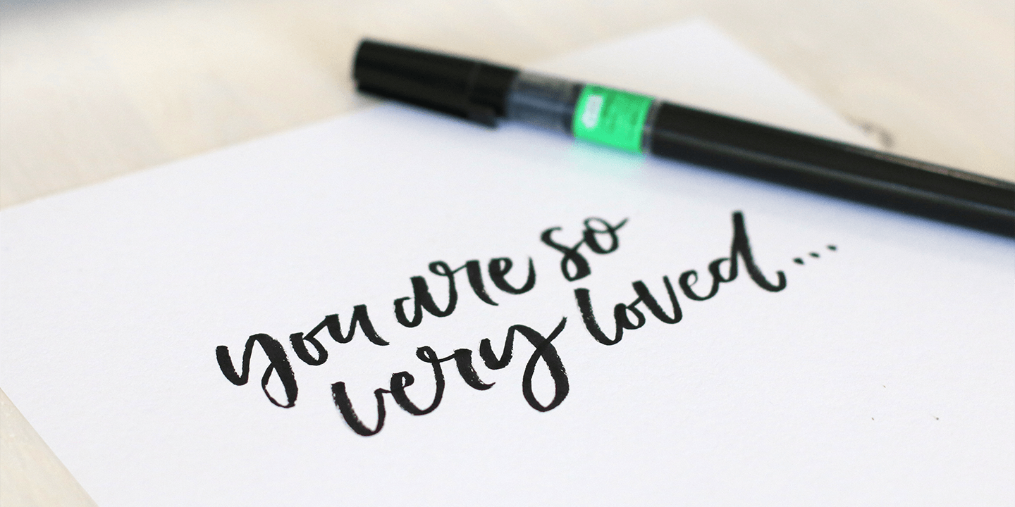
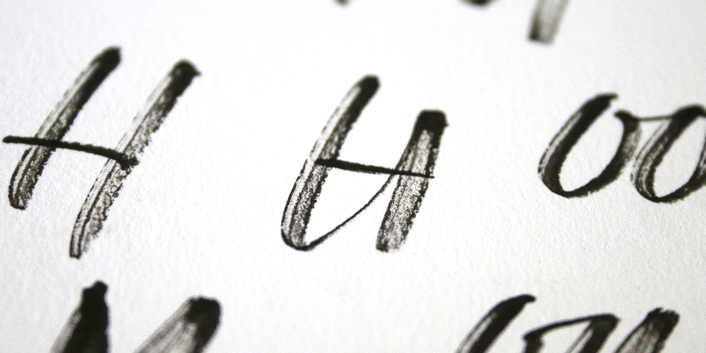
The natural, just-hand-lettered look, including the eventual textures, was something I was keen to incorporate from the very start. The aim was always to create a font that didn’t really look like a pre-made font at all — but rather something the designer lettered especially for the project at hand. I wanted someone to look at the type used in a design and think it was done as custom lettering — as opposed to a pre-made font.
Looking back, all of my initial fonts are unrefined, by varying degrees; all aiming to give a final result that is as close to the real thing as you can get. Starting with paint, I didn’t smooth out the wobbly edges, choosing to keep them, hoping that in doing so, it would make the font look more like it was just freshly painted.
That’s where textures eventually faded in. The first heavily textured font I created was just a change in the writing implement and media I tried — a Japanese style marker pen, on some rough watercolour paper, leaving small texture marks. I left the texture marks in (a variable of fine tuning in the vectorisation process) in pursuit of keeping the letters almost exactly as they appear on paper.
|
|
|
|
|
I’d say the majority of type designers up till now rarely had any direct interaction with the people who ultimately licensed their fonts, but in places that’s changing, and I get the sense that your work reaches the customer in a much more direct way. Could you give me a sense for how you interact with your customers?
I imagine that a few decades ago, there perhaps wasn’t much need for any direct interaction with the font creators or vendors — the buyers at the time where probably mostly tertiary-trained designers, already well equipped with all the knowledge they needed regarding font use and implementation. Fast forward to now though and you have more and more self-taught designers and artists coming into being. People are becoming aware that you no longer need any formal training to be a successful designer — just the will, the tools, the passion and of course the patience.
All of these self-taught people need as much help along the way as they can get, and having been there myself — having started on my own with no training or mentor, I certainly understand and sympathise with that, and as a result will always try and give help where I can.
|
|
|
|
|
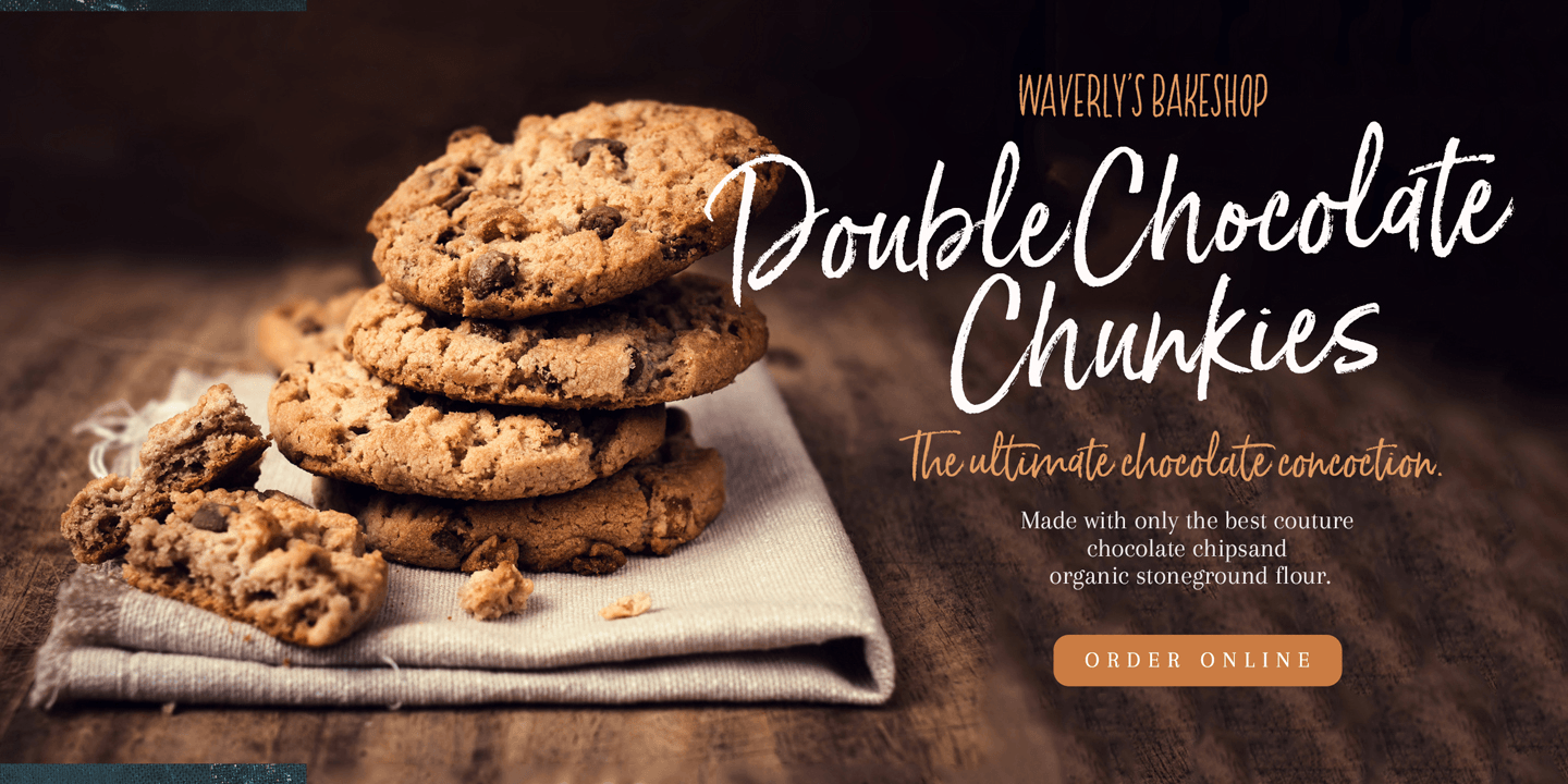
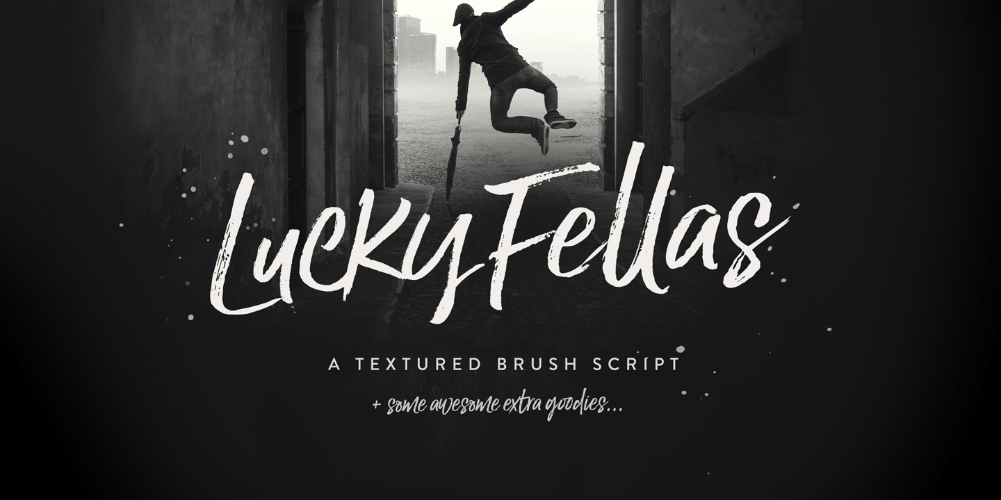
Left: Lucky Fellas appears to take a more haphazard approach to the speed-lettered style, with forms of varying size, broken textures and ink sprayed about, all expertly fit together.
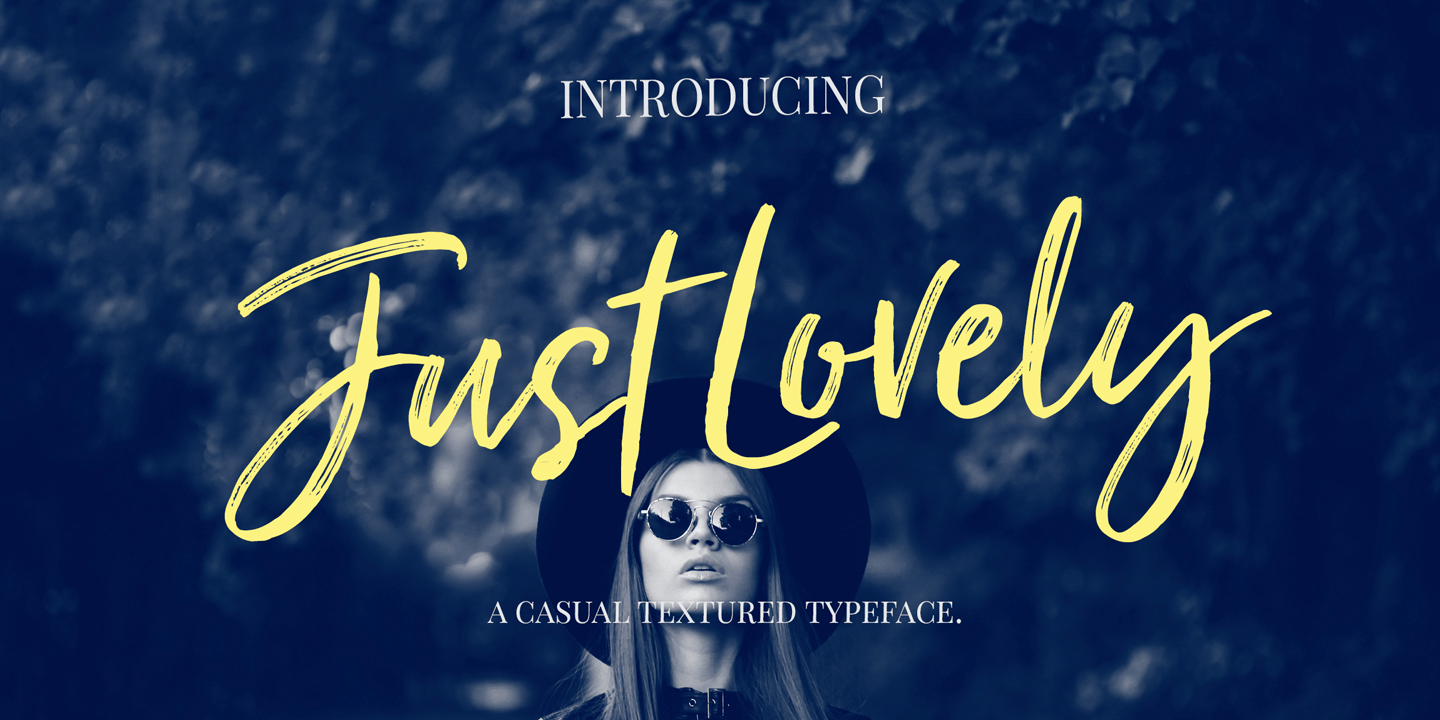
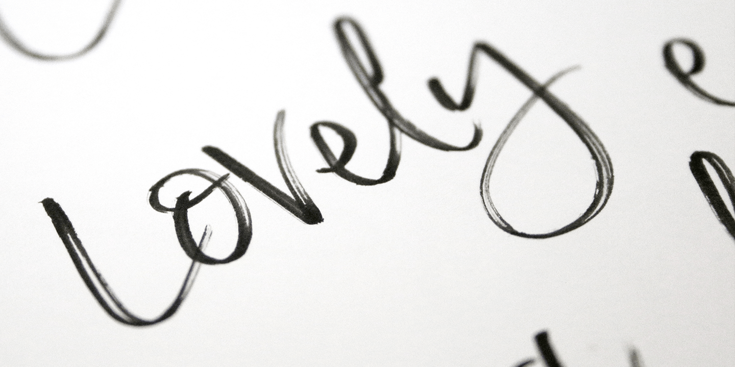
Center: Just Lovely maintains a smoother look — the kind you get with a well-worn permanent marker over a glossy photo. Family includes slanted, wide styles plus extras.
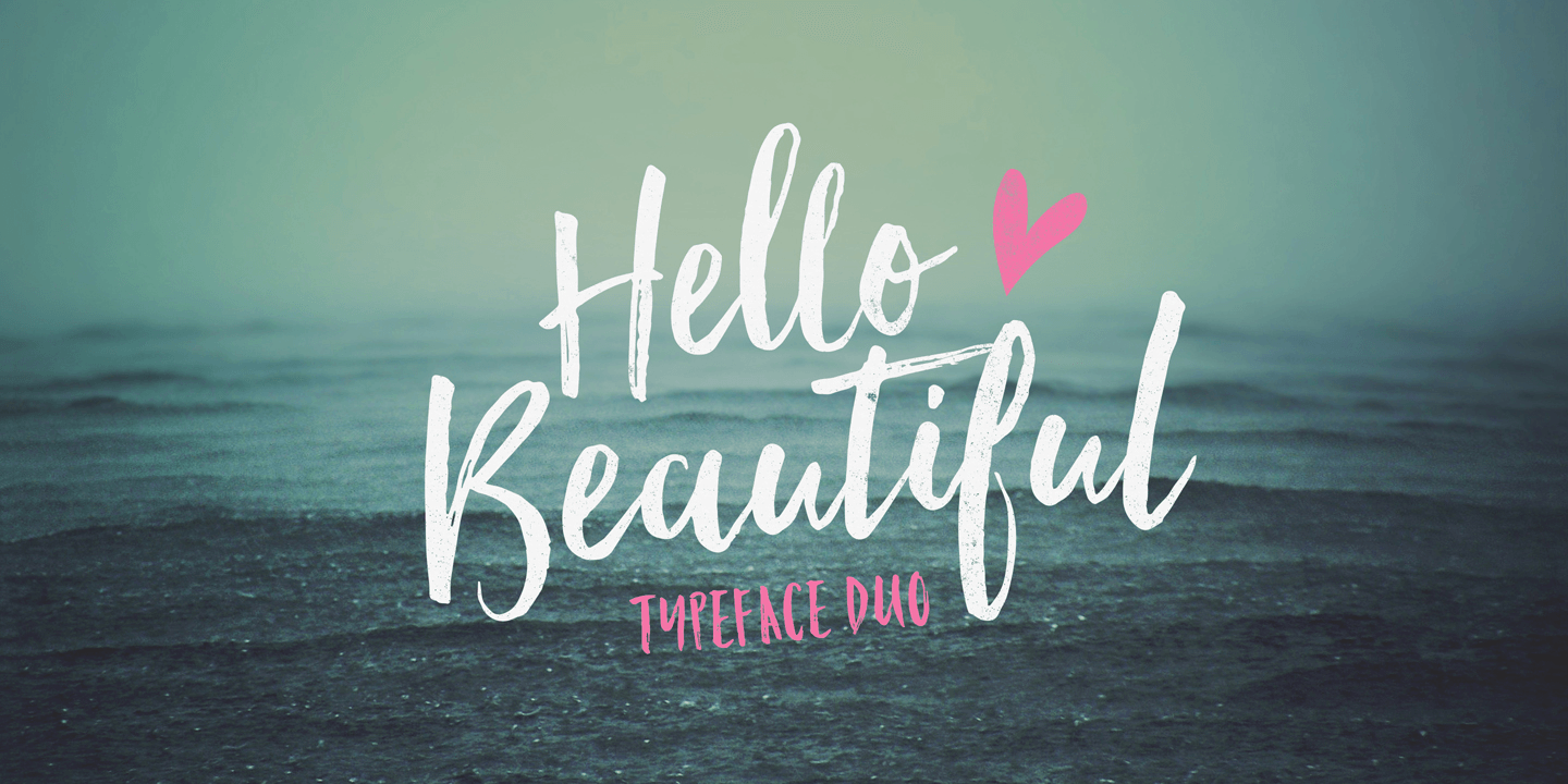
Right: Hello Beautiful celebrates newness and naïveté with a pointed brush. The design includes ligatures and stylistic sets, an all-caps companion and several single swash strokes.
|
|
|
|
|
What does it mean to do serious work?
Unfortunately, given the overly serious time I had in the graphic design industry, currently (and comparatively), nothing feels too serious to me anymore — rather liberating and fun! So in terms of font-making, no serious faces allowed here I’m afraid 😁
What’s the most exciting part of the process?
The most exciting bit? The very second I export a font to test it out.
I literally can’t wait to open up Photoshop and make something with it! This is my biggest weakness though — I need to work on my patience levels regarding this one. Often I end up testing a partially completed font in utter excitement.
There is nothing more rewarding for me than using a font that I made in a design. I call that playtime! This is also the best time to fine tune any discrepancies I find, kerning issues or any letters that just don’t gel well. I use the font literally to death, until I’m 100% content using it as a designer, and that’s when it’s ready to go out.
Of course there is so much work before I get to that point, but when a font is started, it’s the ‘getting to that point’ that makes the lead up and the actual making of the font exciting too.
|
|
|
|
|
Thank you for taking time to talk with us Nicky! We look forward to seeing what comes next from you.
|
|
|
|
We want to know what you think
|
|
|
|
|
Creative Characters Compact is a new version of our long running series of interviews with type designers that seeks to introduce our readers to newer faces and younger designers. Who would you like to see featured? Interested in being featured yourself? Get in touch at [email protected] and let us know.
|

|
|
|
MyFonts on Facebook, Tumblr, Twitter & Pinterest
Your opinions matter to us! Write to us at [email protected] or join the MyFonts community on Facebook, Tumblr, Twitter and Pinterest — feel free to share your thoughts and read other people’s comments. Plus, get tips, news, interesting links, personal favorites and more from MyFonts’ staff.
|
|
|
|
|
|
|
|
Colophon & Credits
Interview conducted by David Sudweeks. Masthead photograph courtesy of Nicky Laatz.
|
|
|
|