Creative Characters interview with Veneta Rangelova


Creative Characters interview with Veneta Rangelova
 
Creative Characters Compact

Fresh Faces & New Designers

Issue #2 | September 2017

As the list of type designers known for extensive bodies of work in the script category expands, Veneta Rangelova is making a place for herself as a specialist in casual scripts. She started her Sofia-based foundry, DearType, just two years ago with the release of Brunette, and has since steadily turned her handwritten and hand-lettered forms into type. Her range in tone goes from loose and playful, to tight, commercial brushwork, often supplemented with plainer hand-drawn letter styles, swashes, and ornaments for convenient, complementary settings.

Before you made the leap into type, you worked primarily in branding. How did you get into that work in the first place?

I’d been working on corporate identities and creative direction for quite some time and branding was the next logical step. I graduated in Cultural Studies and did a Masters in Brand Management and Advertising, both of which were more focused on strategy and thinking rather than visuals, so branding fit right into that paradigm.

I love the process of researching a new business category, launching a new product or campaign and devising the brand strategy behind it. Even with DearType, I seem to spend more time contemplating the way fonts will look and work rather than doing the actual technical work (which by now has become habit). After all, people don’t just buy your product, they buy it for how it makes them feel.”

Blooms Regular
Brunette Brunette
BeachBar Regular

Left: Blooms creates a strong and energetic texture with minimal need for alternates or ligatures. The family also includes a smooth variant and two supporting sans serifs.
Center: Brunette gives a sense of immediacy with linear forms hand written with a ballpoint pen. Its dynamic caps, paired with a steady lowercase make it a fun and memorable option.
Right: In five weights, BeachBar explores casual commercial lettering in both connected and non-connecting scripts. All-caps settings work thanks to its mixed cursive and Roman forms.


Could you describe the transition from designing and working with type to designing type?

I decided to give type design a try because it is one of the few disciplines in the design industry in which you have full control over the product and can constantly improve it. While thinking what my focus should be, I kept coming back to Rob Leuschke’s beautiful and usable script faces. In a sense, his work was what started my unending fascination with scripts. I started it as a side project. Type design was a good test for creating a brand of sorts, although I’m afraid things escalated rather quickly and I haven’t had the time to cater to DearType as I’d want to. I’m very excited to see how this will turn out.

How do you decide what kind of work to pursue as a type designer?

All of my fonts are self-initiated and the result of asking what would be interesting for a large number of people. Each font was designed with a single use case in mind: Guess was made for more formal applications such as wedding invitations and high-end products, Timeout was inspired by urban culture and street wear, and Blooms is a strictly fashion-oriented product. I get easily bored with doing the same stuff over and over and that’s why every font is different in style from the previous. I always produce a ton of sketches and different ideas, but in the end, only the most promising options make it to screen. One thing I noticed is that if you don’t have the customer in mind when designing a font, you end up with a product no one identifies with.

From left: Sketches for Guess, Deartype foundry artwork and sketches for Guess and Lifehack.


What led to your decision to start designing families as kits, mixing contrasting styles in a single family package?

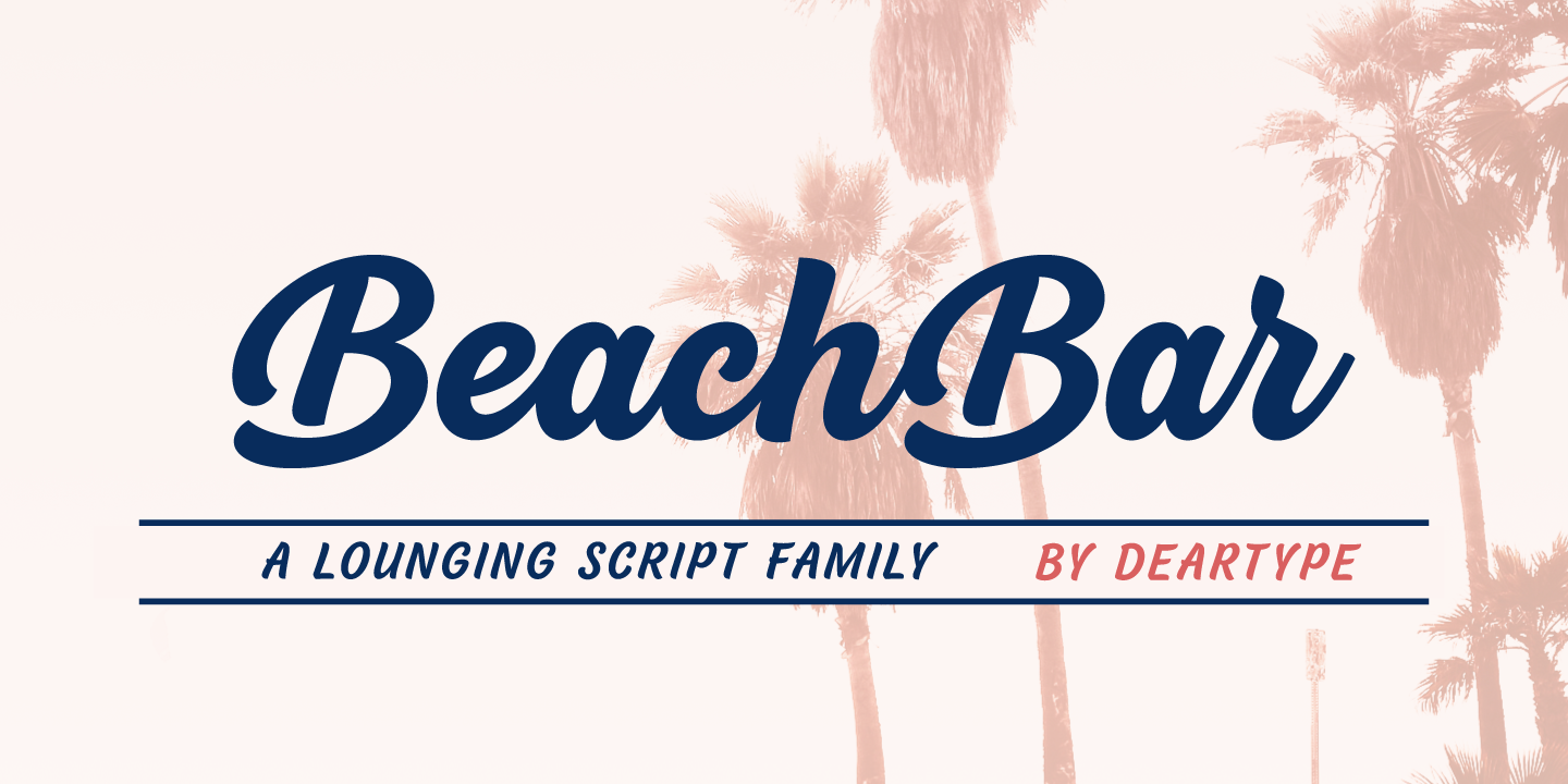
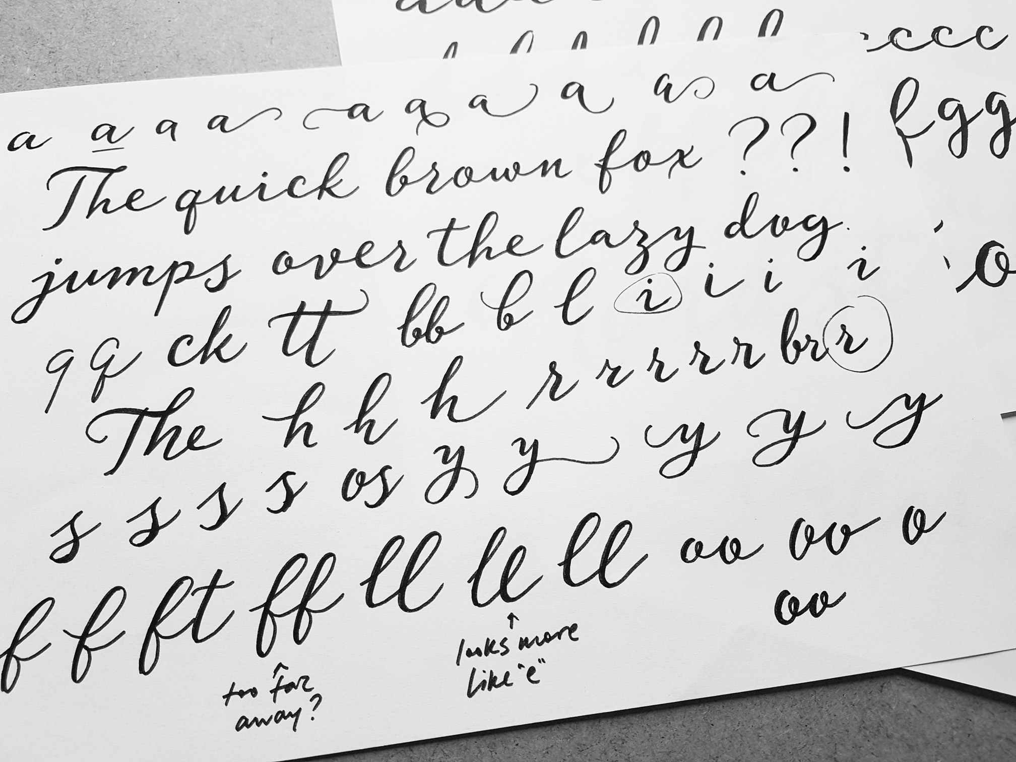
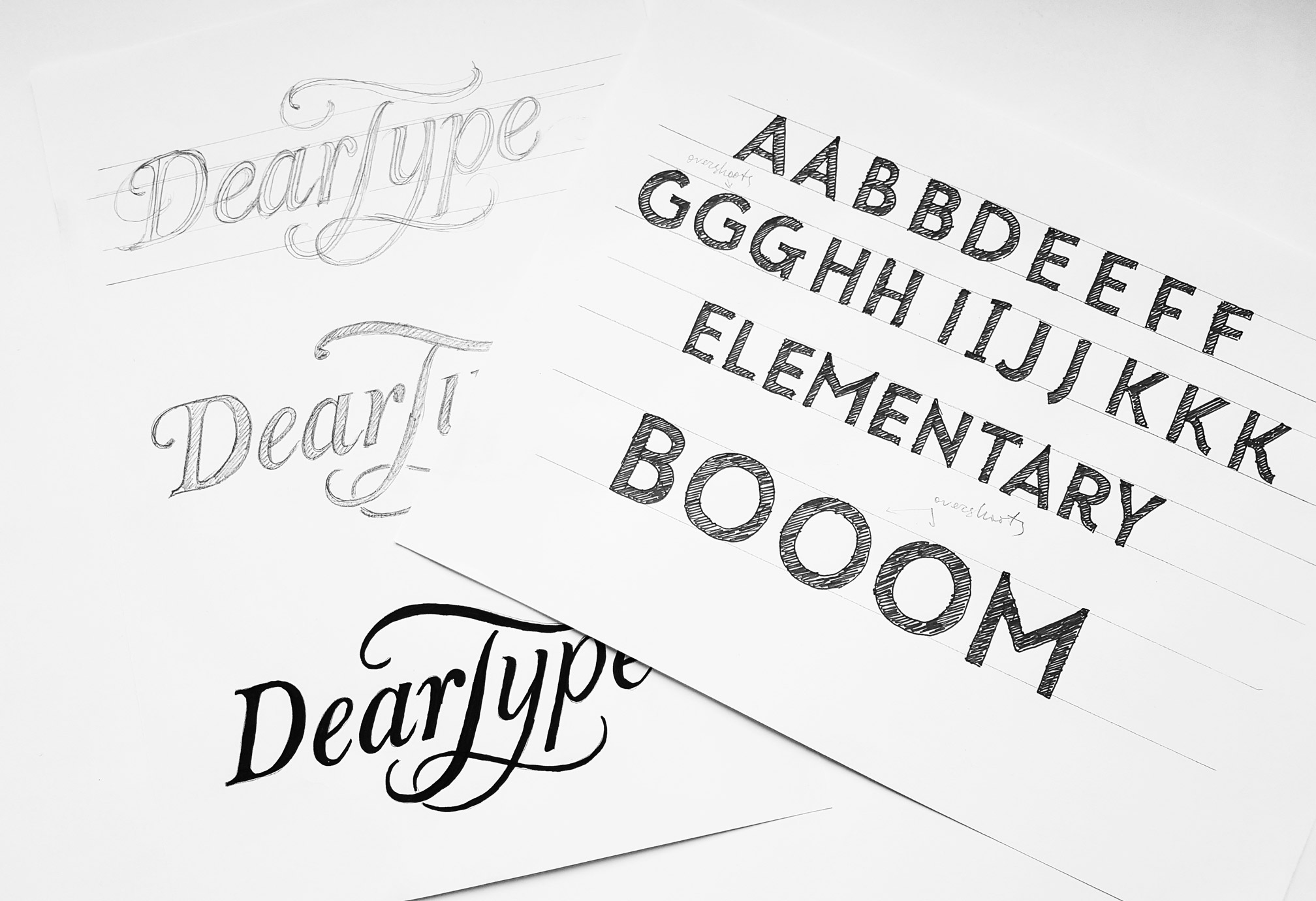
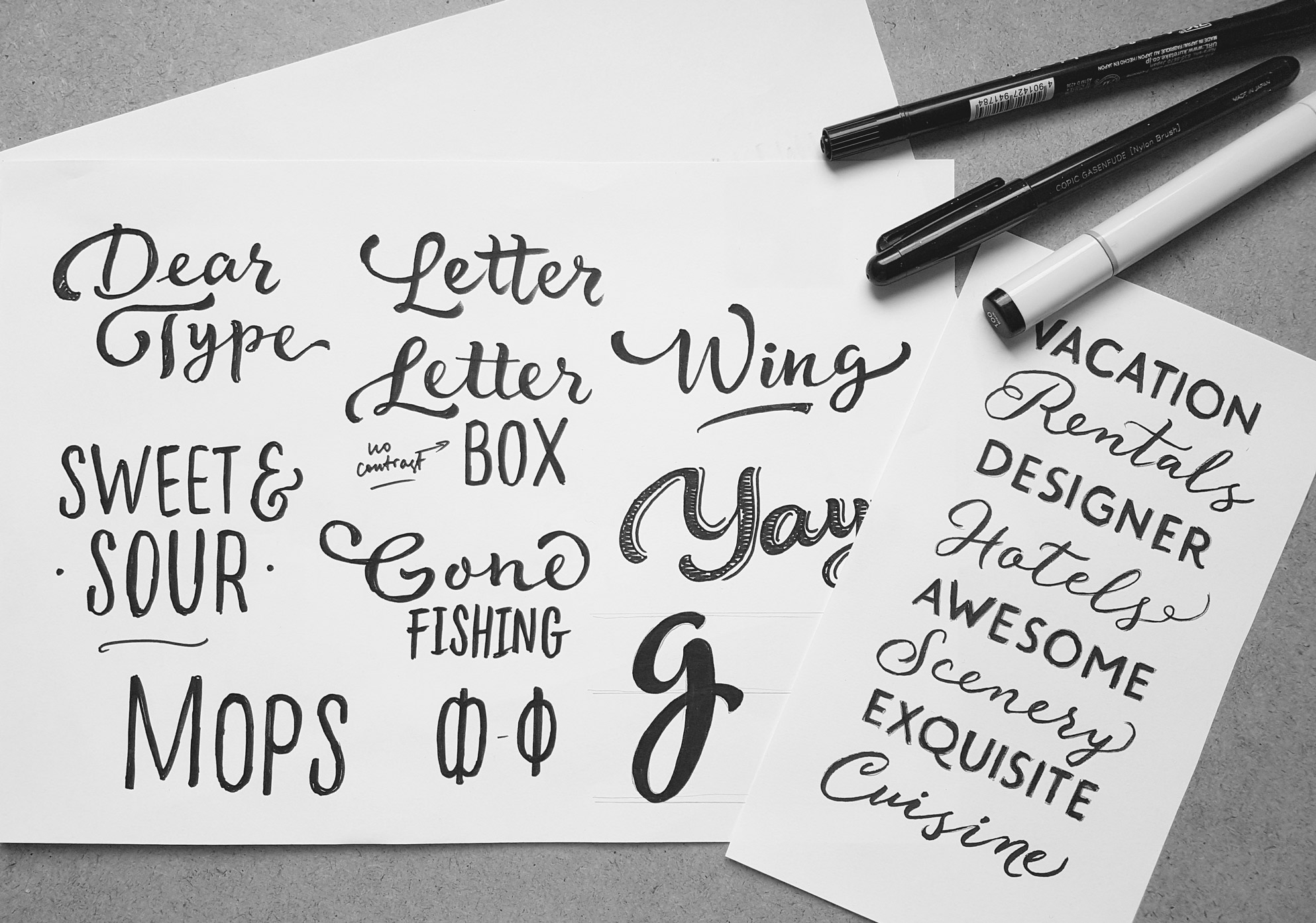
Once I started designing my own fonts I noticed scripts come easily and naturally to me. And scripts are very personal and charming, but they can be hard to use in combination with other fonts.

I decided to focus on font kits because they’re a finished product by themselves and are easy to use by both professional designers and non-designers. It may look like overkill from the designer’s perspective, but from the user’s perspective it’s a welcome head start. (No more three-hour searches for the right font to go with your script!) Additionally, people who are not that design-savvy can nail the much needed cover art or banner without having to be a seasoned pro. DearType’s goal is to help people make their own creative thing through fonts.

What are some of your sources of inspiration?

I’m absolutely nuts about good print ads, especially the ones from the mid-twentieth century. I love everything about them — the long copy, the ridiculous propositions, the variety of lettering styles and fonts, the vintage drawings. Original and humorous copy is so hard to find these days and so good examples deserve to be saved and remembered.

Thanks Veneta and best wishes to you and your work!


Love Veneta’s work? Then you'll be happy to hear that next week, September 5-9, she will be offering all of her families for 70% off! Mark your calendars and come back to stock up on her best selling designs!


MyFonts on Facebook, Tumblr, Twitter & Pinterest

Your opinions matter to us! Write to us at [email protected] or join the MyFonts community on Facebook, Tumblr, Twitter and Pinterest — feel free to share your thoughts and read other people’s comments. Plus, get tips, news, interesting links, personal favorites and more from MyFonts’ staff.

Facebook logo Tumblr logo Twitter logo Pinterest logo

Colophon & Credits

Interview conducted by David Sudweeks.