The last few months of 2007 bring a number of new fonts and several new foundries to MyFonts. We are especially excited to say hello to the Adobe Type Library – not to mention many new small foundries: Big Typephoon, Paragraph, Lorenzo Geiger’s Typewerk, Very Good Fonts, Fictilia, Forte Type, WCM, Letrizmo, Perrens, Melissa Lapadula and Typefolio.
As usual, plenty of old friends like Comicraft, Suitcase Type, Gert Wiescher, James Arboghast, P22 / IHOF, Pizzadude – to name only a few — continue to put out exciting and useful new work, and we are certain you'll find plenty of new faces to pique your interest.
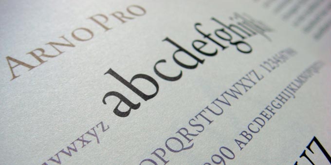
This month marks the addition of the complete Adobe Type Library to MyFonts! The entire 426 fonts of Adobe's extensive collection – which includes many great Adobe Originals, such as Arno Pro and Garamond Premier Pro, plus a truly massive number of display types from many of the world's greatest type designers past and present – is available individually or in three different value packs.
The value packs are perhaps the most affordable way to acquire the staples of the collection, with an Opentype Edition (29 fonts for $69 – just over $2 per font!), Back to School collection (9 fonts for $59) and Essential Scripts Opentype Edition (8 for $59) available right now.
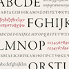
 Every font in the Adobe Library is available in Opentype format, with many families including hundreds of additional accented and alternate characters as well as other language alphabets. Case in point: Arno Pro, the newly-released 32-font family which includes Cyrillic, Greek and more Roman-alphabet language support than you could shake a really big stick at.
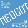
Corradine Fonts is the typographic playground of Bogotá, Colombia-based designer Manuel Corradine, and is another one-man operation new to MyFonts. Corradine explores the gamut, from informal hand-lettering that's quite a bit more consistent and useable than much of the genre to various experiments with grid systems, some of them apocalyptically distressed. His most ambitious project so far as been the eight-style Neogot family, which melds aspects of blackletter and space-age display faces to great effect.
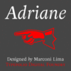
Please welcome Typefolio and principal Marconi Lima to MyFonts! Adriane is Lima's first Typefolio face available here, and if it is any indication of the quality to come, we'll be awaiting more eagerly. A tremendously legible transitional book face, Adriane includes two weights; a beautifully fluid italic; small caps; fractions; figures in old-style and lining forms; an extensive set of ligatures, as well as ornaments and several different ampersands.
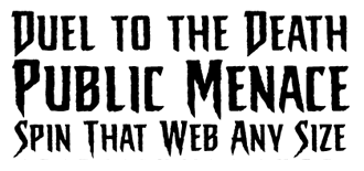
Comic lettering fonts – both those that emulate the hand-inked lettering usually used for dialogue and narrative writing in comic books as well as special- and sound-effect faces – are a sort of hyper-kinetic, expressive mirror of other commercial type trends. Comicraft, child of Richard Starkings and JG Roshell, has been at the forefront of digitizing these popular hand-lettering styles (and inventing dozens more) for 15 years. Check out the new eponymous Comicraft font (roman and italic), made specifically to celebrate this auspicious decade-and-a-half birthday. Ideal for – you guessed it – comic book typesetting, this hyper-kinetic font is ideal for any situation where a condensed, informal face would be called for.
With the recent addition of the arachnoid Sticky Fingers (you can imagine what book this was created for, true believers!) and the seriously heavyweight Deadline, Comicraft have sharpened up the edges of their usual offerings a bit. Their work has appeared in “all the top titles in comics – Superman, Batman, Spider-Man, the X-Men, Fantastic Four” – and promise to be a staple of both superhero and other genre comics for the foreseeable future. As usual, their work has more personality and energy than many entire foundries, but what do you expect for typefaces well-suited to describe two guys in tights beating the crap out of each other?

One or two other type foundries may also produce music from time to time, but P22 is the only corporate entity in the world that mutated from record label to type foundry, and while P22 founder Richard Kegler can hardly be said to be living the Rock and Roll Lifestyle, he certainly is especially experimental in many P22 releases.
Nowhere is this more evident than in the recent revival of Karlgeorg Hoefer's multi-layered and textured 1965 typeface Zebra. The three different layers can be combined in a wide variety of ways, using different colors, shades and overprints to create an enormous range of special effects. And Zebra will certainly be a favorite for many different application.
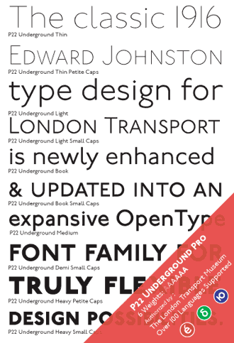
Another recent P22 release is Underground Pro, the last word on Edward Johnston's alphabet originally designed for the London Underground in 1916 and an influence on Gill Sans. The full set, 6 weights in all, Roman, Cyrillic and Greek, titling characters, and both small and petite caps; each pro font weight includes more than 5,000 characters!
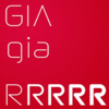
Patric King, half of Chicago design firm House of Pretty, has reworked his cool, smooth Gia family. The punctuation and uppercase have been finessed, and it now includes consistent class-based kerning throughout and is available as a bright shiny Opentype font. Gia's five weights range from extra light to extra bold, and is “loosely based on forms from the retired Nasa ... logo, the recently-reissued Atari logo and elements from crude typefaces of the early '80s which appeared in upright video games.” Patric writes that “the family is named after a supermodel of the period named Gia Carangi, one of the first celebrities to die of AIDS and as shrieked about in the HBO biopic starring Angelina Jolie.”
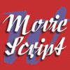
Munich-based Gert Wiescher has more than 100 faces available on MyFonts, and recently added the tremendously detailed monoline Cake Script, the Polish and Czech-inspired Movie Script and the distressed, inky Eddy to that long list.
Gert's career in type started when he was an advertising agency art director; like many of us who have been in the business for long enough, he has to hand-sketch thousands of headline comps for clients before committing to buying a particular display type – “a lot of hard work and a boring task.” When he bought his first Mac, he writes, “everything changed overnight.” Before PostScript, his first font-making experience including painstakingly building bitmaps pixel-by-pixel. This attention to detail has served him well, and we look forward to seeing his varied projects – which range from conservative revivals to what can best be described as grunge – continue to expand.
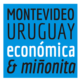
Intellecta Design's most recent release is Vicente Lamónoca's Economica, which as you may guess from its name is a condensed face built to maximize copyfit. Its subtle curves, well-integrated inktraps and extremely legible modern forms do not suffer as a result of its narrow width, and the two weight (with italic) family would be an excellent choice for a wide variety of small-size (7–10 point) applications when space is at a premium.
Economica was created throughout 2007 in Montevideo, Uruguay; Lamónica reports he is gratified to have received assistance with this project from other type designers throughout Latin America.
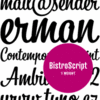
Suitcase Type Foundry and its owner, Tomas Brousil, live in Prague and regularly turn out full-featured and well-constructed display and text faces.
The most recent Suitcase releases include BistroScript, a condensed but fluid advertising script; Purista, a 5-weight family that owes a bit to Eurostile and other geometric sans faces of the mid-20th century; and Corpulent, a tremendously ... well, corpulent rounded display face that is ideal for chocolate packaging and plenty more. Their fourth recent release, Gloriola, is a 9-weight monolinear sans replete with small caps, ligatures, tabular figures and alternates. Gloriola is accompanied by four “extreme” weights which feature tighter ascenders and descenders, and would be apropos for headline and other display use.

Studiocharlie is a small Italian print, product, web and video design firm; typeface development is for them both part of client work and an end in and of itself. They have three new releases this month; Design We Like is a picture font, with silhouettes of the designers' favorite design icons, including a classic Vespa scooter, a low-profile Olivetti typewriter, and various icons of modern furniture design. Friz Biz is a playful face created quickly with a pen tablet, and My Face, another picture font, this time with a cartoonish cut-paper style face – monsters, aliens, clowns – for each character. 
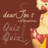
Joe van der Ham, principal at Joebob Graphics, has recently released dearJoe 5 & alternates (the alternates include not only various alternate lowercase characters, but swash caps as well), the newest member of the Dear Joe family; dearJoe 4 was chosen as the most popular handwritten font on MyFonts in 2006.
Van der Ham is one of MyFonts' most accomplished designers of handwriting-based fonts and informal scripts, and requests that designers of children's books please stop using Times Roman, and instead favor his own work and other typefaces similar to it.

Charles Borges de Oliveira (CBdO Fonts) has one new face with MyFonts at the tail-end of 2007. A calligrapher by trade, Borges de Oliveira specializes in hand-lettered faces; his newest work with MyFonts is Avalanche, a masculine all-caps brush script with several alternates. It's an excellent complement to his earlier scripts, such as the very popular Sarah Script, ideal for supermarket and other retail packaging.
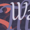
Canada Type is a regular in these pages, as their near-constant output of useful, attractive type means there's always something new and worth paying attention to: this month, they give us Walter, a subtle and fluid script originally by Walter McKay (called Heritage when it was designed in 1952 for Kingsley/ATF) and digitized by Rebecca Alaccari.
Other recent additions include the powerful, wide Miedinger and a “revival, repair and expansion” by Patrick Griffin of Thomas Hollingsworth's 1965 Informal Gothic, now called Social Gothic. More recent favorites include Reiner Hand, another revival, this one of Imre Reiner's 1957 calligraphic London Script; Rebecca Alaccari has redigitized the face from scratch from larger originals than were used previously, and has included “loads” of alternates and ligatures, as well as wider language support.
Rounding out the most recent offerings from this always productive foundry are Celebrity, a space-age high-contrast display face, and Fab, a tribute to '80s synthpop – sure to make any signpainting aficionado's day with its multiple layers specifically designed for multi-color display use.
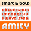
James Arboghast's Sentinel Type recently released a Bayer-inspired unicase – Amity is both modern (or perhaps Moderne) and Deco, with a truckload of alternates that owe just as much to Celtic alphabets as they do Herbert Bayer and Kurt Schwitters' unicase and phonetic alphabets. It's a bold, confident face that would be an ideal building block for logo designers and poster artists alike.
Certainly the vast majority of new additions are designed for display use, but we have another accomplished roman text face this month: Neufville Digital's Andralis, a very large slab or wedge-serif family. Andralis' mix of soft curves and angular cuts look almost punchcut, and the enormous selection of cap, small cap and lower-case ligatures in both upright and italic forms recommend it as a flexible and smart choice for large book projects.
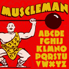
Last but certainly not least, we had been a bit worried about Big Typephoon, having not heard from principal Thomas Ziller since 1994's Arcturus. However, he seems not to have abandoned type design, and adds early American showcard lettering to his interests with recent release Muscleman. This big bold display face has serious heft: like its namesake, it's a great choice “when your design needs a little extra lift.”
Of course, this isn't nearly all that's been added since the last issue of In Your Face. As always, there are several dozen new faces from some of your favorite foundries, and certainly too many to name here. Old friends like Bogotá's Andinistas Fonts have new work, as do John Bomparte, the always-productive Jeff Levine, Jeremy Dooley, Brian Bonislawsky, Jakob Fischer and Nick Curtis.
There's a new Lombardic uncial digitization – Bentele-Unziale – from Chicago's ARTypes; John Wundes' new Caard makes faux-credit card lettering a breeze, and Australian Melissa Lapadula brings us three new designs, including an alphabet based on the video game Tetris. T26, always adding especially unique work from a variety of designers, have Gun Smith, Don, Masterfly and more, and Very Good Fonts, Outras Fontes and Breauhare have new faces as well.
That's a start – explore the constantly-growing MyFonts library and see for yourself how much interesting new work we are adding on a weekly basis!
[email].
If you no longer wish to receive this newsletter, you may change your subscription settings at: http://www.myfonts.com/MailingList