
With Spring comes a staggering number of new releases to the MyFonts catalog. While the first few months of the year are often a time for accelerated releases from many of our established foundries, the last few months have brought us not only several dozen notable new releases from MyFonts staples, but over a dozen new designers as well, all of whom we are very excited to welcome.
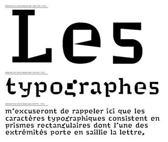
Notable among MyFonts’ newest foundry additions is France’s 256TM, whose completely unique Minuscule was picked by none other than Prof. Erik Spiekermann as one of Typographica’s top fonts of 2007.
Minuscule’s five optical sizes extend the range of its readability down to a theoretical two points; at larger sizes it remains an attractive and useful roman text face. Designers of product disclaimers, less-than-healthy ingredient lists and other legally-mandated fine print will find this typeface useful enough to make the entire package a must-have purchase.
Designer Thomas Huot-Marchand received a TDC award for Minuscule in 2005, and the full family — based on type and legibility experiments of 19th century ophthalmologist Émile Javal — has been offered here on MyFonts since the very end of December 2007.

Luc(as) de Groot has been an important player in the world of typography even before his 1993 hiring as typographic director at MetaDesign. He reworked Spiekermann’s Meta into Meta Plus and managed dozens of logo and publication design projects while there — including, in his off hours, constructing the largest digital type family ever released: 1994’s Thesis.
Since 1997, he’s directed his own typographic and design consultancy, FontFabrik, and through FF’s offshoot LucasFonts, he’s released many of his own type designs. MyFonts is extremely pleased that Luc(as) is now offering LucasFonts releases here.
In addition to LucasFonts faces, his Calibri and the excellent monospaced Consolas are also very recently available via Ascender Corp, also on MyFonts.
Right now, you can view and purchase Taz III and Corpid III, two very large display/text sans families, as well as a few selected display fonts; for more information and to see these faces in print, check out the Spring 2008 LucasFonts newsletter.
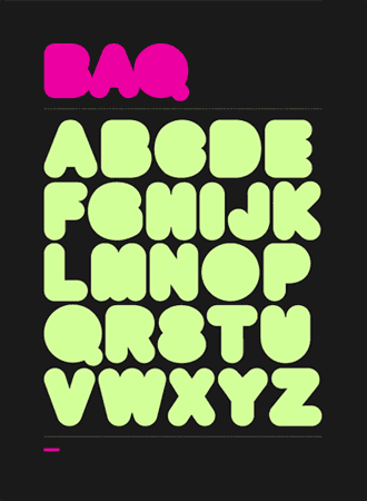
We look forward to additional releases from Thinkdust’s Alex Haigh; his first typeface with MyFonts is the corpulent BAQ Rounded, ideal for a wide variety of display uses and certainly a good jumping-off point for logotype designers.
Haigh has extensive experience as a graphic and type designer for a range of big-name corporate clients, including Nike and Volkswagen; we hope that this is just the first of many faces from this young English designer.
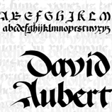
TeGeType is another one-person operation, based in the studio of Thierry Gouttenègre, a French-based Belgian designer with a real flair for lettering. His first two faces with MyFonts include David Aubuert, an interesting and very high-contrast blackletter; and Webtype, a tall, thin and rounded display face that takes a simple bitmap font and transforms it into something else entirely.
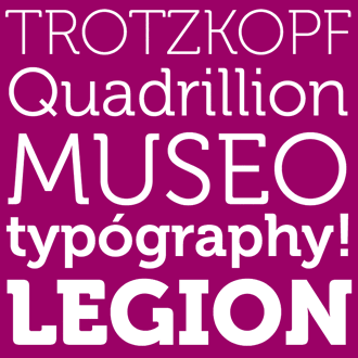
Another one-man shop putting out especially high-quality work is designer Jos Buivenga and his foundry ExLjbris. His newest release is Museo, a soft and very informal five-weight display face. Museo is set aside from similar faces by its soft partial serifs and even color on the page, but what tips the balance in its favor is the price. While the lightest (100) and heaviest (900) weights are $16.50 each, the middle three weights - 300, 500 and 700 - are free. Not just free to buyers of the two extreme weights, but free to anyone who visits MyFonts.

Christopher Ellis Miller, long-time newspaper designer and consultant, has recently shifted his attention from page design to typography and explores this interest with Morning Sans, an especially legible stressed sans which we hope will be developed into a full family. Morning Sans manages to combine both a calligraphic fluidity with the hard edges of incised lettering without focusing too much attention on individual characters: it remains very readable and keeps an even color on the page, even in long settings.
Other foundries to recently become part of our family include Lebbad Design, whose approachable and informal Bunky and Ellen seem destined to become staples of the greeting-card industry, and Japan’s Okaycat, most notable for the breadth of their work — from the Italian / Western Giacinta, to handwriting faces, to the softly rounded geometry of Stefani and the extruded, hand-drawn Bapalopa.
Polenimschaufenster (or PiS, a bit easier on the tongue) brings an urgent punk sensibility to their first three releases; NeoPrint M319 resembles phototype on a bender, Wallride pushes its way through the mosh pit, and Hansch begs to be used in horror film publicity.
Swiss designer Lorenzo Geiger brings us the foundry Typewerk and the all-caps and emphatically grotesk tdBastard, which includes a range of weights as well as both monospace and rounded variations.
Handwriting faces are a huge part of our catalog, and several talented designers have recently added their rich and varied skills: Alison Argento is a travel writer with a strong yen for attractive handwriting; Smokehouse, Gladly Mailed, Smiley and the childlike Urly Lurnin will all be useful additions to any library of handwriting type.
Australian designer Jesse Tilley, who also regularly produces custom type for businesses large and small, brings Guava Juice and graffiti-esque Scratchnessism.
Austrian foundry Write it Personal (WIP) produces mostly-informal connecting scripts with a bit of a German flair.
Fajardo’s liquid James Paul, based on Filipino designer James Fajardo’s own “constantly changing personal hand.”
Other new additions include German foundry Softmaker, specializing in revivals of historic Sütterlin faces (the last widely-used form of Old German blackletter handwriting). Bruder Graphik, and their first face on MyFonts, the playful Graph Paper font; Hamburg’s Doubletwo Studios, who specialize — so far — in big, bold, masculine display faces; Jonathan Hiscott’s eponymous Hiscott Foundry; New York’s Loaded Fonts, a collaborative of “starving font designers,” whose contributions stretch from the tribal tattoo-influenced Scribal to their US Presidential Dingbats and various experiments in geometry; Blackout’s dramatic science fiction-tinged display types; and James Stirling & Michael Adkins’ Fontry, based in Watts, Oklahoma, and their in-your-face display types (they describe themselves as “not ones to wimp around with frilly type,” and it shows).
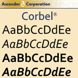
Chicago’s Ascender Corp, a consultancy made up of type designers and programmers with a history of close relationships with Apple, Microsoft and other major large software developers, recently brought a number of Microsoft’s new ClearType faces to MyFonts. Q1 2008 brings Calibri, Cambria, Corbel, Candara, Constantia, Cariadings, and Consolas — all optimized for screen use, and originally designed to accompany Microsoft Vista and the newest version of Office. All are well-made, attractive and useful with an emphasis on legibility (with the exception of Cariadings, an abstract and elegant set of dingbats); Consolas is one of the best looking monospaced programmer’s fonts to come on the market in quite some time.
The fonts are available in a number of sets as well as individually; the full Microsoft ClearType Font Collection is only $299 for all 25 fonts — an excellent way for non-Vista users to get access to these fonts affordably and easily.
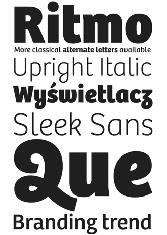
Type-Together, a collaboration between Veronika Burian and José Scaglione, has released the Bree family, a low-contrast and very legible sans — fit for both display and text setting — in five weights. Bree’s genesis lies in the few characters drawn originally for Type-Together’s own logotype, and it takes that sleek and polished smoothness and transforms it into a full character set ideal for branding and headline uses. The font includes four sets of numerals, ligatures, alternates, fractions and language support for over 40 latin-alphabet languages.
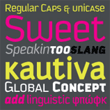
Sudtipos — perhaps best-known for Alejandro Paul’s ebullient and masterfully-drawn scripts— brings us Kautiva, Grover, Politica and Cuisine, all of which enjoy the technical proficiency and large character sets we’ve come to expect of their work.
Kautiva is an 18-style workhorse — small caps, italics, various weights and includes diacritics, alternates, ligatures and all the other richness associated with an OpenType release of this size — and its modernist angles and curves enhance rather than disturb its legibility, even at relatively small sizes and in text settings.
Politica comes in both hyper-economic condensed widths as well as normal and extended versions, each in a variety of weights and styles, and the extensive character sets include support for Cyrillic, Greek, Baltic, Turkish and Central European languages.
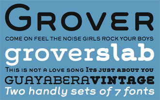
Grover and Grover Slab, named after jazz musician Grover Washington Jr, attempt to “join two distinctive designs: the basic European gothic of the late 19th century and the ‘rounded’ style (common to) 1960s America,” and succeed at this with two clear and uncluttered families.
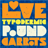
Typodermic’s Ray Larabie has been busy as always, with a number of new releases. Two of his most recent faces — both very heavy display faces — are particularly striking. Ray writes with Pound his intention was to avoid the obvious historical influences that are often associated with filled-counter geometric faces (Art Deco, Peter Max work of the ’60s, and the “Pac-Man” style of the ’80s). The many ligatures, including plenty of interlock pairs, are part of what make this face so useful — what the designer calls “maximum stomp.”
Usurp also has the goal to lay down a tremendous amount of ink, making it also excellent for large-scale display use. Initial letterforms were constructed from cut paper, which was then scanned and traced, with some rotation and a distressed effect added digitally. Both faces use OpenType ligatures to maximum “pseudorandom” effect, and each includes a number of alternates.
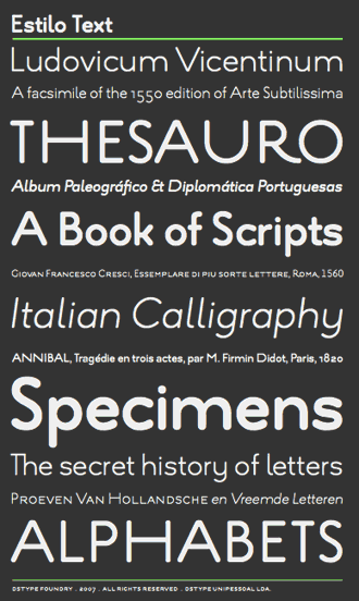
By parts both formal and soft, rigid and rounded, mechanical and organic, Dino dos Santos’ Estilo Text — a companion to 2005’s Estilo and the following year’s Estilo Script (one of the most inspiring and original OpenType releases of the past several years) — is a beautiful, wide and above all useful complement to its display counterparts. Less flashy than its ornate siblings, Estilo Text succeeds in also being far more readable: capable at sizes far smaller than you’d expect, it still brings motion and personality where most other sans faces would be dry and lifeless.
Richard Kegler and Carima El-Behairy run the well-established P22 type foundry, and they’ve brought us four new faces from a number of different sources. Recent releases include master typographer Ted Staunton’s Albemarle and Kaz, both released through subsidiary Sherwood Type, plus Torleiv Sverdrup’s Hoy Pro, “inspired by the wonderful encounter between the Celtic and Norse cultures,” and his Spiggie Pro, a somewhat Deco-flavored humanist sans with tapered extremities, both released under the IHOF banner. As usual, P22 and IHOF releases excel both technically and stylistically, especially with their modern and historic scripts and display type.
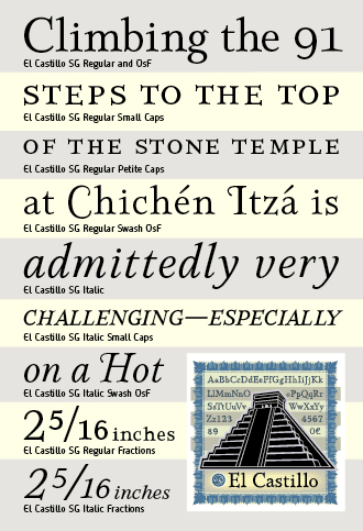
El Castillo, named after the Spanish name for the pyramid at the center of the Chichen Itza site in the Yucatan, is the most successful text family yet from Jim Spiece’s Spiece Graphics — even more consistent and polished than his 2001 revival of Detterer & Middleton’s 1924 Nicolas Jenson. In his many visits to “the musty basements of public libraries and ... the world of flea markets and hole-in-the-wall bookstores,” Jim has come across dozens interesting historic designs to revive or update. El Castillo, though, is an original design, and its emphatic and somewhat severe serifs reinforce its sturdiness. Roman, small and petite caps, an uncommon roman swash — in addition to the more common italic swash alternates — and a full complement of fractions and expert characters round out this large family, which owes much to the typesetting traditions of Spain and Colonial Mexico.
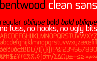
Australian Jan Schmoeger’s Paragraph foundry has two releases at the beginning of 2008: Bentwood, a softly subtle and unique sans, and ParaCaps, an all-caps mono-width display face. ParaCaps comes in three weights and includes a number of alternates, and is a great building block for logo designers; Bentwood’s legibility expands its use from strictly display work to moderate-size text settings as well.
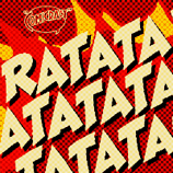
Comicraft’s three most recent comic fonts include Ratatatat, a bold and hyperkinetic display face ideal for much more than simply the machine-gun onomatopoeia that it takes its name from. Mad Scientist is a goofy, humorous unicase with multiple alternates and ideal for those long nights in your secret basement lab design studio. Bryan Talbot, named for Lancashire’s finest comic book artist, was made for the former’s magnum opus Alice in Sunderland.
Typographica has announced their favorite typefaces of 2007; Editor Stephen Coles has invited many luminaries of the type world to write short reviews of the past year’s new releases they were most impressed by. Lucky for you, many of these faces are available here on MyFonts: Adobe’s Arno Pro, Minuscule, Emigre’s Malaga, Mark Simonson’s Kinescope, Suitcase Gloriola and BistroScript (the latter reviewed by MyFonts’ own Nick Sherman), LucasFonts’ Taz III, DSType Leitura, Frantisek Storm’s Anselm Serif and Sans, César Puertas’ Urbana, John Nahmias’ Scriptonah and Casual Brush, and Tipo’s Lineare Serif.
The Type Directors Club has recently announced the winners of TDC2 2008. Visit I Love Typography for a rundown on the winners, and note that several are available for sale here. DSType’s Ventura, whose Dino dos Santos has been designing award-winning type since 1994; Minuscule, from Thomas Huot-Marchand, discussed above; Frantisek Storm’s Anselm meta-family, comprised of serif and sans faces and including support for a variety of languages, including Cyrillic and Greek alphabets, and Tomas Brousil’s Gloriola family may all be had, both conveniently and quite affordably, from MyFonts.
[email].
If you no longer wish to receive this newsletter, you may change your subscription settings at: http://www.myfonts.com/MailingList