|
While Joey Cofone’s journey into the world of design may have been a tad circuitous, he’s already made quite a mark early on in his career. Originally a student of literature and philosophy at Seton Hall University, Joey redirected his studies and holds a BFA in Graphic Design from the School of Visual Arts.
In addition to running an eponymous design studio, Joey is also the co-founder of Baron Fig, whose suite of designer-friendly tools like notebooks, bags, and writing implements aim to “champion thinkers in the journey to create and inspire the world.”
Steeped in a philosophy of elegant simplicity and preeminent usefulness, Baron Fig continues to expand its line of products, all while soliciting direct feedback from the design community in their iterative process — a process that very much embodies a by-designers-for-designers ethos. In this issue of My Favorite Five, Joey shares some insights into his design process, his successful company, as well as the five classic typographic stalwarts he relies on to get the job done — including even, yes, Comic Sans.
|
|
|
|
Joey’s Favorite Five Typefaces
|
|
|
|
|
HELVETICA®
Typeface family of eight weights
|
| |
|
|
|
|
|
“It’s the water of typefaces. Fits in any container, assumes the flavors of whatever it’s mixed in, a clear (no pun intended) choice for any simple design. I always throw the Helvetica family in when I start a new project. This allows me to focus on other aspects before playing with type.”
|
|
|
|
AVENIR®
Typeface family of eight weights
|
| |
|
|
|
|
|
“The Helvetica family not working? The Avenir family is like its little brother — but with more style and personality. By now you can tell my type choices are straightforward, and this fits right in as a go-to for me.”
|
|
|
|
BASKERVILLE™
Typeface family of six weights
|
| |
|
|
|
|
|
“The serif to the Helvetica family’s sans. If I need to throw down a sans serif, then this is the first family called off the bench. It’s beautiful, classic and hyper functional. Have you seen those italics? Mmm.”
|
|
|
|
COMIC SANS
Typeface family of two weights
|
| |
|
|
|
|
|
“Ah — the typeface everyone loves to hate. It’s actually a fantastic little family, the complete opposite of the laissez faire demeanor of my other selections. If those other sans faces are like water, then this is pizza — and I love pizza.”
|
|
|
|
COURIER™
Typeface family of four weights
|
| |
|
|
|
|
|
“There’s nothing like a solid monospaced serif. I like to code, and I’ve gotten used to staring at the Courier type family for hours. It has a special place in my personal experimental work.”
|
|
|
|
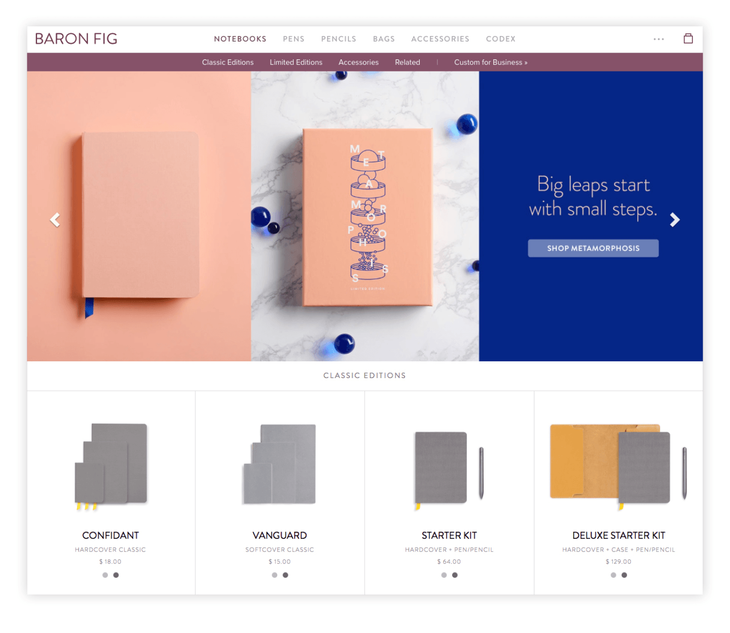
“Baron Fig company and website. We design tools for thinkers — including notebooks, pens, pencils, and more. Metamorphosis by Chandler Reed.”
|
|
|
|
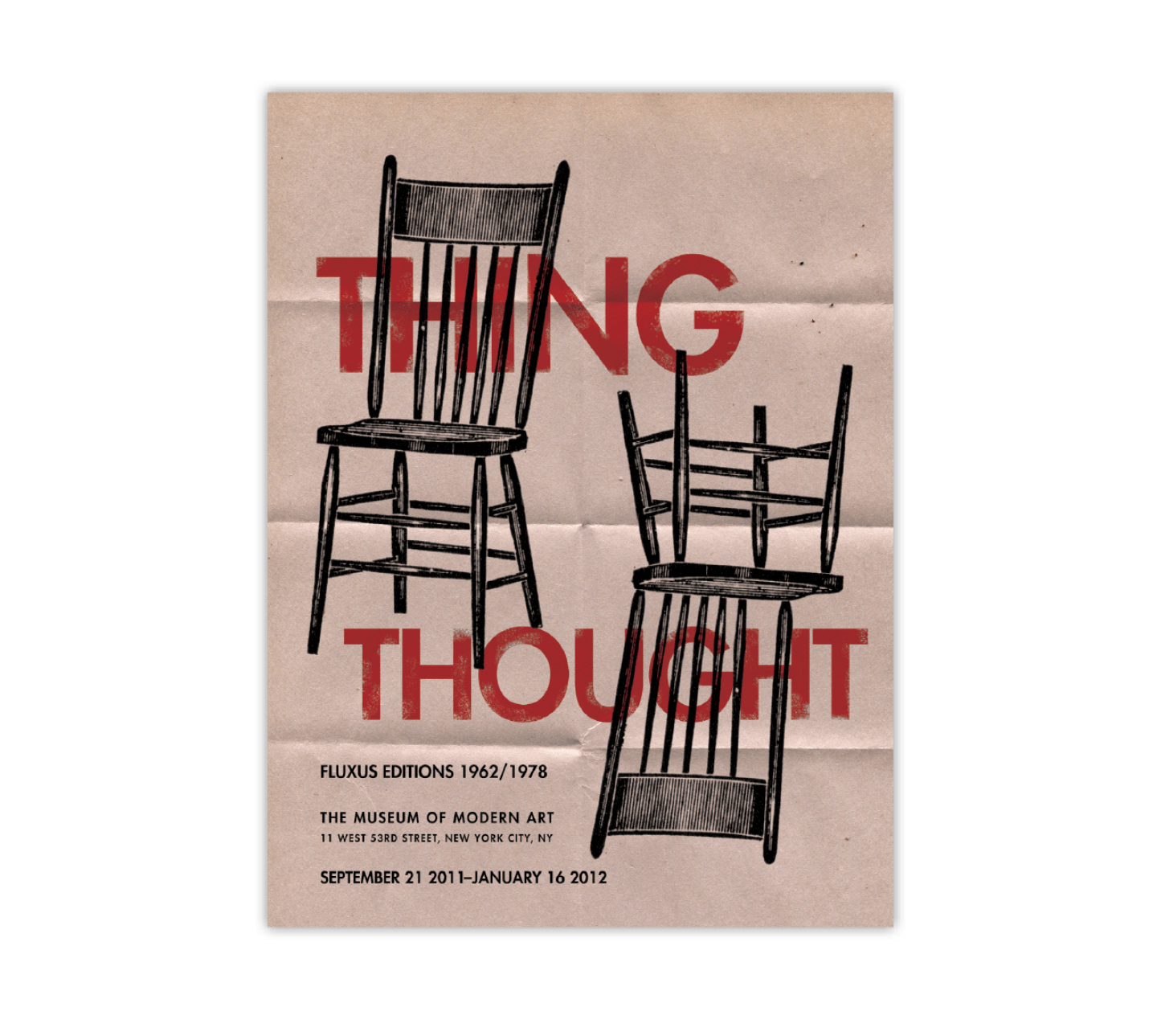
“Fluxus poster. Conceptual poster for Thing/Thought exhibit at the MoMA.”
|
|
|
|
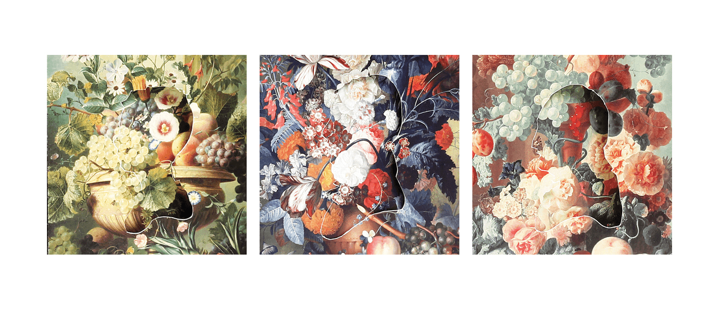
“Series of cutout illustrations for Andre Gide book covers. Each story focuses on the development of a man at a different point in his life: childhood, young adult, and older gentleman.”
|
|
|
|
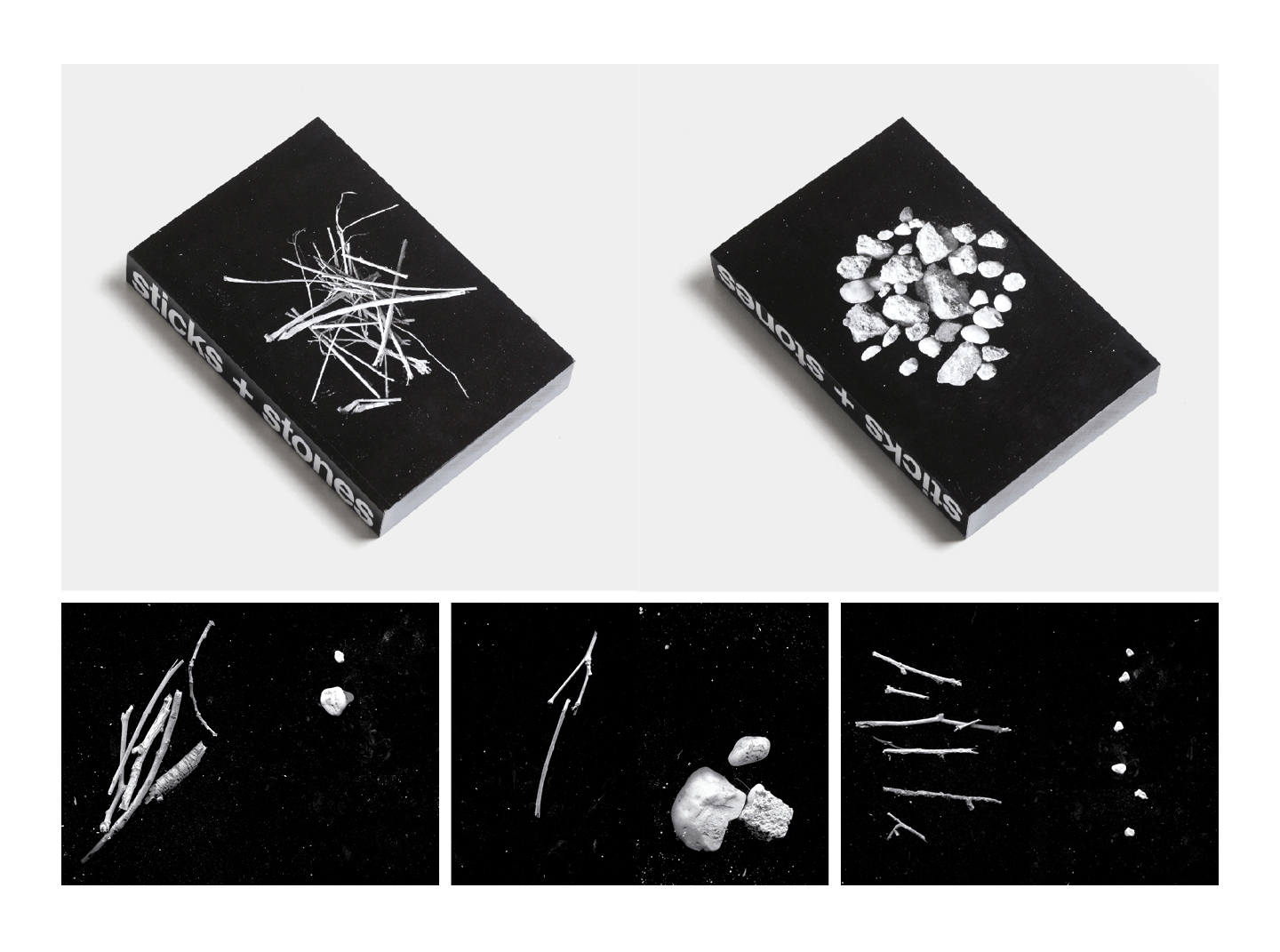
“Sticks+Stones original book. Five hundred pages of sticks on the left, stones on the right. My favorite personal project of all time.”
|
|
|
|
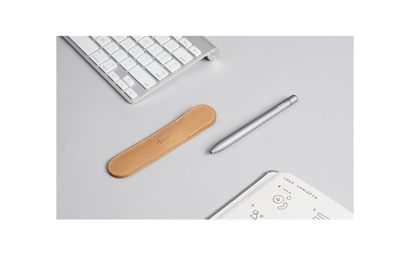
“Pen Sheath leather case. Designed for the infamous Squire pen. It’s a great example of simple, effective design.”
|
|
|
|
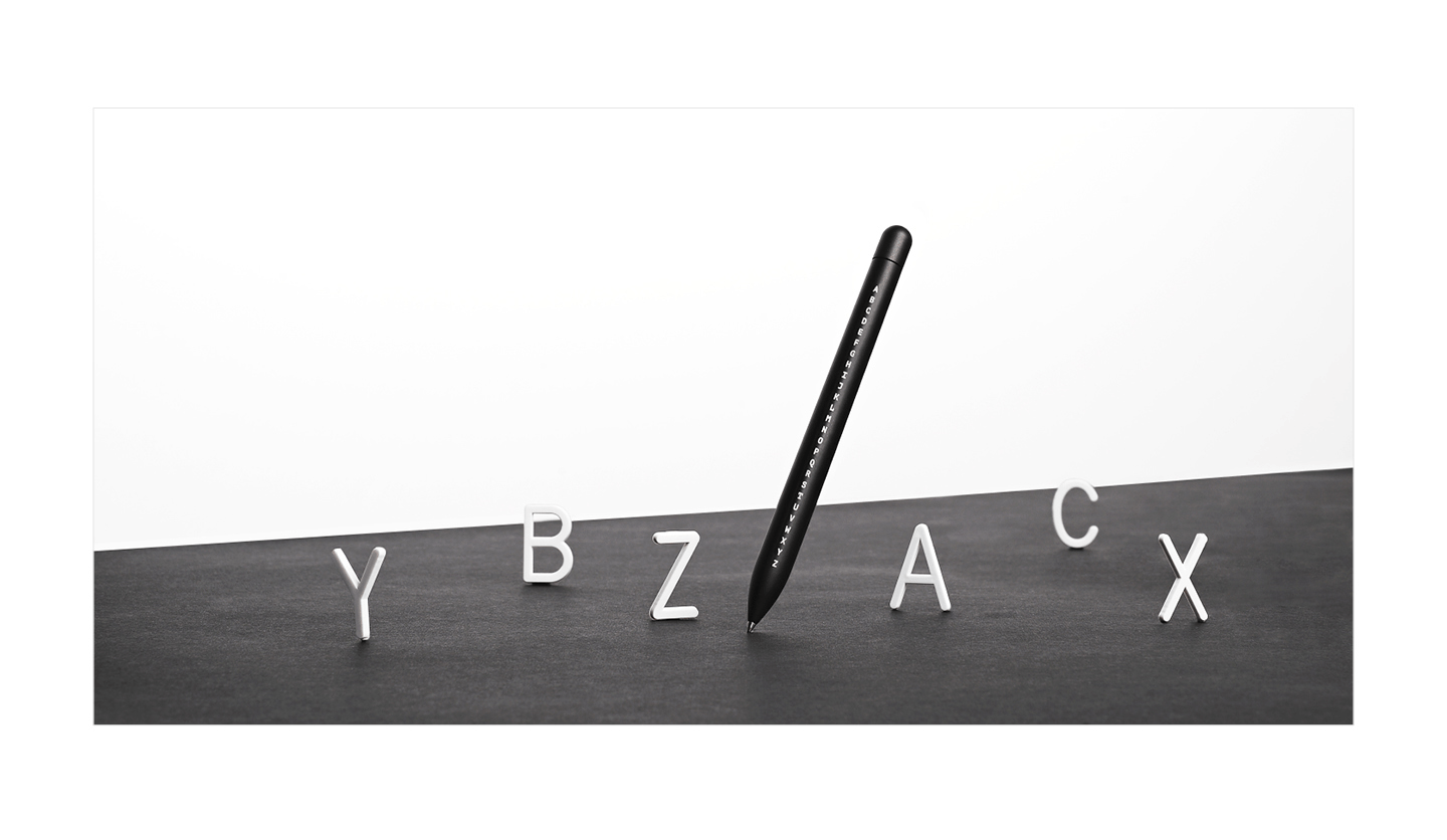
“Alphabet limited edition Squire pen. There are 26 letters in the English alphabet — alone they aren’t much to write home about, but together they grant the power to express your greatest ideas. This limited edition Squire celebrates a love of letters and their ability to change the world.”
|
|
|
|
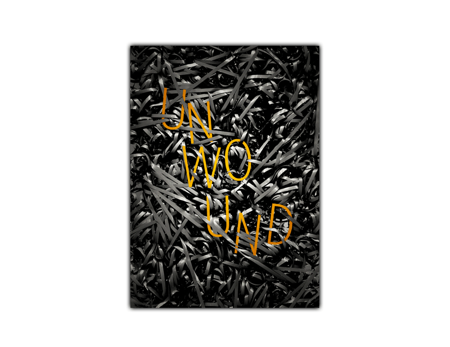
“Unwound poster for short film by Michael Marabella.”
|
|
|
|
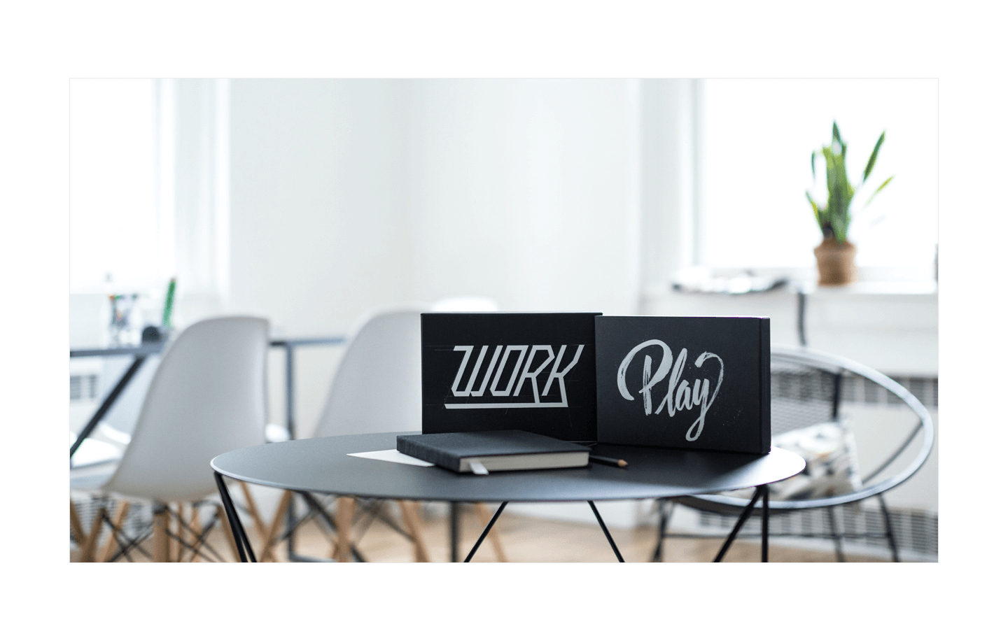
“Work/Play limited edition in collaboration with Jen Mussari. Dot grid on the left, blank on the right — it’s all about balance. The Work/Play II is available now — while they last.”
|
|
|
|
“Massimo Vignelli said you only need a few typefaces in your repertoire. I agree. Rather than attempt to master dozens of families, I try to stick to the few I like best. I work to push their limits, constantly finding new ways to manipulate the same fonts. While Vignelli recommended a set of five, I put forth a slightly different suggestion: Find the ones that best work for you.”
|
|
|
|
Get your mits on some merch!
|
|
|
|
|
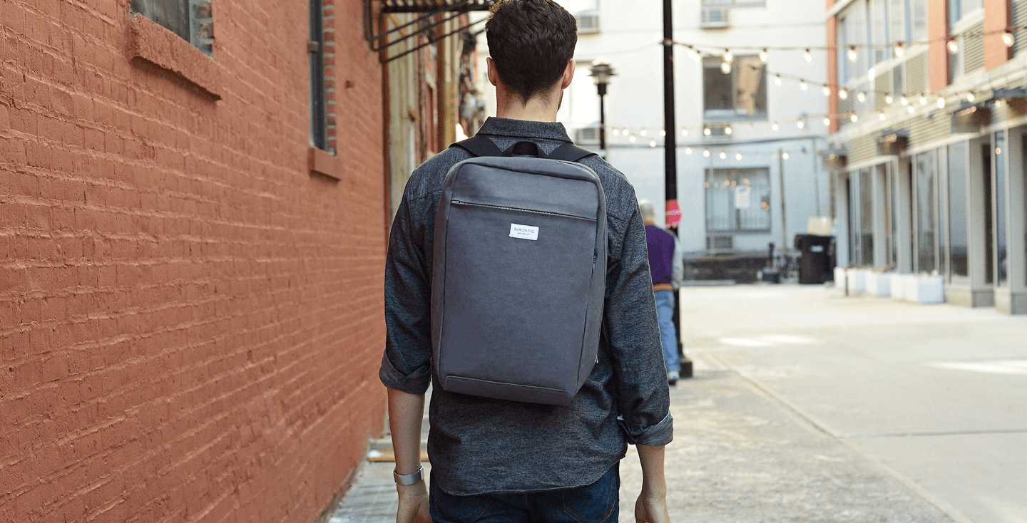
“Introducing the Minimal Backpack, Messenger and Tote. Three years ago we Kickstarted the Confidant notebook — and Baron Fig — with a simple idea as the driving force: A workspace isn’t limited to an office or desk — it’s the whole world. Now we’re back with the all-new minimal Backpack, Messenger, and Tote to continue providing thinkers around the world with well designed high-quality tools. Get yours now on Kickstarter.”
|
|
|
|
Joey on the Master of One podcast
|
|
|
|
|
Want to hear more of Joey’s story? Our friends at the Master of One podcast are sitting down with him in their latest episode. Master of One strives to produce and promote great content that is entertaining, informative and inspirational. It’s their goal to cultivate a community of artists, designers and creatives that work together to put amazing things into the world. We think that mission sounds pretty swell. If you haven’t checked out the show before, you definitely should. Listen and subscribe to Master of One on iTunes or Stitcher so you never miss an episode.
|
|
|
|
We want to know what you think
|
|
|
|
|
How do you like My Favorite Five so far? Who would you like to see featured? Interested in being featured yourself? Get in touch at [email protected] and let us know. And while you’re tweeting, use hashtag #MyFavoriteFive to let the world know what your favorite five go-to typefaces are. Stay tuned for our next issue!
|

|
|
|