|
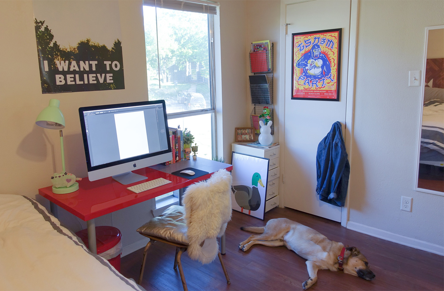
The work of Austin, Texas-based designer Laura Guardalebene is forthright. Whether it’s her branding work, illustration, packaging design or custom lettering and typographic lockups, Laura’s work is both adroit and polished in concept and execution. Most of all, it’s certainly not afraid to be itself. A graduate of Kent State University’s Visual Communication Design program, Laura’s dextrous eye for type is coupled with vibrant palettes, brazen wit, and no-nonsense calls to action.
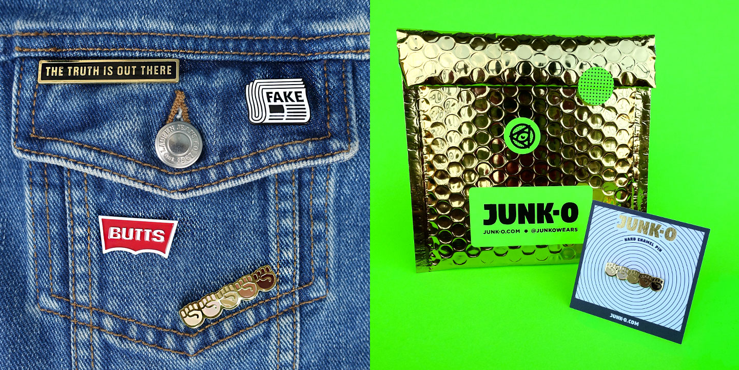
Likewise, Laura’s latest venture — JUNK-O — isn’t afraid to pull any punches, typographic or otherwise. JUNK-O’s collection of enamel pins are born of bold statements, and utilize type as the primary vehicle for their messaging. Below, Laura (who was admittedly famished while putting her selections together) shares with us her design work, as well as a hand-picked smorgasbord of typefaces that help her get through the day. Delicious!
|
|
|
|
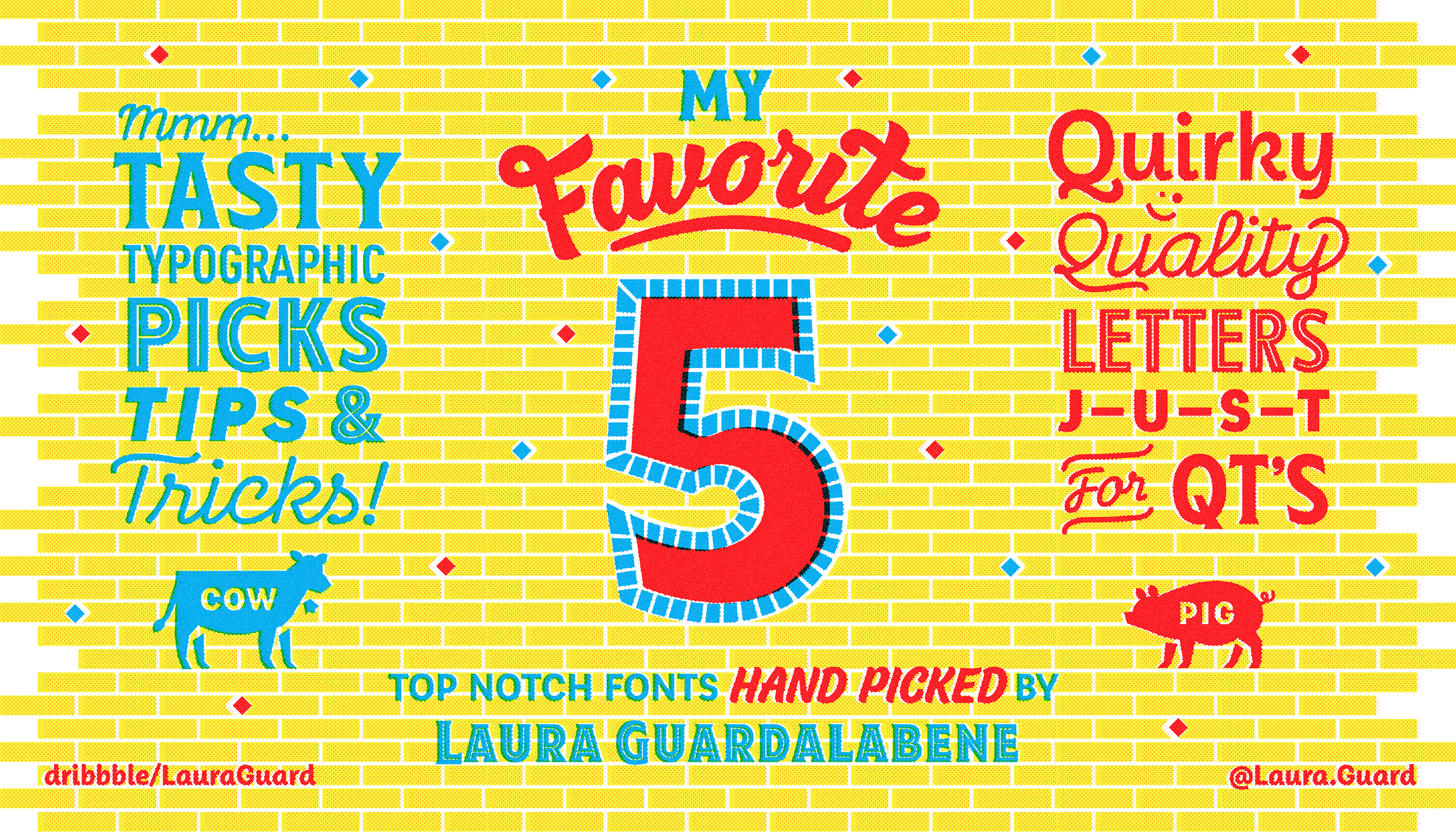
Laura’s Favorite Five Typefaces
|
|
|
|
|
TABERNA
Typeface family of one weight
|
| |
|
|
|
|
|
“Like an avocado, Taberna is extremely versatile. Go for savory with its vintage inspired serif font or something a little sweet with its playful, monoline, handwritten script typeface. Use both fonts in tandem to achieve a balanced typographic flavor profile.”
|
|
|
|
PAPELLI
Typeface family of six weights
|
| |
|
|
|
|
|
“This curvy yet structured font reminds me of lettering you’d see above the awning of a French café. It’s sandwiched perfectly in between a sans serif and script typeface making it the tomato of the type world. Is it a fruit or vegetable? I don’t know… but it’s good.”
|
|
|
|
FF DIN®
Typeface family of one weight
|
| |
|
|
|
|
|
“For the meat ’n’ potatoes guy or gal. This fluff-less font gets right to the point. Clean and utilitarian, the FF DIN family is all about satisfying the appetite of readability. This works just as well in print as it does on the web. Plus, it looks great in ALL CAPS.”
|
|
|
|
GILROY
Typeface family of one weight
|
| |
|
|
|
|
|
“Like a classic PB&J, sometimes understated simplicity is the way to go. The Gilroy typeface is great for large blocks of copy and its heavy weight packs a punch when used as a large display font. I especially love how Gilroy Light looks paired with Rockwell Bold. Who says PB&J and steak don’t go together? Are these food analogies getting weird yet? Yes.”
|
|
|
|
ROCKWELL®
Typeface family of one weight
|
| |
|
|
|
|
|
“I like my slab serif fonts like I like my slabs of steak. Thick and well balanced. The Rockwell collection is a smart and professional typeface family that stands the test of time. It looks especially nice paired with a thin sans serif font.”
|
|
|
|
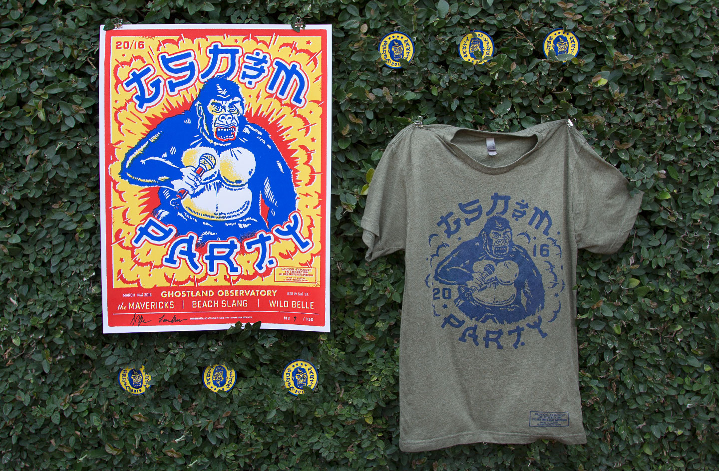
“This was a collaboration between my talented coworker Dustin Coffey and I. Dustin came up with the initial concept and gorilla sketch and I created the custom Asian-inspired typography and fireworks packaging-esque layout.”
|
|
|
|
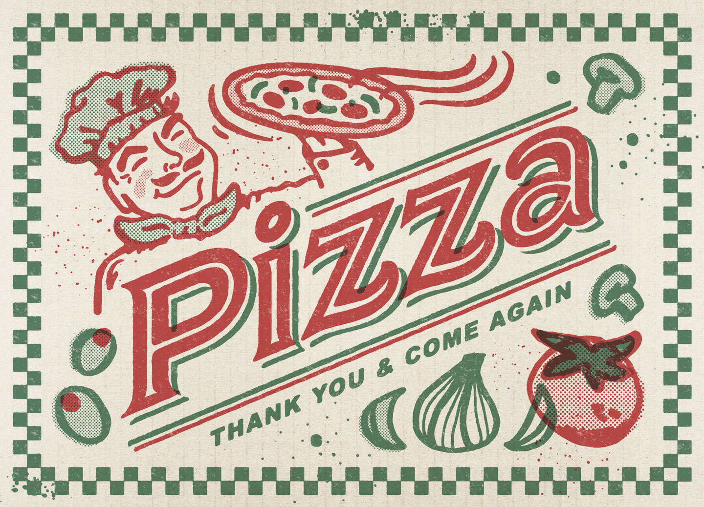
“This greeting card is part of a series of 25 cards. GSD&M gives one to each employee as a gift on their work anniversary. A gift card to a local Austin pizza shop is included.”
|
|
|
|
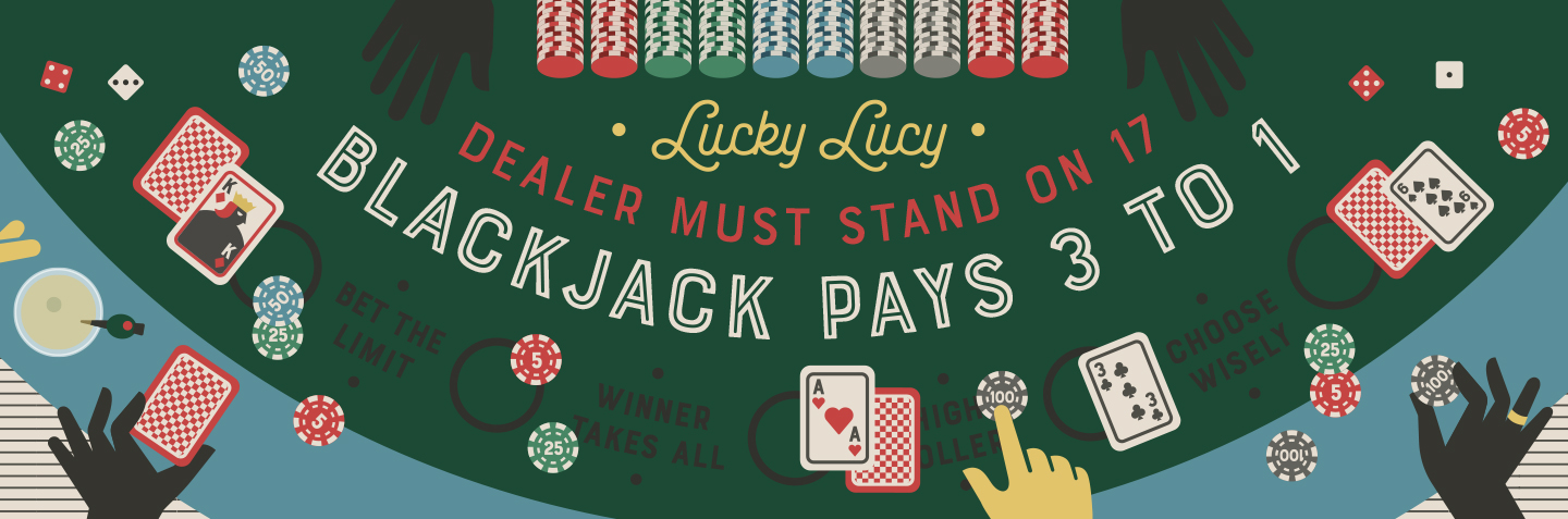
“I had a lot of fun designing this piece to promote the Bourton font family. Las Vegas has so much typographic inspiration. From the games in casinos to the awesome vintage neon signage, I just love it.”
|
|
|
|
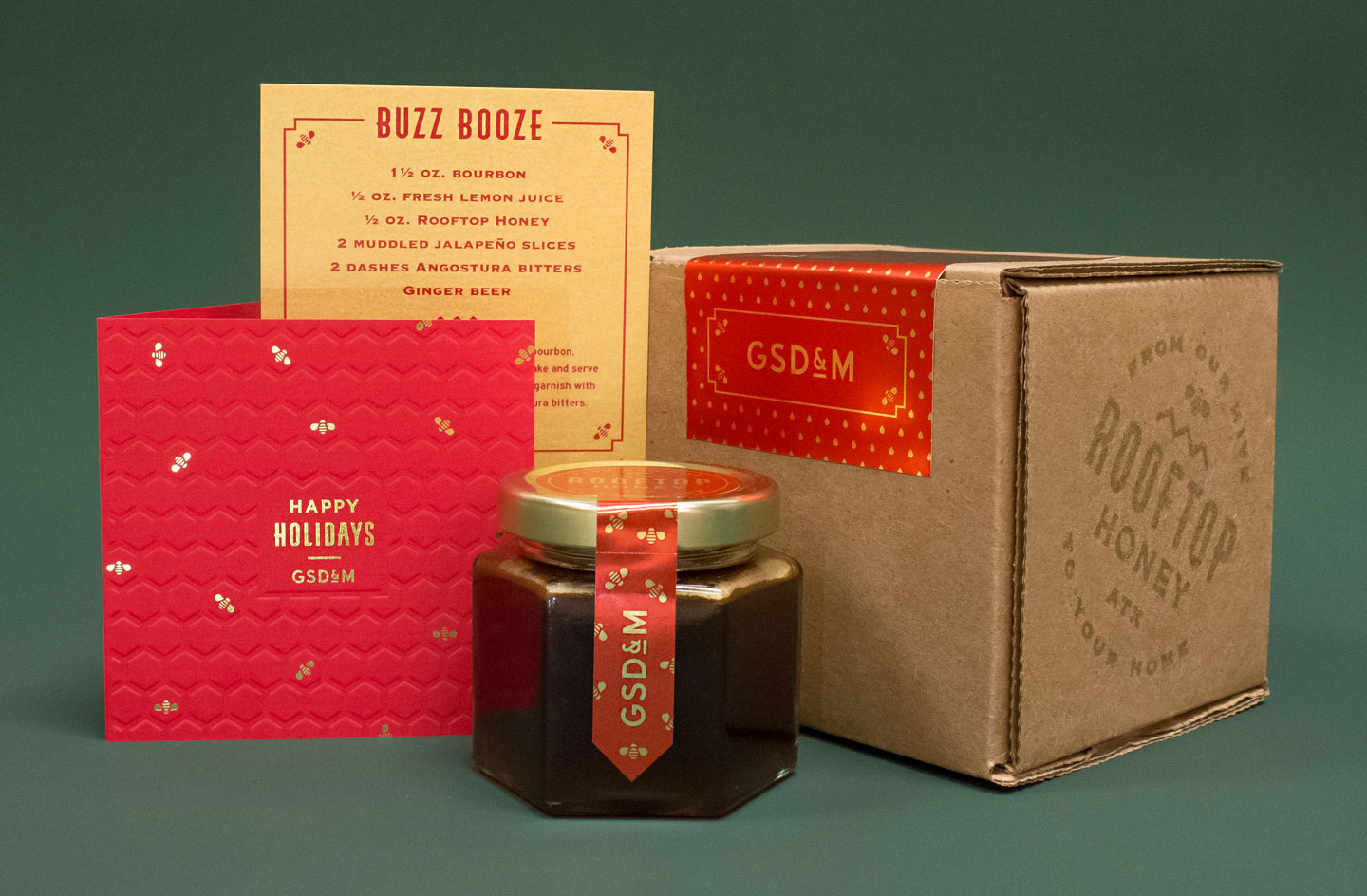
“I had the opportunity to brand and design honey packaging for “GSD&M’s holiday gift this year. The honey literally gets made on the roof of GSD&M, so that’s pretty cool.”
|
|
|
|
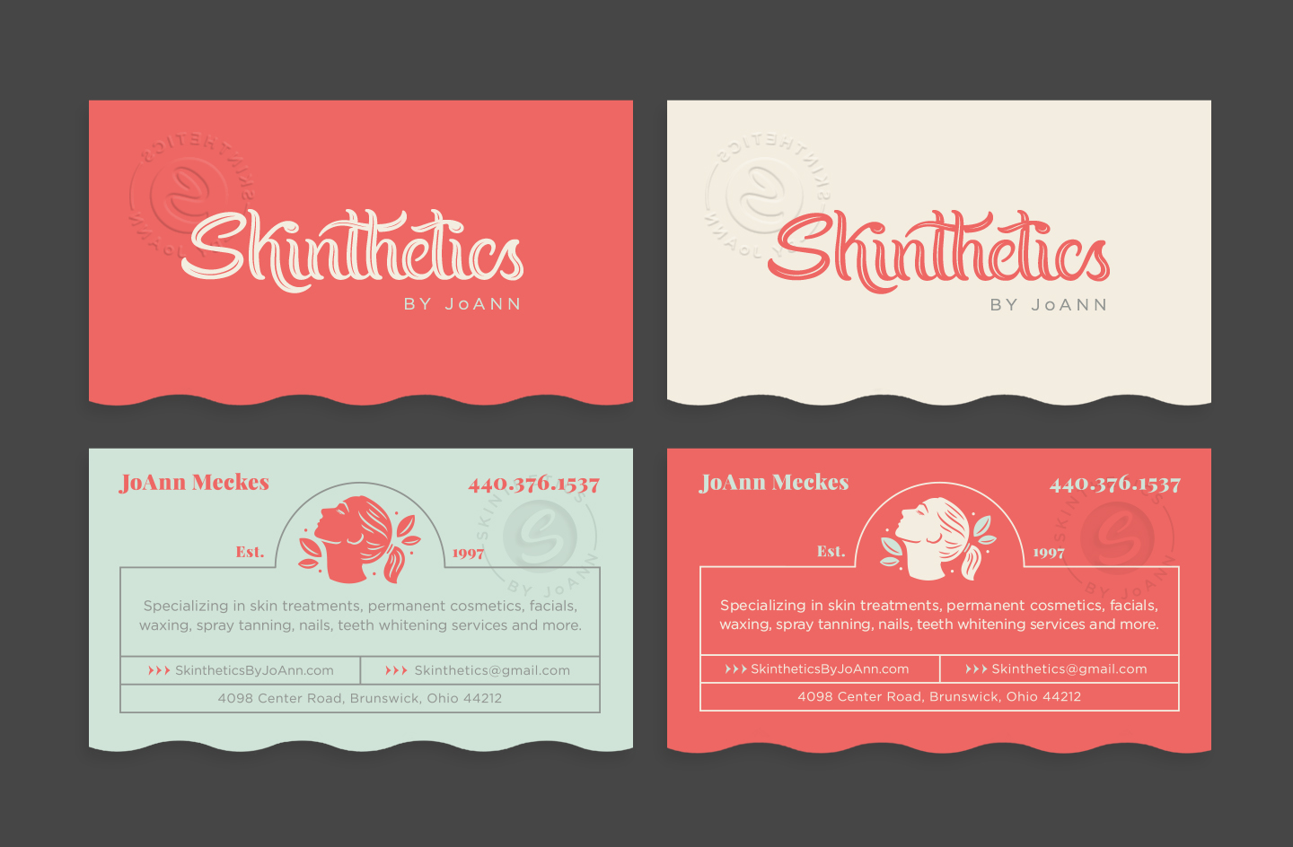
“Branding for a beautician. The script logotype was developed from scratch starting with paper and a calligraphy pen.”
|
|
|
|
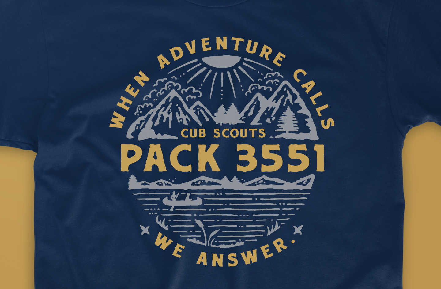
“T-shirt design for my little nephew’s Cub Scouts pack.”
|
|
|
|
“To save time when creating custom lettering, start with a base font and use the ‘Type on a Path’ tool to lay it out on an arch or an interesting curve. Then add some flourishes and ligatures, and use the roughen tool in Illustrator or a Mister Retro Photoshop plugin (what I used for this header image) to create texture — and BOOM — you’ve created some badass customized type that didn’t take weeks to create from scratch. In the words of Food Network’s Sandra Lee: ‘Keep it easy, keep it simple and always keep it Semi-Homemade’.”
|
|
|
|
Get your mits on some merch!
|
|
|
|
|
“JUNK-O makes quality enamel pins inspired by pop culture and fueled by progressive political ideology. My boyfriend and I launched the site in April. Although it’s a ton of work, I’m having a blast getting to brand my own company and create fun pins of a bunch of stuff I like. Check out our site junk-o.com and follow us on Instagram.”
|
|
|
|
We want to know what you think
|
|
|
|
|
How do you like My Favorite Five so far? Who would you like to see featured? Interested in being featured yourself? Get in touch at [email protected] and let us know. And while you’re tweeting, use hashtag #MyFavoriteFive to let the world know what your favorite five go-to typefaces are. Stay tuned for our next issue!
|

|
|
|