arry Potter, Lord of the Rings, the Golden Compass… many of us are fascinated with parallel universes and mythical kingdoms. And, of course, these places situated in a future long, long ago must have their own fonts. Which could well be a mixture of those intriguing historical letterforms that seem charged with meaning: uncial, blackletter, civilité, bastarda. Several of our latest bestsellers belong to this fanciful area. Others just come from Switzerland which, if you think about it, is also a part of the world few people really know. Enjoy!
This month’s Rising Stars
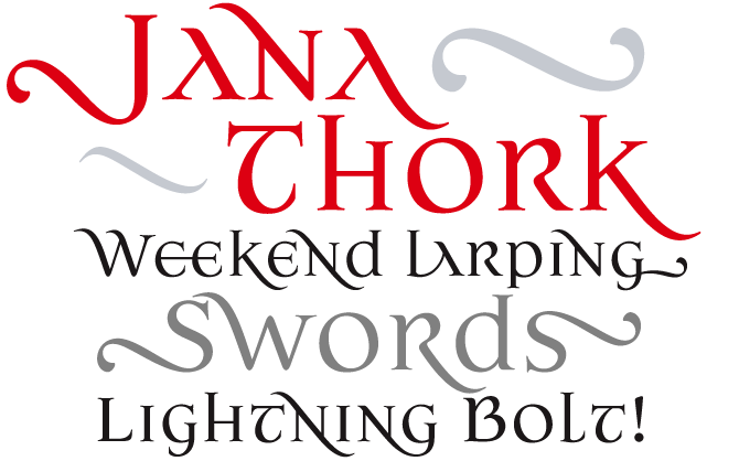
Jana Thork harks back to the uncial, a Roman and Celtic style of writing that was the forefather of our lowercase. It also has elements of stone-engraved capital letterforms, which makes it a font with a pretty complex pedigree. A smart combination of familiar and unexpected shapes, Jana Thork meets our “needs for freedom in a post-historical world” – that’s how designer Ricardo Esteves Gomes sees it. Mixing upper- and lowercase is a tested way of breaking conventions, and Jana Thork does it very elegantly. What makes the font truly impressive, and fun to use, is its wealth of extras, including ligatures and swashes. Jana Thork Pro offers all these alternates in one font for use in programs with full OpenType functionality.
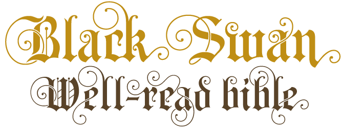
If we had to think of a label for Black Swan, it would be “neogothic”. Like the neogothic architecture and lettering from the 19th century, Black Swan has roots in medieval times, but there’s a frivolousness about it that lends it a touch of Art Nouveau. Its basic forms are stern and black, its swirls and swashes are charming and seductive. It could be on a heavy metal t-shirt, a fancy shop window or a tongue-in-cheek art catalogue: Black Swan is as ironic as you choose it to be. It is beautifully produced, with tons of alternates and ligatures, which allow you to create unique word settings with a custom look.
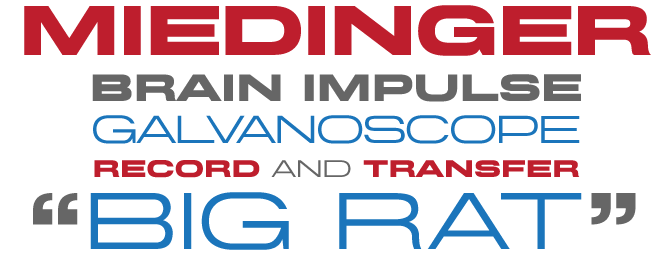
Max Miedinger was the Swiss designer who, under the direction of Eduard Hoffman, drew a typeface called Neue Haas Grotesk that became famous as Helvetica. In 2007, as Helvetica turned 50, the graphic world was swamped by Helvetica-mania: millions of blog pages, declarations of love and hate, even a movie. Canada Type’s Patrick Griffin took a closer look at the mysterious Miedinger, whose name had remained virtually unknown for decades, and discovered another vintage Miedinger typeface. Drawn for the Haas foundry in 1964, Horizontal was a fine display font of extended proportions with some unconventional solutions that made it more interesting than your average set of geometric sans-serif caps. Published under the name of its original designer, Griffin’s digital version has saved Miedinger’s forgotten display face from being a “Haas-been”. True to their more-is-more style of doing revivals, Canada Type added a new, lighter weight and special characters for a wide range of languages.
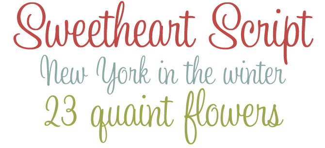
No Rising Stars newsletter is complete without an informal script, and this month’s Sweetheart is gorgeous. It is also number one on the Starlets list of fresh fonts at the moment of this writing. Since publishing her first script face Sketchley in 2000, Canadian designer Ronna Penner has developed a confident style of handwriting and brush script fonts. Sweetheart Script is her most successful creation so far. It’s definitely 1950s–early ’60s in atmosphere: it could be an advertising headline, a film credit font, or the lettering on a greeting card. What is particularly nimble about Sweetheart Script is the way the letters connect into a perfect flow. A beauty.
Text family of the month
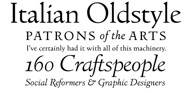
Frederic Goudy’s Italian Oldstyle was published in 1924, when Goudy was art director for Lanston Monotype. Based on the earliest roman typefaces cut in 1470s Venice by Jenson, Italian Oldstyle has been available in a digital form for quite a while. However, this new version from the Lanston Type Company (the heirs to Lanston Monotype) is different from previous digital revivals. The original hot metal version of Goudy’s design had distinctly different masters for each size: the larger sizes were finer and more detailed, the smaller text sizes were sturdier. LTC Italian Oldstyle does it the old-fashioned (and most reader-friendly) way. The light weights of Goudy Italian Oldstyle were digitized from display sizes (72-24pt) and the regular weights were digitized from smaller sizes (12-14pt). The regular weight has a looser fitting for better readability in small sizes. An exquisite little family.
Follow-Up
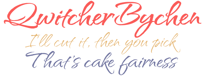
Rob Leuschke, formerly a lettering artist at Hallmark, is a master of script. His buoyant QwitcherBychen was one of last month’s Rising Stars and has continued to attract attention. It’s captivating and confident and doesn’t hide its sharp edges. While many Leuschke designs are single fonts, QwitcherBychen comes in three weights. Not only does this give you three subtly different script styles, it also makes it possible to set lines in different sizes while having equal thickness – if you catch our drift.
If you liked this font from TypeSETit, check out some of Rob Leuschke’s other exciting scripts:
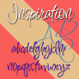
Inspiration
Inspiration is fun: it dances and swings and bounces. It evokes festiveness, music and sunshine. It’s a font to have a party with. Inspiration is included in Scrappers Package, one of TypeSETit’s inspirational Value Packs.
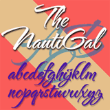
TheNautiGal
TheNautiGal was chosen as “best brush script” in our selection of 2006’s favorite fonts. Witty, sassy and sexy, TheNautiGal wears its curls with contemporary flair. Its characters connect beautifully.
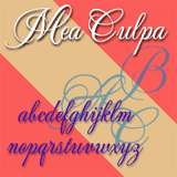
Mea Culpa
It’s one of Rob Leuschke’s most stylish and elegant script styles. It’s formal and courteous and totally hi soc (high society). Check out the fancy alternate caps! Mea Culpa is included in ROB's Variety Package, one of TypeSETit’s versatile Value Packs.
Have your say
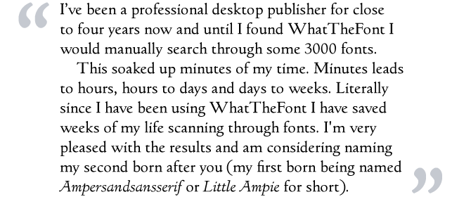
—Daniel from London, Ontario, Canada
January 11, 2007
Your opinion matters to us! Feel free to share your thoughts or read other people’s comments at the MyFonts Testimonials page.
Font credits
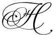
The Rising Stars masthead and subheading are set in Auto 3 and Bryant, respectively. The drop-cap H in the introduction is set in Martina, and the “Have your say” quotation in Italian Oldstyle. The small pixel typeface used at the very top is Unibody 8.
Comments?
Please send any questions or comments regarding this newsletter to: [email protected]
Unsubscribe info
This newsletter was sent to [email]. You may unsubscribe at any time at: www.myfonts.com/MailingList