hey say that people don’t know how to write anymore. All we do is hit keys, composing even our most intimate messages on electronic devices. So people the world over are looking for digital type that will convey a human touch, a sense of hand-made authenticity. The MyFonts Best Seller list speaks volumes. Each of our amazingly popular script fonts, whether wild, cute or formal, seems to shout (or whisper): “Look at me, I’m a person! I’m talking to you, another person!” Scripts are a great way of carving out own your individual look with digital means. But frankly, you’re never too old to finally take that calligraphy course.
This month’s Rising Stars
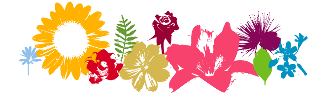
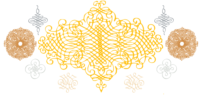
Graphic design is going through a neo-decorative phase. And just like in the days of Art Nouveau, botanic ornaments are a hot item. They look quite different from a hundred years ago, though: more realistic, less idealized. And preferably monochromatic. If that’s Greek to you, that’s just fine: it’s Greek for “one color.” Flozo by Brazilian designer Gustavo Lassala is a great little bouquet of floral shapes. By layering several monochrome flower patterns, using a different color for each frame, you can obtain dazzling effects.
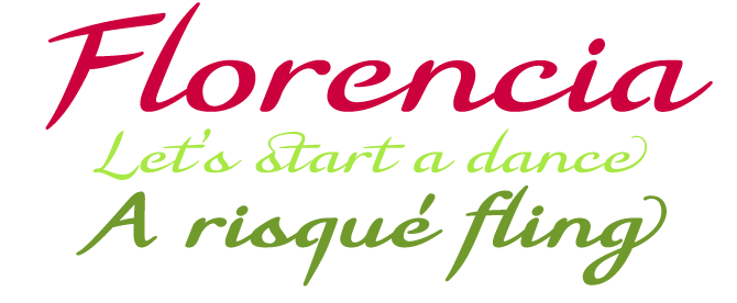
Florencia is a spicy script font that offers some surprising features. It’s wide and well-connected, and moves across the white space of the page with the grace and confidence of a well-trained dancer. It’s got a striking, flame-shaped ‘s’, making it one of the most fiery scripts we’ve seen in a while. Florencia’s OpenType feautures include swash alternates, old style figures and special ligatures.
One of the most successful new ornament fonts is CalligraphiaLatina. It is part of a trend that’s been quite popular lately: messed-up calligraphy. You can dirty up (or “deconstruct”) gracious classic-looking curves in many ways: using a variety of software filters; by superimposition; or even by hand. Brazilian designer Paulo W has his own method, possibly involving a scanner and some auto-tracing. The result works well when you want that worn-down grungy look, combining CalligraphiaLatina ornaments with the equally wobbly Liam, or with something like Panamericana. (Should you be looking for a sleeker, smoother kind of ornament, then Wiescher’s Fleurons or ASType’s perfectionist Ornaments Accolades might be just what you need.)
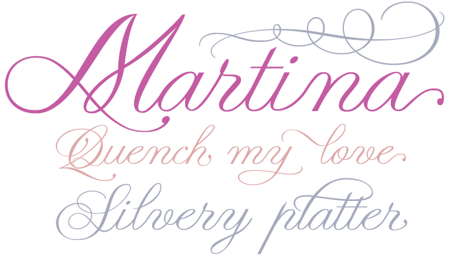
If CalligraphiaLatina’s grungy look is too wild for you, there’s always Martina: a new, wonderfully elegant, connected script face. It is a huge OpenType font that comes with a built-in set of well-crafted ornaments in various styles. Martina’s character set is impressive. There are tons of ligatures, alternates, swashes for beginnings and endings, and special glyphs such as a nicely connnected “Ltd”. We can imagine Martina taking a leading role in designs for luxury packaging, costume dramas or critical art exhibitions on consumer culture.
Text family of the month
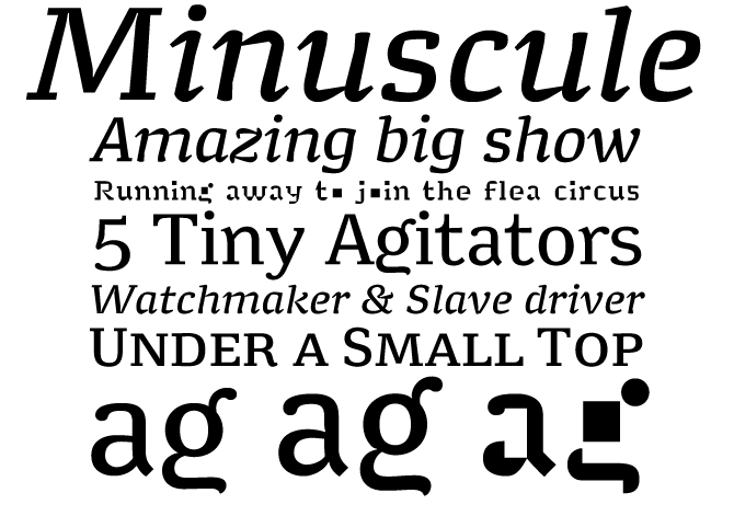
At MyFonts, we like people who take risks; we appreciate the courage of type designers who go where no type designer has gone before. One such pioneer is Frenchman Thomas Huot-Marchand, whose amazing text typeface Minuscule came out last December.
Minuscule was specially developed for setting texts at 6-point and smaller – down to 2-point, which is about the size of a footnote in a matchbox-size bible. Having thoroughly tested reading behavior at these extreme sizes, Huot-Marchand realized that with each step down, legibilty decreases so quickly that it was necessary to design a separate master (or basic drawing) for each point size. He developed five versions, optimized for a use in 6 (Minuscule Six), 5 (Cinq), 4 (Quatre), 3 (Trois) and 2 points (Deux).
All versions of Minuscule share the same characteristics: large x-height, robust slab serifs, vertical stress, open structure, big counters, low contrast. However, as the designated point size get smaller, the forms become more pronouced and elemental. At 2-point, the o is just a tiny black square… and it works!
To fully appreciate Minuscule, the computer screen is not a great medium – you need to see it in print. A good way to test Minuscule is by printing the test specimen sheet on a good black-and-white laser printer using the highest possible resolution.
The main inspiration for the design of Minuscule was the work of Louis-Émile Javal, a brilliant 19th-century scientist and engineer whose theories about the way we see and read have had an enormous impact on more recent legibility studies. Minuscule is a unique tribute to a great inventor.
Follow-Up
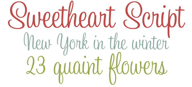
Last month’s Rising Stars featured Ronna Penner’s Sweetheart Script, a merry upright script font with a gentle flow. It has continued to do well, and has become Typadelic’s best-selling typeface. It’s easy to see why: Sweetheart Script is wonderfully drawn, and its lowercase letters connect impeccably. It taps into the great tradition of hand-lettered showcards and magazine headlines without being nostalgic. And it’s how many of us would wish our handwriting to look. One small advice for any script newbies out there: don’t use all-caps!
If you enjoyed this font by Ronna Penner, check out some of her other scripts:
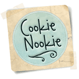
CookieNookie
Typadelic’s fonts are never expensive, but CookieNookie is ridiculously affordable. Needless to say, it made it to #1 on the Starlets list within minutes. But that wasn’t only because of its price: it is cute, spontaneous and lively.
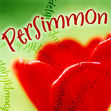
Persimmon
Persimmon looks as if it’s been written with one of those markers that have a flexible tip, amost – but not quite – like a brush. It is confident and distinctive, and has an irregularity all its own. Persimmon can be used whenever you want an informal and lettering style with a lot of personality.
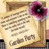
Garden Party
Garden Party isn’t strictly a script – it’s more like a serif display font with a calligraphic feel. It will work wonders on an illustrated book or brochure cover, standing out a little more than a brush script font. It will help the reader to, well, like you. Garden Party is part of Typadelic’s Most Popular Collection.
Have your say
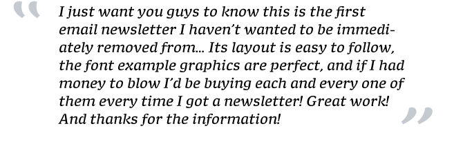
—Dave Wike from Greer, South Carolina
15 Jan, 2008
Your opinion matters to us! Feel free to share your thoughts or read other people’s comments at the MyFonts Testimonials page.
Font credits
The Rising Stars masthead and subheading are set in Auto 3 and Bryant, respectively. The drop-cap T in the introduction is set in Das Riese, and the “Have your say” quotation in Minuscule. The small pixel typeface used at the very top is Unibody 8.
Comments?
Please send any questions or comments regarding this newsletter to: [email protected]
Unsubscribe info
This newsletter was sent to [email]. You may unsubscribe at any time at: www.myfonts.com/MailingList