
Script fonts have always been successful at MyFonts, but this month is exceptional. All the typefaces that did extremely well the past few weeks were scripts, and all of them have that extra something that earns them a place among the Rising Stars. So we’ve proclaimed June “Script Month” here at MyFonts. Which is great, of course, but it does make us frown a little… doesn’t anybody know how to write by hand anymore?
This month’s Rising Stars

The most successful new foundry on MyFonts is Parachute from Athens, Greece. They have dominated our Hot New Fonts list these past two months with their beautifully conceived text and display fonts. Parachute’s Champion Script Pro is an impressive calligraphic font that the foundry itself boldly announces as “the most advanced and powerful script ever made.” Although this may sound like hyperbole, there’s some truth in it: Champion Script probably has the largest number of alternate characters ever offered in one font, and its functionality is powered by some really nifty wizardry. Based on the manuscripts of the 18th-century English calligrapher Joseph Champion, it comes in two weights, each loaded with 4,280 glyphs (!), offering a huge range of alternates and ligatures for all languages. Savvy OpenType programming allows for automatic, context-based substitution of these alternates; or they can be manually selected. Read the Champion Script Pro article to learn more about the font’s design principles and features.
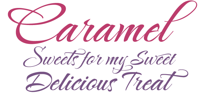
Lettering artist Rob Leuschke is characteristically concise in the description of his latest offering: a “fun, hand-lettered script.” That’s all. So how can we describe what it is that makes the Caramel Family special? The typeface has the typical Leuschke verve: casual yet confident curves, fine hairlines, natural connections. While the lowercase has a very regular rhythm, the capitals are more whimsical. As these are not OpenType fonts and therefore have smaller character sets, the swashy and swinging alternates have been accommodated in two separate fonts, the Crunch and Candy varieties. Only the most elementary version, Nuggets, can be used in all-caps if you’re so inclined — the others are way too expressive!
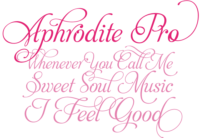
Aphrodite Pro was designed by two young designers from Buenos Aires, Argentina. Sabrina Lopez and Maximiliano Sproviero must be great admirers of the major script faces created by their famous fellow townsman Alejandro Paul, of Sudtipos fame. Aphrodite Pro follows very similar principles — offering a wealth of multi-letter combinations, swirls and swashes — though it does have its own formal logic. With its great possibilities to create arresting calligraphic headlines, Aphrodite Pro has been hugely successful these past two months. Check out the brochure in the Gallery section to see some examples of how to make full use of this OpenType font.
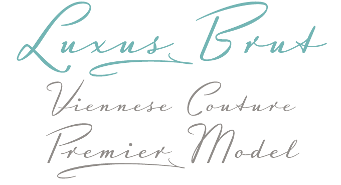
Created in Vienna, Austria, Luxus Brut is a formal script inspired by a shop sign in that city’s sumptuous historical centre. With its large and distinctive capital letters that won’t share the baseline with the lowercase, it breathes the spirit of hand-lettered 1950s signage. Its wide spacing and low x-height make it an excellent choice for posters, magazine headlines, logotypes, branding and any design that requires a touch of luxury and sensuality. Luxus Brut is a luxury OpenType font that comes with a wide array of special endings, underlining swashes and a powerful contextual alternate feature for use with OpenType-savvy layout applications.
Text family of the month

Centro Pro is more than a typeface family. It is a complete series of families, including Slab, Serif and Sans varieties — a superfamily for complex editorial and corporate identity projects. In the 2008 European Design Awards competition, Centro won the award for best original typeface. As the jury wrote, “Centro Pro is an almost ‘invisible’ typeface, it has legibility as its main attribute and is ideal for a wide range of design works. It does not attract any unnecessary attention, but rather serves its purpose. A rare case of contemporary type family working across three alphabets.”
Its functional qualities make the various Centro varieties work well in body text of almost any size. Yet despite its modesty, Centro has enough character to stand out as an attractive headline face as well. The bold and black weights of Centro Pro Serif and Centro Pro Slab are especially suited for this purpose.
Having been produced by Greece’s Parachute foundry, each of the 40 fonts comes with 1,519 glyphs, including those for Greek and Cyrillic typesetting. As such, Centro Pro meets an ever-growing demand for multilingual typefaces among international companies and institutions. Centro Pro has become very popular among designers of printed media and is an ideal choice for newspapers, magazines and corporate applications.
Every font in the series has been completed with 270 copyright-free symbols for packaging, environment, transportation, computers, urban life and more.
Follow-Up
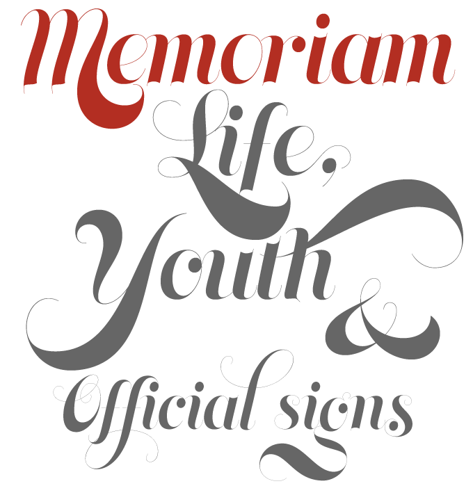
Memoriam was the spectacular opener of last month’s Rising Stars newsletter. Originally designed for the December issue of New York Times magazine, Memoriam is an extremely luxurious and contrast-rich variety of calligraphic display face. Popular with art directors and editorial designers, the typeface’s retail version has continued to do very well on MyFonts’ bestseller list. Of course, due to the extreme thinness of the hairlines it is recommended to use Memoriam at large display sizes only.
If you like this typeface from Canada Type, check out some of their other fonts:

Taboo
Based on magnificent experiments made by Armenian lettering artist Fred Africkian during the late 1970s, Taboo is new display face with a unique look. Based on simple geometric principles, the family comes with interchangeable alphabets of varying height and thickness: science becomes art.
Blanchard
Blanchard is a revival and elaborate extension of Muriel, aka Juventud, a 1950 metal face by Joan Trochut Blanchard. With its high ascenders and sharp corners, it’s the tuxedo of fonts. As many as five ending forms were built for most lowercase letters, allowing the discerning typographer to create ornamental masterpieces.
Jezebel
Jezebel is one of Canada Type’s all-time favorites. She’s got bigger hair than Dolly and Elvira together, more leg than a Moulin Rouge premiere, more sword than a pirate ship, and more loops than a chartered accountant. She’s the queen of now, the essence of cool, the twenty-first century fox. Jezebel is a gorgeous typeface.
Sponsored font
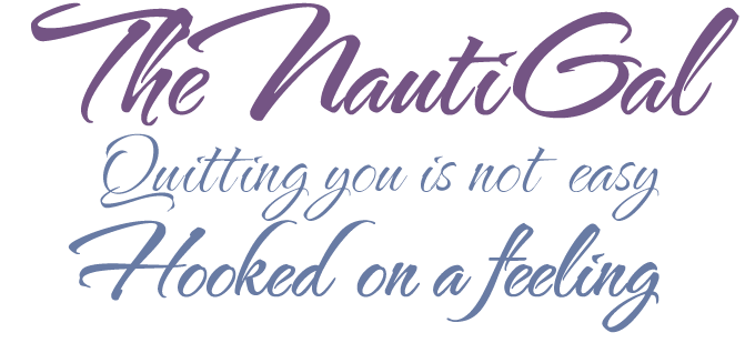
In early 2007, TheNautiGal was voted “best brush script” in MyFonts’ selection of the previous year’s most successful fonts. It has remained a staple of the TypeSETit font library ever since. Witty and sexy, TheNautiGal wears its curls with contemporary flair. It manages to maintain a great balance between sass and formality while seamlessly connecting appropriate letters for a natural script style. The great news is that designer Rob Leuschke is now introducing TheNautiGal’s even slimmer sister: the Light version moves with unprecedented elegance and a disarming giggle.
Have your say

—James in Isle of Man
13 May, 2009
Your opinion matters to us! Feel free to share your thoughts or read other people’s comments at the MyFonts Testimonials page.
Colophon
The Rising Stars nameplate is set in Auto 3 and Bryant, and the Have your say quotation in Centro Slab.
Subscription info
Want to get future MyFonts newsletters sent to your inbox? Subscribe at myfonts.com/MailingList
Comments?
We’d love to hear from you! Please send any questions or comments about this newsletter to [email protected]