
In between newsletters, MyFonts is doing its best to keep you informed about the latest developments in font land. You may enjoy the posts on our blog, or prefer our ultra-short shouts on Twitter. The latest news is that MyFonts is now also on Facebook! Visit us, and become a fan.
Meanwhile, font-wise, November is a month of classics — classic as in “ancient Rome”; classic seventies; the classic beauty of fresh flowers. And then there’s the unclassifiable: a script so eclectic it is in a class of its own, a sans-serif so soft it seems to be genre-hopping. Finally, the re-run of a brush script that is probably the best in its class. Brace up for a classy newsletter.
This month’s Rising Stars
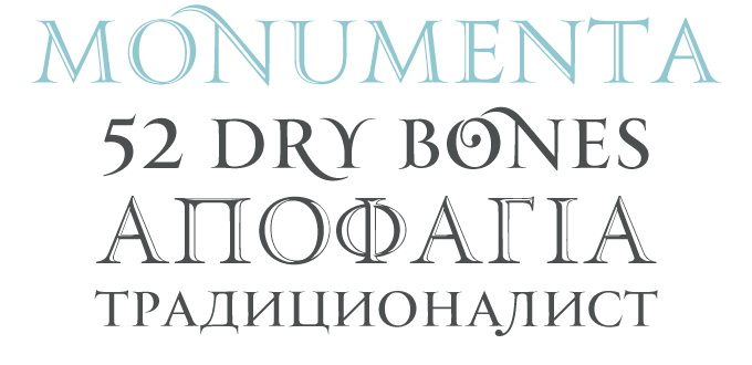
With Monumenta Pro, the Parachute foundry takes the Latin alphabet right back to where its roots lie — to Athens, Greece. The success of Trajan (a staple of movie titles) has already inspired several other revivals of the Roman inscriptional capitals, such as the well-equipped Jupiter. So how is Monumenta Pro different? As it was designed in the land of Alpha and Omega, it naturally comes with a perfectly drawn Greek character set; it also supports Cyrillic. What makes the Monumenta family especially attractive and versatile are its open varieties: the Shaded version is virtually identical to the Regular, but with a finely carved inline. “Metallic” is slightly bolder and simulates three-dimensional metallic lettering. Elegant!
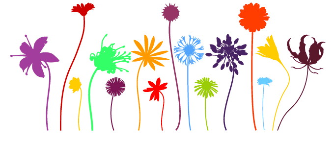
The London-based Kapitza sisters — Nicole and Petra — have created a versatile library of picture and ornament fonts. Their collection includes beautifully crafted silhouettes of people (such as Victoria Park), geometric dingbats and snow crystals. But their most popular sets are those that picture botanical forms. We Love Nature is their most recent offering in this genre: a vaseful of lively stem flowers. The crisp outline illustrations are characteristically well drawn, with a minimum of vector points. The pictures are equally interesting as single illustrations and in multi-colored combinations.
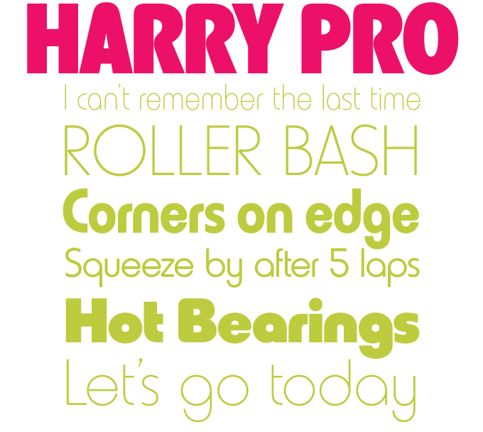
Harry is one of those fonts you may have seen a million times without being able to name it. Published in 1966 by VGC, Harry was ubiquitous in the book and record cover design of the late ’60s and early ’70, and is typical of its time: clean, geometric, unorthodox and jazzy. Its main designer was Marty Goldstein, co-founder of the groundbreaking Creative Black Book, who named the typeface after his father. For this recent digital revival, the people at the Red Rooster Collection added four new weights to the original six.
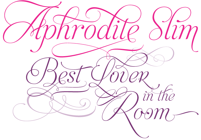
Aphrodite Slim is the lighter sister of Aphrodite Pro, one of this year’s best selling script typefaces from Buenos Aires’ Typesenses. Its designers have more or less been growing up in public, and this new version shows a remarkable leap in ambition. Aphrodite Slim Pro has duplicated the number of characters of its partner, reaching a total of more than 1000 glyphs, including a large number of pre-designed words and syllables in English, French, Spanish and German. It is more delicate and more meticulously drawn than its predecessor, tapping into a variety of calligraphic styles. The result is a curious but attractive hybrid, combining elements from uncial, copperplate and cancelleresca scripts — and more. If you’re interested in Aphrodite Slim’s complex pedigree, check out the text on the font page.
Text family of the month
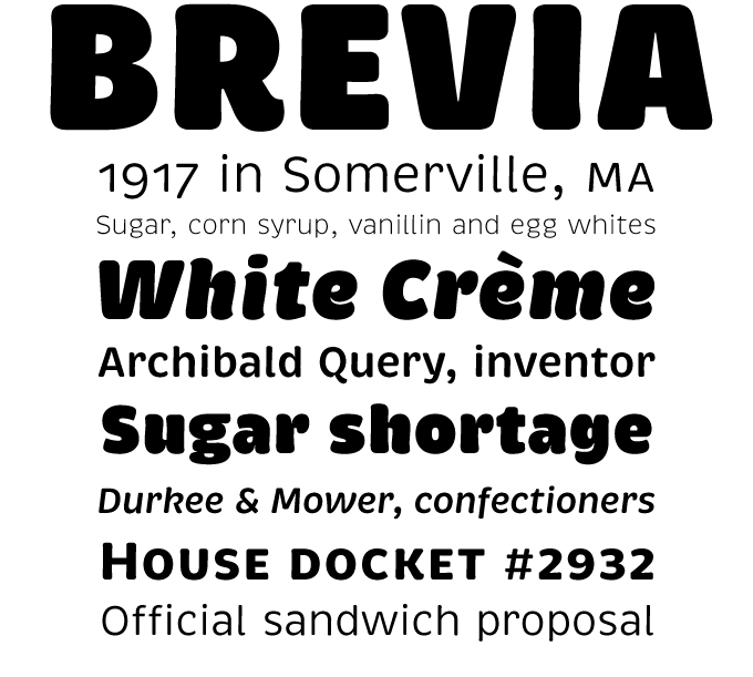
Among the recently released sans-serif typefaces, Brevia takes a special place. While most new fonts in its genre are cool, clean and minimalist, Brevia is warm, friendly and casual. Designer Hannes von Döhren made sure that Brevia, despite its soft shapes, performs very well as a text face. Thanks to the large x-height and its rather wide and open italics, Brevia remains perfectly readable even in very small text settings. Brevia’s heavier weights are slightly more curved and have an eye-catching appearance. They reveal their striking character in bigger sizes, making them the ideal display companions to the text weights. Brevia is equipped for highly professional use: the OpenType fonts have an extended character set to support Central and Eastern European as well as Western European languages. Each font includes small caps, a wide array of numerals and a set of arrows.
Follow-Up
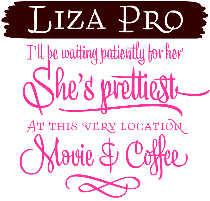
A new font by Underware is always a typographic event, and Liza Pro was no exception. It’s been doing very well this past month and we like it so much we decided to show it again in this issue. Liza Pro uses the wizardry of OpenType architecture to create a font that approaches human hand lettering as closely as possible. Out of a stock of 4,000 hand-crafted characters, Liza creates the optimal combination. All of this works like a breeze when using a program with full OpenType functionality; automatic substitution will make your text look different and fresh all the time.
If you like this typeface from Underware, check out some of their other fonts:
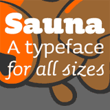
Sauna has a warm and comfortable feeling, just like the Finnish invention it was named after. Sauna’s basic silhouette is rather square, but its details are round and cozy. It is an attractive headline and text face with an unmistakable character of its own.
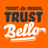
Bello, like Liza, mimics the work of the sign writer, but with quite different results. It adds character to menus, magazines and logos – and would provide perfect signage in a beach bar. Bello Pro combines Bello Script, Bello Small Caps and word logotypes into one impressive OpenType font.
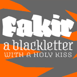
Fakir is a contemporary take on the blackletter genre – a streetwise gothic, so to speak. It examines the edgy structure of the textura alphabet, as it was written with broad-nibbed pens for centuries, but also looks at letter shapes used in graffiti pieces.
Sponsored font
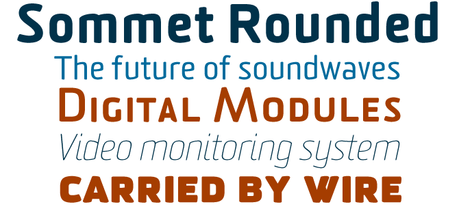
Sommet Rounded from insigne is the a softer version of Sommet, Jeremy Dooley’s take on the computer-age, simplified sans-serif. Sommet Rounded enhances its predecessor's retro-futurist feel by rounding off the terminals, and the overall impression is friendlier and less formal. Its condensed, squarish silhouette and angled horizontals are immediately recognizable. Sommet Rounded has several figure styles as well as small caps. Since the typeface's release just over a year ago, the designer added two new weights for display purposes — Heavy and Thin — as well as Cyrillic language support and new alternate characters. A typeface for striking magazine headlines, corporate design, book covers and more.
Have your say
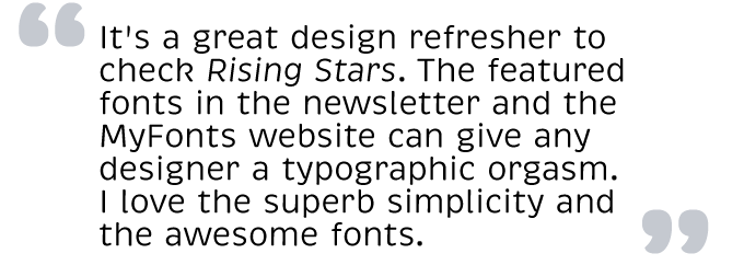
—Chandan in Mumbai, India
Oct 10, 2009
Your opinion matters to us! Feel free to share your thoughts or read other people’s comments at the MyFonts Testimonials page.
Colophon
The Rising Stars nameplate is set in Auto 3 and Bryant, and the Have your say quotation in Brevia.
Subscription info
Want to get future MyFonts newsletters sent to your inbox? Subscribe at myfonts.com/MailingList
Comments?
We’d love to hear from you! Please send any questions or comments about this newsletter to [email protected]