
It’s that end-of-the-year time again when we all begin making lists of what went best this year and what’s going to be even better the next. Here at MyFonts, we are busy counting glyphs in order to establish, with perfect objectivity, who sold most of them in 2009. Nah… just joking! Whatever our method of finding out, we won’t tell you which are the Fonts of 2009 before the year is done. Anything else would be cheating. Meanwhile, here are the fonts of the month, with some very nice surprises from places you may never visit.
This month’s Rising Stars
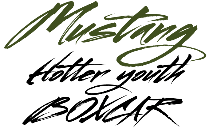
One of this year’s nice surprises in the script department was Robert Arnow’s Streetbrush, a vigorous brush script font that mixes urban graffiti and Asian calligraphy. Mustang, Arnow’s latest offering, is a font in the same vein – powerful and expressive, with an edgy urban aesthetic. Compared to this predecessor, Mustang’s strokes appear to have been drawn with greater speed, its forward angle is sharper, lending the font great intensity and and urgency. Mustang will be especially evocative at large sizes, where the details and sharpness of the shapes really come to life.
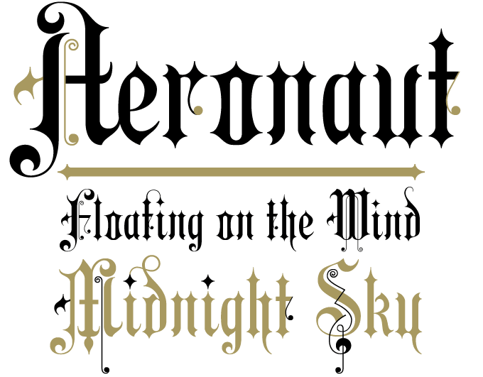
Aeronaut is an homage to the Neogothic of the late 1800s, a style that combined mediaeval gothic elements with Arts & Crafts influences. The font was inspired by a liturgical alphabet called Kirchengotische Schrift that was found in a 1879 German sample book for lettering artists. Like FaceType’s recent Ivory, it has been designed for bi-color compositions. While the regular Aeronaut comes as an alphabet of ornamental letters, the letters in the Aeronaut Base font are 'undressed', so to speak. Ornaments can be added from one of the specially priced ornament fonts: Parachute and Balloon (the latter has longer hairlines). Letters and ornaments have corresponding widths, so they can easily be layered in contrasting colors.
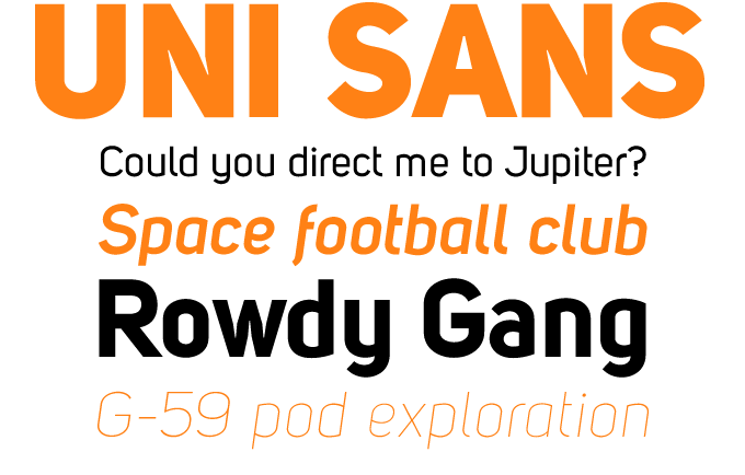
Bulgarian designer Svetoslav Simov has been very successful lately with his very own brand of geometric display fonts, of which Zag and Colo Pro are the most recent examples. Uni Sans is his most ambitious typeface to date: a text and display family of constructed sans-serifs in seven weights plus italics. While the capitals are very DIN-like, the lowercase combines DIN’s industrial simplicity with some avant-garde details, such as the fluid joining of stems and curves and an italic that combines geometry and calligraphy. An art catalogue set in Uni Sans will definitely look cutting-edge… but when done with care, it may also work beautifully.
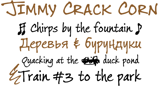
There is always a need for fonts that convincingly capture clear, confident handwriting. Jimmy Crack Corn Pro is such a font. The handwriting it was based on is its designer’s – Jim Ford at Ascender. Based on a model written with a Sharpie™ Extra Fine felt pen, the casual script font evokes an energetic feeling, and has very legible letterforms without quirky distractions. Jim Ford’s hand went global by creating a massive multilingual character set (including Eastern European accents, Cyrillic, Greek and Turkish) and advanced typographic features for use with OpenType-savvy applications.
Text family of the month
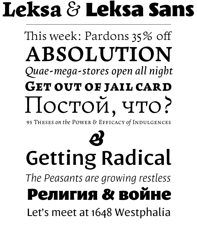
One of the most interesting typographic phenomena of recent times is the influx of well-made new fonts by young designers from Russia – many of them women. Currently the most successful of the new crop is Leksa, a 12-font text family by Alexandra Korolkova from Moscow. Together with its sans-serif companion Leksa Sans (14 fonts) Leksa forms an impressive multi-purpose series.
Considering the fact that Leksa is the designer’s début on the international scene, the family is remarkably mature and original. The designer describes her typeface as “oldstyle, even a bit old-fashioned”. Its pedigree goes all the way back to late 15th century Venice, where Jenson cut the very first “Roman” printing faces. But while Leksa’s silhouette obviously refers to that ancient model, its details and structure belong to the 21st century in every sense. Its harmonious range of six weights, from Light to Black, make it an extremely versatile family. With both oldstyle and tabular digits and true small caps, the family can handle complex typographic jobs. Its usefulness is further enhanced by an elegant, open italic. As Joshua Lurie-Terrell puts it in his review on the MyFonts blog, the result is an “immensely readable bookface”. Needless to say, the family has a professionally designed Cyrillic, which won Alexandra an “excellence in type design” award in the Superfamilies category of the 2009 Modern Cyrillic competition.
Follow-Up
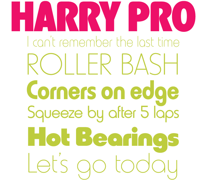
This new digitization of Harry, the quintessential 1970 pop typeface, has been very successful since its release a few months ago. Harry is typical of its time: clean, geometric, unorthodox and jazzy. For this recent digital revival, the people at the Red Rooster Collection added four new weights to the original six.
If you like this typeface from the Red Rooster Collection, check out some of their other fonts:
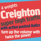
Creighton was the result of an attempt to design a suitable lowercase for Les Usherwood’s Elston typeface, based on an old German typeface called Hermes Grotesque (see also here).
However, the new design quickly took on a life of its own. The result is Creighton, a timeless rounded sans.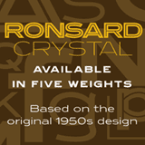
Ronsard Crystal began its life as a single-weight VGC photo display font in the 1950s. The team at Red Rooster liked it so much that they decided to design four additional weights to go with the original inline version. The result is as versatile as it is stylish.
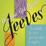
Jeeves was inspired by an old letterhead for a New York company, as reproduced in Leslie Carbarga’s wonderful Letterheads. The spirited script comes with a plethora of extra glyphs, ligature characters and OpenType features.
Sponsored font
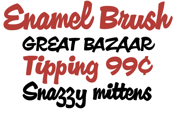
MyFonts offers hundreds of brush script fonts, but Enamel Brush is special. Not only is it lively, sturdy and witty, it also looks great when set in all-caps – which, as most of you know, is not often the case with brush scripts. Also, at less than $9 it offers incredible value for money. Ray Larabie describes Enamel Brush as “a caricature” of a 1955 font called Catalina by New York lettering artist Emil Klumpp. A caricature it may be, but as a font for daily use it means serious business. It even has special ligatures which in OpenType-savvy applications automatically replace certain letter combinations with for a more natural look.
Have your say
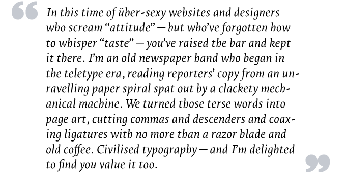
—Rahul in Goa, India
Nov 12, 2009
Your opinion matters to us! Feel free to share your thoughts or read other people’s comments at the MyFonts Testimonials page.
Colophon
The Rising Stars nameplate is set in Auto 3 and Bryant, and the Have your say quotation in Leksa.
Subscription info
Want to get future MyFonts newsletters sent to your inbox? Subscribe at myfonts.com/MailingList
Comments?
We’d love to hear from you! Please send any questions or comments about this newsletter to [email protected]