
This month’s Rising Stars
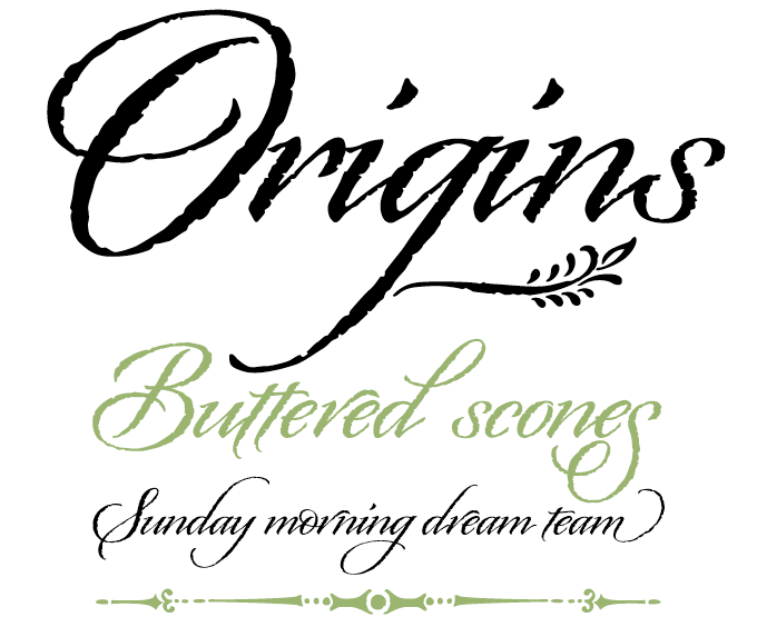
It's only been a few months since lettering artist and illustrator Laura Worthington made her successful MyFonts debut with Recherche, and already we have a lovely follow-up in Origins. Origins is a semi-connected calligraphic font with a confident, regular flow. Based on hand-lettering with a Crow Quill pen on parchment paper, it has natural, rough outlines that contribute to its subtly antiquated look and feel. Origins features gracious ascenders and descenders for an elegant and somewhat formal look. With 140 alternate characters and ornaments, the font is a versatile toolkit to create unique headlines, titling, invitations, branding and more.
For a collection of similarly styled, hand-lettered catchphrases, check out Worthington's Greeting Cards font.
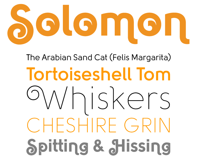
From Bulgaria comes Solomon, the latest type family by designer Svetoslav Simov. It combines the strict geometric construction of letters drawn using compass and ruler with the ornamental craze seen in display fonts from the photocomposition era. The family consists of twelve designs, divided into two main style groups: a text and a display (or decorative) family. Both sub-families build striking headlines with a technological appeal. The Solomon text variety will lend a rational atmosphere to blocks of medium-sized text; Solomon Deco adds curly ornaments to the geometric purity of the basic forms to create an unusual hybrid of mechanic and organic forms.
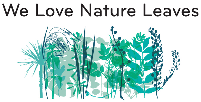
The London-based Kapitza studio, run by sisters Nicole and Petra, specializes in creating picture and ornament fonts. The life of plants is among their favorite subjects: They have lovingly digitized dozens of silhouettes of leaves and flowers. After the popular Blossomy, Posy and We Love Nature Stems, Kapitza has now released two more fonts in the We Love Nature series. The most successful of these is Leaves, a charming and versatile collection of foliage illustrations. Like all Kapitza picture fonts, it consists of hand-drawn, highly detailed drawings which can be used as single illustrations or layered for multi-colored effect. Combine with other illustrations in the We Love Nature series for even more botanical variety.
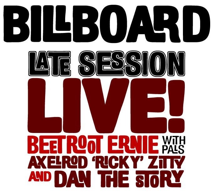
The click'n'jump-ligature style that was seen in some commercial 1960s lettering has suddenly become a new craze in digital display type. After fonts like Sinzano or (outside MyFonts) Ed Interlock, Finland’s Fenotype has now released a soft and chubby variation on the same theme. Billboard is a family of six fonts: three weights, a condensed and an outlined version. The family members all have a load of ligatures to make customized settings for every word. To access these ligatures, use an OpenType-aware layout application and write in CAPS.
Text family of the month
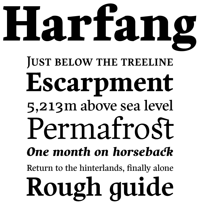
With this month's text family we welcome PSY-OPS, one of the latest foundries of renown to join MyFonts. PSY-OPS offers text and display fonts that, besides being technically sound and well-equipped, are often strikingly original. Harfang by Canadian designer André Simard is a case in point.
The Harfang family takes a fresh look at the tradition of roman book types. While respecting the conventions of proportion and rhythm that have been handed down through the ages, Harfang makes no compromises on the details. There is no hint of nostalgia or sentimentality; the shapes are clean-cut, economic and contemporary.
With small caps and various figure styles for all weights, Harfang is designed for complex book and magazine typography. Its unusual ligatures as well as the alternate letterforms (such as the one-storey "g") allow the user to make individual stylistic choices for each specific job.
Follow-up
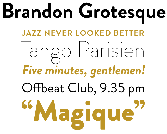
The succes of Brandon Grotesque has been quite phenomenal. At the moment of writing, it sits comfortably at the top of our Bestseller List, (proving that the position of the Swiss classic that usually occupies the #1 spot is not unassailable). Brandon adds a personal touch to a geometric sans serif model that first became popular during the 1920s and ’30s. With its rounded corners and long extenders, it is a stylish contribution to the genre. A modernist face with a warm feel, Brandon Grotesque is well suited for use in headlines as well as longer texts.
If you like this typeface from HVD Fonts, check out some of their other fonts:

Brevia
Brevia was designer Hannes von Döhren’s first extended family: a soft sans serif typeface in seven weights and matching italics. Thanks to its large x-height and rather wide and open italics, Brevia remains perfectly readable even in very small text settings. Each of Brevia’s fonts includes small caps, a wide array of numerals and a set of arrows.
Bumper
Bumper is the perfect ultra-bold sans for headlines that want to be LOUD without committing crimes against good taste. A short text set large in Bumper will shout out its message and still fit in with its context. There are three degrees of Bumper: from the broad-shouldered Regular via the narrower Condensed to the artfully squeezed Compressed.
Cowboyslang
A display type family with a Wild West flair, Cowboyslang consists of three widths plus compatible ornaments. Although it is based on the slab serif typefaces from the nineteenth century, the designer gave Cowboyslang a contemporary and slightly ironic feel.
Sponsored Font: Filosofia
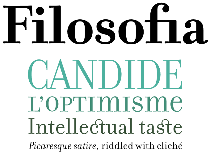
Filosofia is designer Zuzana Licko's interpretation of the Bodoni model: elegant, readable and pleasantly personal. "Filosofia," wrote Licko, "shows my personal preference for a geometric Bodoni, while incorporating such features as the slightly bulging round serif endings which often appeared in printed samples of Bodoni's work and reflect Bodoni's origins in letterpress technology."
The Filosofia Regular family is designed for text applications. It is somewhat rugged with reduced contrast to withstand the reduction to text sizes. The Filosofia Grand family is intended for display applications and is therefore more delicate and refined. An additional variant, included in the Grand package, is a Unicase version which uses a single height for characters that are otherwise separated into upper and lower case. This is similar to Bradbury Thompson’s Alphabet 26, except that Thompson’s goal was to create a text alphabet free of such redundancies as the two different forms which represent the character “a” or “A”, whereas Filosofia Unicase does have stylistic variants to provide flexibility for headline use.
Have your say
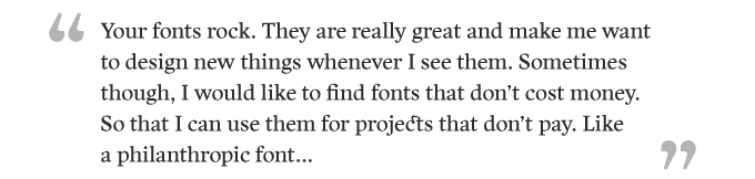
— MoBurkhardt, April 14th, 2010
MyFonts says: Mo, several of our foundries offer fonts for free — and many of these are excellent! You can find them using our search filters.
Your opinion matters to us! Feel free to share your thoughts or read other people’s comments at the MyFonts Testimonials page.
Colophon
The Rising Stars nameplate is set in Auto 3 and Bryant, and the Have your say quotation in Harfang.
Subscription info
Want to get future MyFonts newsletters sent to your inbox? Subscribe at myfonts.com/MailingList Want to get future MyFonts newsletters sent to your inbox? Subscribe at myfonts.com/MailingList
Comments?
We’d love to hear from you! Please send any questions or comments about this newsletter to [email protected]