
People who complain that too many of today’s successful typefaces are script fonts — such people exist! — possibly underestimate the richness of this broad genre. Three of July’s Rising Stars are informal scripts, and yet they couldn’t be more different. Their sources are as diverse as can be — from sixteenth-century manuscripts via 1950s advertising to charming personal doodles. Where they will end up... nobody knows. Sometimes we wonder. As compensation, check out the most minimalist all-caps font currently on our shelves. And don’t miss this month’s Text Font, it’s quite a treat.
This month’s Rising Stars
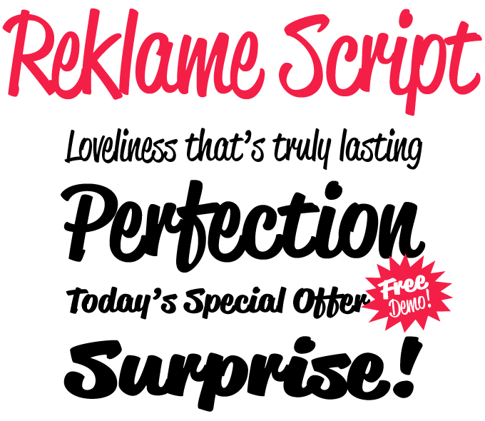
Reklame is a German word that means “advertising”, and that is basically what Reklame Script is for. Inspired by the hand lettering of printed advertisements of the 1940s and ’50s, it is a powerful brush script in four weights, from Regular to Black. The four varieties can be combined for extra emphasis — perfect for slogans, billboards, packaging and the like. Released only a few months after the smash hit Brandon Grotesque, Reklame is another #1 best seller for Berlin designer Hannes von Döhren. The family comes as four OpenType fonts with extended character sets to support a wide range of languages, as well as double-letter ligatures to avoid repetition. A stripped-down test font is offered for free.
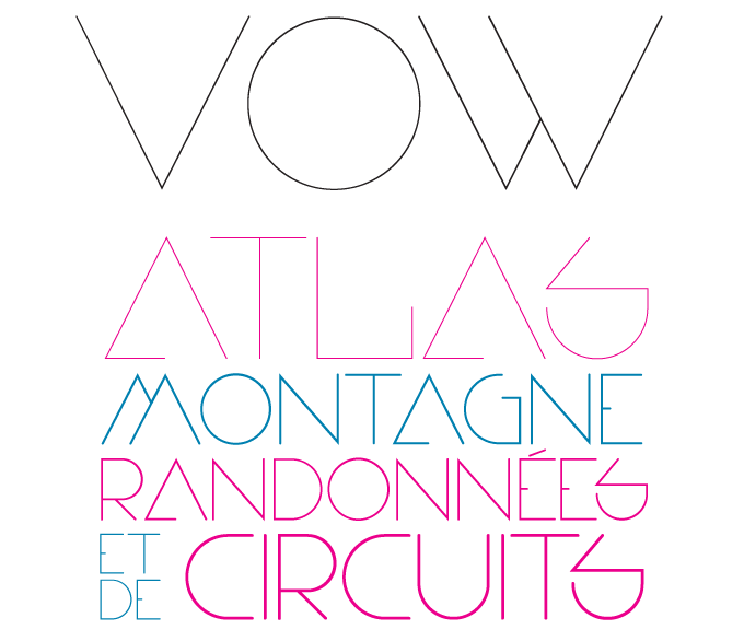
Vow is so thin you might miss it if your computer screen is adjusted too brightly – but when used large (especially in print) it results in attractively clean, minimalist all-caps headlines. Vow is brought to us by British designer Alex Haigh, who specializes in experimental, geometric display faces. With its two weights, its semi-circles and sharp angles, Vow challenges the daring graphic designer to push, tweak and turn its shapes to get the perfect headlining combination. Vow comes with pan-European support and an extended character set.
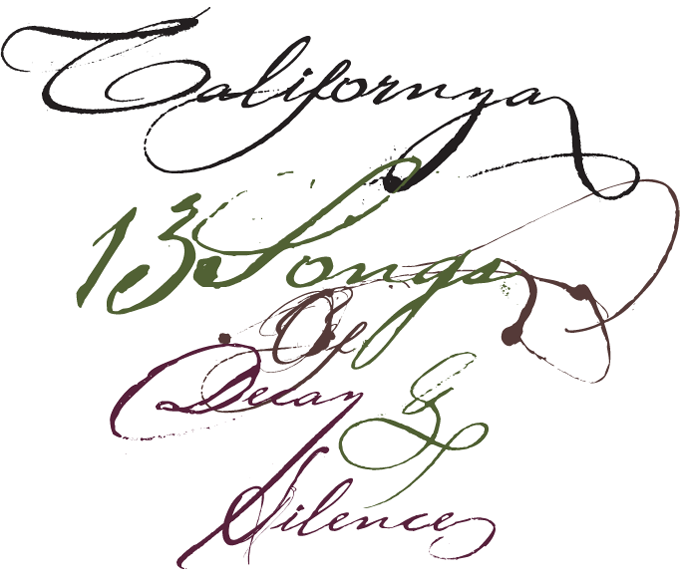
Believe it or not, sometimes the best fonts for a job are the least readable ones. Californya is a script that at times defies legibility, but does so in an intriguing and strangely stylish way. Designer Germán Olaya interpreted letterforms from various sixteenth-century documents, resulting in a set of fonts that beautifully capture the meeting of formal basic shapes with an energetic, hasty execution characteristic of many old manuscripts. Californya consists of three alphabets plus a series of ornaments, ligatures and swashes; each version comes in Regular and Bold. It is possible to combine characters across versions to get a vast range of natural-looking word shapes.
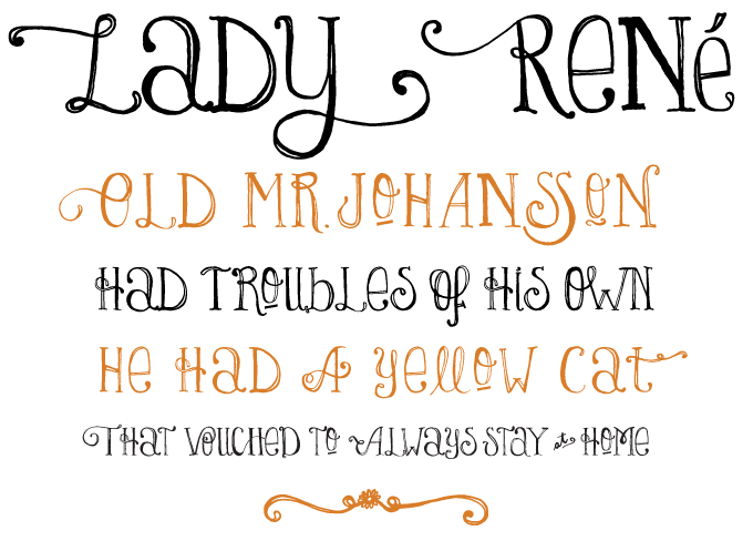
Those of you who are familiar with the elaborate, polished script fonts produced by Alejandro Paul and his associates at Sudtipos may be a little surprised by that foundry’s latest offering — the whimsical, spontaneous Lady René. The font was not made by one of the collective’s regulars; in fact it is the first typeface by a newcomer to the type trade, designer-illustrator Laura Varsky. Specializing in editorial design and CD packaging, Varsky has written that she kept coming back to letterforms as the core element in the designer’s ongoing quest for the perfect “show-to-say-something.” Born out of a love of illustration and a reverence for the written word, Lady René recalls the warmth and spontaneity of a handmade drawing. Alejandro Paul’s hard work made sure that, although unpolished in nature, the font is technically impeccable, its character set full of surprises.
Text family of the month
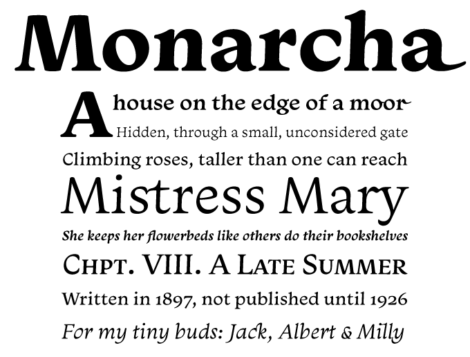
Monarcha was one of this spring’s typographic surprises: a beautifully drawn serifed type family which, in spite of its original and idiosyncratic forms, is surprisingly legible and versatile as a text font. It won’t work for any old project, of course: with its strong baroque influences and voluptuously curved stems it definitely has romantic and poetic overtones — more suitable for branding, say, whiskey or sailing boats than medical equipment or software.
Designed by Isac Corr?a Rodrigues from Southern Brazil, Monarcha is both striking and thoughtful in its detailing. Its romans are slightly skewed in the reading direction and its italics have unusual calligraphic features. The contrast between thick and thin strokes is moderate. In combination with the curved shapes, these characteristics give Monarcha a delicious fluidity and texture.
Monarcha comes in four weights and offers all the features one may expect from a professional text font: small caps, fractions, old style, lining and tabular numbers, scientific figures, stylistic sets and more than 40 ligatures. As a bonus, it has an innovative OpenType feature that will please historians, bibliophiles and science fiction writers alike: it can convert Arabic (“normal”) numerals to Roman ones up to 3999.
Follow-up
If you like this typeface from Lián Types, check out some of their other fonts:
Quijote Sauvage
When designing Quijote Sauvage as an update to the earlier Quijote, designer Maximiliano Sproviero promised to himself “that this new font had to be much more legible than the old version, and at the same time, much more decorative and happy.” The result is a wildly dancing script with the oversized extenders and numerals that are a hallmark of Sproviero's scripts.
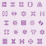
Miscelanea
Miscelanea addresses the need for a set of elements that can be combined into borders or backgrounds to personalize websites, blogs and printed pieces. Each of the abstract ornaments that constitute this font, Lián Types’ first collection of dingbats, was designed to be part of a pattern. They also work as separate symbols or fancy “punctuation marks”.
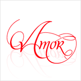
Mon Amour
Mon Amour is one of Lián Types’ most successful scripts, copiously adorned with loopy swashes. It comes as a set of four fonts; besides the main font, Mon Amour Script Pro, there are separate fonts for the Swashes, Alternates and Ligatures, which makes those special forms more easily accessible when working with programs that do not have full OpenType functionality.
Sponsored Font: PF Handbook Pro
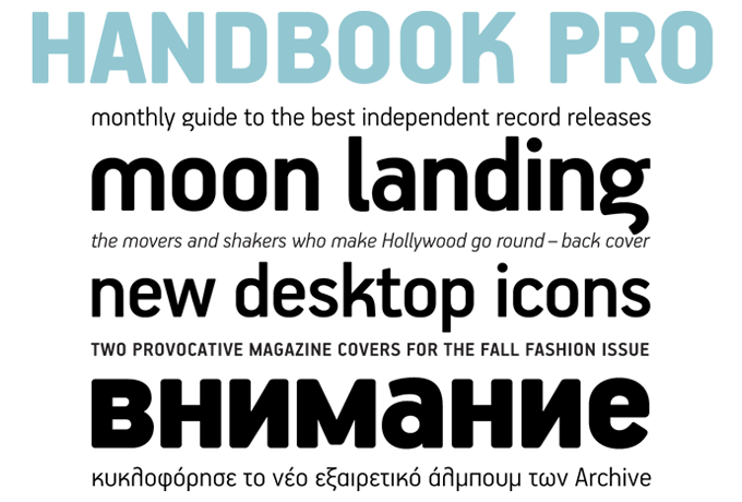
Handbook Pro from Parachute is a great alternative to industrial typefaces such as DIN or the various OCR types that cutting-edge designers often choose for their engineered look. Thanks to its round corners and distinct design elements in characters such as ‘a’, ‘g’, ‘k’ and ‘m’, Handbook Pro has an identity all of its own, without compromising legibility. In order to retain its sharpness, inner corners as well as junction points were left steep. Handbook Pro is a balanced typeface which works very well in long texts at small point sizes. Since its first release it has been used in numerous magazines, advertising campaigns and corporate applications. It comes in seven weights — from Black to Extra Thin — each with matching italics. Its OpenType fonts are equipped with loads of features, including small caps, fractions, ordinals, and a set of interesting stylistic alternates. Every font has been completed with 270 copyright-free symbols for packaging, public areas, environment, transportation, computers, fabric care and urban life.
Have your say
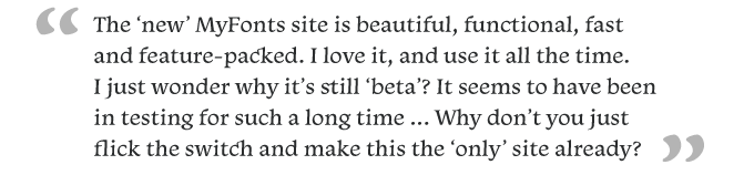
— Anonymous post to “Dear MyFonts”, July 4th, 2010
MyFonts says: Thanks for the kind words!! We can’t quite “flick” the switch just yet... still have a few more things to bring over from the old site. Plus, there’s still a world of users that aren’t yet up to speed with JavaScript, and the new site relies heavily on it. Soooon though, soon ;-)Your opinion matters to us! Feel free to share your thoughts or read other people’s comments at the MyFonts Testimonials page.