
“August creates as she slumbers, replete and satisfied,” wrote a poet with the marvellous name Joseph Wood Krutch. Wouldn’t it be wonderful if August were that kind of month for all of us, type designers and users alike, laid-back yet productive? One way type designers reap their harvest, so to speak, is to rework and expand their earlier designs and — coincidence? providence? — you’ll see among this month’s Rising Stars several faces at last yielding their full potential.
This month’s Rising Stars
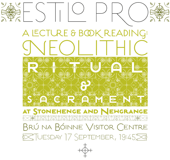
Although the Estilo family has been around for almost five years, the new Estilo Pro is surprising and different in more ways than one. Dino dos Santos has dramatically updated and expanded his popular Deco-style typeface, producing what he calls ‘the ultimate Estilo’. Estilo Pro comes in five weights, from Hairline to Bold, each carrying a thousand glyphs. The glyph sets include alternate characters, initial and ending swashes, ligatures, ornaments, letter/ornament tiles, and drop caps. The result is huge — a fascinating toolkit for making decorative headlines, logos and more. Note: to access the non-standard characters, use the glyph panel and Stylistic Sets in your OpenType-enabled layout software.
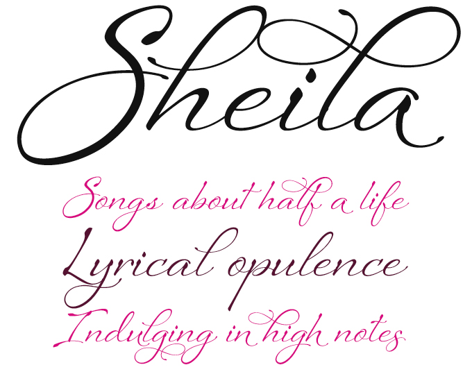
In the course of just a few months, designer Laura Worthington has released an impressive array of new script typefaces, including the highly successful Recherché and Origins. Not only are her faces beautifully drawn and well produced, she has also proved able to master a broad range of script styles. Her latest offering, Sheila, is a case in point. It is decidedly different in atmosphere from its predecessors and strikes an interesting note half-way between formal and informal script styles. In Worthington’s words, Sheila “writes very deliberately, focusing on each letterform, trying to make her writing, and your designs, look as good as possible.” One of its secrets is its subtle thick-thin contrast, which makes it stand out without compromising legibility. Sheila features thirty-five alternate letters and thirty ligatures.
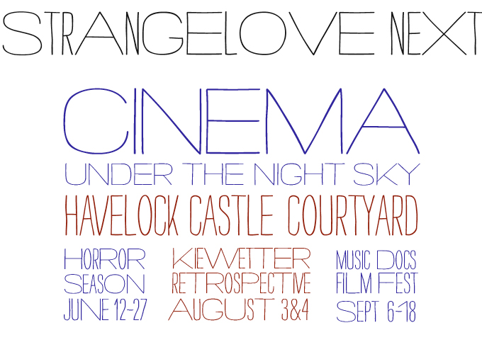
Last year, FaceType released Strangelove Text, a typeface of narrow capitals inspired by the title sequence of Stanley Kubrick’s movie Dr. Strangelove. The new version, Strangelove Next, again pays tribute to Pablo Ferro’s original hand-drawn lettering for the movie, but takes the typeface several steps further. Besides the successful narrow version, the Strangelove Next family contains a new extended version as well as a mix of the first two to give your headlines a whimsical, unpredictable and jazzy look.
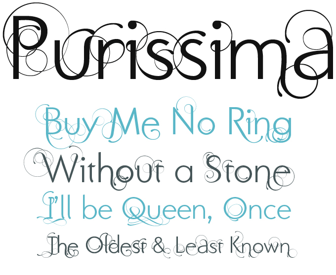
Purissima is Gert Wiescher’s exuberantly decorated reworking of his earlier Pura family of sans-serifs. So ebullient is the new family that its name (“very pure”) almost sounds ironic. Purissima is all about a delight in ornament and the fun of combining curls. Instead of stuffing all the typeface’s variations into one big OpenType font (which sometimes confuses less expert users) Wiescher produced five separate fonts which his foundry offers at a very affordable price. The Light cut has no embellishments. The A and B cuts are two fully embellished sets. The C and D cuts only have embellished initials, but those are driven to extremes. As the designer advises: “All five cuts can — and should — be mixed. But don’t overdo it!”
Text family of the month
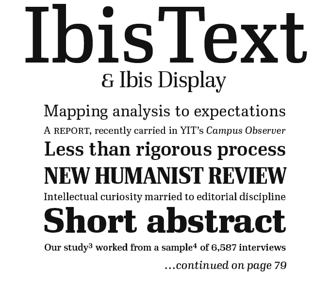
Cyrus Highsmith, senior type designer at Boston’s Font Bureau, is a unique voice in American type design. He has a gift for coming up with letterforms that seem to be in a genre of their own. And sometimes, as with the rounded square silhouettes of the sans serif Stainless and its slab serif companion Dispatch, subsequent trends in type design prove him a trendsetter.
Ibis Text — accompanied by the vast Ibis Display family — is his latest typographic adventure. Studying the Font Bureau type collection, Highsmith found openings that were filled elsewhere by Justus Erich Walbaum’s 1819 Walbaum — a sturdy ‘modern face’ in the Bodoni tradition — and Hermann Zapf’s 1952 Melior. Combining these two diverse influences may be far from obvious, but Highsmith found the fusion to be truly inspirational. The result is a sturdy text-and-titling family with unique characteristics. The small caps are in fact three-quarter caps; and instead of oldstyle figures, the family offers a set of smaller lining figures. Original and appropriate solutions all.
Follow-Up
If you like this typeface from Sudtipos, check out some of their other fonts:
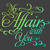
Affair
Affair is designer Alejandro Paul’s masterpiece: an intricate script font with a massive character set that allows the discerning typographer to faithfully recreate 1950s American lettering. Prepare for typographic infatuation or, in Paul’s words: “...alphabet heaven: curves and twirls and loops and swashes...”
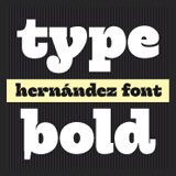
Hernández Bold
Like Lady René, this cheeky display font is a recent Sudtipos release from a newcomer to the foundry. Daniel Hernández’ heavy slab serif comes with a unique feature. Offering a large number of alternates, Hernández Bold allows the user to compose words in different rhythms. It’s a captivating font in every detail, graceful yet with a lot of attitude.
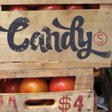
Candy Script
Inspired by Argentina and its culture, Alejandro Paul’s Candy Script captures the country’s spirit. It comes from the tradition of window sign painting, but its thick hand-brushed characters, with alternates for almost every upper and lowercase letter, have a personality all their own.
Sponsored Font: Great Escape
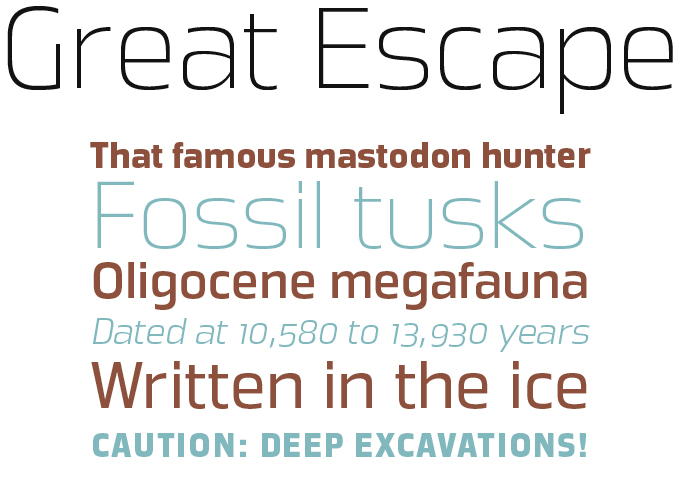
From the Typodermic foundry comes the brand new Great Escape family, a contemporary sans serif with a technical look and feel. Ray Larabie’s design brings a personal touch to the popular ‘squarish sans’ model. Subtle contrasts between the thick and thin parts of each letter lend a human touch to the text and enhance legibility. For a more literary impression, use the balanced set of oldstyle figures. Great Escape is a versatile family in seven weights plus italics, covering a wide range of uses, from giant headlines to small footnotes. Great Escape is a well-made yet affordable sans family for magazine design, corporate identities, branding, signage and more.
Have your say
— Dina Lydia, Seattle, WA, July 27th, 2010
Your opinion matters to us! Feel free to share your thoughts or read other people’s comments at the MyFonts Testimonials page.