Spring is in the air in many parts of the world, and each year that feeling of a new start somehow coincides with a crop of fresh new script fonts. Our newsletter, however, has more to offer than an excess of swashes and loops. From Germany come two of the most interesting sans-serifs to recently hit our shelves. Another German masterpiece is beamed up to us from the early twentieth century via Toronto, Canada. All this and more is possible at MyFonts.
This month’s Rising Stars
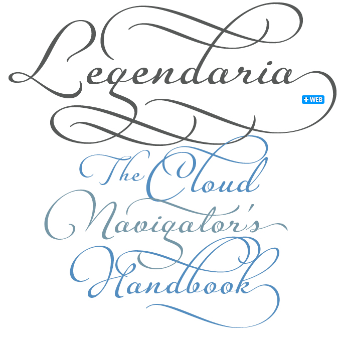
Manuel Corradine from Bogota, Colombia, has given us some fine fonts in the past, such as the eclectic and elegant Mussica and the spontaneous Corradine Handwriting. But Legendaria is his biggest coup so far, his pièce de résistance, his Nec plus ultra. Legendaria is a sophisticated connected script font that dexterously mixes formality and friendliness, exuberance and legibility. With more than 1,300 ornamented characters it is an incredibly versatile toolkit for building gorgeous typographic artwork. Most lower case letters have at least fifteen different options, including tails and flourishes. For users of software with full OpenType functionality, Legendaria OT is the best choice. Others can combine the standard Legendaria with a choice of Swashes, Beginnings and Endings fonts.
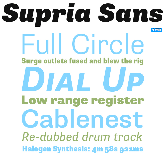
With so many new grotesques coming out, type designers have little room left to navigate between all that’s already been done, and come up with something that truly adds a new flavor. With Supria Sans, designer Hannes von Döhren has pulled it off: it has elements of many classic and modernist sources, from industrial Grotesques to Eurostile, but the result has an atmosphere all its own. Supria Sans presents a combination of features that is quite unusual in its genre. It has three styles, including a curvy, feminine Italic as well as a more conventional Oblique. The Condensed series offers the same six weights and three styles as Supria Sans, but at 80% of the normal width, it allows for significant space saving economies. Used together, Supria Sans and Supria Sans Condensed are a great choice for resolving complex design issues with elegance and sophistication. The specialists agree: we just received news that this brand new family won its designer a TDC Award from the Type Directors Club of New York.
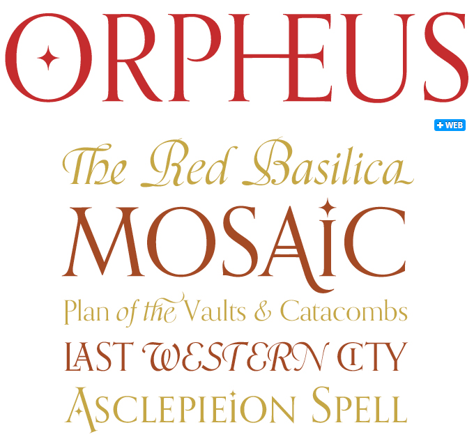
Orpheus Pro is a spectacular revival of the gorgeous 1920s typeface of that name, drawn for Klingspor by Walter Tiemann. Like so many typefaces of that era, Tiemann’s masterpiece got overlooked when type technology changed over to film and then to digital. Enter Canada Type, where designers Patrick Griffin and Kevin Allan King got carried away while working on what started out as a straightforward revival. “The great roman caps just screamed for plenty of extensions, alternates, swashes, ligatures, fusions from different times, and of course small caps. The roman lowercase wanted additional alternates and even a few ligatures. The italic needed to get the same treatment for its lowercase that Tiemann envisioned for the uppercase … Orpheus Pro has been a real ride.” The result is an amazing feat with upwards of 1,000 characters per OT font. And here is good news for those who don’t have access to full OpenType functionality: the Pro fonts ship with their corresponding TTF versions, with six TrueType fonts to cover the character range of the roman and six more to cover the italic.
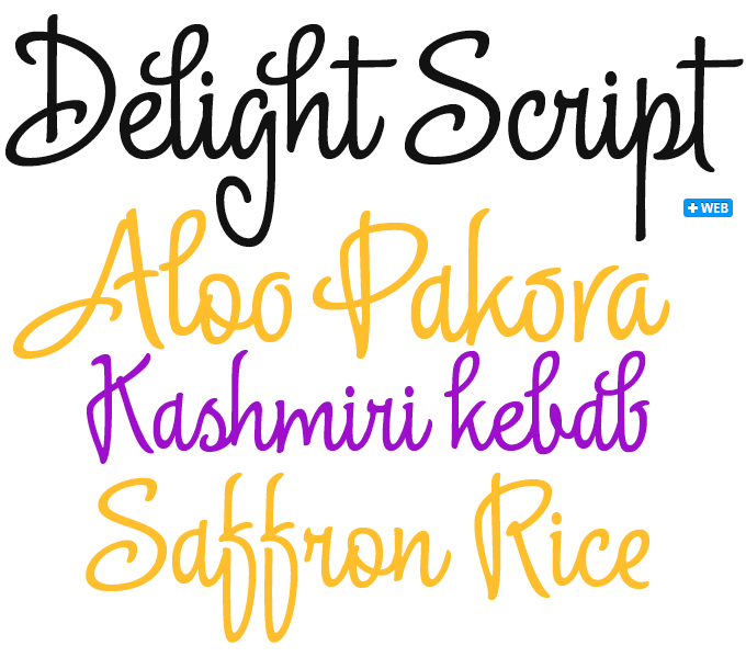
Buenos Aires’ lettering master Angel Koziupa strikes again. His latest offering is Delight Script, a fresh and original design that takes its cues from 1950s advertising scripts. As always, the font was engineered by Sudtipos’ font wizard Alejandro Paul, making sure that the font has tons of alternates that can make every word look like real hand lettering. Delight Script is an upright script that spontaneously alternates between connected and free-standing letters. Casual, bouncy and playful, it is a fine choice for showcards, music and food packaging and, of course, web typography.
Text family of the month
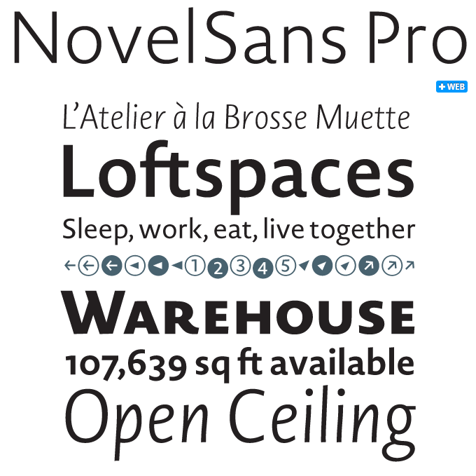
When the Novel type family came out nine months ago, we wrote, “With the number of well-made, sophisticated new fonts steadily increasing, an impressive debut like this could easily be overlooked, or receive just marginal attention. Which would be a real shame, because Novel is indeed a great new typeface that modestly does what the best classic text faces do: make text a pleasure to read and a pleasure to look at.” Luckily, Novel Pro did get the attention it deserved, winning its designer, Berlin-based Christoph Dunst, a Certificate of Excellence in Type Design from New York’s Type Directors Club (TDC) as well as a nomination for the prestigious Design Prize of Germany 2010.
With NovelSans Pro, the original oldstyle text is now given its perfect sans-serif companion. The new sans-serif closely follows its serifed sister’s proportions, and even quotes some of its characteristics that are rather unusual for a sans, such as the prolonged leg on the R or the open loop of the P. The roman y is almost italic in its curviness, but then the italic itself adds an even crazier swing to the same letter — see our reader’s quote below. It all works perfectly, because Dunst has impeccable taste and his designs are painstakingly attuned.
While originally designed for editorial work, NovelSans Pro is a fine choice for a wide array of applications. With 1,020 glyphs per font, the family comes with small caps, alternate glyphs, ligatures, multiple figure sets and much more — all of it in six weights, from Extra Light to Extra Bold.
Follow-Up
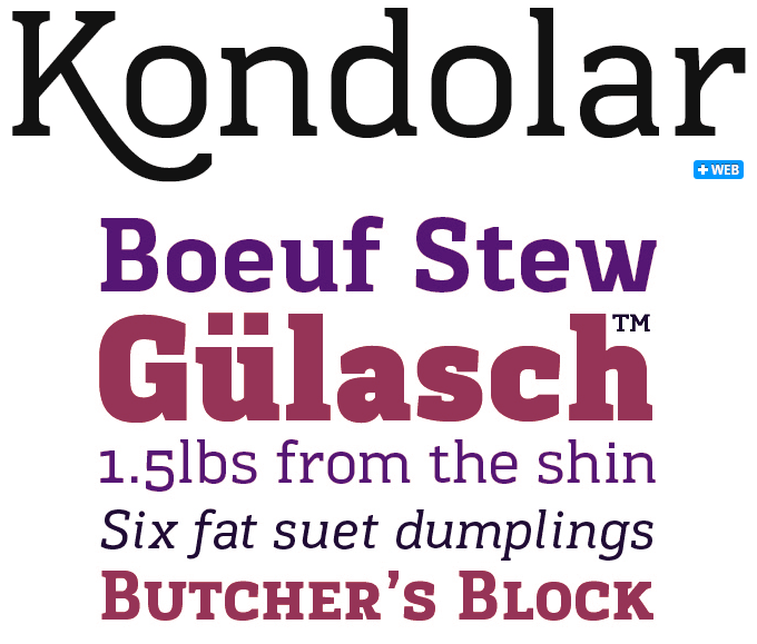
Having been featured in last month’s Rising Stars, Kondolar has continued to do well, settling comfortably among the font elite of our Best Seller list. Which offers us an opportunity to revisit the font in the current issue, and showcase some of the other fine fonts from Cadson Demak, a small typographic studio based in Bangkok, Thailand.
Kondolar’s squarish silhouette combines very well with the short, sturdy serifs, some of which are asymmetrical. With a well-built character set including small caps and several numeral styles, and a supple italic for the Regular weight, Kondolar is surprisingly versatile for such a small family. Besides its use as a text and display typeface in print, we predict a prosperous career as a web font.
If you like this typeface from Cadson Demak, check out some of their other fonts:
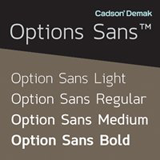
Option Sans
Option Sans is a rework of Anuthin Wongsunkakon’s popular Coupe, originally sold by T-26. Option Sans is a humanized version, offers improved legibility and has been optically corrected to serve better as a fine text font.
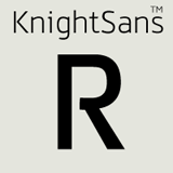
Knight Sans
Conceived by Ekaluck Peanpanawate, the designer of Kondolar, Knight Sans shares some that font’s characteristics. A rather wide, open silhouette combined with unusual detailing (check out the way capital B, K, P and R open up) make for a family with a strong personality.

Enzyme
Anuthin Wongsunkakon’s Enzyme strikes an interesting balance between two worlds: the lucid cool of a hi-tech sans-serif and some calligraphic references that seem out of place, yet fit in perfectly — as evidenced in the quirky details in k, q, r, italic o, and more.
Sponsored Font: Memoriam Pro
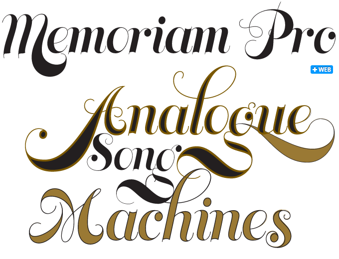
The story of Memoriam must be well-known to most of you type enthusiasts by now. The original Memoriam, 2009’s most popular calligraphic display font, was originally commissioned for the December 2008 “memorial” issue of New York Times magazine. Canada Type’s Patrick Griffin drew a luxurious calligraphic poster font loosely based on ideas found in the foundry’s Jezebel and Treasury typefaces. A great success with the editors and designers, Memoriam ended up being used all over the magazine instead of just the cover and became an instant hit as soon as it was made available for retail at MyFonts. Since then it has become a standard sight on book and magazine covers, billboards, food and cosmetics packaging, event posters, and high-end design pieces everywhere. It continues to generate many calls for project-specific customization for countless publications and design agencies. Released only weeks ago, the new Memoriam Pro comes with three fancy variants (Headline, Outline and Inline) to accommodate public demand.
Have your say
— Nancy, New Orleans, February 9, 2011
Your opinions matter to us! Feel free to share your thoughts or read other people’s comments at the MyFonts Testimonials page.


