This month’s Rising Stars newsletter features the most diverse collection of successful new fonts in months. All popular modes of letter-making are represented: sketching, writing, constructing, reviving and standing on the shoulders of giants. There are fonts for entertainment, fonts for seducing potent loved ones or potential customers, and fonts for creating masterpieces of typographic design. There are even fonts for layering and automatic connecting. If you think that sounds dirty, then that’s not our fault.
This month’s Rising Stars
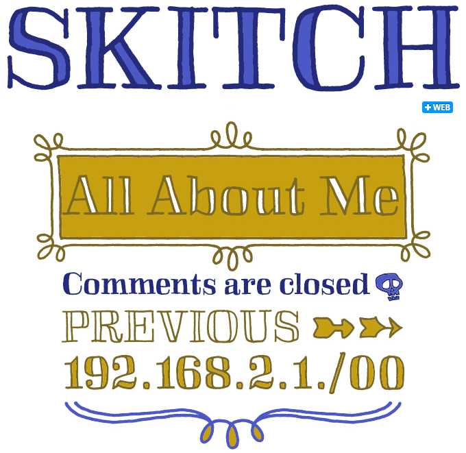
Sketched fonts have been all the rage for the past year or so, and Skitch from Yellow Design Studio is a clever new addition to the genre. A funky hand-drawn serif with regular, solid, and fill options, it can be layered to multi-colored effect. Skitch is loaded with OpenType features, including double-letter ligatures, discretionary ligatures and stylistic alternates. It’s accompanied by an eccentric collection of ornaments, and a set of expandable borders that can be mixed and matched for endless fun. Skitch works best with frame-based layout programs that support full OpenType functionality!
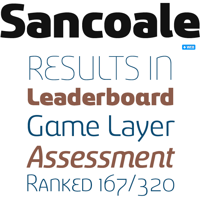
Type designers around the world are exploring ways to breathe new life into the sans-serif, and Insigne’s Jeremy Dooley is no exception. With Sancoale, Dooley offers an attractive contemporary design that combines a lucid, open silhouette with unusual detailing. This makes for a readable typeface family that is useful despite its peculiarities, and very desirable because of those same peculiarities when a more distinctive face is called for. Sancoale’s design is simplified: no stems or spurs in the default character set. The OpenType alternates do include some stemmed variants, and there are six weights with true italics. Have a look at the informative PDF brochure to see these features in action.
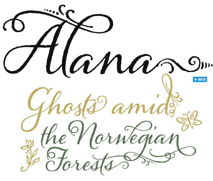
Laura Worthington’s spirited script faces are a staple of MyFonts’ lists and newsletters — Origins and Sheila have been particularly successful. Named after Laura’s younger sister, her latest offering Alana is very likely to become a long-term seller as well. Natural-looking and confident, Alana strikes a very nice balance between a casual and a formal script face. Based on hand lettering, it indulges in elaborate swashes and ornaments without losing its friendly character and slightly nonchalant look and feel. It includes two additional uppercase letter sets along with hundreds of alternate lowercase letters, making it very versatile. Use OpenType-enabled design software to use Alana’s features to full effect.
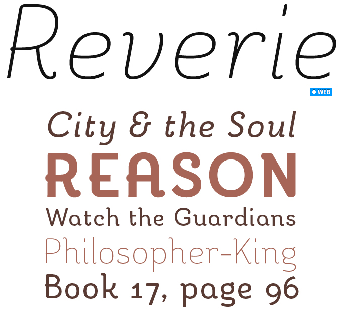
Charmingly and modestly, Reverie has graced the top 10 of our Hot New Fonts list for most of the past two months. This enchanting family from CV Type is in some respects a cousin of well-known MyFonts fixtures like Coquette or Pauline but offers a clearly different approach to the Art Deco advertising-meets-schoolbook model. Reverie is a cheerful band of letters that bounce across the page and get together to create words in three weights with supple, matching italics. Generous spacing and a modest x-height project an airy typeface that is open but not frail and quirky without being too whimsical. Use the regular weight for surprisingly readable text or put the light and bold weights to use for decorative headlines and titles.
Text family of the month
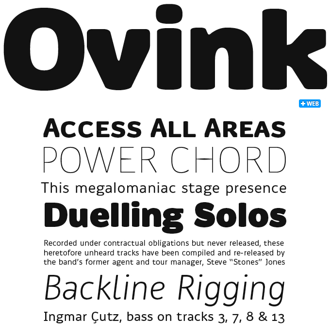
Ovink, a brand new sans-serif from Denmark, is both remarkably original and wonderfully practical. It owes its special look to an intriguing pedigree in Danish signage, and its usability to down-to-earth academic legibility research.
Danish type designers, when asked about their roots, invariably point to the sturdy alphabets used for signage throughout the twentieth century, most notably to the pioneering lettering work of architect Knud V. Engelhardt. Ovink is probably the first major type family to use that designer’s work as a direct reference. Designer Sofie Beier examined Engelhardt’s alphabet for the street signs of Gentofte (a suburb of Copenhagen); she invested her nine-width family with the spirit of that bold 1920s design, rather than literally copying its details.
The font’s name has little to do with Denmark: it pays homage to Gerrit Willem Ovink, a Dutch scholar and type consultant to the Amsterdam Type Foundry, who conducted remarkable research into functionality and legibility. Beier, too, has published studies on legibility: her work as a type designer has been informed by a parallel career as an academic researcher working with noted legibility expert Kevin Larson, among others. The Ovink family incorporates several findings from Beier and Larson’s investigations, which influenced decisions about the shapes of lowercase letters and the inclusion of alternate ‘i’, ‘j’, and ‘l’. For more detailed information, read the article on the Ovink font page.
Follow-Up
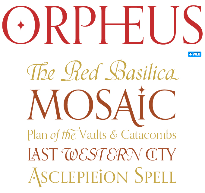
When designers Patrick Griffin and Kevin Allan King began working on a revival of Walter Tiemann’s 1920s Orpheus, they soon got carried away. The result was Orpheus Pro, an amazing family with more than 1,000 characters per OT font. For those who don’t have access to full OpenType functionality, the Pro fonts ship with their corresponding TTF versions, with six TrueType fonts to cover the entire character range. Orpheus Pro has been hugely successful since last month’s feature in Rising Stars — hence this Follow-Up.
If you like this typeface from Canada Type, check out some of their other recent fonts:
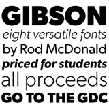
Gibson
Gibson is a humanist sans-serif designed by eminent Canadian type designer Rod McDonald to honor John Gibson, one of the founders of the Society of Graphic Designers of Canada (GDC). The 8-font family is available for a token price to make it especially affordable for design students, hoping to raise awareness about type piracy. All the revenues from sales will be donated to the GDC.
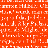
Aragon
Re-introducing the classic Garamond forms for the twenty-first century is no easy task. With Aragon, Hans van Maanen makes a fine attempt at just that by remodeling the traditional shapes through a modern lens with stunning results. Aragon is a workhorse family that performs very well in a variety of text sizes. Its combination of wedge serifs with uniquely tapered stems offers a sturdy Dutch touch that altogether improves legibility.
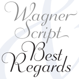
Wagner Script
This gem of a script did the rounds as a metal font under various names. Its origins go back to Troubadour, a bold script from Wagner & Schmidt in Leipzig. Gracia from the Amsterdam Type Foundry was a much lighter and more elegant variety — a common sight on perfume bottles, chocolate boxes and book covers in Europe for about four decades. Wagner Script corrects and greatly expands on the original metal concept.
Sponsored Font: URW++ Eurostile
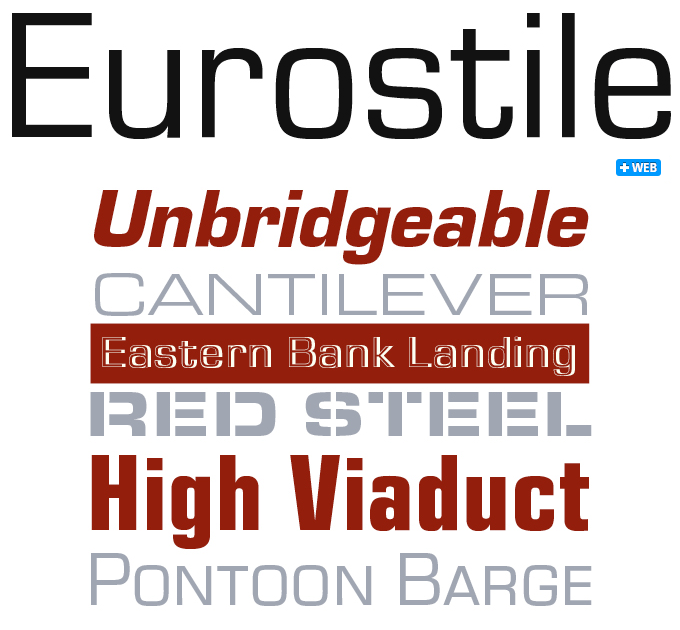
When it came out in 1962, Aldo Novarese’s Eurostile was an unheard-of feat: a space-age leap forward from late 1950s business-like grotesques such as Helvetica and Univers. Like Helvetica — but in a different corner of the design world — Eurostile became an icon of modernity. More recently, the rounded rectangle that is the core of its silhouette has been the starting point for myriad new sans-serifs, some with similar hi-tech cool, others with more humanist details. After the demise of Nebiolo, the font’s original publisher, Novarese’s family became available digitally in various places. This version made and marketed by URW++ remains one of the most faithful as well as most affordable: 3 widths plus headline versions, 25 fonts in all, for less than $200.
Have your say
— Fredges, March 8th, 2011
Your opinions matter to us! Feel free to share your thoughts or read other people’s comments at the MyFonts Testimonials page.


