While the introductions to this newsletter usually amount to no more than idle chit chat, this month’s intro is pure hard sell. We won’t make it a habit, promise. So… with Halloween successfully overcome and Thanksgiving on its way, the holidays are approaching at breakneck speed — and we have the fonts to celebrate in style. Whether you’re creating greeting cards, flyers, menus, websites or invitations, choose from our enormous variety of lovely seasonal dingbats and icons to invest your designs with that irresistible X(-mas) factor. You’ll also need letters, though. What better way to find great new alphabets than by browsing this month’s successful new fonts? But before presenting our bright new stars we’d like to draw your attention to a very good cause indeed — a new Font Aid project called Made For Japan, all the proceeds of which will be donated to organizations that support the victims of the March earthquake and tsunami (the distributors waive their usual percentage). The font contains gorgeous artwork from almost 300 designers, so by buying it you’ll also do yourself a favor.
This month’s Rising Stars
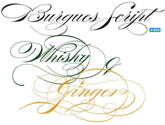
Burgues Script is a tribute to the nineteenth-century American calligrapher Louis Madarasz. Designer Ale Paul based this monumental typeface on two major publications reproducing Madarasz’s work, but there could be no question of a straightforward digitization. As he wrote, Paul had to “change many of the letters in order to be able to produce digital calligraphy that can flow flexibly and offers the user a variety of options, while maintaining its attractive appearance.” As usual, it was hard work to adapt the flexibility and connectivity of the original lettering to the logic of digital machines. Says Paul: “When I think of Madarasz producing a flourished calligraphic logotype in a few seconds, and try to reconcile that with the timelines of my work or that of my colleagues in identity and packaging design, the mind reels.” As it turned out, the digital flourishes of the prize-winning Burgues are no less dazzling. Like that other recent Sudtipos winner, Feel Script, Burgues is a great choice for spectacular lettering, from wine labels to tattoos.
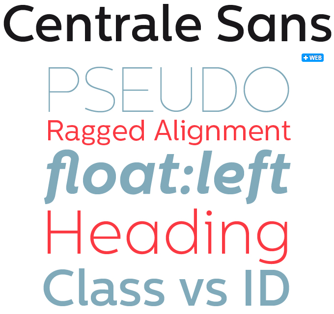
The too-good-to-be-true introductory offer which helped Pluto rise to unseen heights a few months ago (see below) has inspired quite a few foundries to do the same. It worked like a breeze for the small Bulgarian foundry Typedepot, who released Centrale Sans at a bargain price and saw it rise steadily to the number one spot of our Hot New Fonts list. It helped, of course, that Centrale Sans is such a well-made family, adding a welcome new color to the well populated category of multi-functional, readable sans-serifs. It strikes a very nice balance between geometric cool and humanist friendliness. Its openness makes Centrale Sans a good performer on the screen as well.
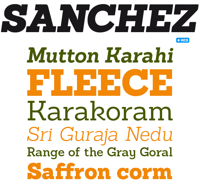
Based in Concepción, Chile, Latinotype has published a great range of display faces that are fine representatives of the ‘latino’ approach: colorful, well-drawn, original and a bit cheeky. Sánchez is Latinotype’s first extensive family suitable for display as well as body text. It is a slab serif, or Egyptian: a modern-day Rockwell, but with more personal lettershapes and subtly rounded edges. Sánchez comprises six weights, from extra light to black, each with its matching italics. Regular and italic variants are available for free, so with a minimal extra investment in SemiBold and/or Bold weights you can obtain a small family to lend your brochure or website the clarity and contemporary feel it deserves.
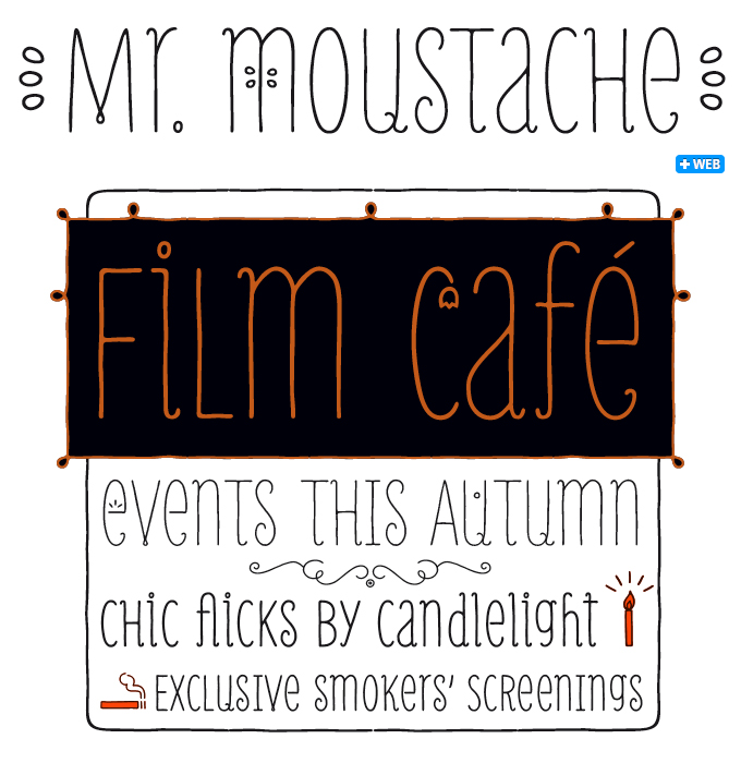
Mr Moustache from FaceType is a great choice when you want to say it big, but not overly loud. Or if you would like to write it by hand but don’t trust your scribbling to be seen in public. Mr Moustache will come to the rescue with its extra-thin, condensed letters. Its convincing handwritten look will lend a warm and friendly feel to your layout. Being able to freely mix the upper- and lowercase letters adds to the fun. The little family comes in two variants: Mr Moustache Display for headlines and other large-size application, and the sturdier Mr Moustache Text for small type sizes and larger volumes of text; each comes with a Unicase variety in which both cases have the same height. Mr Moustache is accompanied by six fonts of frames, ornaments and dingbats that can be layered for multicolored effects. For a full overview, download the Accessories pdf.
Special mention
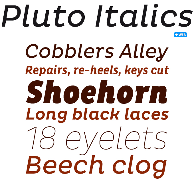
Few people realize that each of the foundries working with MyFonts makes its own decisions about pricing, marketing and product development. Some foundries have a knack for coming up with just the right strategy at the right moment — and when the fonts are good, the result may be an extraordinary success. Such was the case with Pluto. Released with an incredible introductory offer, its sales went through the roof and secured HVD Fonts what is probably going to be one of the best selling fonts of the year: Pluto is definitely up there with the stars. Now the brand new Pluto Italics are available at the same sweet temporary price. Sixteen well-equipped fonts for $49 — what are you waiting for?
Text family of the month
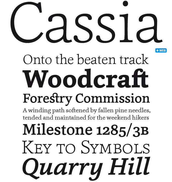
In just over six months Hoftype, a one-man foundry from Germany, has released an impressive collection of accomplished and affordable text families. The company’s principal is no newcomer: for years, Dieter Hofrichter worked with the late, great Günter Gerhard Lange at Berthold. While Cala, which we featured in this newsletter a few months ago, is a crisp, contemporary interpretation of the Venetian oldstyle, the new Cassia is a dynamic modern-face, somewhere halfway between a humanized slab serif and an updated Clarendon. More individual and agile and decidedly warmer than most Slab Serifs, it oozes dynamism and vitality, and yet is still superbly readable.
Cassia comes in ten styles in OpenType format, with extended language support for more than 40 languages. All weights contain small caps, standard and discretionary ligatures and multiple figure styles including fractions and scientific numerals.
Follow-Up
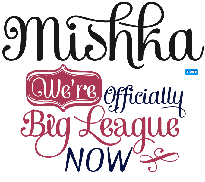
Mishka is the latest offering from Fenotype designer Emil Karl Bertell, and a nice example of his signature style — a playful and personal view of scripts that mixes clear and informal lettershapes with a taste for the exuberant and decorative. Mishka is a pleasant upright script that offers its users plenty of options to customize headlines — just activate Swashes, Stylistic Alternates or Contextual Alternates in any OpenType-savvy program. Its small caps are a font within a font: an energetic set of sans-serif caps that combine well with the scripts but offer a distinct style. Mishka Ornaments is a separate font of ninety typographic ornaments designed to work perfectly with the upright and italic.
If you like this typeface from Fenotype, check out some of their other fonts:
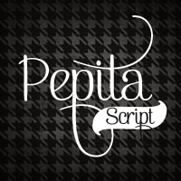
Pepita Script
Pepita Script is a flexible and easy-to-use connected script. Apart from a collection of supple letters (with plenty of swash alternates and ligatures) it also offers a series of matching ornaments. For best results, combine all 3 weights of the font.
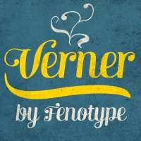
Verner
Verner is the ‘script brother’ to Fenotype’s Verna. While the sister is playful yet strong-willed, Verner is clearly in touch with ‘his’ feminine side. Verner strikes just the right balance between the handwritten and the orderly, between legibility and decorative whim.
For the best price purchase Barber, Pepita Script and Verner as one package.
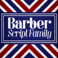
Barber
Barber is a versatile script font family in four weights. While Barber 1 is elegant and neat Barber 4 is cheerful, strong and full of warmth. When used in OpenType-savvy programs; Barber’s Contextual Alternates, Swash and Stylistic Alternates work their magic.
Sponsored Font: Maqui
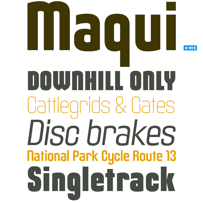
Typodermic’s Maqui is something else. Designer Ray Larabie calls it a “post-industrial” font family, but it is more than that. It is about as eclectic as a clean, minimalist sans-serif can get. Some of its shapes, like ‘A’ and ‘W’, are Gothic (as in “Gothic cathedral”). Others refer to the squarish letterforms in the Eurostile tradition, or the gridiron rigidity of nineteenth-century grotesques. The way the curves connect to the stems — with no trace of a spur or serif — references more recent stylistic inventions. What is most remarkable about this cross-historical mashup is how well it works. On both extremes of the spectrum (UltraLight, Light, Black) the family offers ample possibilities to set striking headlines, both in lowercase and all-caps. The middle weights will also work well in longer, medium-sized text settings. At only $90 for the entire 16-font family, Maqui will add more than one color to your typographic palette.
Have your say
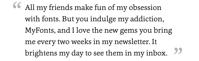
— Kalee, Texas
Your opinions matter to us! Feel free to share your thoughts or read other people’s comments at the MyFonts Testimonials page.
MyFonts is on Twitter and Facebook!
Join the MyFonts community on Twitter and Facebook. Tips, news, interesting links, personal favorites and more from MyFonts’ staff.