The world of typography is continually changing, and MyFonts receives new fonts on a daily basis. Many of these are from small-scale foundries across the world — and these microfoundries continue to challenge the bigger players with great ideas, trend-conscious designs and smart solutions. They’re a bit like microbreweries in the world of beverages — inventing new tastes and improving old ones. But where small-scale breweries usually think globally but act locally, MyFonts allows its microfoundries to reach a global market and provide graphic designers continents away with nifty and influential type tools. Just have a look at this edition of our newsletter for successful new fonts to see what we’re about.
And don’t forget to scroll down for what is probably the most spectacular offer ever from a small-scale foundry: all the fonts from Canada Type’s multifaceted type library at 50% discount — this week only.
This month’s Rising Stars
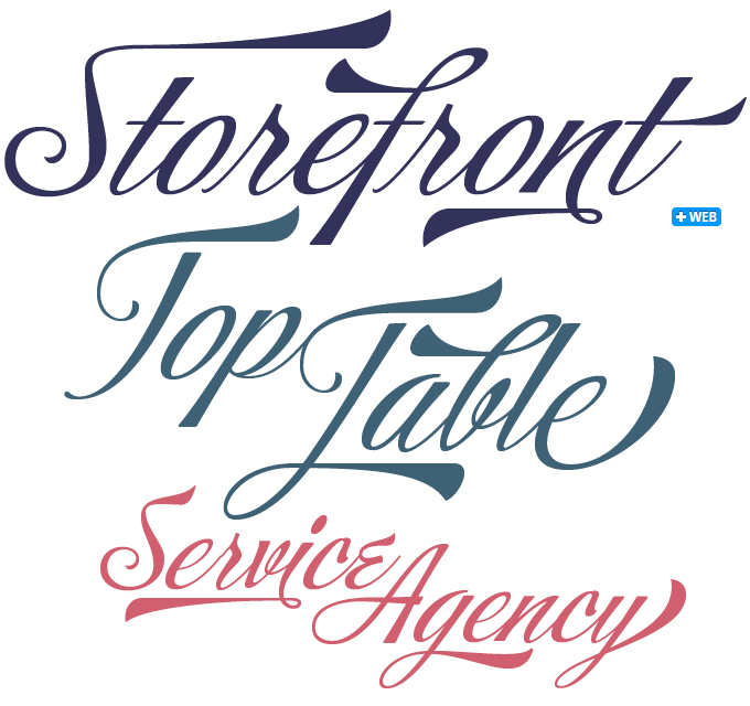
Storefront Pro is an American advertising script in the same vein as some of Ale Paul’s earlier successes, such as Ministry Script and Buffet Script. This time, Paul’s main source of inspiration was the work of American sign painters of the 1920s and 1930s — the font they might have created had they had access to the lettering and type technologies we have today. Rooted in an incomplete Alf Becker alphabet sample, Storefront offers Ale Paul’s usual abundance of alternates and swashes, and is characteristic of his ongoing effort to bring typesetting closer to that ever-elusive handmade impression. While its main shapes, especially the majuscules, are rooted in nineteenth century scripts, the additional variants provide a leap in time to what sign makers and packaging designers are doing today. Storefront comes with over a thousand glyphs for your branding, packaging, and sign-making pleasure.
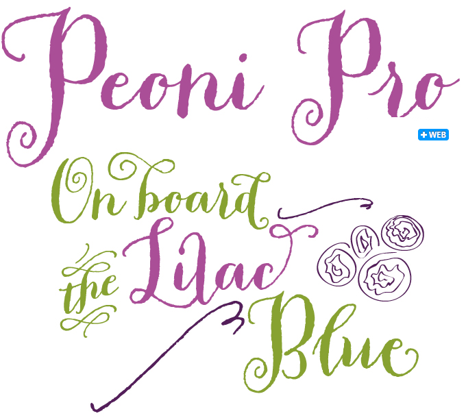
Designer Emily Conners offers a growing collection of playful, energetic script and display fonts through her Emily Lime foundry. Many of our users loved the quirky charm of her Carolyna family. Peoni Pro, her most recent offering, is well on its way to topping that success. Despite its carefree and capricious appearance, Peoni Pro is technically robust and sophisticated. Offering over 1200 glyphs, it is full of features designed to select the most ideal characters as you type (using OpenType-enabled software). With the OpenType panel, glyphs panel or character map, the user can have fun customizing the look of a headline or slogan. Peoni comes with several styles of figures, as well as a set of stylized words, such as “and”, “the”, “from”, etc.
Text families of the month
Text typefaces for demanding editorial work need to possess special qualities: excellent readability, a generous range of weights, italics and small caps for all weights, multiple figure sets (lining, oldstyle, table) and ample language coverage. In this section of the newsletter we cover recent releases that meet these standards. All work beautifully in print; however, if you are a web designer considering using any of these typefaces as a web font for body text, test thoroughly!
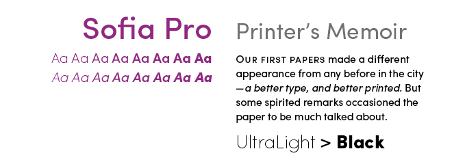
Olivier Gourvat of Mostardesign designed Sofia to ooze modernism, harmony and roundness, resulting in a stylish type family for use in body text as well as headline settings. Redesigned in 2012, Sofia Pro comes with more than 500 glyphs, supporting a wide range of languages. The new version also has small caps, contextual and stylistic alternates, fractions, oldstyle and tabular figures. Sofia comes in 8 weights plus matching italics.
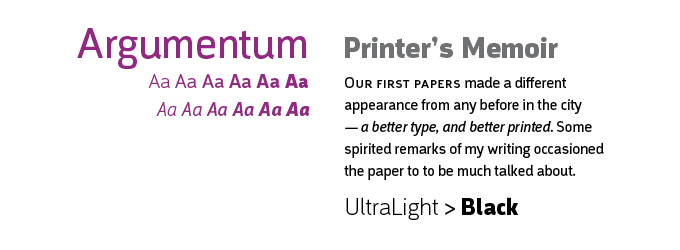
For designers of sans-serif fonts there is little room to move between the many typefaces already in existence. Yet time and again, type designers manage to come up with faces that make a difference — fonts that lend a specific and unique personality to a piece of design. Argumentum by Nikola Kostić occupies a place somewhere in the triangle between DIN, Eurostile and, say, Fedra Sans: a technical looking sans with a warmer feel to it, balanced between hard geometric shapes and friendly curves. Equipped with small caps, multiple figure sets and much more, Argumentum is ready for the most demanding of typographic jobs.
Follow-Up
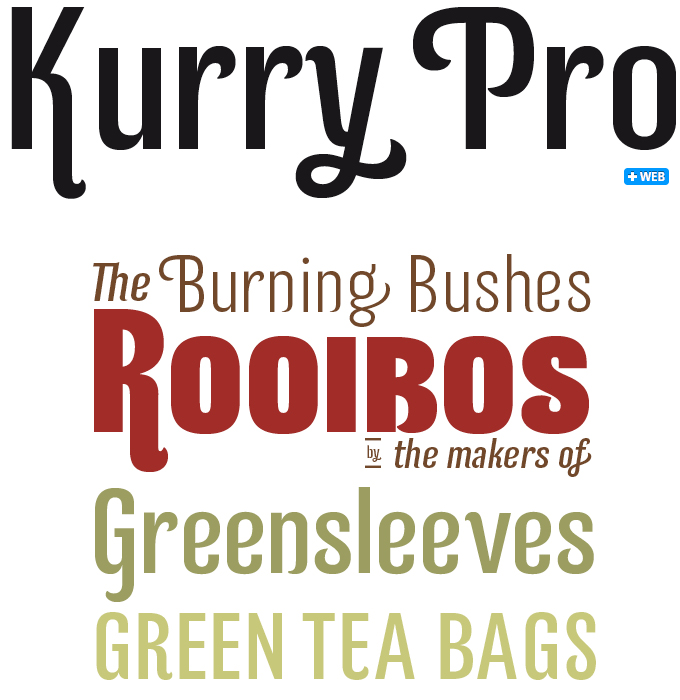
Kurry Pro has been one of the surprise sellers of the past couple of months. Among the many no-nonsense sans-serif fonts that have come out recently, it stands out as a rather exotic hybrid. Its basic structure is simple — a narrow rectangular skeleton rounded at the top and the bottom — but its somewhat quirky details set it apart. Terminals end in a softened point, as do some strokes where curves join straight stems; many letters have a swashed alternate version, and special English-language keywords such as “with”, “of” and “by” (the latter two in upper- and lowercase) add to the font family’s versatility.
If you like this typeface from Cadson Demak, check out some of their other fonts:
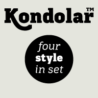
Kondolar
It’s easy to let Kondolar’s occasional swooping descender trip you up, but that shouldn’t distract from what is essentially an uncomplicated, multi-purpose text-and-display slab serif. The option of flourishes on K, Q and R adds a dash of adventure to the workmanlike slabs.

Due
Launched in December 2011, Due is Cadson Demak’s latest take on the genre of the humanized businesslike sans-serif. Its open shapes, agreeable curves and clear, rather wide italics make it a good choice for display and basic text settings in corporate as well as editorial design projects.
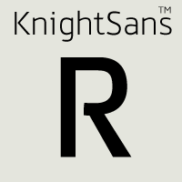
Knight Sans
With a rounder overall character than some of Cadson Demak’s other sans faces, Knight Sans would be a good candidate for corporate publications, special print projects and websites. It holds up well as a varied text face possessed of enough character and individuality to escape bland conformity.
Spring 2012 Promotion: Canada Type
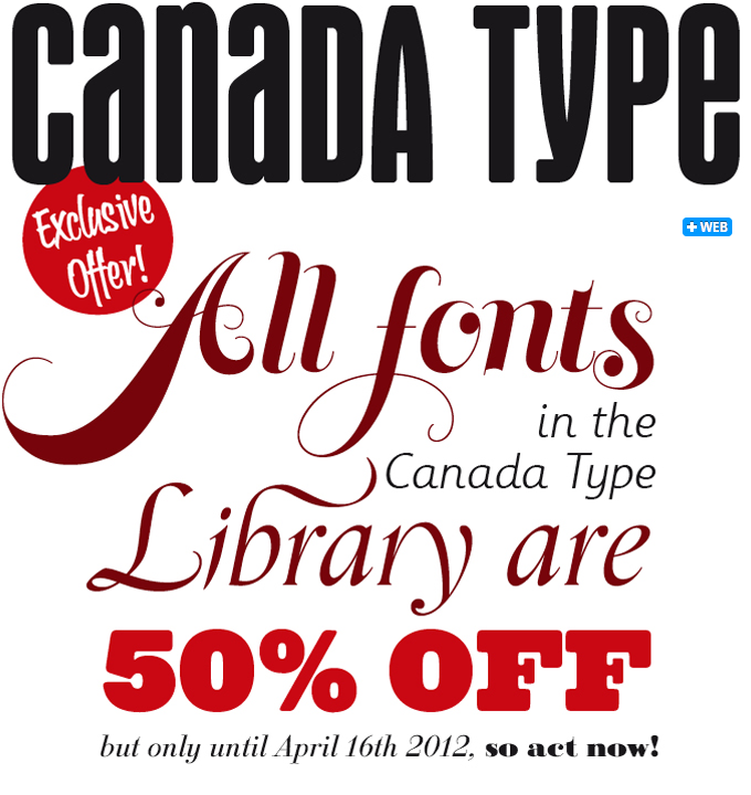
More and more foundries come up with special offers on font families, and we love ’em for it. But a foundry offering all its fonts for half price is a rare event indeed — all the more so when that foundry boasts a library as large, well-made and varied as Toronto’s Canada Type. The fonts used in the sample above are just the tip of the iceberg. Canada Type offers well over 200 families in an amazing array of styles and atmospheres, including popular bestsellers such as Memoriam, Orpheus, Ambassador Script, Semplicita and Clarendon Text. All of this is available at a 50 percent discount until this coming Monday. This week’s special Spring Promotion — the first of its kind — is exclusive to MyFonts, and it is unlikely to happen again anytime soon. So this is a unique chance to acquire fonts you’ve always wanted at prices you never dared dream of.
Canada Type will be donating 10% of the sale’s revenues to Médecins Sans Frontières (Doctors Without Borders). Offer ends April 16, 2012!
Have your say
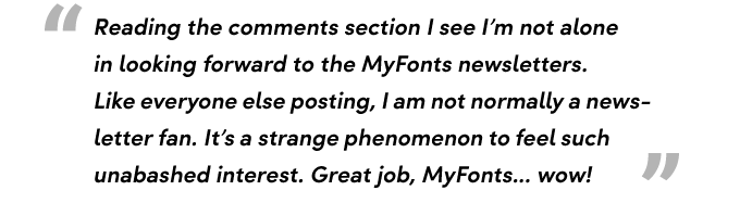
— Penny from Southern California, March 8, 2012
Your opinions matter to us! Feel free to share your thoughts or read other people’s comments at the MyFonts Testimonials page.
MyFonts is on Twitter and Facebook!
Join the MyFonts community on Twitter and Facebook. Tips, news, interesting links, personal favorites and more from MyFonts’ staff.