With so many new typefaces coming out every week, it’s those that have a clear purpose or add something genuinely new to the typographic palette that capture attention and stand out from the crowd. Of course, fonts that simply offer fantastic value for money also stand a good chance of getting noticed. This month’s newsletter for successful new fonts offers a bit of each: the original, the useful, the affordable and the downright gorgeous. Enjoy!
This month’s Rising Stars
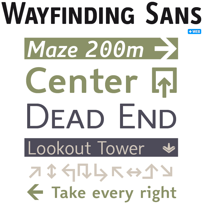
Wayfinding Sans began with a road trip that lasted several years: designer Ralf Herrmann drove tens of thousands of miles to explore the legibility of road signage alphabets around the world. He then built a theoretical framework of legibility parameters and wrote his own real-time simulation software to create difficult reading conditions (distance, fog, positive/negative contrast, etc.) while the letters were being designed. The result is a new typeface for maximum legibility under adverse conditions: bad weather, haste, speed, stress. In a recent independent study at the Berlin University of Applied Sciences, Wayfinding Sans Pro was the winner in all tests, being significantly more legible on signs than the other typefaces tested. With special weights for optimized positive and negative contrast, the family structure is unusual. Consult the PDF specimen for more info on which version to use when.
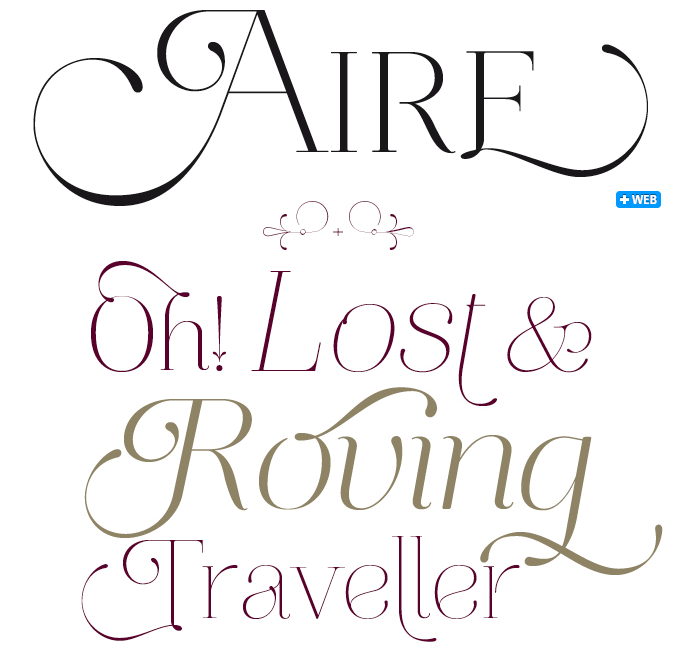
Following his success with the lovely Reina, Maximiliano Sproviero of Buenos Aires brings us Aire — a new display family in seven varieties. Each variant is loaded with ligatures, alternates and the entire Cyrillic alphabet — even the very affordable Std versions offer Cyrillic. Sproviero’s Lián Types foundry recommends consulting the user guide PDF for details. The typeface was designed to emanate lightness and delicacy — hence its name, “aire” being Spanish for “air.” As its designer notes; “Aire [...] started as a really thin style of Reina, but it rapidly migrated from it and grew up alone.” With three weights plus italics (all delicate, but some more feathery than others) Aire offers possibilities for combining large and small sizes within one headline, or create subtle stylistic variations within one design project.
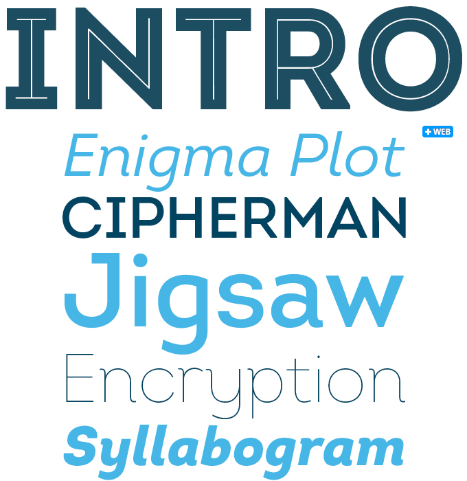
FontFabric’s latest offering is a pleasant variation on familiar themes. The Intro family has elements of several great typefaces of the past few years, from Museo to Pluto; however, its basic structure also rests firmly on designer Svetoslav Simov’s own previous work, such as the Solomon suite. With 26 styles (six weights plus alternates and italics, an inline version and titling caps) the family is a versatile toolkit for large as well as small text in print and on the web. There is little doubt that Intro owed part of its immediate succes to the fabulous introductory price; the best news is that the 80% discount offer has been extended until the end of this month, i.e. May 31, 2012!
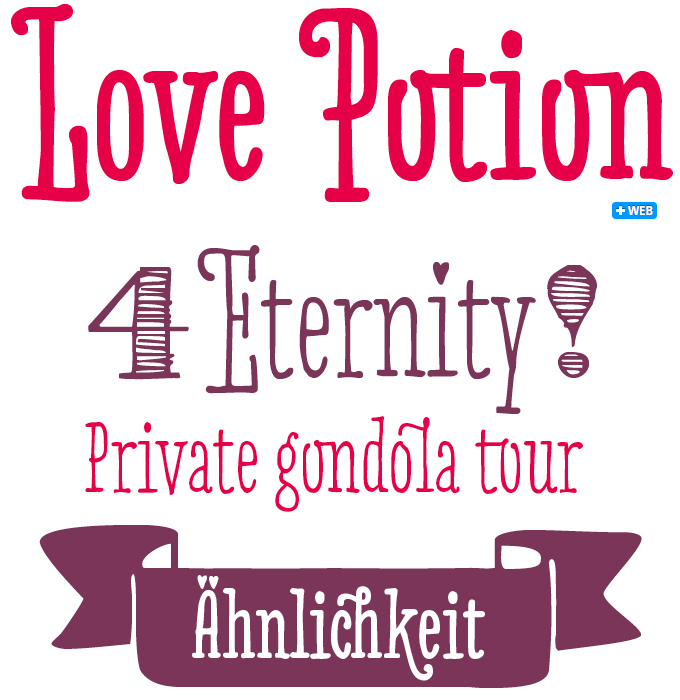
Two things can be said about the successful Love Potion from HVD Fonts. One: A casual glance may give you the impression that designer Hannes von Döhren simply capitalized on the current fashion for skinny, narrow headline fonts with a hand-drawn look. Two: Further examination will tell you that built into this seemingly simple concept are a load of nifty features, including extravagant ligatures, swash letters, catchwords, arrows, borders and other goodies. So just like HVD’s more serious-looking (and seriously named) fonts, Love Potion offers everything needed for professional typography. By the way, with Linotype and ITC fonts back on our site, we now offer even more great families from Hannes von Döhren — check out Quench, Chino, and Klint.
Text families of the month
Text typefaces for demanding editorial work need to possess special qualities: excellent readability, italics and small caps for all weights, multiple figure sets (lining, oldstyle, table) and ample language coverage. In this section of the newsletter you’ll find releases that meet these standards. If you are a web designer considering using any of these typefaces as a web font for body text, test thoroughly!
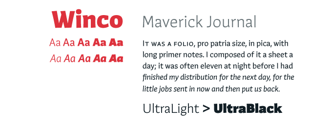
The Winco family was inspired by a style of lettering that was common in British, Dutch and German book covers of the 1950s and 1960s. Their designers produced hand-lettered lettershapes that could be labelled ‘glyphic’ or ‘incise’, i.e. referring to letters cut into stone (think Optima or Pascal). Having studied this work, as well as expressive printing types from German and Czech traditions, Ramiro Espinoza designed Winco from scratch, which allowed him to create an original, typographically consistent and versatile family in five weights. Winco successfully combines the legibility and seriousness of a text face with the dynamism, expressiveness and subtle irreverence of the original hand-rendered alphabets. While not cheap in single weights, the Winco family is quite affordable right now, thanks to a 50% discount (until May 20, 2012).
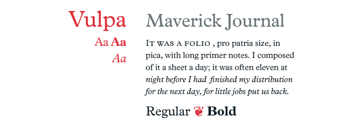
A Text Family of the Month with just two weights, and an italic for the Regular weight only? — you must think we’ve lost it. Well, we haven’t. Sometimes that is all you need, and when the font in question is as charming and seductive as Vulpa, then you might even invent a project especially for it. Vaguely based on the proportions of Plantin, Vulpa successfully combines expressive, whimsical details with a basic structure that makes for perfect readability at text sizes. The OpenType features make Vulpa capable of demanding typographic work; both the regular and bold weights include small caps, while the italic features swash capitals for most letters. All styles include standard ligatures, automatic fractions, proportional and tabular, lining and oldstyle figures. Also check out the Ornament and Drop-Cap fonts.
Follow-Up
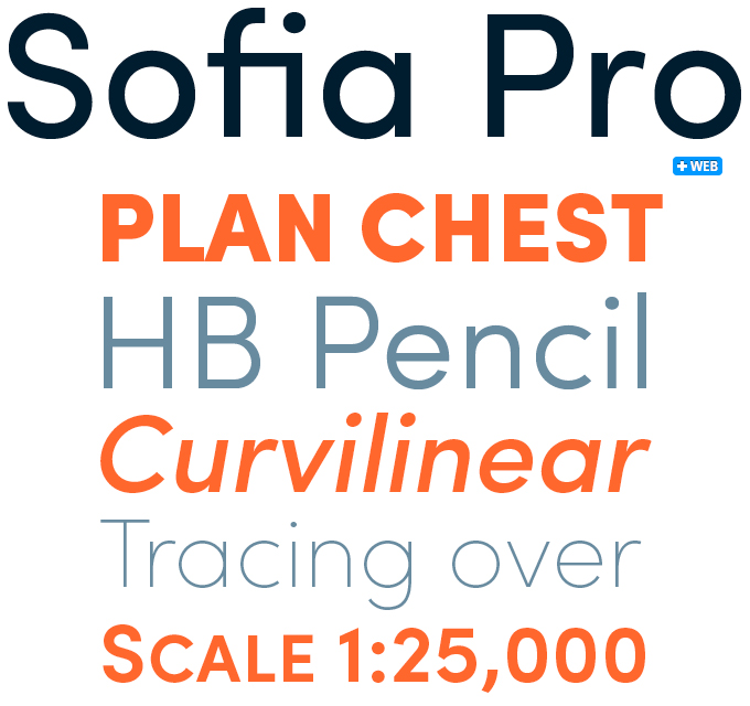
Last month’s text faces have done remarkably well: both Argumentum and Sofia Pro ended up in the Hot New Fonts top five. Mostardesign’s Sofia has done particularly good business, and it is easy to see why: oozing modernism, harmony and roundness, Sofia Pro is a stylish geometric sans for use in body text as well as headlines. It comes with more than 500 glyphs, supporting a wide range of languages, plus small caps, contextual and stylistic alternates, fractions, oldstyle and tabular figures. Sofia Pro comes in eight weights plus matching italics.
If you like this typeface from Mostardesign, check out some of their other fonts:
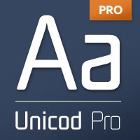
Unicod Pro
Unicod Pro was designed for sectors that need a futuristic touch to their communication — such as media and related businesses. Its square proportions make the design very readable at a wide range of sizes, while its characteristic shapes give it a unique look in headlines, branding and web work.
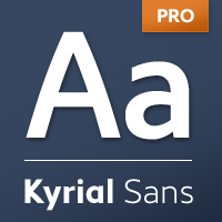
Kyrial Sans Pro
Kyrial Sans Pro, designed by Olivier Gourvat in 2011, has generous proportions in a wide range of weights. This makes it a versatile family for print, text, signage, branding and web design work. Kyrial Sans Pro offers lots of OpenType features and broad language support.
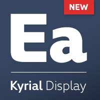
Kyrial Display Pro
Kyrial Display Pro was designed as an expressive extension to the Kyrial family. It is also a practical typographic choice to express strength, elegance, and conceptual clarity. Kyrial offers lots of OpenType features and broad language support.
Sponsored Font: Samantha Pro
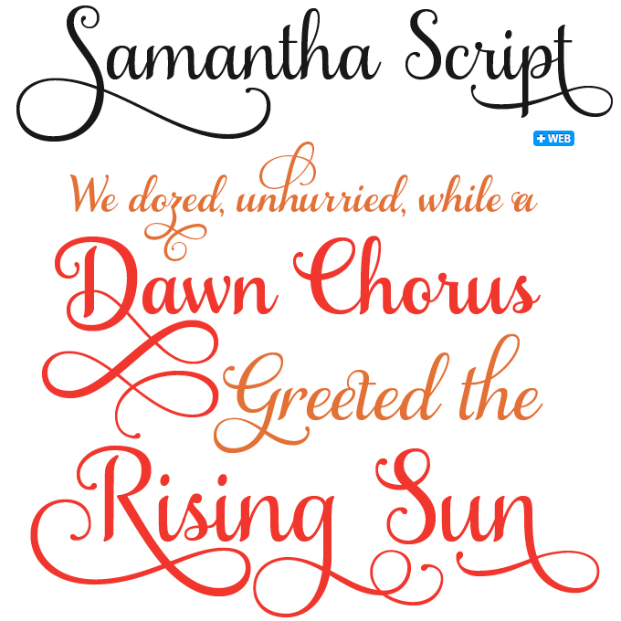
Introduced in August 2011, Laura Worthington’s Samantha Script was already a massive script family, with over 1,100 alternate and swash letters that, among other goodies, featured ascenders and descenders that vary in length and complexity, lively discretionary ligatures, 60 ornaments and 45 catchwords.
Now, with the introduction of the brand new Bold and Bold Italic weights, the versatility of the Samantha Script is multiplied. The new weights are more powerful, and especially useful for occasions where extra emphasis is needed, or when the tastiness of a product needs to be underlined by equally creamy lettershapes. In both weights, the expanded Samantha Script is a gorgeous and very usable connected script in two distinct styles (Upright and Italic), with measured rhythm and contrasting strokes. Samantha possesses a smooth elegance with the ability to take on many appearances, from simple styling to fancy exuberance. A detailed user’s guide PDF is available in the font’s Gallery.
Have your say
—Dominik, Croatia, April 11, 2011
Your opinions matter to us! Feel free to share your thoughts or read other people’s comments at the MyFonts Testimonials page.
MyFonts is on Twitter and Facebook!
Join the MyFonts community on Twitter and Facebook. Tips, news, interesting links, personal favorites and more from MyFonts’ staff.