It’s either/or, this month, on MyFonts’ list of popular new fonts. The crop of successful new typefaces is neatly divided into playful, informal script faces, and cool, clean sans-serifs; not much else in between. Apparently, those are the quintessential typographic tools in this day and age, and who are we to complain? Our foundries offer a wealth of possibilities in both genres, and there is a lot of quality out there. In the elevated realm of typographically sophisticated text faces, there is more nuance, as our selection below shows. Happy browsing to all, and for those professionals who come to TypeCon later this month: we are looking forward to meeting you at our booth!
This month’s Rising Stars
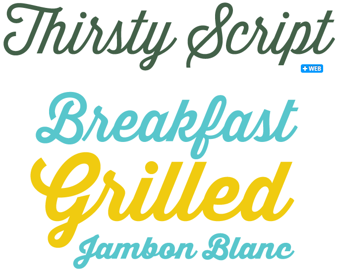
Designer Ryan Martinson of Yellow Design Studio cites an impressive range of typefaces that have influenced Thirsty Script: the font is described as “a marriage of elements from vintage signage scripts, Wisdom Script, Deftone Stylus, Lobster and even Proxima Nova.” The result is a cursive script with a handmade feel. It is friendly with an edge — part retro script, part modern sans serif italic. Unlike the script faces that form its main sources of inspiration (all one-weight fonts), Thirsty Script comes in six weights, from Light to Black. It is typographically sophisticated, with old-style figures, contextual alternates (for a slightly more traditional feel), multiple language support, and a set of alternates and ligatures.
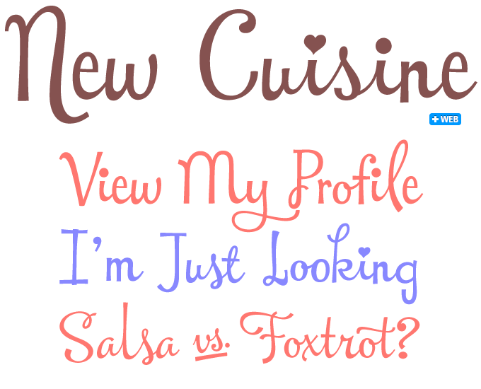
MyFonts offers fonts by many great lettering artists — specialists who excel in crafting headlines and logos, and whose fonts betray their roots in hand-lettering made with a variety of brushes, pens and other instruments. Stephen Rapp is such a specialist, whose many styles of hand-written words grace packaging, book covers, greeting cards and more. New Cuisine is the outcome of personal research into today’s do-it-yourself lettering. The meeting of vernacular styles and the expert hand has resulted in a a joyful-looking script which, in spite of its quirky looks, has clockwork precision under the hood: perfect connections, unique alternates, OpenType programming. Delightful.
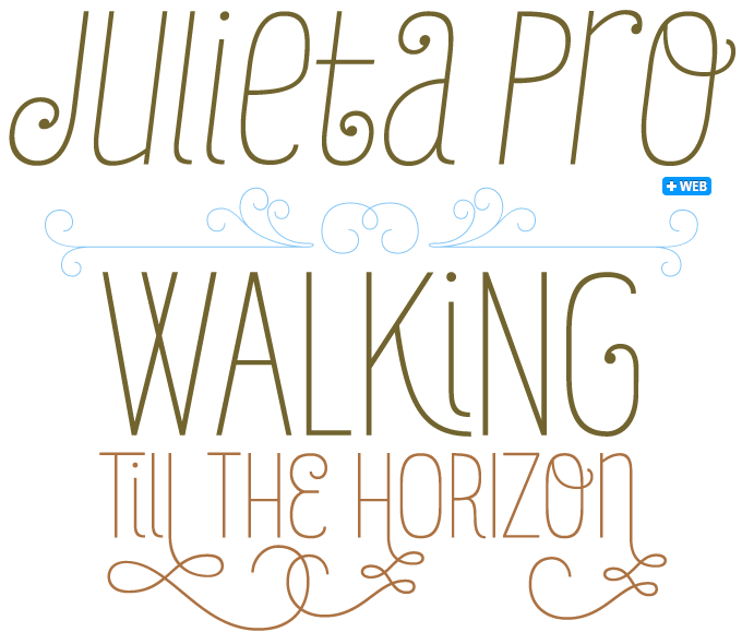
Two font families from Chile’s LatinoType foundry have been doing exceptionally well these past few weeks. Both have women’s names. While Frida is a stylish, clean sans-serif with moderate use of swashes, Julieta by Paula Nazal Selaive takes ornamentation to the extreme. In typographic terms, Julieta is an informal, condensed sans with constant stroke thickness (monoline) and no separate uppercase and lowercase (unicase). But its real character and charm lie in its swashes and flourishes. The posters on the Julieta font page give a good idea of the kind of ornamentation this font makes possible. Julieta Pro comes with a total of 810 glyphs, but if you don’t need all these alternatives, there is the Essential version consisting of 247 characters. In addition, Julieta has an affordable set of ornaments, connectors and catchwords.
Text families of the month
Text typefaces for demanding editorial work need to possess special qualities: excellent readability, a generous range of weights with italics and small caps for all of them, multiple figure sets (lining, oldstyle, table) and ample language coverage. In this section of the newsletter you’ll find recent releases that meet these standards.
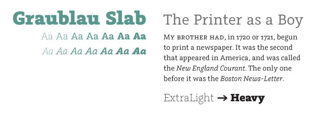
Graublau Slab is the latest addition to Georg Seifert’s popular Graublau family. The original Graublau is a versatile, crystal-clear sans-serif with humanist overtones. It does a great job in a wide range of graphic projects, including signage and corporate design, and design for the screen. The new Graublau Slab is a welcome addition, especially for those who produce editorial projects that require multiple typefaces to establish hierarchy and articulation. Graublau Slab has the same structure and weights as the Graublau mothership, yet has a clearly different character: the ideal match.
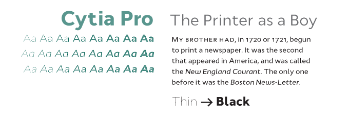
Organizations that operate across Europe need fonts with ample language coverage that include Cyrillic (Russian, Bulgarian, etc.) and Greek. It is not always easy to find a typeface with the right personality that offers both, as well as small caps and a good choice of numerals. Cytia Pro from Mint Type in Kiev has the lot — a modern, geometric sans in eight weights. For italics it offers both a slanted roman and “real” italics, wrapped in OpenType Stylistic Alternates or Stylistic Set 02.
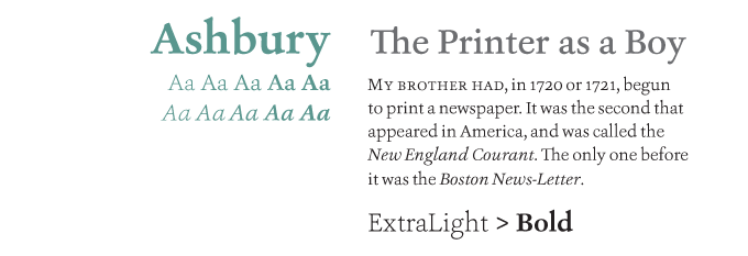
After a series of original text typefaces with simple structures and clean detailing, designer Dieter Hofrichter now presents a family with a more historical feel. Ashbury derives its inspiration from eighteenth-century transitional types such as Caslon and Baskerville. Far from being another revival, it interprets these formal aspects in a new and individual way. Its flowing outlines give it a warm and pleasant personality; its solid strokes lend it strength and expressiveness. With five weights plus italics, small caps, swash capitals and a wide range of figure styles, Ashbury is well equipped for ambitious typographic projects.
Follow-Up
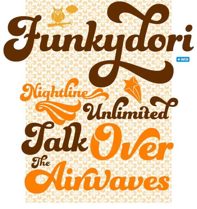
For those familiar with Laura Worthington’s elegant scripts, the soulful Seventies font Funkydori must have been something of a surprise — and proof of the designer’s versatility. Funkydori perfectly captures the groovy atmosphere of the era, and has found many far out friends in the two months since it came out. Equipped with 213 alternates, thirteen discretionary ligatures and 38 ornaments, the font allows for a wide variety of variations within its familiar-looking idiom.
If you like this typeface from Laura Worthington, check out some of her other fonts:
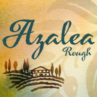
Azalea Rough
Laura Worthington’s new Azalea family has a glimmer of the exotic, a touch of the unusual. Azalea Rough has a rustic, organic feel with a distinct irregularity to the letters. It features an alternate set that is slightly more casual than the standard set.
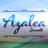
Azalea Smooth
Azalea Smooth is the sleeker variant of Worthington’s new Azalea family of big, fancy, flourishing letters. The clean lines of Azalea Smooth accentuate its jaunty, angular letterforms, giving it a modern look.

Honey Bee
Honey Bee is a casual all-caps typeface with the look and feel of handwriting. It features ninety alternate characters, including a set of uppercase and lowercase letters with standard serifs. The font comes with twenty ornaments in the same informal style.
Sponsored Font: Parfumerie Script
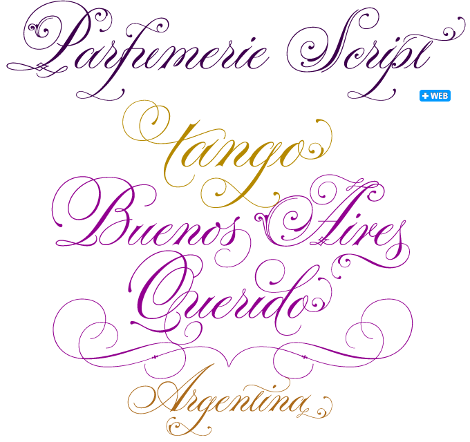
Parfumerie Script from Typesenses is an elegant connected script packed with hundreds of alternates. Based on the calligraphy of its designer, Argentinian Sabrina Lopez, Parfumerie Script offers lush curves and the finest of swashes. It comes with a special set in a unique local style: an ornamental form native to Buenos Aires, called “Filete Portenio", which is what the Decorative option stands for. All this and more is contained in the Pro Version — over 2,500 glyphs in a single font. If your software is not fully OpenType-compatible, choose the Decorative, Curly, Text and other varieties, which offer specific sections of Parfumerie’s huge set of options. Parfumerie Script was selected in the Tipos Latinos 2012 Latin American type design competition as one of the best display fonts.
Have your say
— Peter G from Columbus, OH, June 16, 2011
Your opinions matter to us! Feel free to share your thoughts or read other people’s comments at the MyFonts Testimonials page.
MyFonts is on Twitter and Facebook!
Join the MyFonts community on Twitter and Facebook. Tips, news, interesting links, personal favorites and more from MyFonts’ staff.