We partly wrote this newsletter in Milwaukee, where the MyFonts team has enjoyed a few days of intensive networking and font-tasting during TypeCon, the international conference organized by the North-American Society of Typographic Aficionados. Not only does this yearly get-together allow us to connect with a growing number of foundries and type designers, it’s also an occasion for the MyFonts team, usually divided by the Atlantic Ocean, to meet up and brainstorm about the future.
Meanwhile, we present the most successful new typefaces of the past month, as well as a selection of interesting text faces for extensive body text settings. Attention impulse buyers: many of these fonts are available at a temporary discount — some almost too good to be true.
This month’s Rising Stars
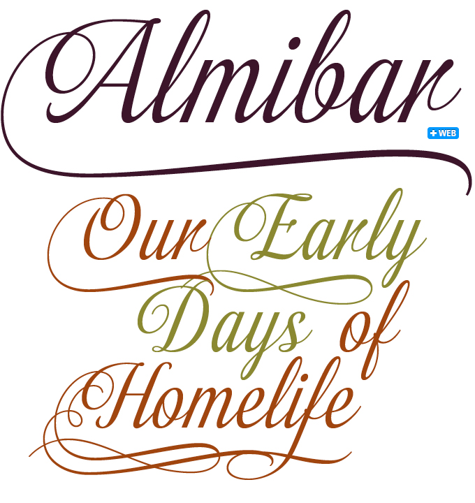
Based in Bogotá, Colombia, designer Manuel Eduardo Corradine has released a string of script typefaces in a broad range of styles, from witty handwriting fonts to ornamented formal scripts. Almibar is possibly his most sophisticated typeface to date. It comes with a huge set of alternate characters, including dozens of classy, doubly-swashed decorative caps. A quick look at the glyph page of the Pro version will give you a good impression of the kind of goodies Almibar has to offer. If you’re not intending to use applications with full OpenType functionality, don’t choose Almibar Pro, but take the regular Almibar instead, adding Swash1 or Swash2 — or both — for decorative purposes.
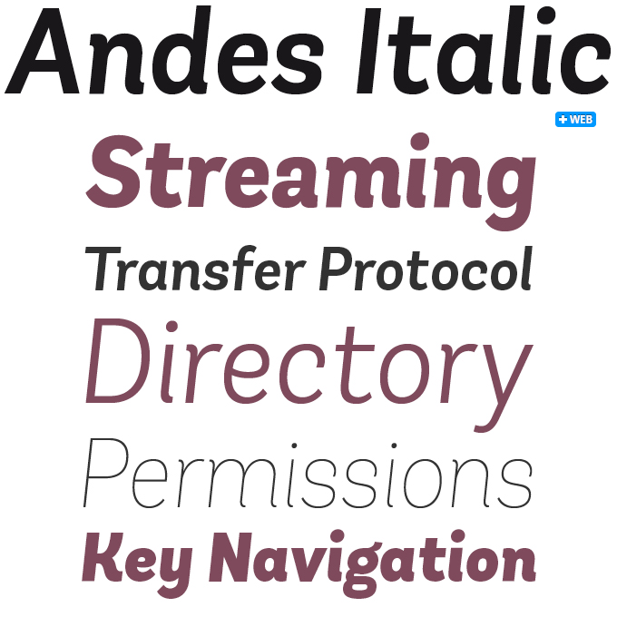
When we interviewed designer Daniel Hernández in January, his Andes family had just come out. It’s had a remarkably successful career since. An extension to the delicate Merced, Andes is a display and text face full of character that up to now had one big disadvantage: it had no italic. Andes Italic fills that gap, and it does so beautifully. It is not merely a slanted version of the the upright, but adds extra calligraphic flow to the family DNA. With the addition of the italic, Andes is now a fully-fledged type family of 10 weights of uprights, italics and condensed fonts, ranging from Ultra Light to Black. Andes Italic contains a small set of alternative glyphs (a, y, z, g) that allow you to personalize headlines and logos. Note that the introductory offer is about to end! (until Aug. 11, 2012) See also the brand new Andes Condensed.
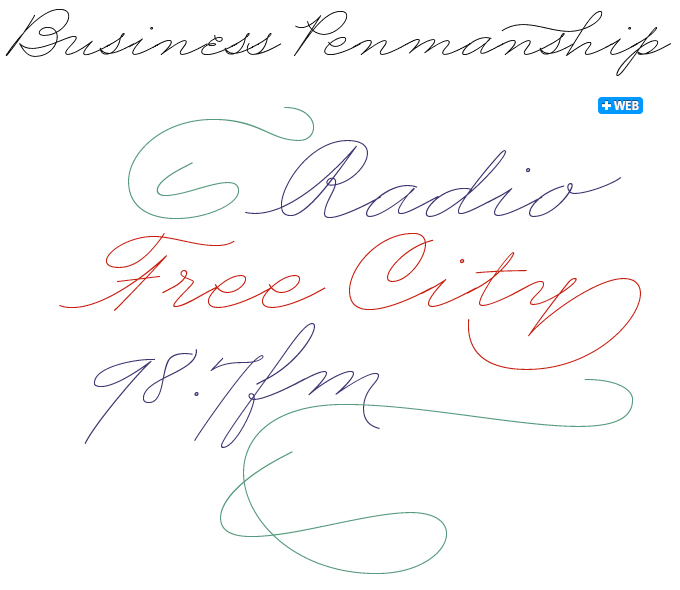
Alejandro Paul of Sudtipos continues to surprise with his elaborate script fonts based on historical models. Business Penmanship is an ode to the business handwriting of an era when elegant writing was a highly valued aspect of business education and practice. Throughout the 1800s and early 1900s, American writing masters and educators, from Spencer to Zaner to Palmer, strived to provide models for better writing. Tapping into that unique American tradition, Business Penmanship references models that are the apogee of elegance and subtlety, offering ultra-fine, monolinear strokes that need to be used at large sizes to reveal their full power. It is a feature-rich single font that includes over 1200 characters, covering ligatures, alternates, a large set of beginning and ending extensions, and ample language coverage. To take advantage of all the OpenType features included in the font, please use programs that support such advanced typography.
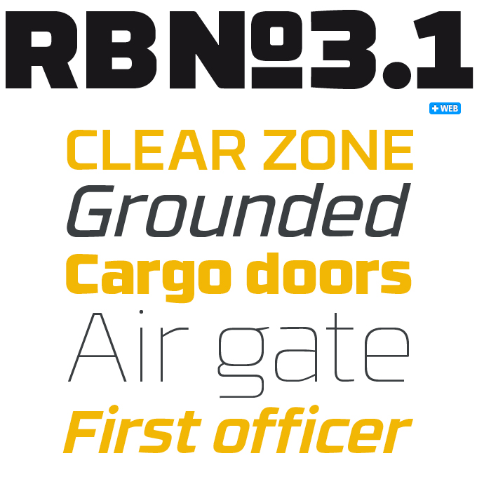
RBno.3.1 is a new sans-serif in the squarish geometric genre that includes such popular typefaces as Klavika and Geogrotesque. Designer Rene Bieder has opted for a radically technical approach (reflected in its unusual name), using a clean construction of straight lines and circular parts. This does not imply that RBNo3.1 is strictly monolinear: in the medium and bolder weights, the horizontal strokes are not of constant thickness, but have visibly tapered endings (see a, c, e, s, and more). This design element lends the family some extra elegance and dynamism. The family comes in nine weights with matching italics. Its large x-height makes it especially legible at small point sizes. Please note that the fantastic introduction offer — one of the secrets of its success — ends on Aug. 28, 2012!
Text families of the month
Text typefaces for demanding editorial work need to possess special qualities: excellent readability, a generous range of weights with italics and small caps, multiple figure sets (lining, oldstyle, table) and ample language coverage. In this section you’ll find recent releases that meet these standards. Exceptionally we may include a family — as we’ve done this month — that is not as extensive, but is interesting and useful for other reasons. (For those who’ve wondered: our specimen texts for this section are taken from Benjamin Franklin’s autobiography.)
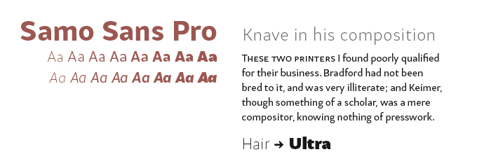
With Samo Sans, designer Samuel Čarnoký found a fine balance between the dynamism of a humanist sans and the technical precision of industrial sans-serifs. The new Samo Sans Pro offers a lot more than the original family: eight weights plus italics, ample language coverage (including Cyrillic and Greek!), small capitals, alternates and special ligatures, a wide range of figure sets, arrows, dingbats and more. The wonderfully balanced family is a versatile tool for book and magazine design, international corporate identities and financial publications. At the current introductory price (until Sept. 5, 2012), adding the complete family to your typographic palette is probably a wise investment.
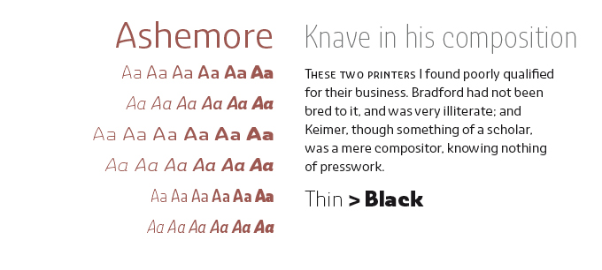
With its subtle references to early 20th-century lettering and display type, Ashemore from insigne looks almost too fancy for a text face. Yet its standard width (it also has Condensed and Extended varieties) works well in longer body text settings. Quirks such as the bent strokes on the capitals and the Popeye-like arm on the lowercase k blend nicely into the overall harmonious text image. Equipped with small caps and multiple numeral sets, the family offers the features needed for complex typography. The wide and narrow versions — all in six weights plus italics — allow for a wide array of display styles. Check out the fantastic introductory offer (through Aug. 24th, 2012).
Follow-Up
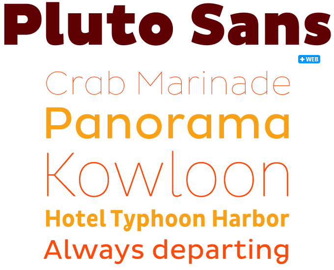
Pluto Sans is a companion to Pluto, last year’s absolute best-seller. While the original Pluto isn’t exactly a serif typeface, it does have bent terminals and other somewhat eccentric details that make it less than ideal for longer text settings. Pluto Sans solves that problem. Its straight strokes and simple forms make it a perfect typeface for body texts in smaller sizes and for usage on screens. And just like its older brother, Pluto Sans is a hit.
If you like this typeface from HVD Fonts, check out some of their other fonts:
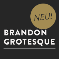
Brandon Grotesque
With Brandon Grotesque Hannes von Döhren took a fresh look at the geometric modernist classics from early twentieth-century Germany. The geometric shapes of the compass and ruler were optically corrected for better legibility and harmony. The rounded corners lend the typeface a softer look.

Love Potion
Behind Love Potion’s seemingly simple concept are a load of nifty features, including extravagant ligatures, swash letters, catchwords, arrows, borders and other goodies. Just like HVD’s more serious-looking fonts, Love Potion offers everything needed for professional typography.
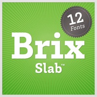
Brix Slab
Typefaces, we have been taught, are the building blocks of graphic design; and Brix Slab offers building material of a particularly robust calibre. Brix Slab and Brix Slab Condensed form an extended family of 24 fonts, optimized for longer texts and highly readable in small sizes.
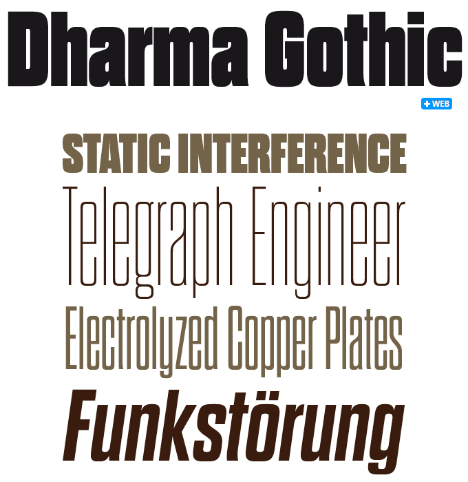
Sponsored Font: Dharma Gothic
Have your say
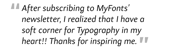
— Sonusmac, June 18, 2012
Your opinions matter to us! Feel free to share your thoughts or read other people’s comments at the MyFonts Testimonials page.
MyFonts is on Twitter and Facebook!
Join the MyFonts community on Twitter and Facebook. Tips, news, interesting links, personal favorites and more from MyFonts’ staff.