With Christmas only days away, we can’t help looking back at this remarkable year. One of the biggest changes in typography, of course, is webfonts. More and more websites look and work so much better now, being designed with great new typefaces instead of system fonts or type made into GIFs. Web designers can now order most of our new fonts as webfonts. The biggest news: since last week, our collection of webfonts includes thousands of classic and contemporary families from Monotype, Linotype and ITC. Meanwhile, here are some of last month’s most successful new typefaces from independent foundries — a varied and enticing bunch.
Happy holidays from the MyFonts team!
This month’s Rising Stars
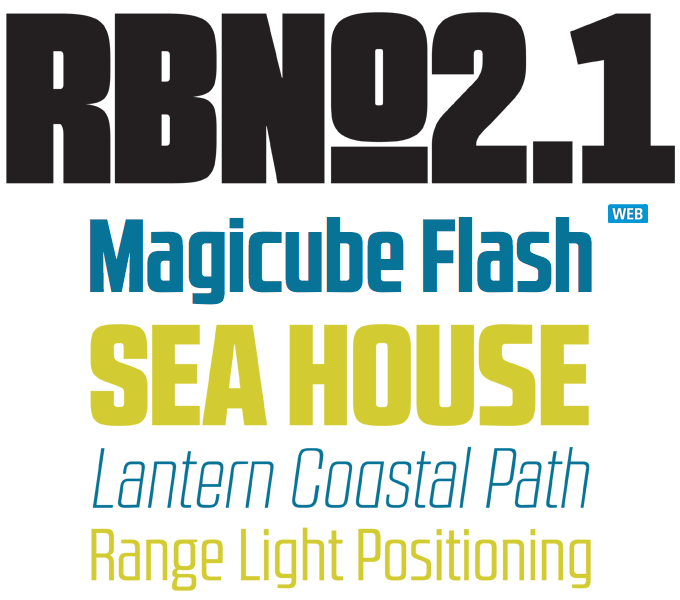
Designer Rene Bieder has found a simple solution to the increasingly delicate issue of naming fonts. Instead of inventing fanciful associative monikers, he figured his initials and a serial number should do. The designs of the two families he has released so far are equally down-to-earth. RBNo.2.1 — the number 1 on our Hot New Fonts list at the time of this writing — conveys a sense of technical dryness and geometric precision. Yet, just like geometric display lettering from the mid-twentieth century, its simple shapes build powerful, expressive headlines. The family comes in two versions (RBNo2.1a and RBNo2.1b) and has 7 weights with matching italics and several alternate shapes.
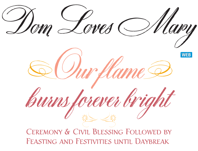
Correspondence Ink is a collaboration between lettering artist and illustrator Debi Sementelli and experienced type designer Brian Bonislawsky. Dom Loves Mary is the follow-up to their first effort Belluccia — one of last year’s most successful script fonts. The recipe is somewhat similar: based on hand-lettering, the script serves up classic shapes with a rough outline. Thanks to its many alternate shapes, creating a convincing imitation of hand-made lettering is a breeze. You don’t need OpenType software to get access to the special versions of each letter. Users can choose to acquire the all-in-one Pro version with 1000+ glyphs, or get one or more styles as single fonts. Moreover, the family comes with several sets of flourishes and catchwords, as well as a compatible set of caps for simpler text settings. Check out the the font family page to get the details (click “More…”)
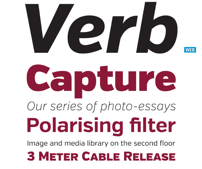
The number of multi-purpose, clean sans-serif type families published recently is staggering. Some look bland or unemotional, some go for a huggable round appearance to suggest warmth. Verb from Yellow Design Studio takes the third road: it is friendly and approachable, but not too busy being sociable to get things done. With open shapes and round italics, it is legible in the smallest of text sizes; used in large displays, it reveals lively shapes and personality. True italics, small caps, oldstyle and tabular numerals and extensive language support make Verb a fine solution for demanding editorial use. Try out Verb Black for free!
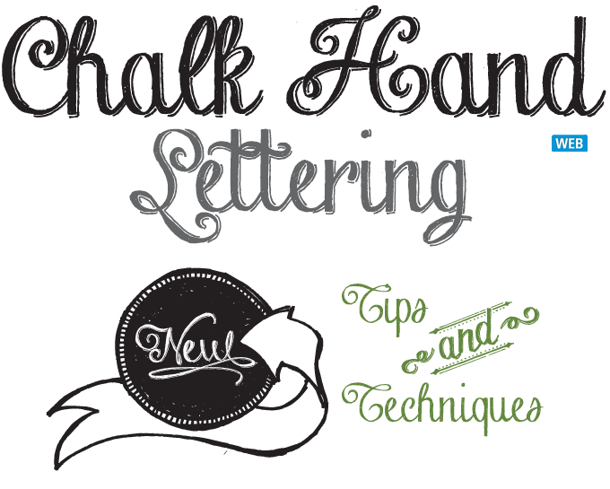
Chalk on blackboards has been the teacher’s default communication medium for ages. On a more sophisticated level, traditional pubs use elegant lettering on slate to announce the day’s menu. Lately, the lovely work by Brooklyn’s Dana Tanamachi and other writing masters has triggered a new fashion in chalk lettering. For those who want to create the effect but lack the skills, Chalk Hand Lettering from Fontscafe may come in handy. While not nearly as refined as the stunning letterforms devised by Tanamachi and her peers, the font gives a nice impression of a deliberately naive script done on a blackboard, with or without shading. It comes with a versatile “Elements” set of keywords, banners and ornaments.
Text Families of the Month
Only months ago, we sometimes had trouble filling this section: new, original typefaces equipped for demanding editorial work don’t exactly grow on trees. But more and more type designers devote themselves to the painstaking task of crafting fonts for excellent readability, typographic subtlety and linguistic sophistication. The three excellent families below are but a selection of the excellent text fonts we received lately. Check out this album to discover more.
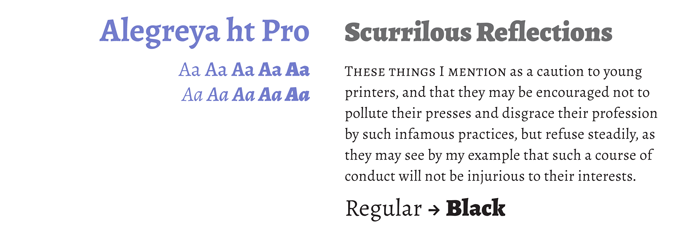
Huerta Tipográfica is a young foundry from Buenos Aires. Their elegant text face Alegreya ht Pro has won them an impressive series of awards. Designed in the vein of great renaissance book faces, it combines classic proportions with crisp, contemporary detailing, making it one of the freshest new families for literary texts — and more.
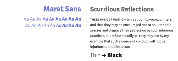
Marat Sans by Ludwig Übele is the brand new sans-serif companion to that designer’s Marat Pro, one of the most original text faces of the past decade. While harmonizing well with its older brother and following roughly the same skeleton, the sans-serif also contributes a very different vibe to the family. When combined, the possibilities are endless: bilingual texts, financial publications, improving contrast and navigation in editorial projects.
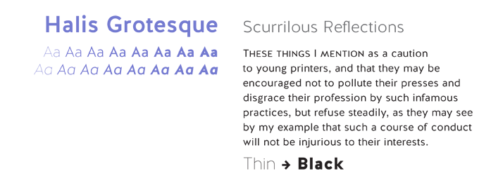
Stylistically, Halis Grotesque from Turkish designer Ahmet Altun sits somewhere between the subtle nostalgia of Brandon Grotesque and the modernist overtones of Avenir: a functional text family with Art Deco elements. It is designed for legibility, and is very well-equipped: it comes in eight weights plus italics, has small caps for romans and italics, and multiple figure sets. The small caps are accommodated in separate fonts, making their use in web typography even easier.
Text Family Follow-Up
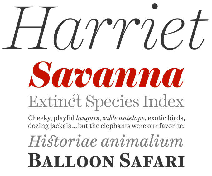
in our Text Font section. It’s an impressive family — a contemporary reinterpretation of the serif text faces popular in mid-20th-century America and Britain — and it’s been doing very well these past few weeks. It is easy to see why. The display styles give it plenty of oomph to build striking headlines, while the unobtrusive, sturdy design of the text styles makes it a true workhorse. Harriet, no doubt, is a keeper.
News Round-Up
In this section we pick out interesting news snippets from MyFonts’ own kitchen and from the greater world of fonts, lettering and typography.
Pencil to Pixel
Photo: Creative Clerkenwell
One of the most talked-about typographic events of the past few months was Pencil to Pixel at London’s Metropolitan Wharf. For the first time, Monotype UK opened its legendary archives, treating typography lovers to a rich selection of its treasures — from original type designs by Eric Gill to rare type samples, tools, matrices and much more. It wasn’t just a historical affair — taking the viewer through a century of rapid technological changes, the exhibition also discussed the future of type in the digital age. An issue of Eye Magazine was devoted to Monotype’s unique heritage. The exhibition only ran for a short period, but there will be a follow-up. “Yes, it will travel,” says its curator, Monotype’s UK Type Director Dan Rhatigan (pictured above). We’ll keep you posted.
Codex issue 2: Raising the bar
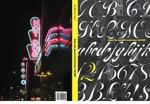
People have been predicting the “end of print” for decades, but there still seems to be a healthy market for well-made printed design magazines. Codex is a case in point: a paper publication that grew out of a popular blog, Codex reverses the current trend. The blog is ilovetypography.com and its founder John Boardley also edits Codex, helped by a handful of internationally known type specialists, including co-editor Paul Shaw. Amazingly, the entire run of 4,200 copies of Codex #1 is already sold out. Issue #2 is now ready, and it “sets the bar even higher” with contributions on the likes of Massimo Vignelli, Alan Fletcher and Oldřich Menhart, and an article about multi-lingual typefaces from David Březina of our own Rosetta foundry. The magazine now offers annual subscription.
Sponsored Font: Lust from Positype
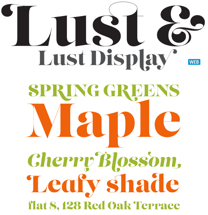
Designer Neil Summerour describes Lust as an “indulgent attempt to infuse wanton sensuality in a typeface.” Navigating between the looseness of his scripts Fugu and Nori on one end of the spectrum and the deliberate rigidity of sans-serifs like Aaux Next on the other, Summerour chose to go for a curvy serif. To create a “lusty” typeface, he felt he needed “…almost demure, coy contrast, mixed with the flowing curves of a woman’s body, incomplete, almost teasing ball terminals, and serifs that went on forever — so sharp they would draw blood if you touched them.” The result is a seductive display face that needs a generous body size and room to breathe; this is especially true for the Display version, with extra contrast and hairlines so tense you could slice cake with them. Lust is packed with alternates to play with — OpenType features and the Glyph palette give access to endless variations of Stylistic, Contextual, Titling, Historical and Swash alternates.
Have your say
@BenDayhoe on Twitter, December 11, 2012
MyFonts is on Twitter and Facebook!
Your opinions matter to us! Join the MyFonts community on Twitter and Facebook, and feel free to share your thoughts or read other people’s comments. Plus, get tips, news, interesting links, personal favorites and more from MyFonts’ staff.