Rational yet friendly: such is the personality of many a typeface today. Many of the fonts featured in this newsletter are the result of the somewhat paradoxical fusion of geometrical shapes — constructed with circles and straight lines — and just enough likable detailing to steer clear of rigidity and iciness. Which is just as well at this chilly time of year, as millions of us in the Northern hemisphere crave silver linings, bluebells and blossoms, and the warm yet sensible curves of well-crafted type.
This month’s Rising Stars
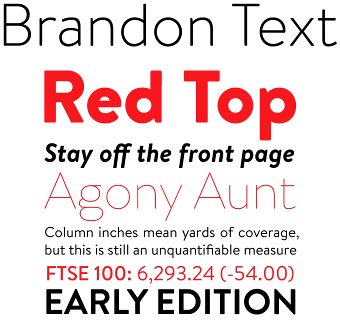
Released thee years ago, Brandon Grotesque was the first blockbuster from Berlin’s HVD Fonts — a decisive moment in the career of type designer Hannes von Döhren. The family has remained wildly popular to this day, lending a touch of Art Deco charisma to hundreds of websites, books and magazines the world over. But with its long extenders and small x-height, it’s not ideal for long text and immersive reading. This is where the new Brandon Text comes to the rescue. With its generous x-height and rational shapes, it is optimized for long settings and small sizes. It is manually hinted and optimized for screens, so it is also an excellent choice for websites.
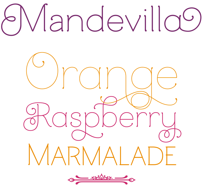
It’s been a while since we welcomed a new typeface by Laura Worthington in this newsletter. Not that she’s been idle — her output is constant, and consistently excellent (check out the recent Gioviale) but competition in the script sector, her specialty, is fierce. Her biggest hit in a while, Mandevilla, is quite a different beast: neither script nor constructed display font (but with bits of both) Mandevilla is reminiscent of those early 1900s typefaces based on monolinear writing with a round-tipped pen. Its tiny ball terminals lend it some extra zing, and the swashes, when used with moderation, are attractive and fun without being kitschy. Swashes, alternates and a set of plainer, slightly smaller capitals, can be used with OpenType capable software. The font deservedly bubbled up to the highest regions of our Hot New Fonts list and is sure to stay up there for some time.
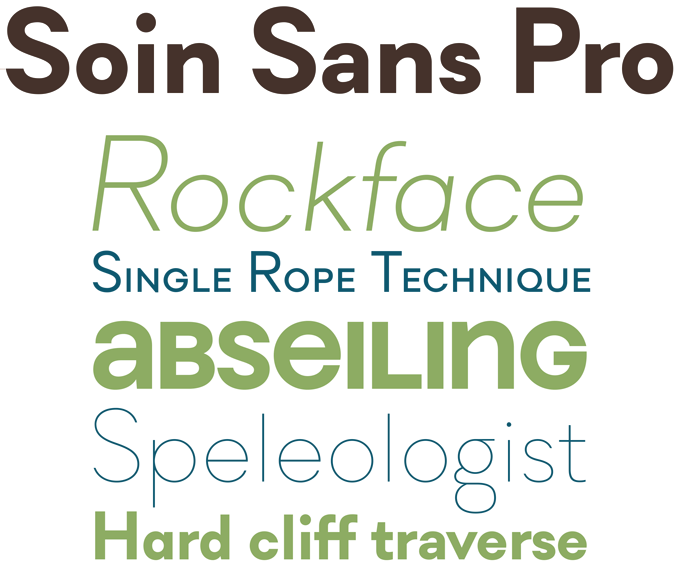
Soin Sans Pro is one of those type families that consciously follows a trend, yet has enough personality to offer subtly different color to the typographic palette. The roots of Soin Sans are somewhere between the geometry of Kabel and Avant Garde Gothic, and the more humanist 19th-century forerunners of Helvetica and its contemporaries. With small caps and multiple figure sets, Soin Sans Pro is well-equipped for demanding typography. It is the biggest success so far from Stawix Ruecha’s Bangkok microfoundry, helped by a fantastic 90% introductory discount (valid until February 25, 2013).
Text families of the month
Text typefaces for demanding editorial work need to possess special qualities: excellent readability, a generous range of weights with italics and small caps for all of them, multiple figure sets (lining, oldstyle, tabular) and ample language coverage. In this section of the newsletter you’ll find recent releases that meet these standards.
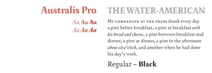
Australis Pro from Latinotype has a long history. It won first prize in the Morisawa Type Design Competition in 2002. It took its designer Francisco Gálvez Pizarro another decade to complete this small family, packed as it is with useful features for the most demanding typographers. Its regular weight includes a set of incised titling capitals.
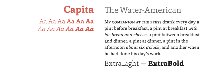
Hoftype’s Dieter Hofrichter is such a regular of this section that he almost has his own reserved parking spot. His latest, Capita, is a softer, warmer take on the slab serif genre and, much like its stablemate Cassia or Jan Fromm’s Rooney, is a good choice for projects that need a friendlier touch. By now, it should go without saying that this is a superbly equipped font with everything required for expert typography.
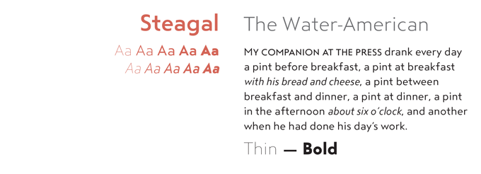
Steagal is American foundry insigne’s successful attempt at an American-flavored geometric sans, pulling together elements of Futura and Morris Fuller Benton’s Eagle. Steagal’s feature set will satisfy the demands of sophisticated typesetting projects, offering not only the expected small caps and various figure types, but plenty of alternative characters, a monospaced variant and a rough version that recalls American vernacular signpainters’ least-polished lettering.
News Round-Up
In this section we pick out interesting news snippets from MyFonts’ own kitchen and from the greater world of fonts, lettering and typography.
Typecast: Typographic bliss, in the browser
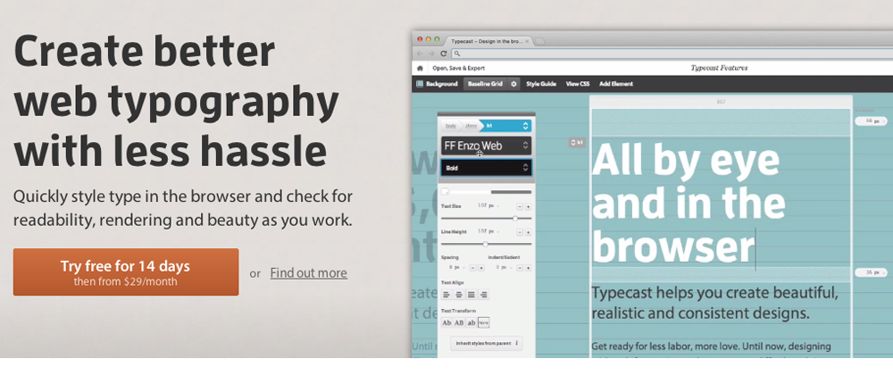
Web designers have all experienced that stressful moment when the client first views a new website in the browser. In that first test run, typography often looks painfully different from the clean Photoshop mockups that sold the design in the first place. Unhappy with the available tools, a bunch of Belfast-based designers and coders created Typecast, arguably the smartest tool available for viewing web typography in the browser while making the design decisions. Having started public beta-testing in October 2012, they were acquired weeks later by MyFonts’ mother company, Monotype, and are now ready to open their doors to the wider web design community. Take the service for a test drive by signing up for a free trial.
Rising Stars: Webfonts Edition
Since we’re on the topic of web typography, take a look at this month’s Rising Stars selection set using webfonts. Each month we create versions of the samples for this newsletter using @font-face CSS and HTML, and while some fonts translate to the web better than others, it’s our aim to show that with a little tinkering and experimentation, there’re always interesting possibilities. We hope there’s something here to inspire you to try your hand at some web typography!
We’re now on Tumblr!
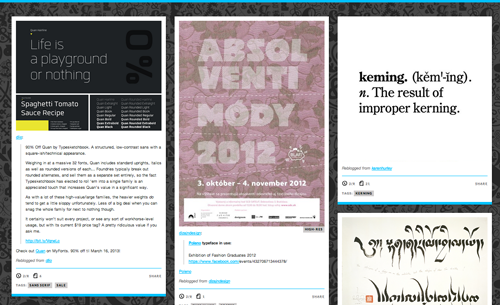
MyFonts has finally made it onto Tumblr, go check it out for some excellent typographic inspiration.
Sponsored Font: Rama Gothic
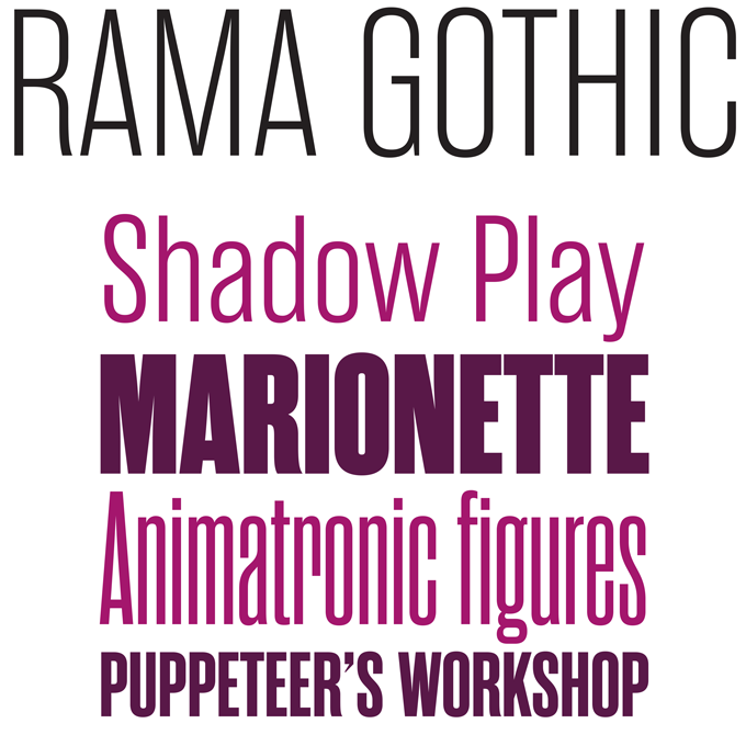
Condensed and compressed gothic faces with a nineteenth-century flair have experienced a kind of second (or third) life lately. Delivering maximum impact using minimal horizontal space, these headline faces are a popular design element on posters, in magazine headlines and information graphics. Rama Gothic from Flat-It is a recent and extremely useful addition to the genre. Combining a nostalgic retro feel with modern flexibility, it offers 18 styles — three widths in six weights — for designing dense yet lively typographic constructions. For greater variety, there is also a serif version, Rama Slab. To complement the powerful typography made with Rama, Flat-It offers a series of ornaments, borders and frames called Gothic Extras, a family inspired by a nineteenth-century catalogue of the famous Hamilton Wood Type factory. The best news: Gothic Extras is offered free of charge!
Have your say
Luke Henley (@and_luke) on Twitter, January 21, 2013
MyFonts is on Twitter and Facebook!
Your opinions matter to us! Join the MyFonts community on Twitter and Facebook, and feel free to share your thoughts or read other people’s comments. Plus, get tips, news, interesting links, personal favorites and more from MyFonts’ staff.