If form follows function in architecture and product design, as Louis H. Sullivan famously wrote, one wonders if this is true for type design as well. It could be argued that type is more like fashion: each season (they last somewhat longer in type) has its trendy silhouettes and popular textures. The fancier the shapes, the higher the probability that functionality will be limited. But there’s also the work wear sector — more matter-of-fact, less volatile, yet with its own subtly changing trends and colors. Does this mean that in the type world form also follows function, or is it perhaps the other way around? One thing is certain: this month’s Rising Stars won’t give you an answer to pretentious questions like that.
This month’s Rising Stars
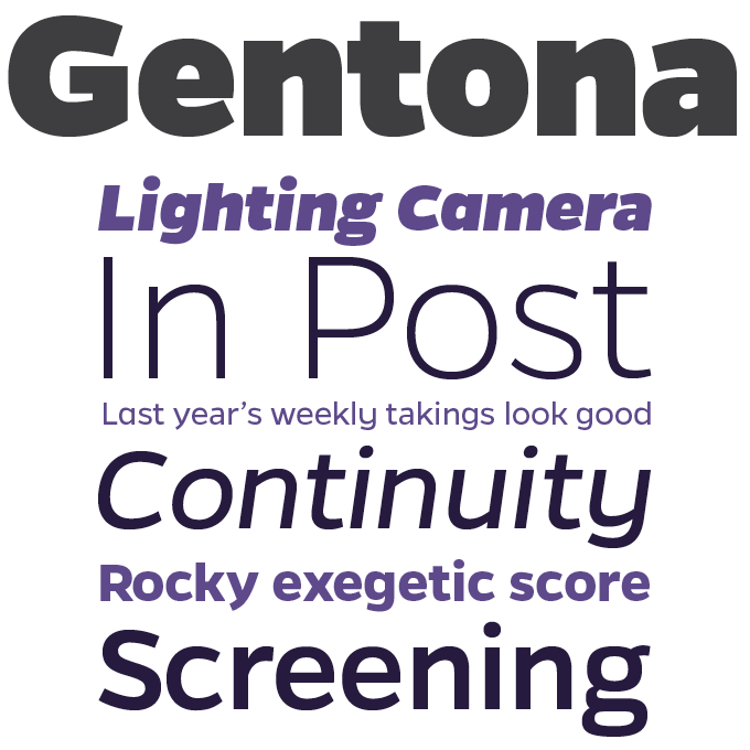
Rene Bieder’s Gentona, the fourth font family from this Berlin-based designer, is probably his most sophisticated to date. The somewhat rigid shapes of RBNo2.1, RBNo3.1 and Quadon have given way to more fluid and natural curves, although the overall impression remains one of efficiency and neutrality. The nine-weight neo-grotesque family offers a wealth of possibilities: the middle weights build lucid body texts; the sharp-cut light weights and the muscle-bound heavy styles make for confident headlines. A wide range of typographic features round off the family. Gentona is offered at an 80% introductory discount through August 24, 2013.
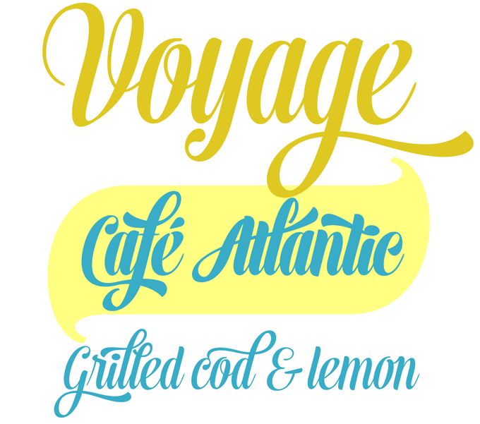
Voyage is the latest connected script from Fenotype’s Emil Karl Bertell. Smooth and attractive, it comes in two weights, with companion ornament sets. With its high contrast, brush script verve and feisty swashes, it offers endless possibilities for customized letter combinations — in headlines, logos, and on packaging. The many alternates are best activated in OpenType-aware programs, using a wide array of functions: Swash, Contextual, Stylistic or Titling Alternates, and Discretionary Ligatures. Combine Voyage with Voyage Ornaments to complete your designs. For the best price purchase the Complete Voyage Family. All weights are 35% off until August 30, 2013.
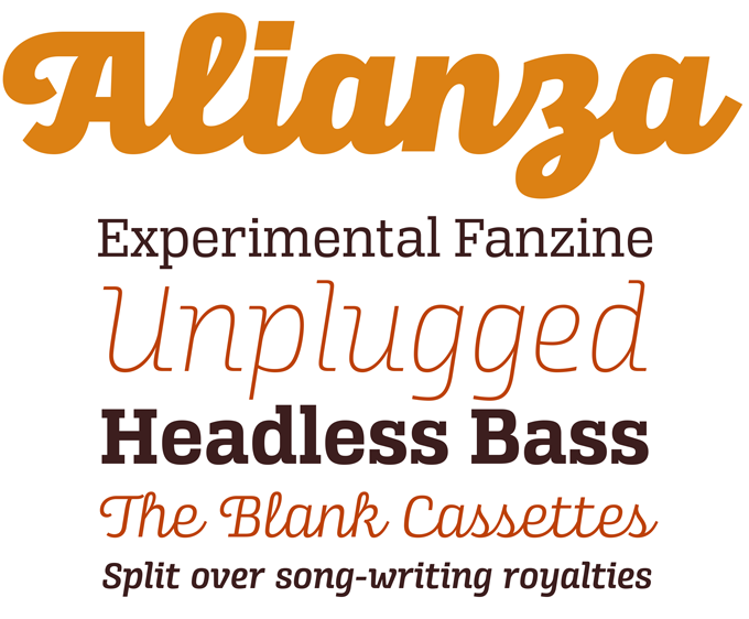
Alianza from Corradine Fonts represents an interesting take on the concept of the type family. It is basically a slab serif with an accompanying italic, but its rather unique character lies in the third part of the family — a compatible connected script. What makes Alianza Script particularly notable is that, just like the other two sub-families, it comes in nine weights, from 100 (thin) to 900 (ultra black). This will allow for interesting experiments in combining the three variants across a complex editorial project. Each style has a professional selection of figure sets — proportional lining, tabular lining and old style. Three non-alphabet sets complete the family: Ornaments, Labels, and Negative Labels.
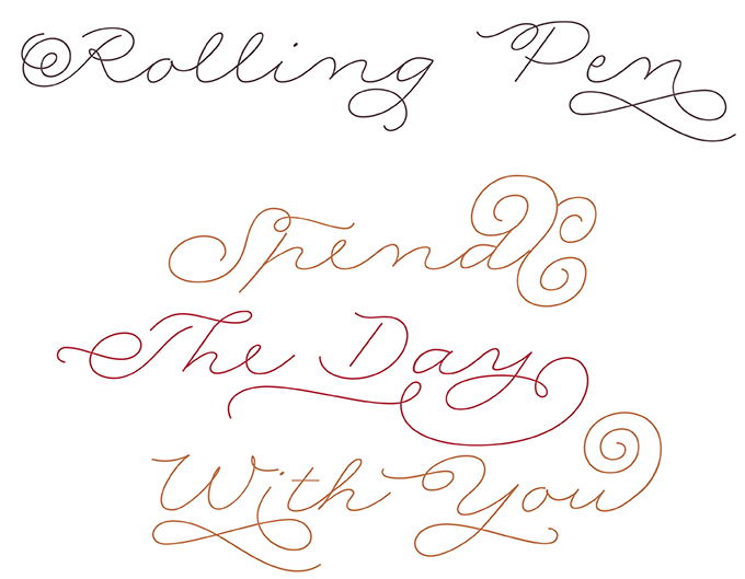
Rolling Pen is the latest offering from Ale Paul at Sudtipos, probably the most popular supplier of exuberant script fonts today. In his accompanying text, Paul outlines the various contemplations that led to the creation of this curly monoline hybrid. The model that provided the cue for Rolling Pen is a circular, roll-flowing calligraphic style from the late nineteenth century, characterized by smoothly rounded endings. It’s the kind of script that seems to be a typical child of the digital age — and yet precedes it by a century. Like the similar style that inspired Paul’s earlier Business Penmanship font, this kind of writing was devised for business correspondence, not for the kind of festive occasions that fonts like this evoke today. To further demonstrate how a typeface’s use may deviate from its original function, Paul commissioned a series of visual poetry pieces from artist Tomás García — nineteenth-century writing in neon tubes. Splendid.
Text families of the month
Text typefaces for demanding editorial work need to possess special qualities: excellent readability, a generous range of weights with italics and small caps for all of them, multiple figure sets (lining, oldstyle, table) and ample language coverage. In this section of the newsletter you’ll find recent releases that meet these standards.
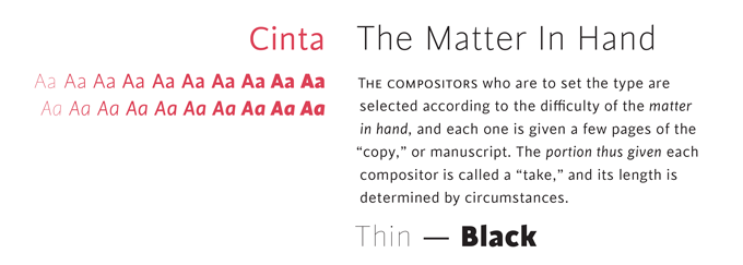
Cinta from Tipo Pépel is a new sans serif font designed for text. Based on the proportions of classic book faces, it has a humanist skeleton clad in tense, smooth musculature. The result is fresh and contemporary, and a bit like a crossover music genre — its designer compares it to mestizo rhythms, “bright, dreamy but completely real.” Cinta comes in a broad variety of well-equipped weights, which makes it a perfect tool to create delicate hierarchies both in print and on the web. Refined yet practical, Cinta could become the discerning typographer’s new best friend. Moreover, it is offered at a 70% discount through September 7, 2013.
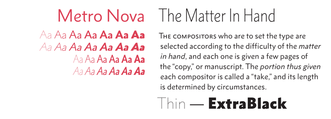
Metro from 1929 was W.A.Dwiggins’ response to an assignment from Chauncey Griffith at Mergenthaler Linotype, who wanted an American competitor for Futura. The result was warmer and more human than the European geometric sans-serifs, and one of the most innovative typefaces of 1920s America. The new Metro Nova by Monotype staff designer Toshi Omagari finally introduces Metro to the 21st century. Seven weights with italics and small caps, a condensed version, and a wonderful set of alternate shapes make Metro Nova a serious contender for editorial projects that require a readable sans with personality. Great introductory offer: the complete Metro Nova family is only $99 until September 13, 2013!
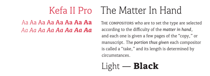
Jeremie Hornus is new to MyFonts but not to digital type. He worked on prestigious typographic projects at Dalton Maag in London; for Apple he designed the original version of Kefa, a Latin/Ethiopian system font for the Mac. Kefa II Pro, the first release from his newly established foundry, is the result of a drastic overhaul of Kefa — expanded into eight weights with italics, the family is friendly, versatile, and wonderfully readable.
News Round-Up
In this section we pick out interesting news snippets from MyFonts’ own kitchen and from the greater world of fonts, lettering and typography. This month’s news is dedicated to design events around the world. The first one is next week’s Typecon in Portland, where you’ll find most of the MyFonts team — we covered that in the July newsletter.
AGI Open in London, Sept. 26 & 27
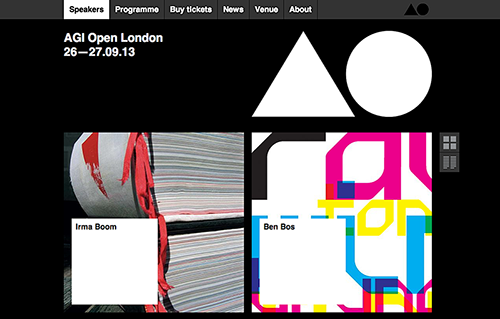 If you’re a typography and design buff and happen to be in London in September, this is the one event not to miss. AGI is the organization that unites the world’s greatest graphic designers on an invitation-only basis. For a few years now, its exclusive yearly conferences have been accompanied by a public event called AGI Open, which offers a unique opportunity to see lectures by some of the association’s best known members for an affordable entrance fee. This year’s AGI Open takes place September 26-27. Among the speakers will be Marian Bantjes, Stefan Sagmeister, Michael Bierut, Simon Esterson, Chip Kidd, Irma Boom, Pierre Bernard, Margaret Calvert, Paula Scher, and A2 Type’s Henrik Kubel. What a cast!
More September conferences
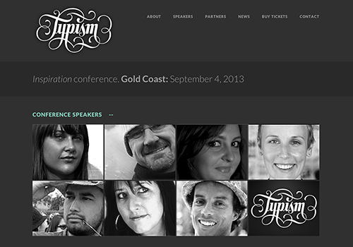 September offers more conferences big and small around the world. First up is Typism, a one-day conference to be held on September 4th on the Gold Coast near Brisbane, Australia. Among the speakers are the talented Gemma O’Brien (aka Mrs Eaves), and Wayne Thompson of the Australian Type Foundry.
On September 6 and 7, the Czech city of Brno hosts the third edition of TypeTalks, the cozy conference initiated by the Rosetta foundry’s David Březina. Among the speakers are type designers Laura Meseguer and Erik van Blokland, and the organizers promise: “Splendid weather has been requested, beer will be chilled, wine deliciously dry and food mouthwatering. As always.”
More type events on Lanyrd.
Web fonts at MyFonts

All of the top four Rising Stars fonts are available for licensing as webfonts. Visit Webfonts.info for HTML and CSS versions of this month’s Stars, plus lots of articles, resources and a showcase of web typography in the real world.