
Type designers (mostly the male ones) have often compared the curves of a well-drawn font to the female silhouette. Oh well, you may say, boys will be boys, and a little sensual fantasy will probably help reconcile designers to the fact that what they’re staring at for hundreds of hours are actually sterile pixels on a monitor representing unfeeling Bézier curves… But no, you’re wrong. Type designers are imaginative and sensitive people, and their relationship with those shapes on the screen can be something just as heart-felt as a painter’s love affairs with canvases, brushes and colors. Watch as the energetic, luscious and rounded shapes of this month’s Stars unfold.
This month’s Rising Stars
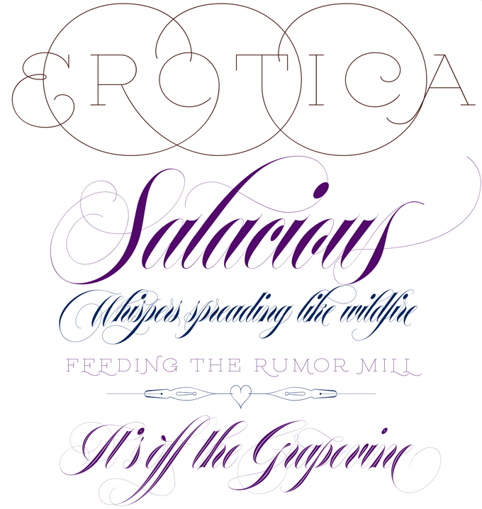
A low resolution sample like the one above cannot really do justice to the subtleties of Erotica, the latest offering from Lián Types in Buenos Aires. Designer Maximiliano Sproviero has surpassed himself in creating a font family of luscious curves, striking contrasts and gossamer hairlines. The typeface came into being when Sproviero was doing exercises in roundhand calligraphy and at some point in his research of sensual, handwritten letterforms realized that “the world was in need of a really sexy yet formal copperplate.” His full step-by-step account of the design process can be read on the Erotica font page. Taking the rules of copperplate lettering to the extreme, the designer gradually softened the harsh contrasts of his initial design to arrive at this beauty of a display script family, which was completed with a set of ultra-thin and somewhat thicker capitals (for large and small settings), fleurons and an inline variety.
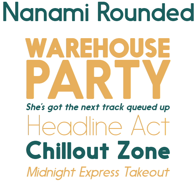
Earlier this year, Nanami from Thinkdust made it to pole position on our Hot New Fonts list. Nanami Rounded is a carefully engineered, softened version of the original family. In order to keep its style clean and corporate and avoid an all-too-chubby presence, the curves on the corners were kept very slight. Nanami Rounded comes in 18 weights, from Thin to Black, with matching slanted versions. Its combination of geometric construction and “unsharp” appearance makes it a good choice for layouts and identities with mildly nostalgic, mid-20th-century overtones. It works well in both headlines and longer copy. All weights are 90% off until October 16, 2013!
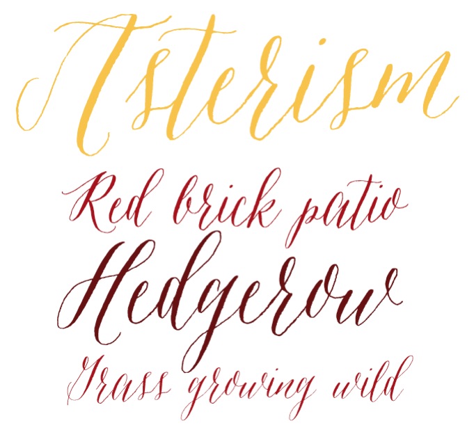
Great Lakes Lettering is a charming new collection of fonts based on the work of Dathan Boardman and Molly Jacques Erickson, two lettering artists from, you guessed it, the Great Lakes area. Asterism is a font in the enthusiastic style of calligraphic hand-lettering that has been so successful for Emily Lime, Tart Workshop and, more recently, Debi Sementelli. This new font by Great Lakes Lettering is their most successful typeface so far. Asterism — a great name — has a moving baseline and a shining personality. This handwriting font is based on one of Molly Jacques Erickson’s signature lettering styles. Try combining it with some of her other handmade fonts, such as Frosted, Icing, or Saint Agnes.
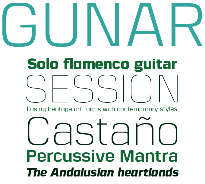
The Northern Block, the Yorkshire-based foundry of Jonathan Hill, has become a specialist in cool, clean sans-serifs that are often based on geometric, squarish skeletons. Hard as it seems to come up with new variations of that well-defined and popular genre, Hill has managed to craft a whole series of families, each with its own peculiarities and atmosphere. In some respects, his latest Gunar looks like an homage to that archetypal squarish sans that is Eurostile®, while the italics seem informed by trailblazing modern families such as Stainless and Ginger. Yet by mixing these influences with hand-welded details such as the bridged ‘A’ and ‘N’, he has introduced some northern industrial elements to produce a fresh, technical typeface. Gunar comes with 550 characters per font, with alternative lowercase a, e, g and y, and five styles of numerals.
Text families of the month
Text typefaces for demanding editorial work need to possess special qualities: excellent readability, a generous range of weights with italics and small caps for all of them, multiple figure sets (lining, oldstyle, table) and ample language coverage. In this section of the newsletter you’ll find recent releases that meet these standards.
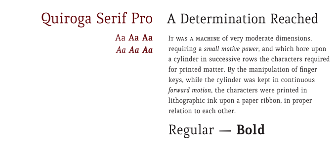
Quiroga from Uruguay’s TipoType has been around for a while; with Quiroga Serif Pro, designer Fernando Díaz has created a version that is equipped for a wide range of text settings, especially where space-saving is an issue. Quiroga’s low-contrast forms are a mix between tradition and innovation; with vertical stress, sturdy serifs and a tall x-height it was designed for enhanced legibility in small sizes. While efficient and economic, the typeface is unique in character. The new Pro version comes with typographic delicacies such as small caps, small cap numerals, mathematical signs and case-sensitive currency signs.
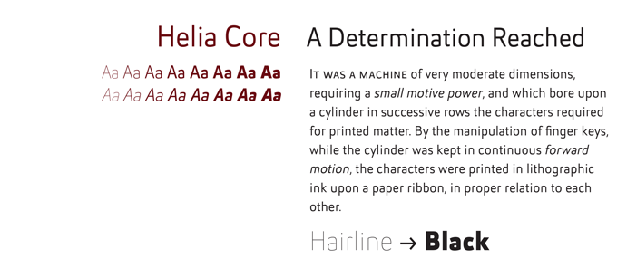
Nico Inosanto’s foundry Nootype is on a roll: he is currently publishing one successful typeface after another. Don’t confuse Helia Core with the ever-expanding Core series from Korea’s S-Core — although it has similar high-tech aesthetics. Despite its minimalism, Helia Core is relaxed rather than strict, supple rather than stiff. The family comes in eight weights, from Hairline to Black, with matching oblique-style italics. Each font includes small caps, multiple figure sets and a load of other OpenType features. The ligatures enable designers to create original and creative layouts.
News Round-Up
In this section we pick out interesting news snippets from MyFonts’ own kitchen and from the greater world of fonts, lettering and typography.
Finally: real live web font previews
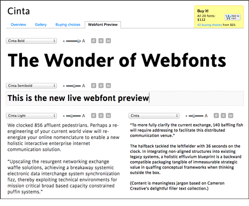 Webfonts aren’t always easy to explain. They’re basically fonts chosen by the website designer and sent along with a website’s HTML and CSS code to the user. As some fonts look better in certain browsers and on certain devices than others, it is crucial for web designers to get an adequate preview of the end result when deciding on which fonts to embed. As of this week, MyFonts offers a new web font preview feature that allows you to play with all available webfonts online, in real time. Designers can test the page in their target browsers and operating systems, and play with OpenType features such as contextual alternates, discretionary ligatures, and oldstyle numerals. One step beyond!
Ampersand NYC: web type on the main stage
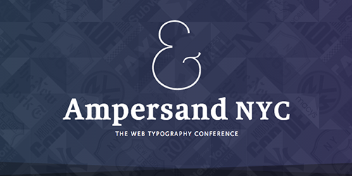 Last June, Brighton hosted the third edition of Ampersand, one of the world’s leading conferences on web typography. Type designers and web designers in North America will be pleased to know that the one-day conference also has its New York branch. On November 2, Ampersand 2013 NYC will take place in the beautiful Times Center in Manhattan. As always, the quality of the speakers is top-notch. The line-up includes Luc(as) de Groot, Mark Boulton, Jonathan Hoefler, Christian Schwartz, as well as the man whose redesign changed the face of our own site, Nick Sherman. Needless to say, MyFonts is a sponsor.
Wayzgoose at the Hamilton Wood Type Museum
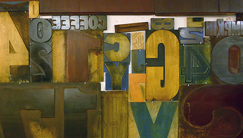 Earlier this year, the Hamilton Wood Type and Printing Museum in Two Rivers, Wisconsin, had to abandon its old home, the original Hamilton factory. A new location was found a few blocks from the old site and with the massive help of volunteers, the immense collection of wood type, machines, patterns and prints is now being relocated. The museum still managed to organize its annual Wayzgoose event, named after the traditional yearly printers’ outing. The program includes workshops (all sold out), lectures by the likes of Catherine Dixon, Allan Haley, Erik Spiekermann and Nick Sherman, and specialist break-out sessions. Dates: November 8–10, 2013. Find out how to support the museum here; and browse digitized Hamilton Wood Type on MyFonts.
Webfonts at MyFonts

All of the top four Rising Stars fonts are available for licensing as webfonts. Visit Webfonts.info for HTML and CSS versions of this month’s Stars, plus lots of articles, resources and a showcase of web typography in the real world.


