|
There was a time — not so long ago — when nobody but typesetters bought fonts. Their service to the client was setting up pages of text, set in a typeface from the typesetter’s limited selection. Typically the typesetter chose the fonts himself (it was almost always he). Graphic designer clients might choose fonts from a small list. You wouldn’t believe (unless you remember) how expensive typeset text was. If you weren’t a regular customer, and just needed a couple of pages of body text and some headlines for a brochure, that one-time service would cost you considerably more than, say, a license for the complete Gist family will cost you today. In fact, fonts have become so affordable that many people now collect them for fun — without wondering if that investment will pay for itself in client work. We don’t mind, of course — but make sure you know what font to choose when the time comes to make decisions. There’s a webinar coming up later this month to help you do just that. See our News section below.
|
|
|
This Month’s Rising Stars
|
|
|
|
|
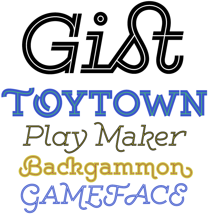
It’s been a while since we had a brand new family from Yellow Design Studio, but his Gist was worth the wait. Ryan Martinson’s latest is arguably his most fun and possibly his most original family to date. All its elements are familiar — but it’s the meeting of all these features that make the family unique. What other typeface can claim to offer all of this at the same time? It’s a slab serif, it has an inline, it is layerable to make two-tone headlines, and it has script-like overtones plus a truckload of wavy and swashy alternates. As Martinson puts it: a collision between monoline slab and indie script. With 627 glyphs per weight, it’s highly customizable… you can either keep it simple with the base character set, or use ligatures, alternates and swashes for extra flair. To know more about Gist’s OpenType features and get some tips for optimum use in various applications, read the full article on the font page. Check out the incredibly affordable family price and the free Light weight. Also, just out: Gist Rough.
|
|
|
|
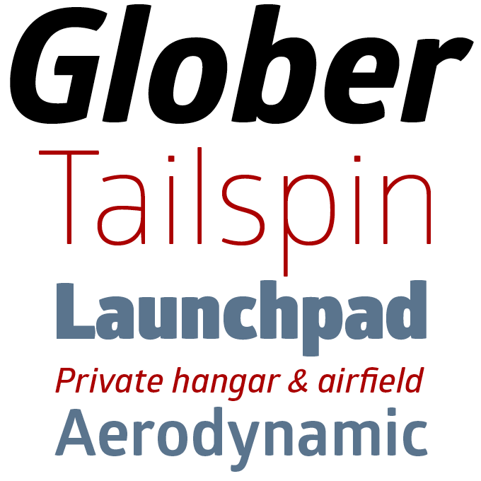
Glober is the latest offering from Bulgaria’s Fontfabric. Its look and feel are clearly different from the foundry’s signature style, and that’s no coincidence. Fontfabric’s founder Svetoslav Simov has begun publishing fonts by other designers. Glober shows that designer Ivan Petrov has quite a different approach — instead of cool geometry, it offers humanized proportions and rounded stroke endings, which are especially notable in the Heavy and Bold weights. Glober is such a versatile display font — with its nine weights plus matching italics — that it is ideal for setting both headlines that shout and headlines that whisper. Its middle weights also work well in longer text blocks — its softened shapes make for excellent legibility both in print and on the web. Glober is a whopping 90% off until March 18, 2014.
|
|
|
|
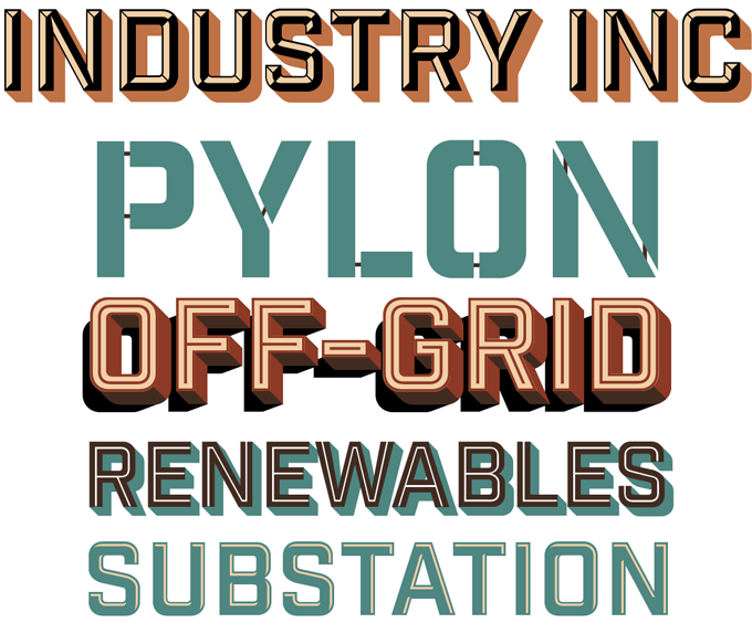
Since joining MyFonts almost a year ago, Mattox Schuler’s Hold Fast Foundry has produced a string of display faces in the popular “retro Americana” genre. Schuler’s variations on the theme are increasingly ambitious, and Industry Inc is his most sophisticated type family so far. Perhaps it would be better to speak of a type system, as the different fonts in the family don’t represent different weights, but combine seamlessly to produce impressive, multi-colored headlines and slogans. Schuler has made a video tutorial to show how the layering works: start with the shadow, add 3D effects, top off with the regular, the beveled version and/or the inline. Industry is 58% off until March 15, 2014.
|
|
|
|
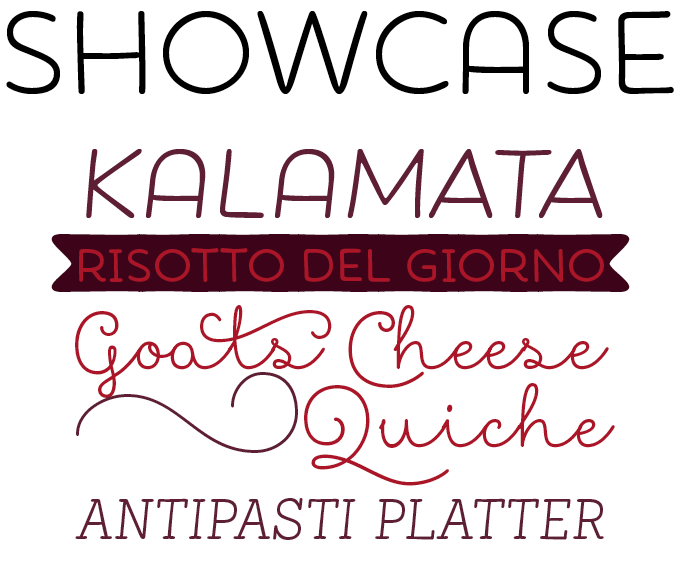
Showcase, the latest typeface by Latinotype’s Daniel Hernández and Paula Nazal Selaive, is a smart kind of display family. Its styles are a mixed bunch: a script, a sans-serif, a slab, a sans mini (think small caps) and finally a set of ornaments and dingbats. Designed to mix well and work together in perfect harmony, they speak the same visual language but with very different nuances. The underlying theme is handwriting: all styles look as if they have been carefully hand-drawn with a monolinear round pen. The result is a versatile and easy-to-use family, ideal for informal yet lucid menus, labels, showcards and brochure titles. Showcase is 80% off until April 12, 2014.
|
|
|
Text fonts of the month
Typesetting for books, scientific magazines, or annual reports requires fonts with special qualities: excellent readability, a generous range of weights with italics and small caps, multiple figure sets (lining, oldstyle, table) and ample language coverage. In this section of the newsletter you’ll find recent releases that meet these standards.
|
|
|
|
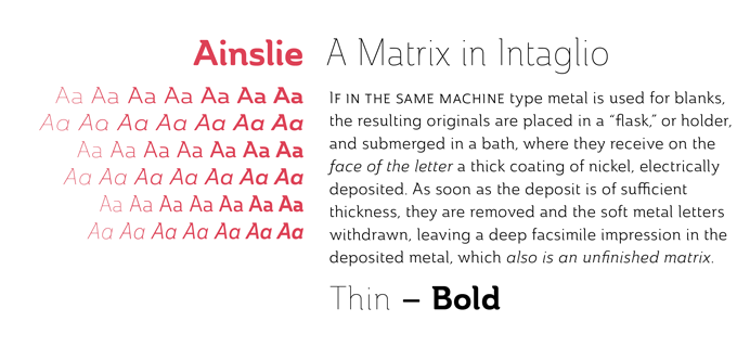
Jeremy Dooley has a knack for drawing typefaces that are different from the usual. Ainslie belongs to the hybrid category of half-serifs: some letter parts have a serif, some don’t. It is also different in its atmosphere: it is clear and open enough to work well on the text block level; but as the size increases, the font starts swinging and unusual details come to the fore. Originally developed for the Canberra Australia Centennial Typeface Competition, Ainslie incorporates influences from Canberra and surrounding areas, blending the geometric principles of the city’s groundplan with the organic, flowing forms of aboriginal art. The family comes in three widths — Condensed, Normal and Extended — each in seven weights plus italics. Epic!
|
|
|
|
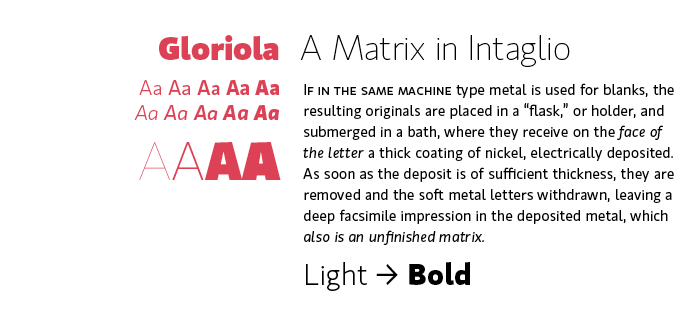
Good news for type gourmets: the splendid Gloriola from Suitcase has been re-released. In the increasingly dense landscape of all-purpose sans-serifs, Gloriola stands out. It has a clear-cut yet attractive basic structure; and a wide range of cuts including four extreme weights (from Hair to Fat) specially drawn for display purposes. Add the friendly small caps, the open italics and the beautifully drawn range of figure styles, and the result is one of the today’s most distinctive and usable monolinear sans faces.
|
|
|
|
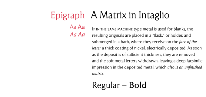
Dragan Pešić joined MyFonts in June last year with the quirky Owl, then went on to publish a series of original typefaces in very different styles. Epigraph is probably his most classic face to date. Its main role models are in the lapidary genre: letters designed to look like stone-carved alphabets. The stems don’t have serifs, but are tapered and have the rudiments of a serif. Epigraph has humanistic proportions, is unobtrusive and graceful. With only a Regular and (rather light) Bold weight and just one set of small caps, Epigraph’s use as a text family has its limitations; but used in cultural publications or luxury brochures it may lend your publication just that extra touch of elegance. Epigraph is sold at 30% off its already very affordable price until March 17, 2014.
|
|
|
News Round-Up
In this section we pick out interesting news snippets from MyFonts’ own kitchen and from the greater world of fonts, lettering and typography.
|
|
Now pay in your own currency!
Users in many European countries will have noticed a big change on the MyFonts website: prices in the euro zone are now quoted in euros or, if you’re in the UK, in British pounds. There’s some sophisticated programming going on behind the scenes: the dollar-to-euro/pound rates are being updated regularly, or any time when a big fluctuation occurs, to make sure nobody pays or receives too much. The advantages are obvious: the prices don’t vary from day to day, price quotes are more precise, and invoices are in the currency of your country.
|
|
Font wisdom from Rhatigan: March 25, 2014
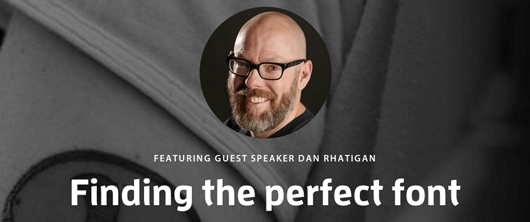
Monotype’s UK Type Director Dan Rhatigan is a renowned letterform historian (he curated the remarkable Pencil to Pixel project) as well as a seasoned typographer. So who would be better placed to give you some expert insights into what typefaces to use, and how to use them? On March 25, Dan will be the host of a webinar called Finding the Perfect Font. He will talk about how type has evolved, what makes type work well on screen, and what to look for when picking fonts. Make sure to book your place on the registration page.
|
|
MyFonts on Facebook, Tumblr, Twitter
Your opinions matter to us! Join the MyFonts community on Facebook, Tumblr and Twitter — feel free to share your thoughts and read other people’s comments. Plus, get tips, news, interesting links, personal favorites and more from MyFonts’ staff.
|
|
|
|
|
|
|
|
|
MyFonts Inc. 500 Unicorn Park Drive, Woburn, MA 01801, USA
MyFonts and MyFonts.com are registered service marks of MyFonts Inc. Other technologies, font names, and brand names are used for information only and remain trademarks or registered trademarks of their respective companies.
© 2014 MyFonts Inc
|
|
|
|