It’s the last Rising Stars newsletter of the year! Small and bigger companies know what this means. If your fiscal year ends on December 31, now is the time to spend the remainder of your software budget, fast. And what better way to make your pennies work than by getting some trendy new fonts at great prices? This month’s newsletter features some of the best new fonts in the most popular genres: readable sans-serifs, whimsical display families, layerable type for multi-colored layouts, bright new text fonts. They’ll also make a great holiday gift. Enjoy! |
|
|
This Month’s Rising Stars
|
|
|
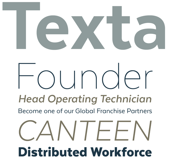
“A sans for all” — that is how Chile’s Latinotype have labeled their latest font family for text and display, Texta. Their approach was historical: they studied twentieth-century classics of the humanist sans genre, from Edward Johnston to Adrian Frutiger, as well as the simplified Gothics made by signpainters (the kind that Johnston called “block-letter”). The result is an almost timeless sans-serif family — rational, transparent and useful. The family comes with a separate Alt version that replaces lower case letters like a-g-y with more geometric constructions, a subtle variety to achieve a somewhat more modernist look. |
|
|
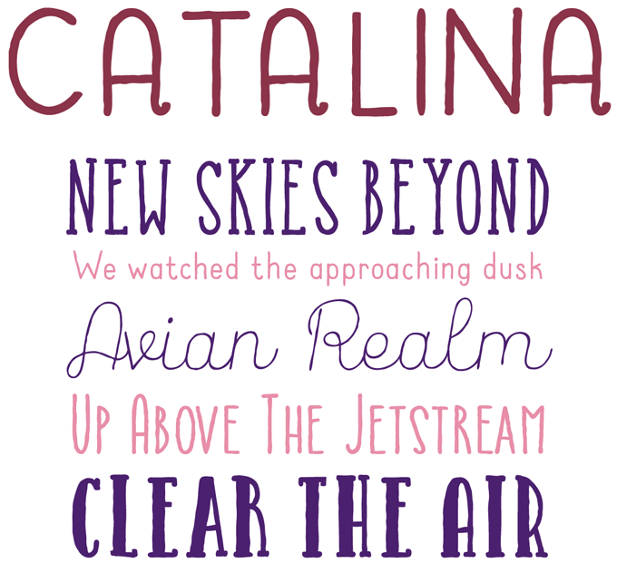
Catalina by Kimmy Kirkwood was inspired by a visit to a bakery in Newport Beach, CA, a charming place with hand-lettered menus, chalkboards and quotes on the walls. Back home, Kimmy created a suite of compatible hand-drawn fonts in various styles — a wildly popular genre by now. The complete Catalina package consists of five sub-families, each containing at least a light, medium and bold, and two graphic ornament fonts. Catalina Anacapa comes in both sans and slab serif styles, and includes large caps and small caps. Catalina Avalon is similar to Anacapa but offers the added excitement of a high contrast between thin and thick strokes. Catalina Clemente is a hand-made, organic variation on the geometric sans genre. And we haven’t even mentioned the charming Catalina Script, Typewriter and Extras sub-families yet! All drawn by the same hand, using the same technique, Catalina is yet another charming hodgepodge of a type family. |
|
|
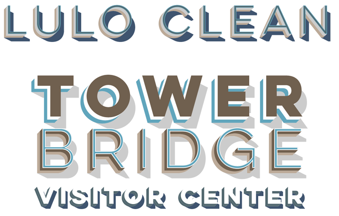
Last August, Ryan Martinson of Yellow Design Studio brought us Lulo, an attractive family of textured capitals for making amazing multi-colored 3‑dimensional effects. Now there’s Lulo Clean, the non-distressed version of the original weathered face. Endless effects can be created by adding different colors to each of the five stackable layers. Like the original Lulo, the Clean version is all-caps and includes regular and bold weights and extensive language support. Lulo Clean One and One Bold can double as companions for the distressed Lulo, to be used when texts are longer and smaller. There’s no discount on Lulo right now, but don’t be blinded by percentages: at full price it’s a bargain anyway! |
|
|
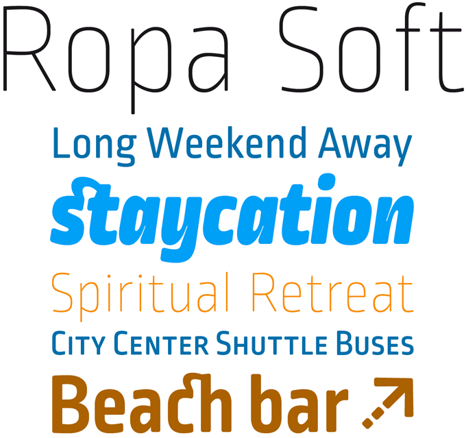
Ropa Soft Pro by Botio Nikoltchev is the rounded version of Ropa Sans Pro, one of this year’s most original takes on the “squarish sans” genre. Like its companion family, Ropa Soft Pro has several characteristics that make it stand out. It’s narrower than most, which can save space especially in headlines. The boldest weights, notably the italics, have unique and tasty details — check out the cheeky ink traps, boomerang-shaped ligature and rectangular dot in the word “staycation” above. The family comes in eight weights plus italics, and separate small caps fonts. Two styles of Ropa Soft Pro can be downloaded free of charge: the smooth and understated Regular and the strikingly distinct Extra Bold Italic.The complete family is 90% off until December 31, 2014. |
|
|
Text fonts of the month
Typesetting for books, magazines or annual reports requires font families with special qualities: excellent readability, a generous range of weights with italics and small caps, multiple figure sets (lining, oldstyle, table) and ample language coverage. Here is a selection of recent, high-quality text typefaces.
|
|
|
|
|
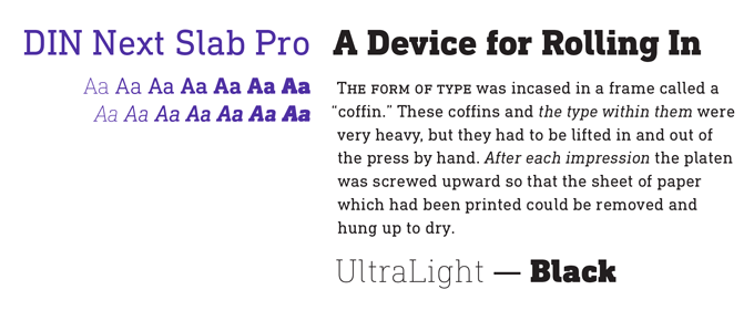
Ever since graphic designers became bored with the cool, clean look of 1950s Swiss typefaces, the more industrial feel of the DIN typefaces has been wildly popular. Linotype’s DIN Next™ typeface has been one of its most successful digital versions; now, the new DIN Next Slab Pro typeface adds new design potential to the family. DIN Next’s shapes were optimized to work with the robust slab serifs, underlining the technical and formal nature of the font. The team led by Akira Kobayashi had some challenges to overcome. While it is relatively easy to imagine the DIN Next Light typeface with slab serifs, the available space quickly disappears when it comes to the Black styles. Experiments with modified contrast and one-sided serifs were quickly abandoned as it changed the family’s character too much. As it was necessary to simplify the shapes of some letters for the Black weight, these changes were then applied to all weights for consistency.
Like the DIN Next typeface family, the DIN Next Slab Pro family comes in seven weights with matching italics — a winning team. The complete DIN Next Slab family is 80% off until December 12, 2014.
|
|
|
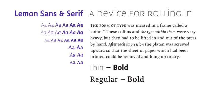
Type Department is a new foundry from Berlin, and Lemon is their first major text family. It’s easily one of the most extraordinary text typeface releases of the past few months. The Lemon Serif family is small — only a Regular and Bold weight, with Italics — but beautifully drawn and very well equipped. Lemon Sans is big: six weights with italics, plus an equally extensive Condensed version. Both Lemon Sans and Lemon Serif come with a complete Unicase set (lowercase mixed with small caps). In short, Lemon is a versatile suite for striking text and headline settings. The Lemon family is 66% off until December 31, 2014. |
|
|
|
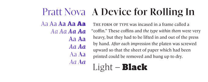
Based on typefaces Nick Shinn designed for Toronto’s Globe and Mail, Pratt Nova was shaped by the requirement to accommodate a large character count. The Text weights go about their business with sturdy yet elegant efficiency. In the Display and the Fine styles we note superb refinement of detail that will delight at poster sizes. What’s more, they are unusually space-saving — semi-condensed, large x-height, short descenders and capitals.The complete family amply transcends its restrictive origins, expressing a spirit of visual and semantic opulence, equipping the typographer with a comprehensive array of harmonized fonts, all rigorously drawn, all iterations of a single, very original design.
|
|
|
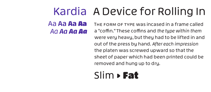
Of the recently released text type families, Kardia from Rodrigo Fuenzalida is one of the most charming, soft, and friendly. Inspired by brush lettering, it takes many features from he pen-strokes of foundational calligraphy; nevertheless it is a very contemporary and versatile typographic tool that allows the user to compose a wide range of texts. Features include ample proportions that were revised to maintain similar line performance across all its weights. The large x-height facilitates reading in small body sizes, in addition to helping build solid headlines. Kardia comes in four weights, all with corresponding italics, small caps and ample language support. |
|
|
News Round-Up
In this section we pick out interesting news snippets from MyFonts’ own kitchen and from the greater world of fonts, lettering and typography.
|
|
Mice, Ants and the Lazy Dog
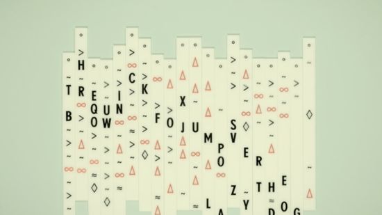
Those smart folks at FontFont have just put together this enjoyable promo film with Stark Films announcing new support for OpenType features for their Web Fontfonts. Among all the various fun visualisations of magically changing type, look out for the rotating lenticular drum and the magnetic iron filings in particular.
|
|
MyFonts on Facebook, Tumblr, Twitter & Pinterest
Your opinions matter to us! Join the MyFonts community on Facebook, Tumblr, Twitter and Pinterest — feel free to share your thoughts and read other people’s comments. Plus, get tips, news, interesting links, personal favorites and more from MyFonts’ staff.
|
|
|
|
|
|
|
Comments?
We’d love to hear from you! Please send any questions or comments about this newsletter to [email protected]
|
|
|
|
|
|
MyFonts Inc. 500 Unicorn Park Drive, Woburn, MA 01801, USA
MyFonts and MyFonts.com are registered service marks of MyFonts Inc. Din Next is a trademark of Monotype GmbH and may be registered in certain jurisdictions. Other technologies, font names, and brand names are used for information only and remain trademarks or registered trademarks of their respective holders.
© 2014 MyFonts Inc
|
|
|
|