Each month, MyFonts’ editorial team selects its Rising Stars from the best-selling fonts on our constantly changing Hot New Fonts list. As we choose the best-selling fonts from various genres, this newsletter is a pretty reliable barometer of trends in type. This month’s selection is a case in point: the four families featured represent four popular genres — from whimsical display suite to modernist sans. The section of promising text fonts is particularly interesting this month: it’s probably the first time we’re not featuring a single sans-serif text font. Each of these families is a smart and contemporary variety on the oldstyle book face — modest “machines for reading”, but without a trace of nostalgia. Enjoy! |
|
|
This Month’s Rising Stars
|
|
|
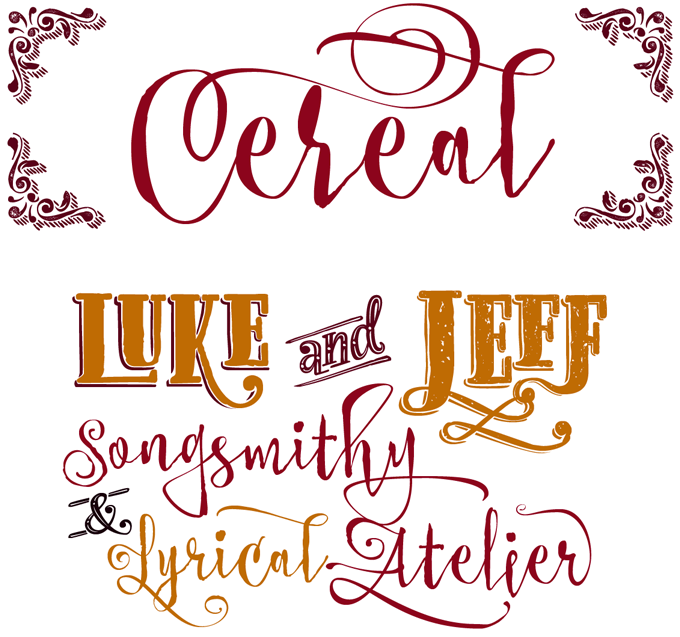
Last month we interviewed Carlos Fabián Camargo Guerrero of Colombia’s Andinistas for our monthly Creative Characters series. One family that was prominently featured was Camargo’s latest, Cereal. It is a suite of lively hand-drawn script and display faces, with a load of shadow effects, banners, dingbats and catchwords thrown in for good measure. Taken as a whole, the family exudes a cozy, homely shabbiness. The various styles can be used together to create informal layouts, but also work well individually. This collection will be very much at home on posters, personal stationery, book covers and magazine layouts. |
|
|
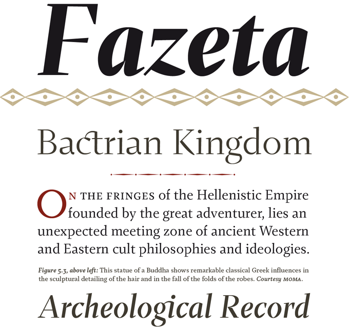
Possibly the most unusual and striking text family of recent times is Fazeta by Slovakia’s Andrej Dieneš. It is an ambitious project, offering three optically optimized versions for use in different sizes — captions, body text, and headlines. With its vertical thick-thin contrast it is a sort of contemporary Didone, but it manages to steer clear of the usual rigid look of this category. Inspired by typefaces from 1960s Czechoslovakia — from designers such as Josef Týfa and Vojtech Preissig — the typeface has sharply-cut details and utterly rational optical solutions, combined with classical proportions. The designer speaks of a “naked cold expression without emotions”, but don’t be fooled: the design is not as stern as that may sound — in spite of its willful character its effect is not unfriendly. With 1,140 glyphs per font (including mathematical symbols, arrows and borders) the family is marvelously versatile. |
|
|
|
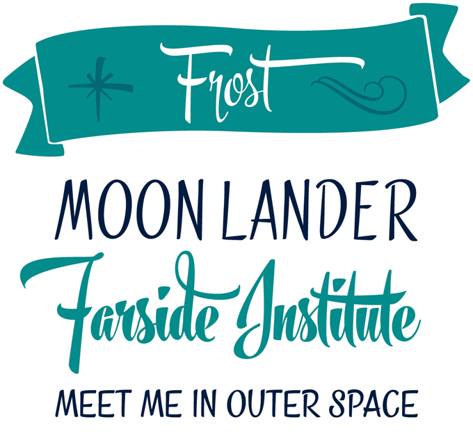
The Frost series from Fenotype is built around a well-drawn, confident advertising script with strong contrasts. Besides the lively connected script in three weights, the family comes with ornament and banner sets and separate caps and small caps, resulting in a versatile family of compatible fonts. Influenced by hand-lettering and sign painting from the 1950s and 1960s, Frost’s appearance is more polished and regular to better suit contemporary design trends. Frost’s connected script fonts are equipped with automatic ligatures and three or more alternatives for each basic letter, allowing the user to create a personalized layout with a perfect flow. As usual an application with full OpenType functionality is the ideal environment to get the most out of the smart font family. Frost is on sale until February 21st, 2015 — for the best price purchase the complete family!
|
|
|
|
|
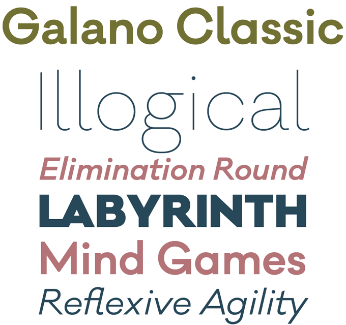
Galano Classic from Rene Bieder is the latest in a series of releases inspired by the classic grotesques of the early twentieth century. Designed as a companion to Bieder’s Galano Grotesque family, Galano Classic is informed by the geometric faces of the early twentieth century. But instead of attempting another reinterpretation of the geometric genre, this subfamily prefers to linger in the past, flirting with modernist proportions, and sporting details such as the long stretched leg of uppercase ‘R’ and the traditionally shaped lowercase ‘g’. Many of Galano Grotesque’s characters were redesigned from the ground up for the Classic variety; it also has more alternative characters, ligatures and OpenType features. With ten weights with matching italics, each containing 555 glyphs, Galano Classic is an ambitious subfamily; while it was planned to be the display version of Galano Grotesque, it also works perfectly well in small sizes and long text passages.
Galano Classic is on sale until February 15th 2015, so go grab it quick!
|
|
|
Text fonts of the month
Typesetting for books, magazines or annual reports requires font families with special qualities: excellent readability, a generous range of weights with italics and small caps, multiple figure sets (lining, oldstyle, table) and ample language coverage. Here is a selection of recent, high-quality text typefaces.
|
|
|
|
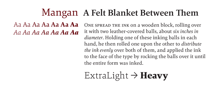
Like all of Hoftype’s type families, the new Mangan is a trustworthy modern workhorse. Designer Dieter Hofrichter is a master craftsman who manages to add something new to each genre and sub-genre he tackles. With Mangan he has found a delicate balance between classic elegance and contemporary efficiency; the result is a vivid family with a high degree of functionality. The Mangan family comes in seven weights plus italics, and is well suited for ambitious typography. All weights contain small caps, ordinals, ligatures, and multiple figure styles with matching currency symbols, plus a useful set of arrows. Mangan is on sale until March 2nd, 2015.
|
|
|
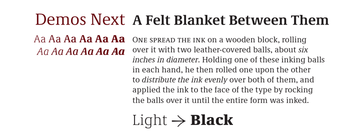
Dutch designer Gerard Unger is one of the most original minds in contemporary type design. He started his career in a time when the challenges of new type rendering technologies demanded smart answers. His 1975 text font Demos was just that: an unorthodox, personal exercise in legibility under less-than-ideal conditions. Linotype’s Demos® Next typeface family is a complete revision and expansion to Unger’s classic. This new version introduces subtle changes to character shapes, proportions and spacing, optimizing the design for today’s technology. The new family has six weights plus italics and includes small caps and oldstyle figures, making it a versatile toolkit for complex design projects. |
|
|
|
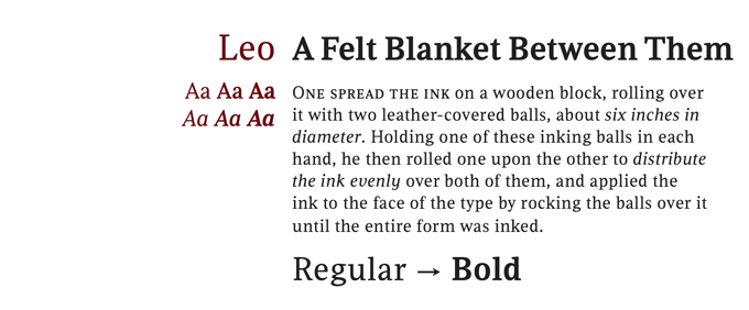
Leo is a new family from Dutchman Hans van Maanen, produced in collaboration with Canada Type’s Patrick Griffin. The family was designed as an economic text face for demanding editorial typography. Designed with the explicit intent of relaying complex information without calling attention to itself, Leo avoids expressivity and was built with as little ornamentation as possible. Its italics, rather than following traditional models with very diverse shapes, have a regularity that is closely related to the stance and rhythm of their roman counterparts. Each of its fonts contains over 700 glyphs and supports the vast majority of Latin languages; they come with built-in small caps, multiple figure styles, and optional long descenders for optimal line space management.
|
|
|
News Round-Up
In this section we pick out interesting news snippets from MyFonts’ own kitchen and from the greater world of fonts, lettering and typography.
|
|
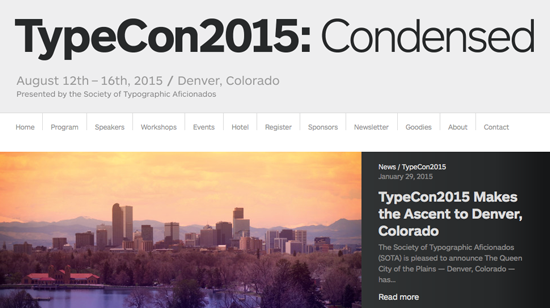
TypeCon comes to Denver
TypeCon’s photo of Denver by Bryan Simmons via Wikimedia Commons ( CC BY-SA 3.0 )
This year’s edition of TypeCon, the North American get-together of type designers and typography buffs, will come to a region the conference hasn’t visited before: the American South-West. For visitors from the Americas as well as Europe this is a great occasion to visit Denver as well as the Great Outdoors of Colorado; for designers and students from the region, a unique chance to meet their heroes in type design and research. TypeCon 2015 takes place from August 12 through 16, but there’s a reason why we’re announcing it this early. The success of the event depends to a large extent on the commitment of its volunteers, and now is the time to sign up. Those willing to invest time and energy into this high-quality conference can contact its initiators, the Society of Typographic Aficionados (SoTA) via the website.
|
|
MyFonts on Facebook, Tumblr, Twitter & Pinterest
Your opinions matter to us! Join the MyFonts community on Facebook, Tumblr, Twitter and Pinterest — feel free to share your thoughts and read other people’s comments. Plus, get tips, news, interesting links, personal favorites and more from MyFonts’ staff.
|
|
|
|
|
|
Subscription info
It is never our intention to send unwanted e-mail.
Want to get future MyFonts newsletters sent to your inbox? Subscribe at:
MyFonts News Mailing List
|
|
|
Comments?
We’d love to hear from you! Please send any questions or comments about this newsletter to [email protected]
|
|
|
|
|
|
MyFonts Inc. 600 Unicorn Park Drive, Woburn, MA 01801, USA
MyFonts and MyFonts.com are registered service marks of MyFonts Inc. Demos is a trademark of Monotype Imaging Inc. registered in the U.S. Patent and Trademark Office and may be registered in certain other jurisdictions. Other technologies, font names, and brand names are used for information only and remain trademarks or registered trademarks of their respective holders.
© 2015 MyFonts Inc
|
|
|
|