Is the long winter getting to you? Are you overwhelmed by the sheer quantity of attractive new typefaces? Your monthly newsletter comes to the rescue. Rising Stars offers you a sunny selection from last month’s most successful fonts, and we’ve made sure to include some surprises. Enjoy! |
|
|
This Month’s Rising Stars
|
|
|
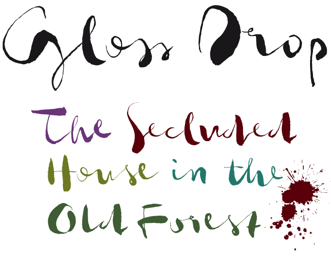
One of the most charming and popular script faces on MyFonts is Luxus Brut from Phospho — it has been selling consistently well since its debut in 2009. Like some of the Vienna foundry’s other faces, it was inspired by the craftsmanship of mid-20th-century lettering, an era that designer Roland Hörmann loves and understands. His recent Gloss Drop is proof that he is not stuck in history, and that he’s mastered a much wider range of styles. Gloss Drop is based on the designer’s own sassy brush lettering, and has lost none of its spontaneous vibrancy in the digitization process. Thanks to the power of OpenType it gets pretty close to what you’d expect from an expert letterer using ink, brush and paper. No fancy swashes or curly ligatures in this script font: what makes it stand out is the natural imperfection dripping from every letter, adding splatter and guts to magazine pages and hand-made illustrations. Gloss Drop is, well, different. |
|
|
|
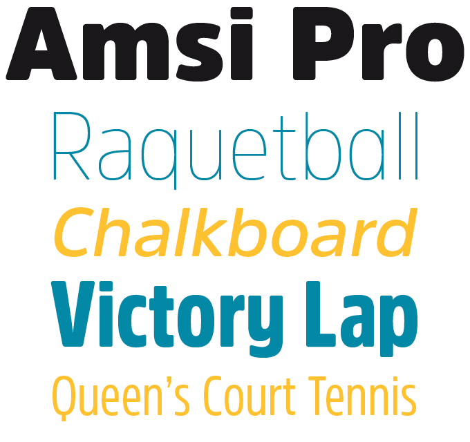
The impulse to draw Amsi Pro, according to designer Stawix Ruecha, was an encounter with the simple, expressive display faces of the early 20th century — in the German style known as Plakatstil, or Poster Style. The Amsi familiy is an ambitious interpretation of the historical model, extrapolating a dark, condensed display style into a huge family. With three widths and eight weights, from Thin to Heavy, and Italics (actually: oblique romans) for all, it totals 48 styles. The Narrow and Condensed styles are good choices for compact headlines; the middle weights of both the normal and Narrow versions will work well in longer text settings. Amsi Pro is discounted until March 20, 2015.
|
|
|
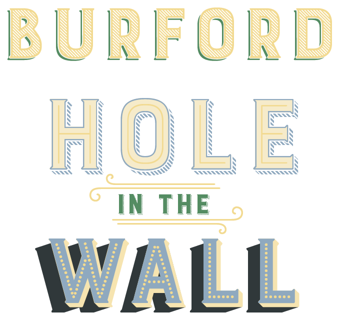
Kimmy Kirkwood of Kimmy Design is good at picking up trends and adding her own personal touch. Her successful new Burford typeface is a case in point. Based on sketches made while traveling through Europe, Burford is a layerable family whose individual fonts can be stacked to create multi-colored headlines and logos. The complete Burford Pro package comes with 18 layering fonts, including base layers, top and bottom layers for shadows, decoration and 3D effects, and two sets of graphic elements. The Burford Basic package was created for users who don’t have access to professional design applications and are unable to stack frames to obtain the layering effect. The Burford Extras sets offer banners, borders, corners, arrows, line breaks, catchwords, anchors and more — around 100 total elements per set. No discount needed: the font is wonderfully affordable as it is. |
|
|
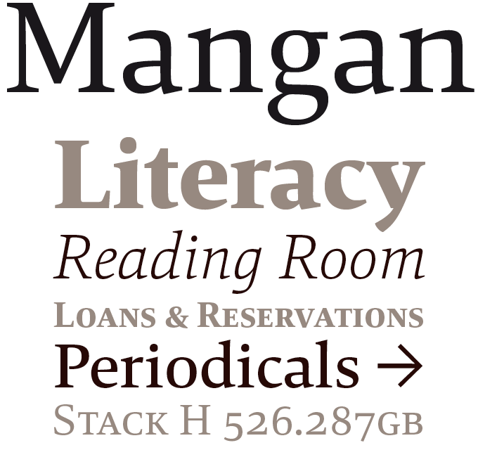
After being featured in February’s Text Fonts of the Month section, Mangan from Hoftype has continued to do well. Combining classic rationality with contemporary features, Mangan is possibly one of Dieter Hofrichter’s most widely usable text faces yet. Its built-in horizontal dynamism pushes the eye forward, lending a high degree of functionality to a text face that is both classy and vivid. With 14 styles, each containing small caps, multiple figure styles, matching currency symbols and arrows, the family is extremely well-equipped for ambitious typography. Mangan’s free Light style allows you to try it out at no cost before buying a larger selection of weights. |
|
|
Text fonts of the month
Typesetting for books, magazines or annual reports requires font families with special qualities: excellent readability, a generous range of weights with italics and small caps, multiple figure sets (lining, oldstyle, table) and ample language coverage. Here is a selection of recent, high-quality text typefaces.
|
|
|
|
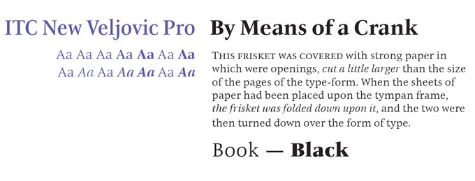
Thirty years after its first appearance, Jovica Veljović has produced ITC New Veljovic® Pro, a revised version of his very first typeface. That original, ITC Veljovic, is a classic — one of the most innovative text and display faces of the latter 20th century. A trained calligrapher, Veljović conceived it in 1984 with the aim of adding something genuinely new to the ITC library. Thirty years later, Veljović came to believe it was time to completely revise the family. By carefully adjusting the proportions of the characters, the designer provided the new version with a more harmonious presence. The design is as striking as ever, but its appearance is more balanced, and its usefulness and legibility have increased. The expansion has made New Veljovic Pro more flexible and useful than ever before. There’s more on ITC New Veljovic over at the Fonts.com blog. Take advantage of the introductory discount until March 20, 2015.
|
|
|
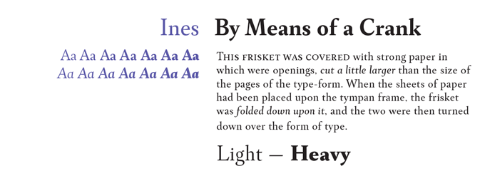
DSType, the studio run by Portuguese designer Dino dos Santos, continues to be a reliable source of well-drawn, original, elegant text and display faces. His latest family, Ines is also one of his most bookish — in a good sense. Its relatively high ascenders lend it great dignity, its round proportions make it friendly and readable. The Ines family comes in seven weights plus italics and includes small caps, smart fractions and several ligatures. Ines is on promotion until March 20, 2015. |
|
|
|
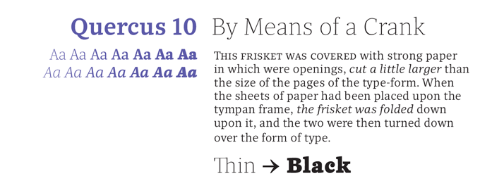
A new text family from František Štorm is always a treat. The name Quercus simply means “oak tree” — which is what Štorm sees from his countryside studio window. Quercus 10, shown here, is the sturdy variety for body text. Its design is characterized by open yet subtly condensed shapes with ample letterspacing. The eight weights are relatively close together, so that the discerning user can select an exact value for each size and typographic color, especially on the web. For use in larger sizes there’s Quercus Serif, which took inspiration from classicist faces with vertical contrast, ball terminals and thin serifs. Štorm’s splendid superfamily also contains a Sans version and a decorative inline Display variety called Quercus Whiteline.
|
|
|
MyFonts on Facebook, Tumblr, Twitter & Pinterest
Your opinions matter to us! Join the MyFonts community on Facebook, Tumblr, Twitter and Pinterest — feel free to share your thoughts and read other people’s comments. Plus, get tips, news, interesting links, personal favorites and more from MyFonts’ staff.
|
|
|
|
|
|
Subscription info
It is never our intention to send unwanted e-mail.
Want to get future MyFonts newsletters sent to your inbox? Subscribe at:
MyFonts News Mailing List
|
|
|
Comments?
We’d love to hear from you! Please send any questions or comments about this newsletter to [email protected]
|
|
|
|
|
|
MyFonts Inc. 600 Unicorn Park Drive, Woburn, MA 01801, USA
MyFonts and MyFonts.com are registered service marks of MyFonts Inc. ITC Veljovic is a trademark of Monotype ITC Inc. registered in the U.S. Patent and Trademark Office and which may be registered in certain other jurisdictions. Other technologies, font names, and brand names are used for information only and remain trademarks or registered trademarks of their respective holders.
© 2015 MyFonts Inc
|
|
|
|