Summer is here in the Northern hemisphere — and with it, the prospect of a few weeks off to explore the world, or bond with friends and family. But some of us will just have to work harder. Magazines are to be launched, shops opened, books and catalogues printed in time for trade fairs in the fall. So we don’t blame you if you have fonts on your mind. Believe it or not: this month’s newsletter is full of them — very nice fonts indeed. And if you happen to design for readers, do look beyond our spectacular selection of Rising Stars, and check out the Text Font section. It may give you ideas… but that’s OK. |
|
|
This Month’s Rising Stars
|
|
|
|
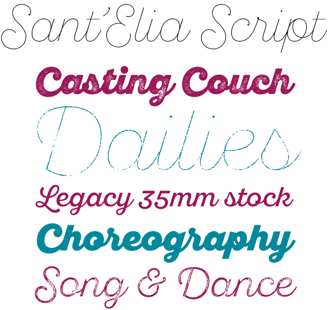
Although based around a single design, the new Sant’Elia Script family from Yellow Design Studio is huge. The robust and modern script was produced in six weights, from Line (hairline) to Black. Designer Ryan Martinson then gave each weight the “rough” treatment at which he is a master — offering three different distress levels that can be mixed for customization. An alternate version with more contrast and angled strokes was added for some nervous energy. The family has quite a collection of OpenType features, including a set of swash forms and alternates, ligatures, oldstyle numerals, and more. The result is a 44-style family that allows for a high degree of stylistic control. Try Sant’Elia Rough Line, Line Two and Line Three for free!
|
|
|
|
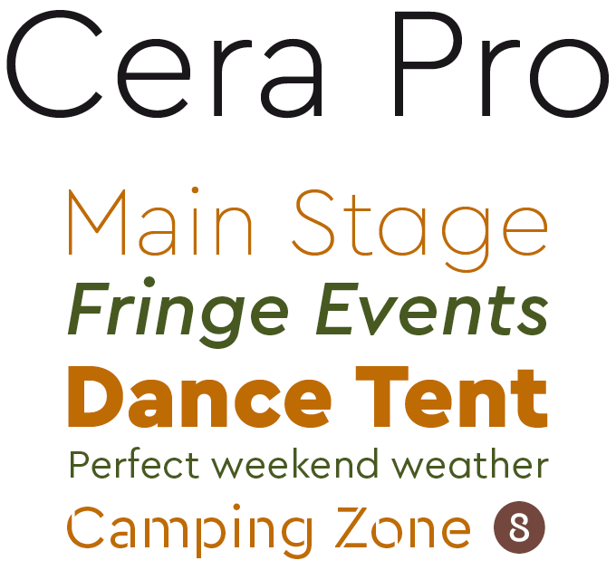
Jakob Runge is one of the talented new voices from Germany; his delightful oldstyle FF Franziska has won him various awards. Cera Pro, published by Runge’s own type me! fonts, is a very different bunch of curves. Indebted to geometric classics such as the Futura® type family, it takes the modernist model into the postmodern age with technical savvy and a healthy dose of human warmth. This pan-European family has impressive language support, and includes Cyrillic and Greek. Runge has paid attention to little known differences in how characters and accents are used in different countries, adding localized lettershapes and diacritics. There’s also a nicely made stencil version, sold as a separate typeface: Cera Stencil Pro, a useful addition for striking headlines.
|
|
|
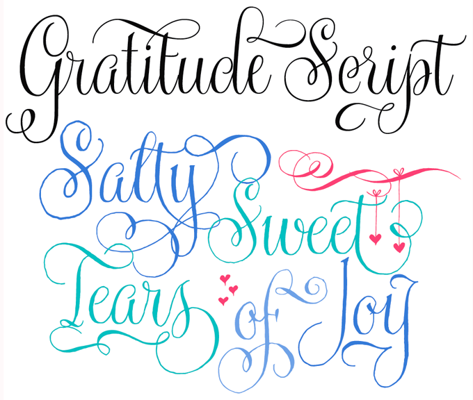
Lettering artist Kathy Milici drew a lovely set of casual, whimsical letterforms, then handed them over to Alejandro Paul of Sudtipos who expertly digitized her work to produce Gratitude Script. Its style is clearly based on the kind of lettering Milici is famous for: wedding invitations. With its signature hand-written look, flowing lines, graceful curves and flourishes, Gratitude Script’s space saving, vertical style is perfect for small printing areas as well as large format presentations. This OpenType font contains more than 1400 glyphs including ligatures, alternates, endings, support for a wide range of Latin languages and a set of ornaments and words — a versatile addition to your font repertoire. There is a smooth version of Gratitude Script too. Use with OpenType-enabled software to get the maximum effect out of the family! The foundry is offering a special introductory price until June 19th, 2015. |
|
|
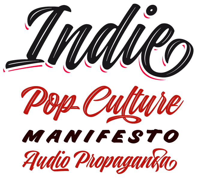
Indie, the latest family from Lián Types, is a script face in a well-known pointed-brush style, but it offers some features that few scripts have. To designer Maximiliano Sproviero — a long-time fan of sign painting and hand lettering — brush scripts have become the epitome of urban hipster culture, representing the cult of the Now. He created Indie from his own hand-lettering. Besides its basic style, Indie offers a couple more versions to create sophisticated headlines and logos: Indie Shade and Indie Inline are stand-alone variations, while Indie Shade Solo offers the possibility to create shadow effects in a second color. All share the exact same glyphs and metrics for carefree layering. For a more casual look, activate the contextual and the decorative ligatures. A very fine toolkit indeed. |
|
|
Text Fonts of the month
Typesetting for books, magazines or annual reports requires font families with special qualities: excellent readability, a generous range of weights with italics and small caps, multiple figure sets (lining, oldstyle, table) and ample language coverage. Here is a selection of recent, high-quality text typefaces.
|
|
|
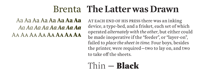
Brenta from Ludwig Übele is a brand new contemporary text face in a style that could be labelled “transitional” — in other words, it has 18th-century roots. Its open counters and compact proportions make it highly readable, even at small sizes. Like the Italian mountain range that gave it its name, Brenta is characterized by sharp-edged and sturdy forms, but also oozes clarity and elegance. Strong serifs, flat and bold shoulders and open terminals emphasize the horizontal and help to guide the eye along the line. Very fine junctures keep the characters sharply defined and create dynamic light traps. Check out Brenta’s introductory discount until July 3rd, 2015. |
|
|
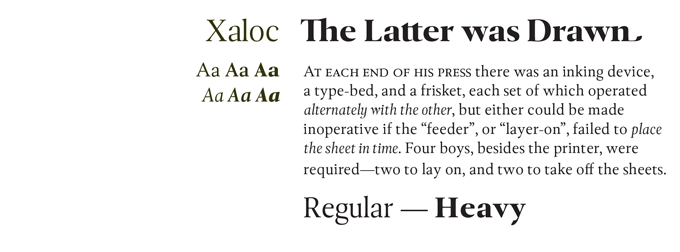
Among recent oldstyle book faces, Xaloc by Ricardo Santos is one of the most impressive. Designed for editorial use in books, magazines and newspapers, Xaloc has many features that make it both functional and out of the ordinary — asymmetrical serifs, geometrically modulated strokes that emulate calligraphic ductus, baroque detailing. Moreover, it offers four different versions, each optimized for a specific range of sizes: Caption, Text, Subhead and Display. A text face that combines supreme usability with great personality. |
|
|
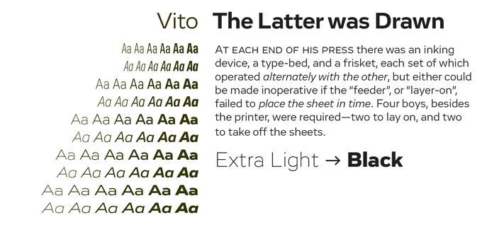
There’s little doubt that, for editorial design and branding, the typographic style of the moment is the geometric sans with Art Deco overtones. There are, of course, quite a few rather bland takes on the genre. Vito from Typejockeys is a breath of fresh air. Designer Thomas Gabriel has invested his sans with subtle reference to various periods of modernist typography. What’s more, he has produced Vito in five widths, from Compressed to Wide, making it a tremendously flexible family for magazines, packaging or movie titles. Vito is on promotion until July 14th, 2015. |
|
|
News Round-Up
In this section we pick out interesting news snippets from MyFonts’ own kitchen and from the greater world of fonts, lettering and typography.
|
|
MyFonts Redesign: Phase 1 Complete
Over the course of this year we’ll gradually be moving towards a fully responsive MyFonts that will look great on any device and give each of our users the best experience possible.
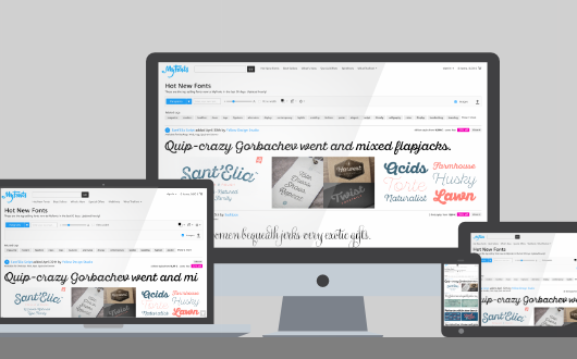
List page redesign
We recently took our first steps in that direction, with newly redesigned list pages on MyFonts. The search results, Hot New Fonts, Best Sellers, What’s New and Top Webfonts pages have all been reworked and they look awesome — check them out! With these improvements, the pages now look great on devices of any size, whether computer, phone or tablet. Our latest blog post has more information.
More Fonts Like This 2.0
“More Fonts Like This” is our font similarity matching system, that helps you find similar fonts to the font you’re looking at. We’ve now rewritten it from scratch using artificial intelligence techniques that work on visual characteristics of the font shapes — and the results are great! It gives much better results than the old version, which simply matched keywords that had been assigned by people. Whether you get great results or if you’ve found a possible glitch, do let us know what you think!
Favorites
It’s been a long time coming, but finally you can Favorite your fonts with one click to create your own list of most-loved fonts. Simply click the heart next to fonts you want to come back to and they will appear in your Favorites list, found under your personal account menu.
FontScout: Coming Soon!
Both “More Fonts Like This” and Favorites will be major features in an exciting new project we’re bringing to an iPad screen near you soon. For curious people there’s a small teaser at fontscout.com. Watch this space!
|
|
MyFonts on Facebook, Tumblr, Twitter & Pinterest
Your opinions matter to us! Join the MyFonts community on Facebook, Tumblr, Twitter and Pinterest — feel free to share your thoughts and read other people’s comments. Plus, get tips, news, interesting links, personal favorites and more from MyFonts’ staff.
|
|
|
|
|
|
Subscription info
It is never our intention to send unwanted e-mail.
Want to get future MyFonts newsletters sent to your inbox? Subscribe at:
MyFonts News Mailing List
|
|
|
Comments?
We’d love to hear from you! Please send any questions or comments about this newsletter to [email protected]
|
|
|
|
|
|
MyFonts Inc. 600 Unicorn Park Drive, Woburn, MA 01801, USA
MyFonts and MyFonts.com are registered service marks of MyFonts Inc. Futura is a registered Trademark of Bauer Types. Other technologies, font names, and brand names are used for information only and remain trademarks or registered trademarks of their respective holders.
© 2015 MyFonts Inc
|
|
|
|