|
There is something special about this edition of Rising Stars. After making our selection from the most popular new typefaces we realized that all of this month’s four Stars are from South America — and that’s a first. It’s a testimony to the success of Latin American designers and foundries on the global typographic scene today, with fonts that are both imaginative and well-made.
|
|
|
This Month’s Rising Stars
|
|
|
|
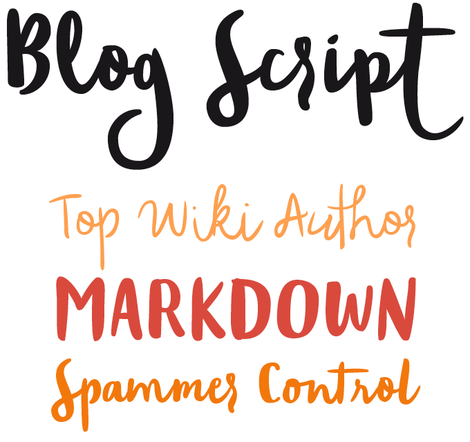
The latest bestseller from Argentina’s Sudtipos is called Blog Script — a name that suggests a very specific use. Designed to make a difference in an age of smooth corporate design, where thousands of companies decide to communicate their uniqueness using uniform web layouts and sleek sans-serifs, Blog Script was made to grace individualist websites. It is lettering artist Carolina Marando’s supple variation on a familiar theme: the nonchalant low-contrast brush script. The design was expertly digitized by Ale Paul — their second collaboration after the successful shabby-chic suite Distillery — in two weights, with alternates for most letters. Designed to denote freedom of spirit, Blog Script has carved out no small ambition for itself: “to tell the world that we’re still human, for now.” Amen.
|
|
|
|
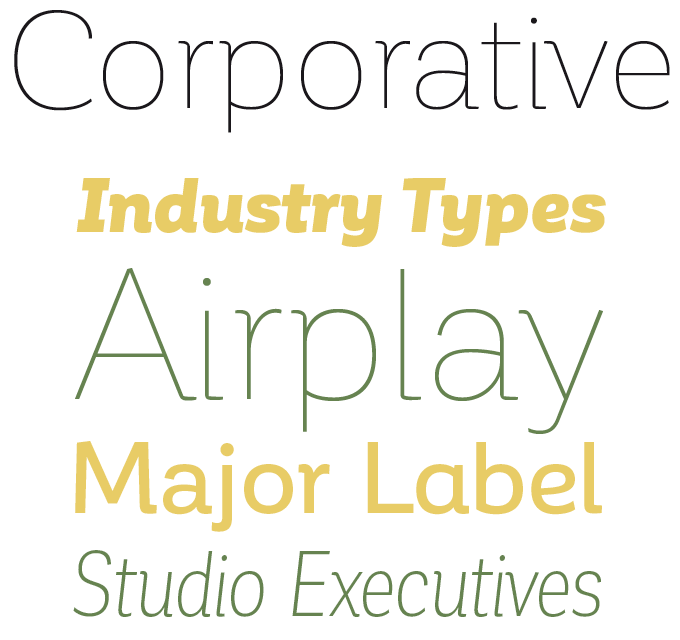
Based in Chile, the Latinotype foundry is extremely productive, relying on efficient collaboration between the growing number of type designers involved. Their new family Corporative is not credited to a single designer, but to the five-person Latinotype Team. The font’s name speaks volumes: Corporative is a fine family for corporate identity projects. A semi-serif design, it is not as generic as the smooth sans-serifs that many design agencies propose today; its straight-angle serifs and open shapes lend it a distinctive personality and high recognizability. With eight weights and elegant italics, it offers superb legibility at smaller sizes as well as attractive detailing for display sizes. The Corporative suite comes in four varieties, each consisting of 16 fonts — a basic family and an alternative family, and condensed widths for both, resulting in enhanced versatility and a wide range of atmospheres. Corporative is on special promotion until August 7th, 2015.
|
|
|
|
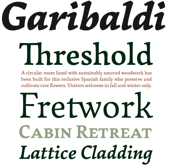
We featured Garibaldi as a Text Face of the Month in the July newsletter; we’ve promoted it to a bona fide Rising Star because it has done exceptionally well. Garibaldi is designer Henrique Beier’s very personal view on the humanist text face. Opting for an approach that is evidently calligraphic, he has created a book face with unique detailing and a strong personality — oldstyle, yet anything but nostalgic. Some of Garibaldi’s spirit echoes expressive Czech type design, from Preissig and Menhart to Veronika Burian’s Maiola. With four weights and matching italics, small caps, and beautifully drawn numerals (including both old style and special small caps figures) Garibaldi from Harbor Type is a solid choice for demanding editorial design.
|
|
|
|
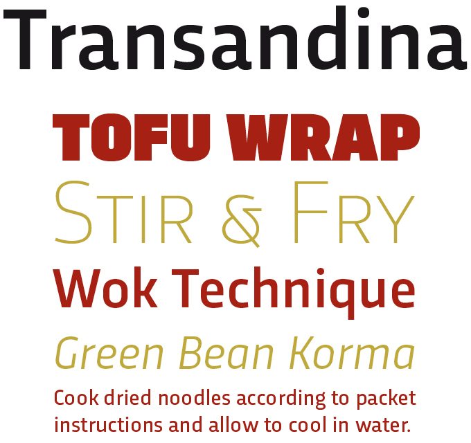
Transandina from Uruguay’s first typefoundry TipoType wears its Latino-ness on its sleeve. The name means “across the Andes”; its letter shapes — especially the boldest weights — have the in-your-face directness of Latin street lettering. At the same time, designer Fernando Díaz has made sure the family is versatile and usable. With nine weights and matching italics, Transandina offers a huge range of atmospheres based on the same skeleton; sporting 800+ characters per weight, the family offers impressive language coverage and the extras of OpenType features. Optimized for web use and for legibility in small sizes, Transandina has practicality covered; yet the powerful simple shapes of the extreme weights (from Thin to Ultra) make for headlines and logos with a strong personality.
|
|
|
Text Fonts of the month
Typesetting for books, magazines or annual reports requires font families with special qualities: excellent readability, a generous range of weights with italics and small caps, multiple figure sets (lining, oldstyle, table) and ample language coverage. Here is a selection of recent, high-quality text typefaces, two of which are available in multiple “optical sizes.” Read on to know more.
|
|
|
|
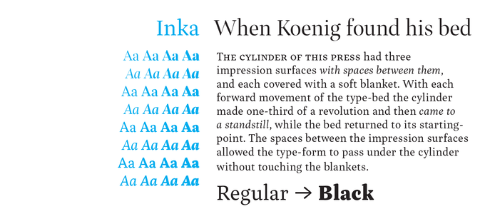
In the era of metal type, each size of a typeface had its own proportions. Large display sizes were more subtle, small sizes were sturdier and less contrasted. Inka, a beautifully produced new book face by Samuel Čarnoký, follows this principle, which is now often referred to as “optical size.” The family consists of several variations of the same basic design, for captions and footnotes (Small), body text (Text), intros and subheads (Title), and headlines (Display). Two version with different extender lengths further enhance the variety: Inka A has the proportions of classic book faces, Inka B has longer ascenders and descenders, plus lower uppercase characters and numerals. It’s the kind of text font discerning typographers dream of. Take advantage of Inka’s introductory discount until September 11th.
|
|
|
|
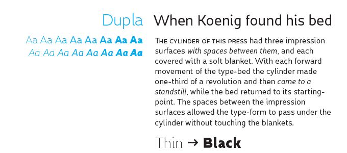
From the Spanish foundry Tipo Pèpel comes Dupla, a sans-serif that combines historic reference with contemporary smoothness. For Dupla’s skeleton, designer Josep Patau sought inspiration in late-nineteenth-century grotesque workhorses, but its skin has the shine and smoothness of a tanned vacationer. As for the typeface’s functionality, Patau’s accompanying text has a whimsical poetry that could profoundly confuse users looking for a simple sans. Its characters, he wrote, “…do not feel very comfortable in low-cost airplane company’s seats, but in the proper location with enough room, will fill the atmosphere with kindness … It’s in the insultingly generous, almost obscene use where Dupla is felt.” Let’s summarize the family’s main assets in practical terms: A modern-looking sans with ample language coverage, small caps, multiple numerals styles. Wickedly usable. Dupla’s is discounted until August 17th.
|
|
|
|
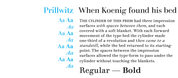
German punchcutter Johann Carl Ludwig Prillwitz was a contemporary of Didot and Bodoni, but his work has remained one of the era’s best kept secrets. He cut his first faces in 1790, even earlier than that other German classicist, Walbaum. Prillwitz Pro by Ingo Preuss is simply a gorgeous revival. It is modest in scope — it offers just Regular, Italic, and Bold — but it’s beautifully made. It also offers various optical styles, optimized for different sizes: Normal, Book, and Display. Plus Prillwitz Press, specially created for small-size newspaper use. While many digital Didot and Bodoni revivals are too thin and vulnerable for long-form reading, this family in a similar style is great for demanding editorial work, offering versions with excellent readability for each hierarchic level of the layout.
|
|
|
News Round-Up
In this section we pick out interesting news snippets from MyFonts’ own kitchen and from the greater world of fonts, lettering and typography.
|
|
MyFonts at TypeCon
MyFonts is once again a headline sponsor of the annual get-together of the Society of Typographic Aficionados (SoTA), otherwise known as TypeCon. We’ll be there in person to soak up Denver’s heady mountain air and just talk type, design and all things font and letter with our customers, our foundries and anyone else up for a chat. Hope to see you there!
|
|
Fitchburg Alphabet
There’s an interesting newspaper project unfolding in Fitchburg, MA, featuring a roster of notable type designers and foundries each contributing a cover design corresponding to a letter of the alphabet. Check out #fitchburgalphabet on Instagram and on Twitter as each cover is revealed.
|
|
FontScout — Explore the MyFonts collection on iPad
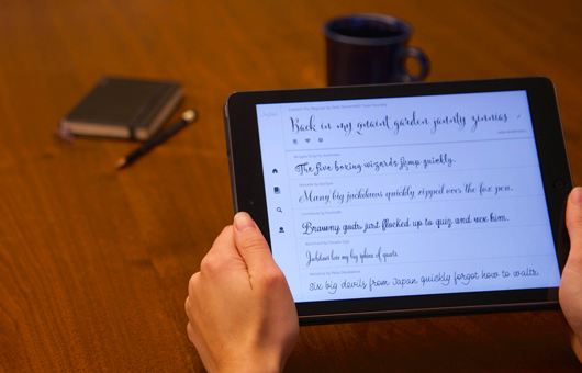
FontScout is the brand new iPad app from MyFonts that gives you a new and different way to explore the world’s largest collection of fonts. Browse the MyFonts collection to narrow down your search to the perfect typeface using our new “More Fonts Like This” technology. Hit the heart button to Fave fonts as you go and add them to albums — everything syncs automatically to your MyFonts account, making it easy to go back to view your top picks later. How much, you ask? It’s free!
|
|
|
|
MyFonts on Facebook, Tumblr, Twitter & Pinterest
Your opinions matter to us! Join the MyFonts community on Facebook, Tumblr, Twitter and Pinterest — feel free to share your thoughts and read other people’s comments. Plus, get tips, news, interesting links, personal favorites and more from MyFonts’ staff.
|
|
|
|
|
|
Subscription info
It is never our intention to send unwanted e-mail.
Want to get future MyFonts newsletters sent to your inbox? Subscribe at:
MyFonts News Mailing List
|
|
|
Comments?
We’d love to hear from you! Please send any questions or comments about this newsletter to [email protected]
|
|
|
|
|
|
MyFonts Inc. 600 Unicorn Park Drive, Woburn, MA 01801, USA
MyFonts and MyFonts.com are registered service marks of MyFonts Inc. iPad is a trademarks of Apple Inc., registered in the U.S. and other countries. Other technologies, font names, and brand names are used for information only and remain trademarks or registered trademarks of their respective holders.
© 2015 MyFonts Inc
|
|
|
|