|
One thing that makes the English language such a superb tool for songwriting is the fact that “September” rhymes with “remember”. A splendid coincidence indeed. In Dutch (the mother language of a couple of our team members) September only rhymes with the local word for “ginger”, which, let’s face it, will never win you a Grammy for best lyrics. English even has three months to rhyme with “remember”, but for some reason, after September, it’s usually “memory almost full.” To cut a long rant short, we can only assume that the current month is more memorable than most, and the newsletter you’ve just started reading totally confirms this. Among the typefaces presented below are fonts that, once read, you may never forget.
|
|
|
This Month’s Rising Stars
|
|
|
|
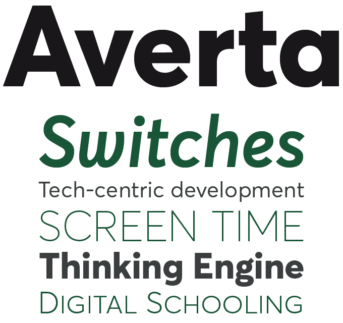
Averta, the name of latest sans-serif by Kostas Bartsokas refers to the Greek “αβέρτα”: to act or speak openly, bluntly or without moderation, without hiding. A nice name for a text and display face that aims to offer a neutral and friendly vehicle for your clear, frank messages. In its design concept Bartsokas has brought together features from early European grotesques and American gothics, resulting in a sans that is both clean and approachable. With open counters and low contrast strokes, the upright is simple and straightforward; thanks to its calligraphic elements, the Italic adds a softer and more humanist dimension. The central weights (Light to Bold) were designed to perform at text sizes, while the extremes are spaced tighter to shine in compact headlines. Averta comes with extended OpenType features including alternates, small caps, fractions, multiple styles of numerals, and more — so it doubles as a versatile family for complex editorial tasks.
|
|
|
|
|
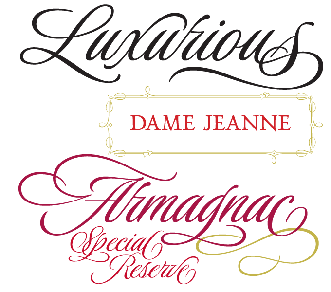
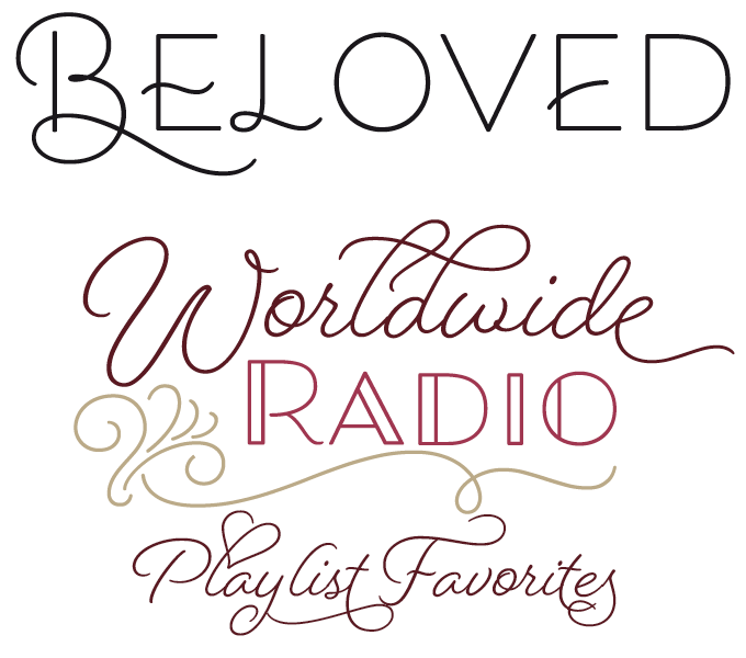
In calligraphy and handwriting, it’s the tool that makes the style. A seasoned lettering artist, Laura Worthington is well aware of this. For the new Beloved Script she has recreated the romantic spirit of Roundhand scripts — known for the waltzy modulation of a rotating pointed pen — into the ballpoint’s monolinear stroke. It’s a bit like taking the rococo plot of an English costume film and transposing it to the romantic comedy of contemporary cities. While many digital script faces impose “on or off” rules about character connections, Beloved Script embodies a more casual and natural state of handwriting — the semi-connected script. Out of the box, the font is lively but casual. But with over 1000 swashes and alternates to choose from, it can become a beautifully decorative spectacle, powerful for custom headlines and word marks. The designer’s typographic palette is further enhanced by Beloved Sans, a set of caps and small caps, with a whopping 800 swashes and alternates, and a compatible set of Ornaments. Special offer until September 26, 2015.
|
|
|
|
Rob Leuschke’s TypeSETit collection is one of MyFonts’ reliable sources for energetic scripts of high technical standards. Luxurious is his latest, and one of his most successful. Luxurious was created “with the new bride in mind” — think wedding invitations, menus, and other events where elegance and sensory delights are celebrated. The family revolves around a virtuoso formal script; cursive shapes with a sharply slanted and condensed character, enhanced by a wealth of flourishes and swashy beginnings and endings. A set of Ornaments adds more options to design something festive or formal. A surprising element is the Roman — a lively alphabet of bookish yet quirky lettershapes to complement the script. All of these are available as separate fonts or together in one Pro set. Luxurious Frames, an attractive toolkit for building, well, frames, is a separate font. Special offer until September 25, 2015.
|
|
|
|
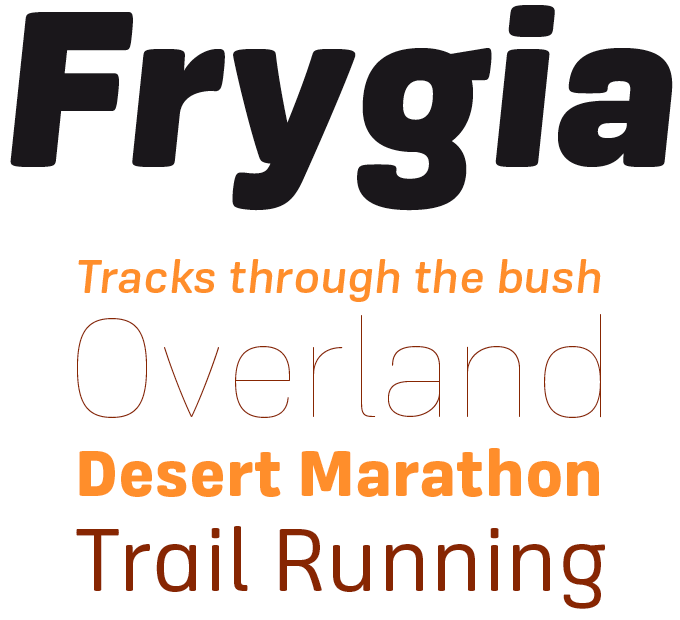
Stawix is an ambitious young foundry based in Bangkok, Thailand. Its founder Stawix Ruecha likes giving a personal twist to traditional genres. Amsi Pro was his biggest success so far — a large sans-serif family extrapolated from pre-Modernist display faces. The new Frygia, which Stawix designed in collaboration with Kawisara Vacharaprucks, ventures a bit further from the beaten path of type history, combining the characteristics of the squarish industrial sans with quirky personal details. The Frygia family comes in ten weights with matching Italics, ranging from Hairline to Black, with subtly rounded corners that lend a lot of appeal to especially the heavy weights. A versatile, usable text and display family, Frygia is tasty in its extreme weights and readable in the middle weights. Special offer until September 19, 2015.
|
|
|
Text Fonts of the month
Typesetting for books, magazines or annual reports requires font families with special qualities: excellent readability, a generous range of weights with italics and small caps, multiple figure sets (lining, oldstyle, table) and ample language coverage. Here is a selection of recent, high-quality text typefaces.
|
|
|
|
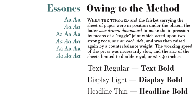
James Todd’s typefaces are nothing if not thorough. His MyFonts debut Garvis Pro, released in 2012, was a miracle of language-sensitive type design. Three years later, here’s Essonnes, an in-depth exploration of optical size. As in metal type, it proposes different variations of one design, optimized for distinct uses: body text, medium-size text, and display. There is a strong historical twist to the project — it brings functionality back to the Didone genre. Due to earlier highly detailed digitizations with ultra-fine hairlines, many graphic designers believe that Didot and Bodoni faces are made for headlines, not body text. Essonnes shatters that myth. The text and display weights have been designed from the ground up for their intended roles. Smitten with the original Didot type, Todd has worked since 2011 to carry the purposes of its original foundry metal incarnations into the 21st century. Well done. Special offer until October 1st, 2015.
|
|
|
|
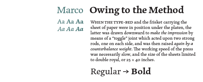
UK-based Japanese designer Toshi Omagari has produced a couple of remarkable revivals and an amusing historical parody as a staff designer for Monotype. The recent Marco is a more personal project, conceived during his time at Reading University, and released now through Type Together. This is a lively text face with an informal touch, inspired by 15th century Italian letterforms. Designed to be used primarily for immersive reading, Marco offers many features required for sophisticated book typography — ample language support in extended Latin, Cyrillic and polytonic Greek, a multitude of swashes in the italic styles, stylistic alternates, and more. An ingeniously crafted text face, Marco comes in three weights with matching italics, and features huge glyph sets: over 1900 characters per style in the uprights, and almost 2600 in the italics.
|
|
|
|
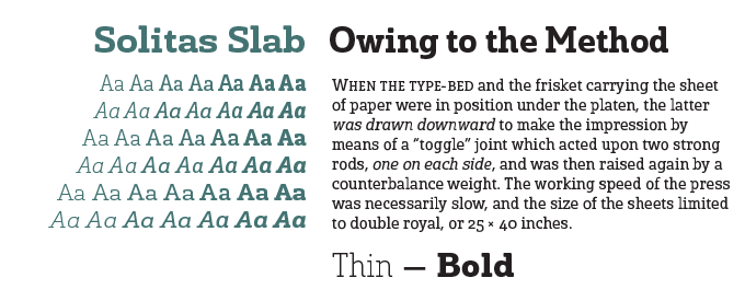
With his Solitas, Jeremy Dooley produced one of his smoothest and most readable text faces to date; six months later, he has presented its slab serif counterpart, Solitas Slab. With its soft and distinct look, Solitas Slab defies the typical robust feel of the slab category. Its compact structure and rounded corners will lend a welcome touch of friendliness and clarity to branding, packaging and editorial projects. Solitas Slab offers a suite of 42 well-rounded fonts that read well both in print and online. The intermediate weights are perfect for long copy, while bolder versions make expressive headlines and subheadings. With OpenType options such as titling caps, small capitals, and multiple figure sets, Solitas Slab offers the full equipment needed for serious text settings. Special offer until October 16, 2015.
|
|
|
News Round-Up
In this section we pick out interesting news snippets from MyFonts’ own kitchen and from the greater world of fonts, lettering and typography.
|
|
It’s Conference Season in Switzerland
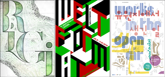
Three posters shown at Luzern’s Weltformat (“World-Size”) Poster Festival: flanking Melchior Imboden’s festival poster (center) are a poster for the Rigi mountain by student Joel Burri and work from South Korean designers Sulki & Min.
If you’re in Central Europe during the second half of September, and crazy about type and graphic design, then Switzerland is the place to be. Three events in a row feature (typo)graphic design at its best.
In St Gallen, possibly the country’s major center for book culture, the third edition of the biennial Tÿpo St Gallen conference takes place from September 18 to 20. Speakers include type designer Lucas de Groot, Portuguese-German-Dutch agency Carvalho/Bernau, French typographic researcher François Chastanet, German Fritz Kahn specialist Thilo von Debschitz, and many more.
After St Gallen, travel immediately to the West to attend the fabulous AGI Open conference in Biel, organized on September 21 and 22 by the world-wide Alliance Graphique Internationale. The splendid cast of speakers includes type designers Kris Sowersby and Peter Biľak, poster artists Bruno Monguzzo and Werner Jeker, graphic designers Simon Esterson, Mario Eskenazi, Julia Hasting, Quing Zhao, Jan Wilker and Ruedi Baur.
Finally, on to the thriving graphic design hub that is Luzern, home to several of Switzerland’s best known poster designers. From September 26 to October 4, the city is home to Weltformat 15, the seventh edition of its annual poster festival. Berlin designers Sven Lindhorst-Emme and Fons Hickmann present a major exhibition of recent posters from the German capital; the program also focuses on young designers from South Korea.
|
|
FontScout — Explore the MyFonts collection on iPad
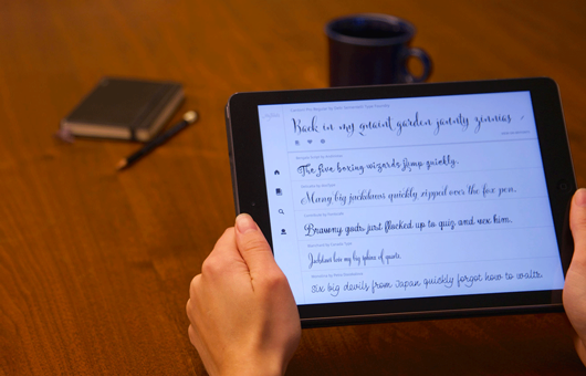
FontScout is the brand new iPad app from MyFonts that gives you a new and different way to explore the world’s largest collection of fonts. Browse the MyFonts collection to narrow down your search to the perfect typeface using our new “More Fonts Like This” technology. Hit the heart button to Fave fonts as you go and add them to albums — everything syncs automatically to your MyFonts account, making it easy to review your top picks later. How much, you ask? It’s free!
|
|
|
|
MyFonts on Facebook, Tumblr, Twitter & Pinterest
Your opinions matter to us! Join the MyFonts community on Facebook, Tumblr, Twitter and Pinterest — feel free to share your thoughts and read other people’s comments. Plus, get tips, news, interesting links, personal favorites and more from MyFonts’ staff.
|
|
|
|
|
|
Subscription info
It is never our intention to send unwanted e-mail.
Want to get future MyFonts newsletters sent to your inbox? Subscribe at:
MyFonts News Mailing List
|
|
|
Comments?
We’d love to hear from you! Please send any questions or comments about this newsletter to [email protected]
|
|
|
|
|
|
MyFonts Inc. 600 Unicorn Park Drive, Woburn, MA 01801, USA
MyFonts and MyFonts.com are registered service marks of MyFonts Inc. Other technologies, font names, and brand names are used for information only and remain trademarks or registered trademarks of their respective holders.
© 2015 MyFonts Inc
|
|
|
<
|