|
This is a December newsletter just as it should be: festive and optimistic. It offers elegant and energetic fonts to typeset your holiday menus. It looks into current trends that will, quite probably, also be the fashions the new year will inherit. But it also has some amazing offers for your inner business person. If this is the end of your fiscal year, expanding your typeface collection with some wonderful modern classics could be an ideal way to fill out your yearly software budget. If not — buy somebody a fontastic present.
|
|
|
This Month’s Rising Stars
|
|
|
|
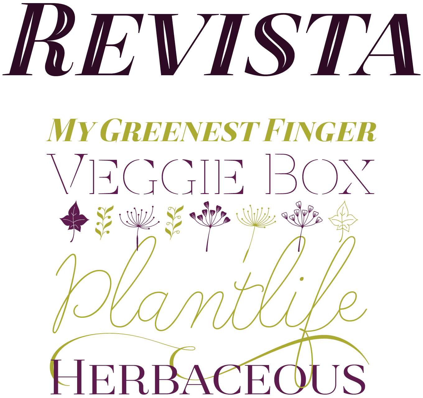
Chile’s Latinotype is churning out one group effort after another; and Revista (Spanish for “magazine”) is one of their most successful type suites so far. Designers Paula Nazal Selaive, Marcelo Quiroz and Daniel Hernández have put together a typographic system that covers a range of functions and atmospheres to grace, say, a lifestyle magazine project. The package consists of a Didone uppercase and small caps family of four weights plus italics, a stencil version of the same set, and an Inline Black weight. Revista also contains a Script subfamily that comes in five weights, from a monolinear Thin to whimsical contrast in Black, with many ligatures and alternates. For more instructions of how to use the script, see the font page. Finally, the suite includes two sets of dingbats, varying from zodiac signs symbols to fashion and technology symbols, and a font of Ornaments in three weights.
|
|
|
|
|
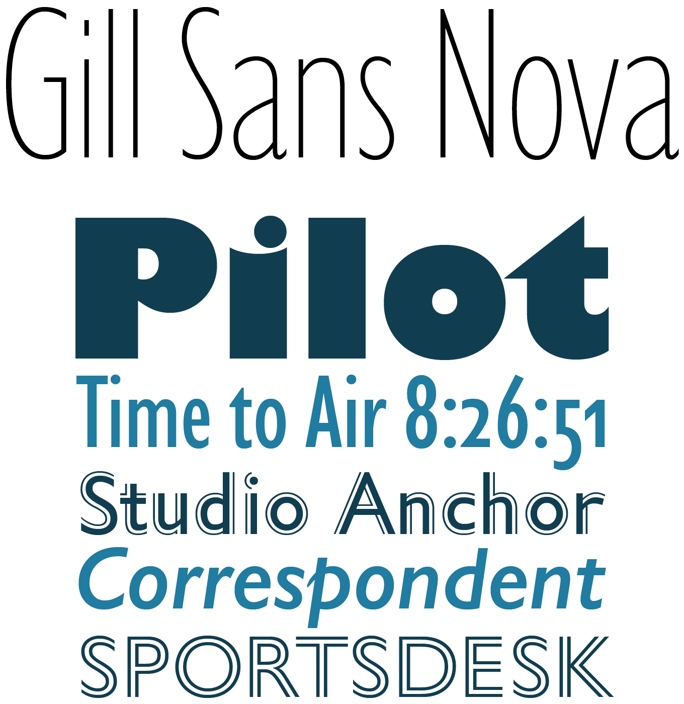
The Monotype library is home to some of the best-loved modern classics of the past century, and the faces by Eric Gill are an important part of that legacy. We recently introduced a new version of Gill’s most popular typeface families: Gill Sans® Nova and Joanna® Nova, plus an intriguing new sans-serif — Joanna Sans Nova. The Gill Sans Nova family was drawn by Monotype Studio designer George Ryan, expanding the Gill Sans family from 18 to 43 fonts. It’s a rigorous update to one of the most influential sans-serifs of the early twentieth century, turning the family into a more systematic range of roman and condensed designs. Several new display fonts were added, including a suite of six inline weights, shadowed outline fonts that have never been digitized before, and Gill Sans Nova Deco that was previously withdrawn. A new chapter in the story of a pioneering typeface that is still ubiquitous in contemporary graphic design. The Eric Gill Series (including Joanna and Joanna Sans) in on offer until December 19.
|
|
|
|
|
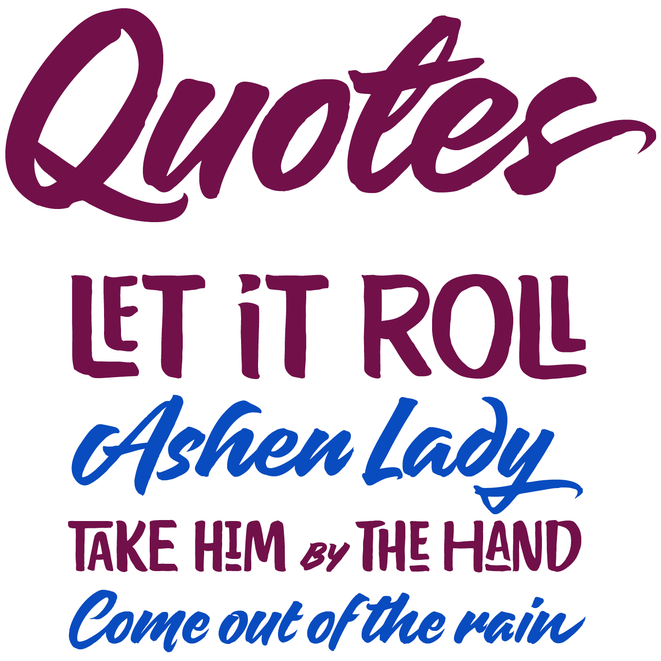
Quotes is the second typeface calligraphed for Sudtipos by Yani Arabena; digital design and production by Guille Vizzari and Alejandro Paul. Arabena’s inspiration is the thrill of handling the pointed brush, the fascination for spontaneous messages and gestures. The typeface’s name refers to the kind of texts it was designed to express — inspirational phrases and quotes. Quotes comes in two complementing handwriting styles: Script and Caps, investing the visualization of the spoken word with variations in rhythm and energy. Script, the more carefree and spontaneous family member, offers a great variety of alternates in both its lowercase and uppercase letters, adding ligatures and alternates to shape the beginnings and endings of words and phrases. Caps is an uppercase set offering a huge amount of alternate glyphs, ligatures and connectors to enrich different types of messages. Quotes, made to express feelings — or sell beer if you absolutely want to. A special introductory offer on Quotes runs until December 26.
|
|
|
|
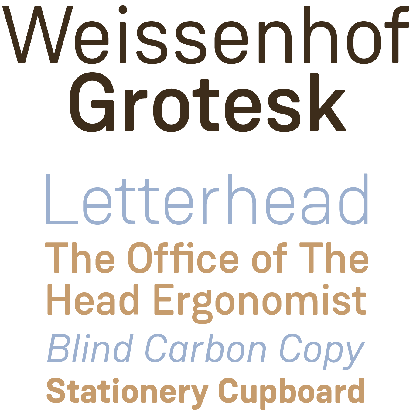
Stefanie Schwarz and Dirk Wachowiak are two designers from Stuttgart, Germany, who have previously published with T-26, FontFont and Acme. They’ve now struck a collaboration with Indian Type Foundry presenting Weissenhof Grotesk, a typeface inspired by their city’s housing project of the same name, a 1927 modernist classic. Architectural features such as curves connecting to straight segments inspired the typeface’s letterforms, and the straight-sided ‘o’ supplied a pattern for the structure of many letters. Weissenhof Grotesk features monolinear strokes and a well-balanced range of stroke thicknesses — four weights with matching italics. The horizontal proportions tend toward equalization between characters, without becoming monospaced. Weissenhof Grotesk is on offer until December 21.
|
|
|
Text Fonts of the month
Typesetting for books, magazines or annual reports requires font families with special qualities: excellent readability, a generous range of weights with italics and small caps, multiple figure sets (lining, oldstyle, table) and ample language coverage. Here is a selection of recent, high-quality text typefaces.
|
|
|
|
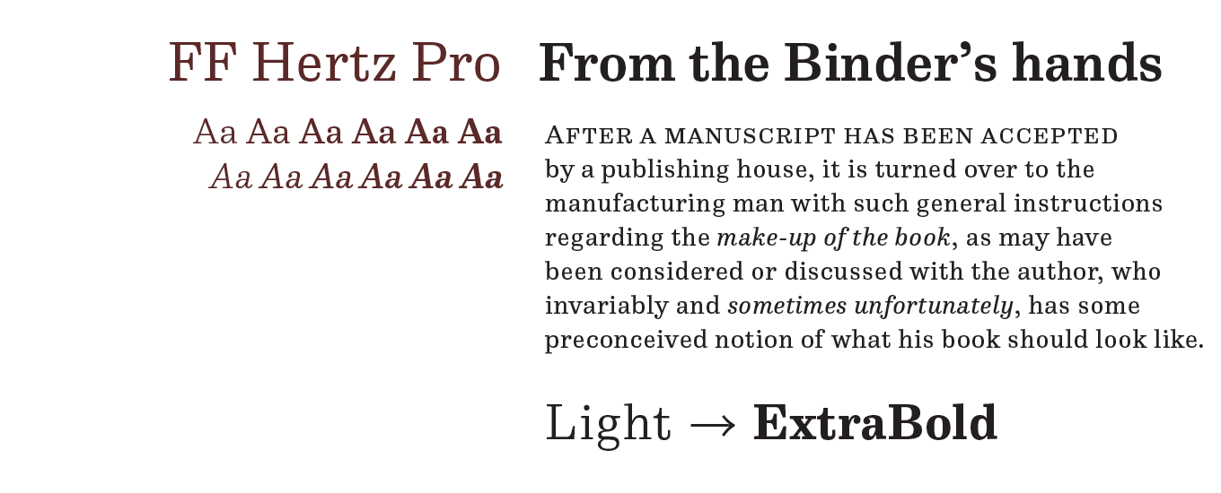
It’s been a while since we saw new typefaces from the prestigious FontFont library on these pages, so in this newsletter we present two. Both are highly functional text faces, and both have interesting historical roots. A unique mixture of influences go into Jens Kutílek’s FF Hertz™, from super elliptical (“squarish”) typefaces like Zapf’s Melior® family to German cartographic alphabets. The result is a mighty and versatile text suite in six weights. One feature of note is FF Hertz’s uni-width design. Each letter occupies the same space in all weights, so text can be set in a heavier weight without reflowing. Also great for tables!
|
|
|
|
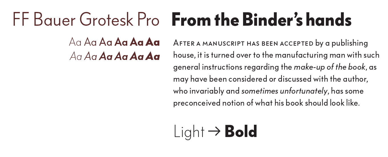
The original Friedrich-Bauer-Grotesk typeface, released in 1934 by the Hamburg foundry J.D. Trennert & Son, is one of the lesser known German sans-serifs. It has a charm all its own. Friedrich Bauer designed his Grotesk with a nod to famous faces like Futura, Erbar, Kabel and Super Grotesk; its geometric construction is infused with a touch of Art Deco. FF Bauer Grotesk™ by Thomas Ackermann and Felix Bonge of FontFont is its highly anticipated revival: a sensitive adaptation that is somewhat warmer, but also more homogenous. An ideal new sans for those looking for something with historical weight to use across editorial and packaging design, in publishing, and ephemera.
|
|
|
|
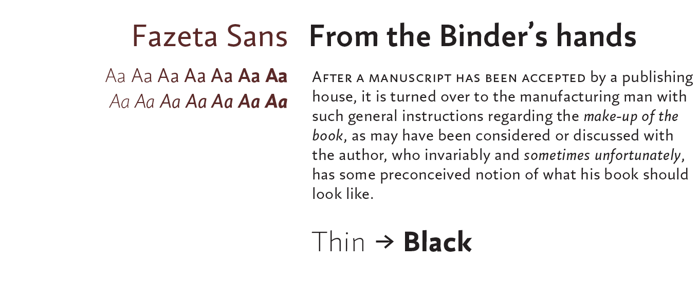
Fazeta Sans by Slovakia’s Andrej Dieneš is the perfect companion to Dieneš’ serif typeface Fazeta. Almost a year ago we welcomed that text face as “possibly the most unusual and striking text family of recent times.” While that Fazeta comes in three optical variations for large and small sizes, the sans-serif does it more simply. One optical size (makes sense, because the sans is sturdier and less contrasted) but two extra weights on the lighter side of the spectrum. The result: seven weights plus matching italics, in a fine gradation that lets you choose the perfect weight for each project. With 1140 glyphs per font (including mathematical symbols, arrows and borders) the sans is as marvelously versatile as its serif companion. Curious to learn more? Check out the 16-page PDF specimen downloadable here. Fazeta Sans is discounted until Dec. 17, 2015.
|
|
|
News Round-Up
In this section we pick out interesting news snippets from MyFonts’ own kitchen and from the greater world of fonts, lettering and typography.
|
|
The Foundation Collection
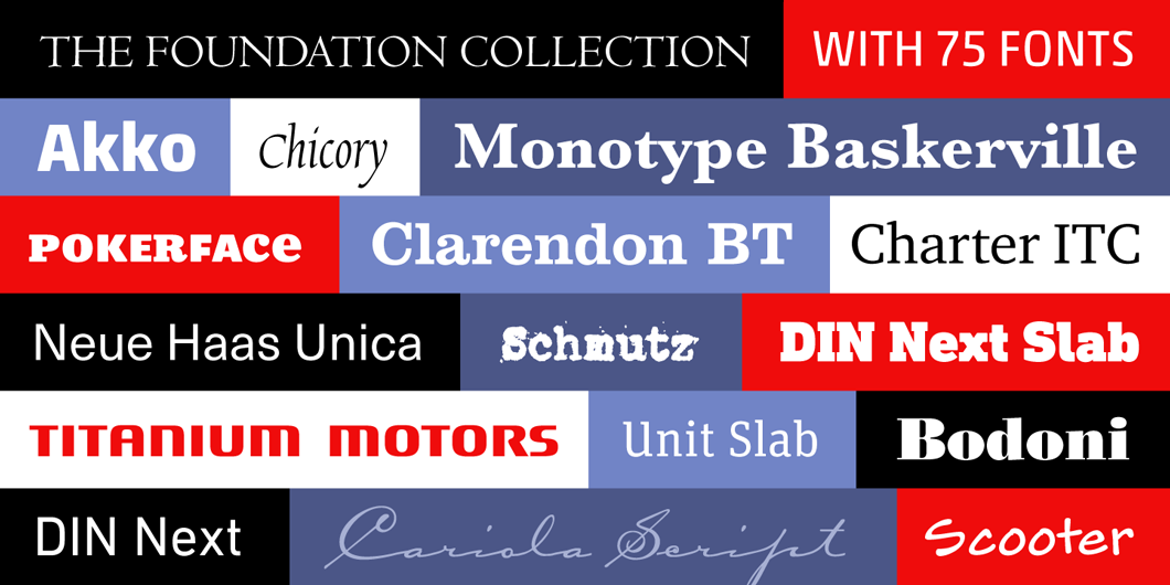
The Foundation Collection is a package of high quality text and display families
New to MyFonts this week and available for a few more days at a pretty amazing price is the Foundation Collection, a compilation of type families and display faces that includes established big hitters like Avenir® Next, Clarendon® BT, DIN® Next, Charter® ITC, Baskerville™ MT and Bodoni™ LT, together with a handful of sleeper hits such as Akko® Pro and Ayita™ Pro (all in four MS Office-friendly font sets that include bold and italic styles). The Collection is rounded out by a selection of display faces, which all adds up to a highly useable and comprehensive kit of essential typefaces for both creatives starting out on their professional journey and seasoned typographic practitioners.
This amazing package is available for just $49 until this Friday, 11th December.
|
|
Popular Designer of the Month
Each month, we add a new designer to the sidebar of popular designers on our homepage, based on their popularity with customers. This month, our new addition is Debi Sementelli of Correspondence Ink.
 Sementelli enjoyed a successful career as a professional lettering artist and calligrapher for many years. Only four years ago she ventured into digital type design, with the technical assistance of Brian J. Bonislawsky. Their first font, the joyously connected script Belluccia, became an immediate success on MyFonts, and her subsequent typefaces have all been popular. “I have a romance with letters,” she writes. “I can easily get entranced with the curve of a C or the descender of a y. My favorite moments are spent amongst pens, inks, paints, and brushes, wildly flourishing my way through an alphabet.” Becoming a font designer was “an invigorating and challenging journey. But I still get a thrill every time I see someone using one of my fonts in a uniquely creative way.”
|
|
|
MyFonts on Facebook, Tumblr, Twitter & Pinterest
Your opinions matter to us! Join the MyFonts community on Facebook, Tumblr, Twitter and Pinterest — feel free to share your thoughts and read other people’s comments. Plus, get tips, news, interesting links, personal favorites and more from MyFonts’ staff.
|
|
|
|
|
|
Subscription info
It is never our intention to send unwanted e-mail.
Want to get future MyFonts newsletters sent to your inbox? Subscribe at:
MyFonts News Mailing List
|
|
|
Comments?
We’d love to hear from you! Please send any questions or comments about this newsletter to [email protected]
|
|
|
|
|
|
MyFonts Inc. 600 Unicorn Park Drive, Woburn, MA 01801, USA
MyFonts and MyFonts.com are registered service marks of MyFonts Inc. Joanna and Gill Sans are trademarks of The Monotype Corporation registered in the United States Patent and Trademark Office and may be registered in certain jurisdictions. DIN Next, Hertz and Bauer Grotesk are trademarks of Monotype GmbH and may be registered in certain jurisdictions. Avenir, Clarendon, DIN and FF are trademarks of Monotype GmbH registered in the U.S. Patent and Trademark Office and may be registered in certain other jurisdictions. Baskerville and Bodoni are trademarks of The Monotype Corporation and may be registered in certain jurisdictions. Charter is a trademark of Monotype ITC Inc. registered in the U.S. Patent and Trademark Office and which may be registered in certain other jurisdictions. Akko is a trademark of Monotype Imaging Inc. registered in the U.S. Patent and Trademark Office and may be registered in certain other jurisdictions. Other technologies, font names, and brand names are used for information only and remain trademarks or registered trademarks of their respective holders.
© 2015 MyFonts Inc
|
|
|
|