|
Just last week the film world celebrated the best in their industry at the annual Academy Awards ceremony — commonly known as The Oscars. But why only once a year? MyFonts prefers to celebrate the best in the typography world every single month with our Rising Stars newsletter. Instead of choosing the best movie, best director, best actor or actress, we showcase four of the hottest new fonts, plus the best new text fonts. And each month we are surprised at the variety of the offerings: this edition features an elegant combo of script and sans serif styles, a sturdy squarish sans family, an idiosyncratic serif face, and a soft geometric sans. Now where do we keep those golden statuettes…?
|
|
|
This Month’s Rising Stars
|
|
|
|
|
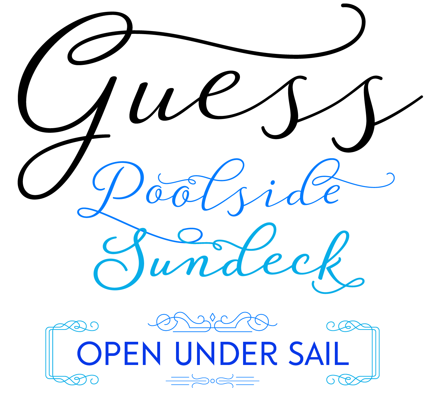
The concept of a type family can be very fluid — from a single design in different weights and/or widths to a collection of stylistically related designs in a variety of genres. Guess joins the ranks of a growing number that marry scripts to sans serifs. DearType’s latest release is similar to its predecessor Lifehack, also a bestseller. Whereas Lifehack was more relaxed — a bold upright brush script and a casual hand-drawn sans — Veneta Rangelova designed Guess to convey elegance and style. The slender connecting script in Regular and Bold strikes the perfect balance between refinement and friendliness, and offers tons of swashes and stylistic alternates to unleash your creativity. Guess Sans is the companion sans serif: nine weights of geometric capitals with gracefully curved details. A set of beautiful borders and swirling ornaments completes the family. This makes Guess the perfect choice for anything from fashion brands and editorial design to greeting cards and invitations — any application that needs to appear classy and chic.
The complete Guess suite is on special offer until March 20, 2016.
|
|
|
|
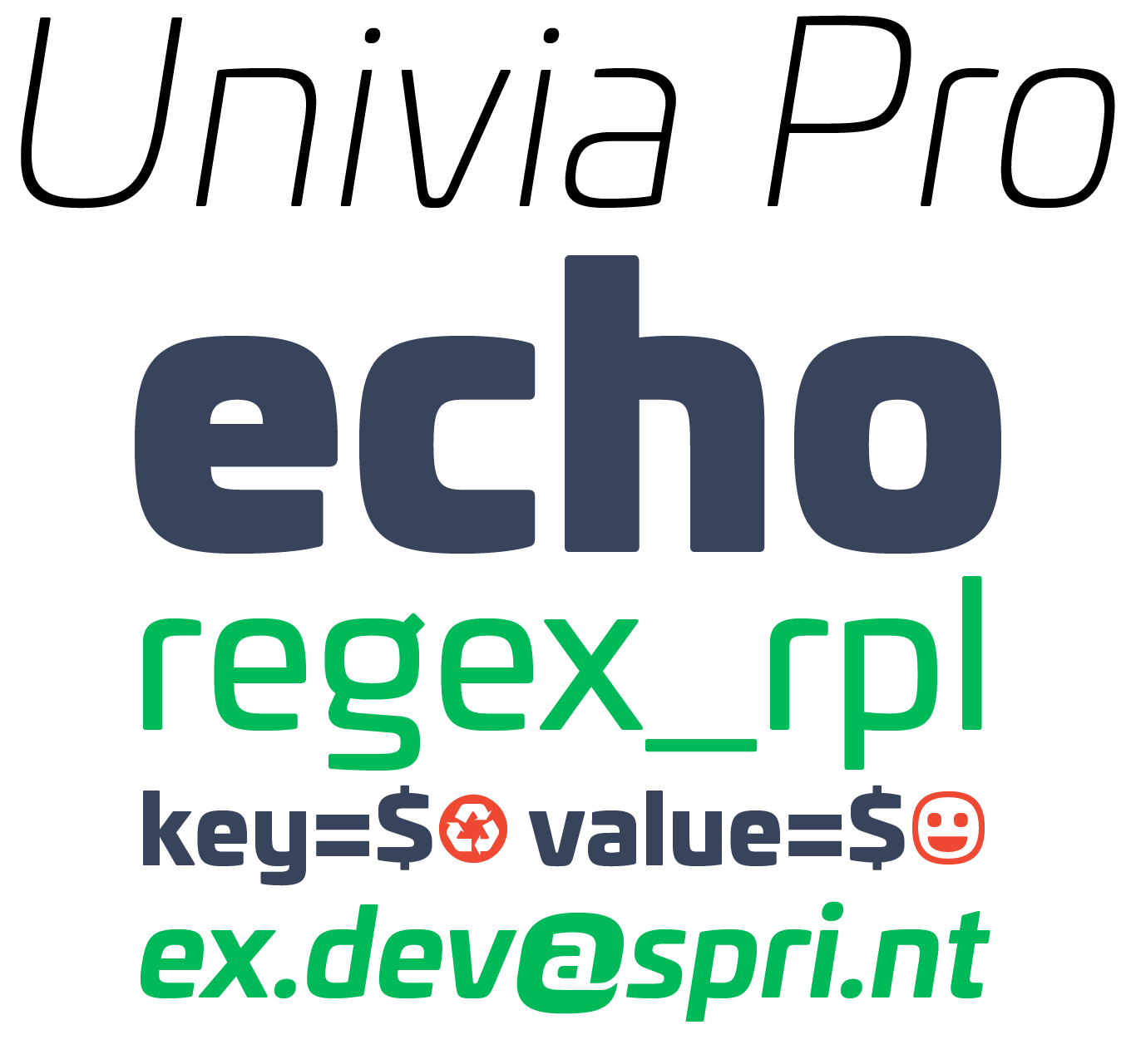
Univia Pro is a clean, versatile text and display family from Mostardesign with a strong and pleasant personality. Olivier Gourvat achieved its distinctive look by dressing a sturdy, squarish skeleton with rounded features. The confident expression of the superelliptical shapes is softened by smooth curves and round corners. The absence of spurs simplifies the letter forms, further enhancing Univia’s modern look and contributing to an uncomplicated character that makes it ideal for e-books, websites, user interfaces, mobile apps and so on. This professional, feature-rich OpenType font comes in 18 styles (nine weights plus italics), and offers all the necessary features for demanding typography including a selection of surprising @ and # signs for all your social media needs.
|
|
|
|
|
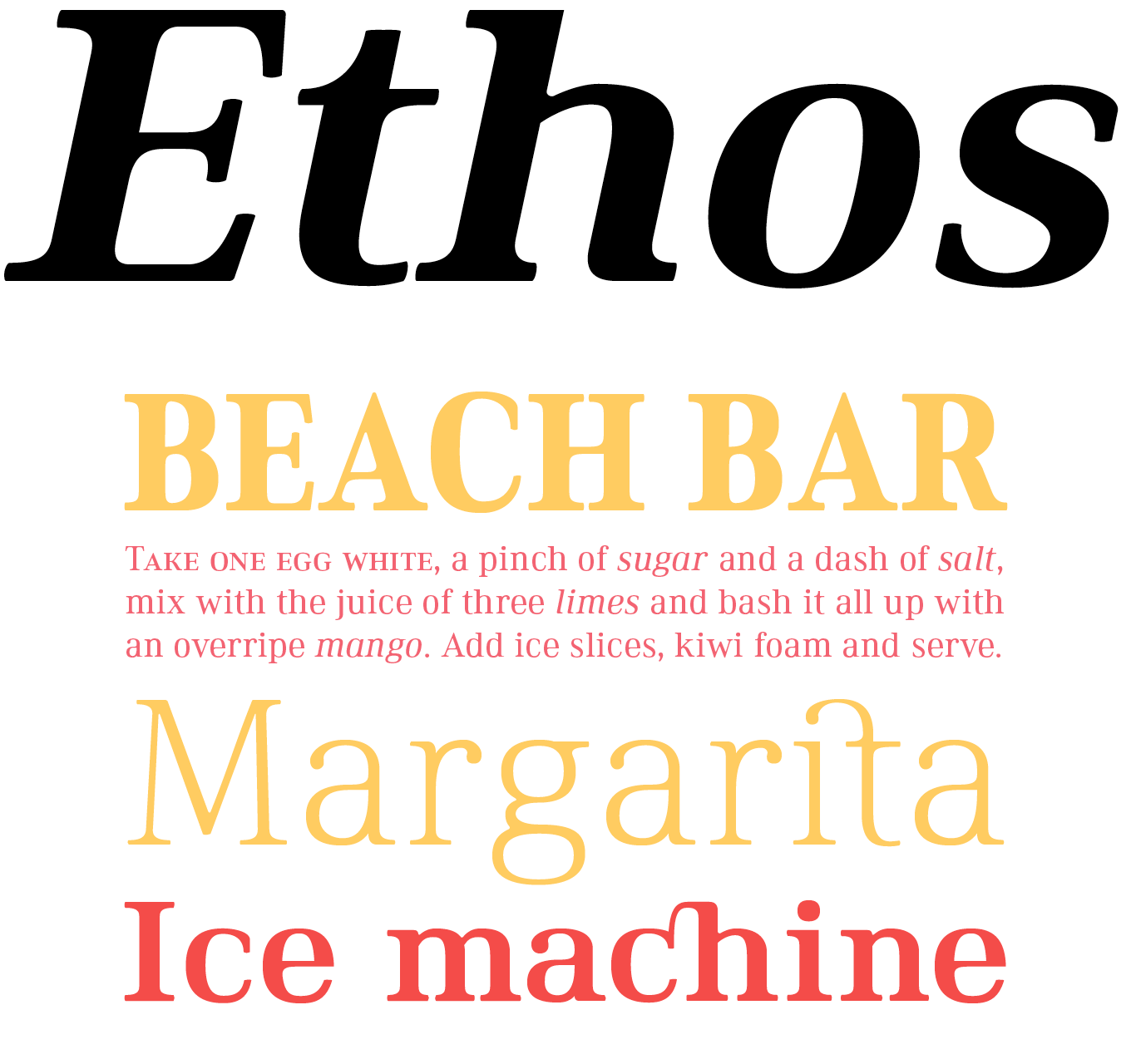
Since it was mentioned as one of the text fonts in last month’s Rising Stars newsletter, Ethos from Fonts With Love has been a persistent presence at the top of our Hot New Fonts chart. Designer Florian Klauer has created a contemporary serif typeface with surprising detailing: delicately rounded serifs and alternating angular and curved corners. The strategic location of the curved corners in the letter forms lends the typeface a wonderful, well-balanced fluidity. With its generous x-height and vertical stress Ethos remains legible even in small type sizes. The geometric character and unusual design details make the typeface stand out when used at large sizes. The lighter weights have a low contrast, improving their legibility on screen.
Ethos is available in six weights from a breezy Thin to a solid Heavy, all in three widths (Regular, Condensed and Expanded) and with matching italics for a total of 36 styles. Adventurous type users can combine the lowercase and the smallcaps for a unicase effect. Try Ethos Regular and Italic for free.
|
|
|
|
|
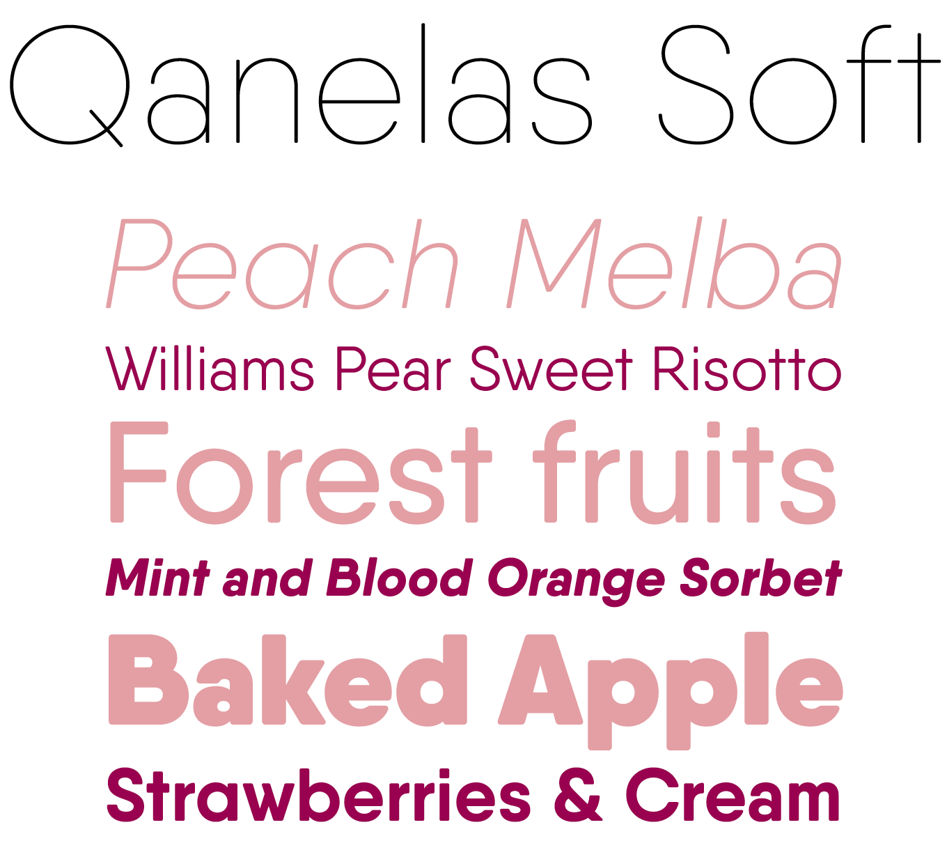
There is something about geometric sans serifs that seems to make them irresistible to both type designers and regular users. Maybe it is the reassuring rhythm of recognizable, simple forms like the circle, the square, and the triangle. Maybe it is the many options that those geometric shapes offer for creating striking typographic compositions, commanding titles and headlines, or memorable logotypes. Yet some people may find them a little too technical or cold. For those people Radomir Tinkov found a good solution. He took three months to retool his previous release Qanelas, carefully rounding the corners of the glyphs. The subtle operation proves to be effective: the appearance of the new Qanelas Soft is undeniably friendlier and warmer, while retaining its geometric aspect.
Offering an impressive 20 styles (10 weights in upright and slanted versions) and a wealth of OpenType features, Qanelas Soft works well in print and on the screen, for graphic design and display use, in applications such as corporate and editorial design as well as signage.
|
|
|
Text Fonts of the month
Typesetting for books, magazines or annual reports requires font families with special qualities: excellent readability, a generous range of weights with italics and small caps, multiple figure sets (lining, oldstyle, table) and ample language coverage. Here is a selection of recent, high-quality text typefaces.
|
|
|
|
|
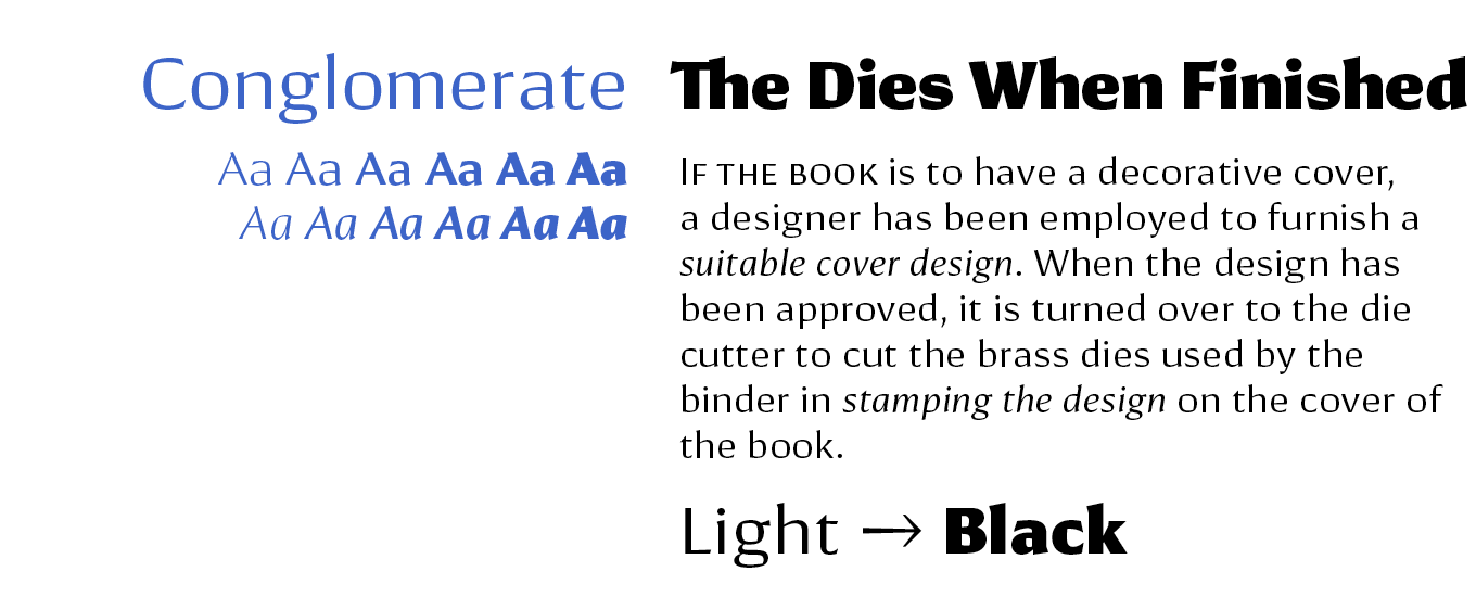
Gregory Shutters won the 2015 Print Magazine Typography & Lettering Award with Conglomerate, straight out of the [email protected] postgraduate program in typeface design. This unlikely hybrid of a rational superelliptical sans and harshly stressed, broad nib calligraphy does not fit neatly into any particular category. Sans or serif? Square or rounded? Calligraphic or geometric? Conglomerate is both all and none of these things — a subtle yet unorthodox blend of typographic traits resulting in a clean, unique, and versatile font family. It has large, open counters for legibility in text yet crisp, sharp details that sparkle at display sizes. Conglomerate comes in six weights with matching italics, each containing an extensive set of OpenType features for quality typesetting — small caps, several sets of numerals, case-sensitive punctuation, ligatures, localized forms, and more. Webfont versions have also been manually hinted for optimum screen clarity on Windows and the web. To celebrate its release the family has an introductory discount until April 15, 2016.
|
|
|
|
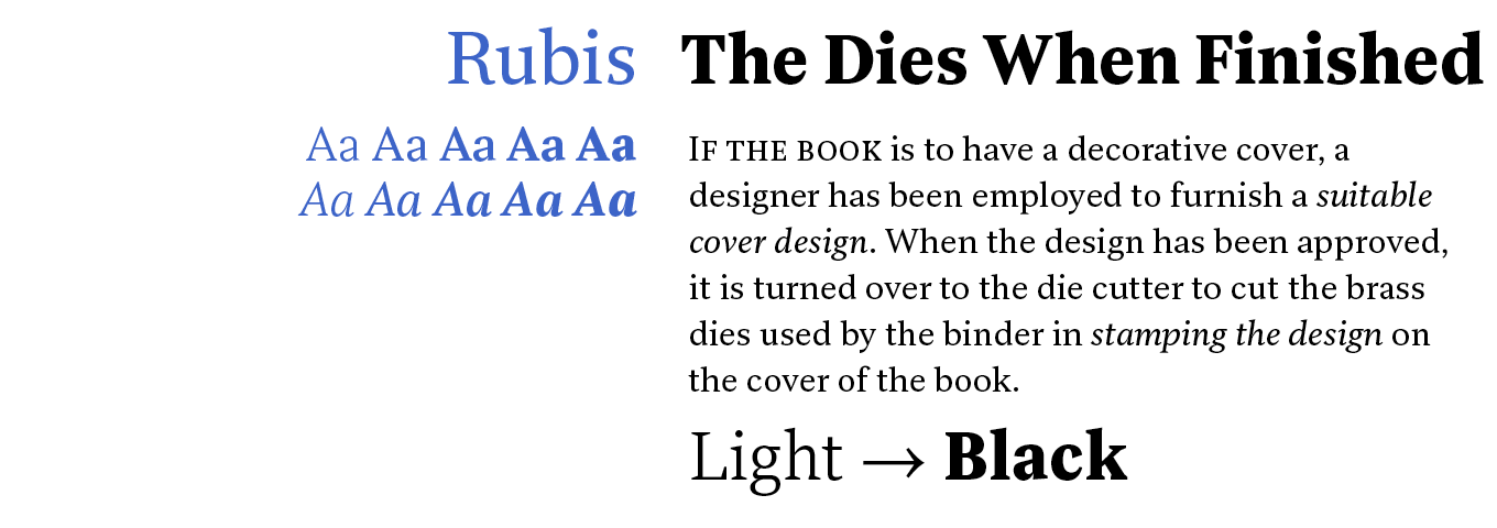
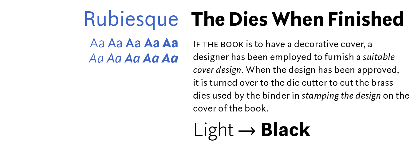
These latest releases by Nootype make a flexible superfamily of serif and sans serif companions, ideal for editorial use. Rubis is a contemporary serif typeface developed specifically for immersive reading. Nico Inosanto aimed to draw sharp letters with flawless curves. The design is serious, yet not without charm. It mixes classical influences as found in the calligraphic terminals with modern traits such as a moderate contrast, sturdy serifs and sharp details.
Rubiesque is the grotesque (another word for sans serif) counterpart to Rubis. Both families consist of 10 styles (five weights with corresponding italics), and share the same skeleton with a harmonized weight range. Rubiesque combines characteristics from both the humanist sans and the American gothic models. It injects subtle vintage design details in a contemporary setting. This blend of styles gives the typeface an interesting and unique personality.
|
|
|
|
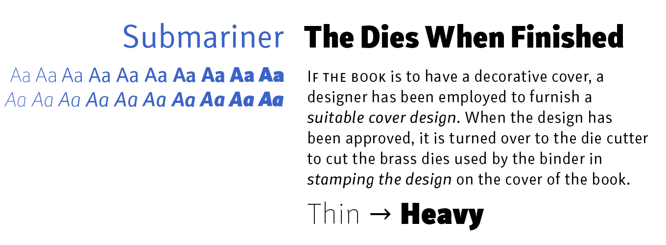
Submariner is a space-saving humanist sans serif family of 20 feature-rich fonts, friendly and full of character. Marin Santic designed Submariner to have a familiar look and feel, yet added some remarkable letters that spice up its reliable appearance without disrupting the flow of the text. With a strong and elegant construction, ample x-height, open apertures, and ascenders that are a little taller than the capitals, the letters are very readable. The typeface handles high-density information design with ease, be it annual reports, information graphics, editorial typography, long-form text, as well as signs, headers and titling work. Get the complete family at an introductory price until March 21, 2016.
|
|
|
News Round-Up
In this section we pick out interesting news snippets from MyFonts’ own kitchen and from the greater world of fonts, lettering and typography.
|
|
TYPO Labs in Berlin — The magic behind fonts
Save the date for TYPO Labs in Berlin, May 10-11, 2016. This new conference from the organizers of TYPOBerlin will bring together type developers with foundries and industry leaders in the field of font engineering. The things they’ll discuss may sound arcane — responsive type, WOFF 2.0, GX Variations, OpenType fine tuning, scripting, parametric fonts — but they’ll be appearing in fonts near you soon!
Confirmed speakers include Just van Rossum, Erik van Blokland, Nina Stössinger, Tal Leming, Tom Rickner, John Hudson, Julia Sysmäläinen, Thomas Phinney, Behdad Esfahbod, Vlad Levantowsky and many more. Classrooms and workshops are offered by the makers of Fontlab, Glyphs and Robofont. Tickets are €249 (plus tax), while group discounts are available. More informations on program, speakers and registration can be found on the TypoTalks website.
|
|
Popular Designer of the Month
Each month, we add a new designer to the sidebar of popular designers on our homepage, based on their popularity with customers. This month, our new addition is Jeremy Dooley of Insigne.
 Jeremy Dooley’s Insigne label has grown over the last decade and more to become one of MyFonts’ most consistent, reliable and productive independent foundries. His families are often notable for their clarity of purpose, their individuality and their originality, while a kind of restless curiosity and urge to experiment seems to never be far from the surface.
His Aviano series of type families redefined what constitutes a super family (and has left its mark on several prominent Hollywood productions), while many of his designs offer the user unprecedented choice and levels of control over typographic detailing through smart use of OpenType alternates. Most of his newest releases, such as Haboro and the brand new Ranelte include multiple widths as standard, as well as small caps, multiple figure styles and plenty of typographic refinements.
|
|
|
MyFonts on Facebook, Tumblr, Twitter & Pinterest
Your opinions matter to us! Join the MyFonts community on Facebook, Tumblr, Twitter and Pinterest — feel free to share your thoughts and read other people’s comments. Plus, get tips, news, interesting links, personal favorites and more from MyFonts’ staff.
|
|
|
|
|
|
|
Comments?
We’d love to hear from you! Please send any questions or comments about this newsletter to [email protected]
|
|
|
|
|
|
MyFonts Inc. 600 Unicorn Park Drive, Woburn, MA 01801, USA
MyFonts and MyFonts.com are registered service marks of MyFonts Inc. Other technologies, font names, and brand names are used for information only and remain trademarks or registered trademarks of their respective holders.
© 2016 MyFonts Inc
|
|
|
|