|
These are only the first days of Spring, and already flowers are hesitantly poking their heads from between the fresh leaves. Birds have started building their nests in frantic anticipation of the new life they will soon welcome. At MyFonts, we are also always excited to welcome new fonts, fresh from the minds of typeface designers from all over the world. This month is all about contrast: from script styles that are casual and textured to others that are controlled and smooth, to sans serifs that are brand new to others based more closely based on the past.
|
|
|
This Month’s Rising Stars
|
|
|
|
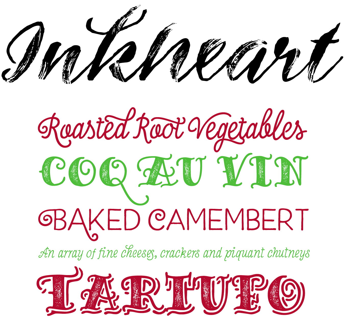
The latest release on Emil Bertell’s Fenotype label is Inkheart, an eclectic collection of 22 casual fonts that merge calligraphy and lettering. This family covers a wide range of different styles that work independently but also play very well together. It features eight script fonts — four monoline designs in three connected Script styles and one unconnected Text style, and four high-contrast brush scripts: Brush and Wide Brush, both in Regular and Dry versions for that extra grit. Channel your inner sailor with tattoo-inspired fonts: the monoline slab serif Pirate and Sailor, available in eight flavors ranging from Outline over Printed to Circus Shadow. The final two alphabetical fonts are a casual brush Sans and Serif. Three dingbat fonts round out the family: a collection of 182 Catchwords, 190 tattoo-inspired Ornaments, and 63 Patterns to spruce up your designs. This fun collection is available at a great introductory special offer until April 11, 2016.
|
|
|
|
|
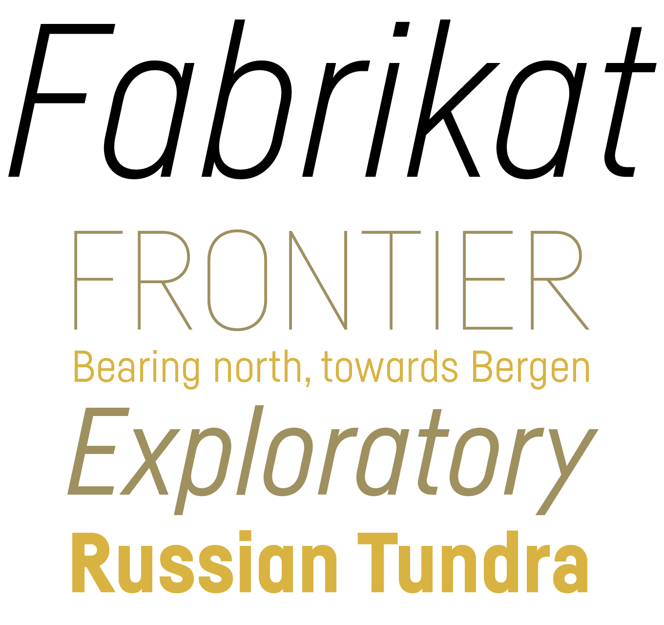
HVD Fonts’ new full time collaborator Christoph Koeberlin (known for his Typefacts blog and formerly of the reputable FontFont Type Department) was in the driver’s seat for the first time for the creation of Fabrikat — and his first solo production under von Döhren’s creative direction has been an immediate hit. Fabrikat’s geometric design is based on German 20th century engineers’ typefaces. This becomes apparent in the plain yet precise letter forms that are mostly constructed with straight lines and circle arcs, as if they were meticulously drawn with straightedge and compass. Don’t let the strict geometry fool you however — the lettershapes are optically corrected with great care, in order to retain their uncut charm. The straight-sided sans serif consists of seven weights from Hairline to Black, all with matching italics. These feature-rich OpenType fonts are equipped for complex, professional typography in both display and text applications. Grab 14 styles of German precision for a very appealing price until April 9, 2016.
|
|
|
|
|
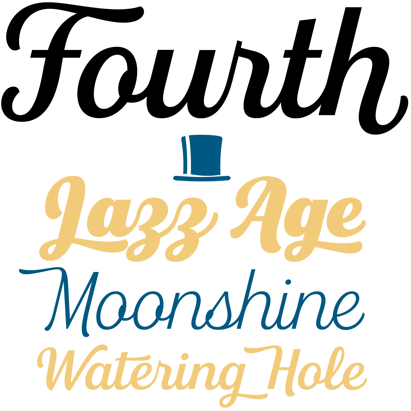
Typography was such an important part of Jason Vanderburg’s design practice that it led the Canadian graphic designer to pursue it in depth. Adding to his previous three releases on his eponymous label is the aptly named Fourth, which has struck a chord with audiences and has quickly become a Best Seller. This contemporary roundhand script with a classic feel taps into our collective nostalgia. It draws its inspiration from quintessential Americana like baseball scripts, sign painting, and retro branding. Smooth curves, a large x-height and rational forms make for clear, consistent and legible text. The lighter weights are perfect for short, stylish copy, while the heavier weights add instant cool to logos and headlines. The family offers a wealth of extras: swash capitals and lowercase letters for extra elegance, contextual alternates for smooth initial and end forms, and underlines and catchwords for effortless styling. Finally, stylistic alternates allow you to achieve the exact word shapes you want, up to the most minute detail.
|
|
|
|
|
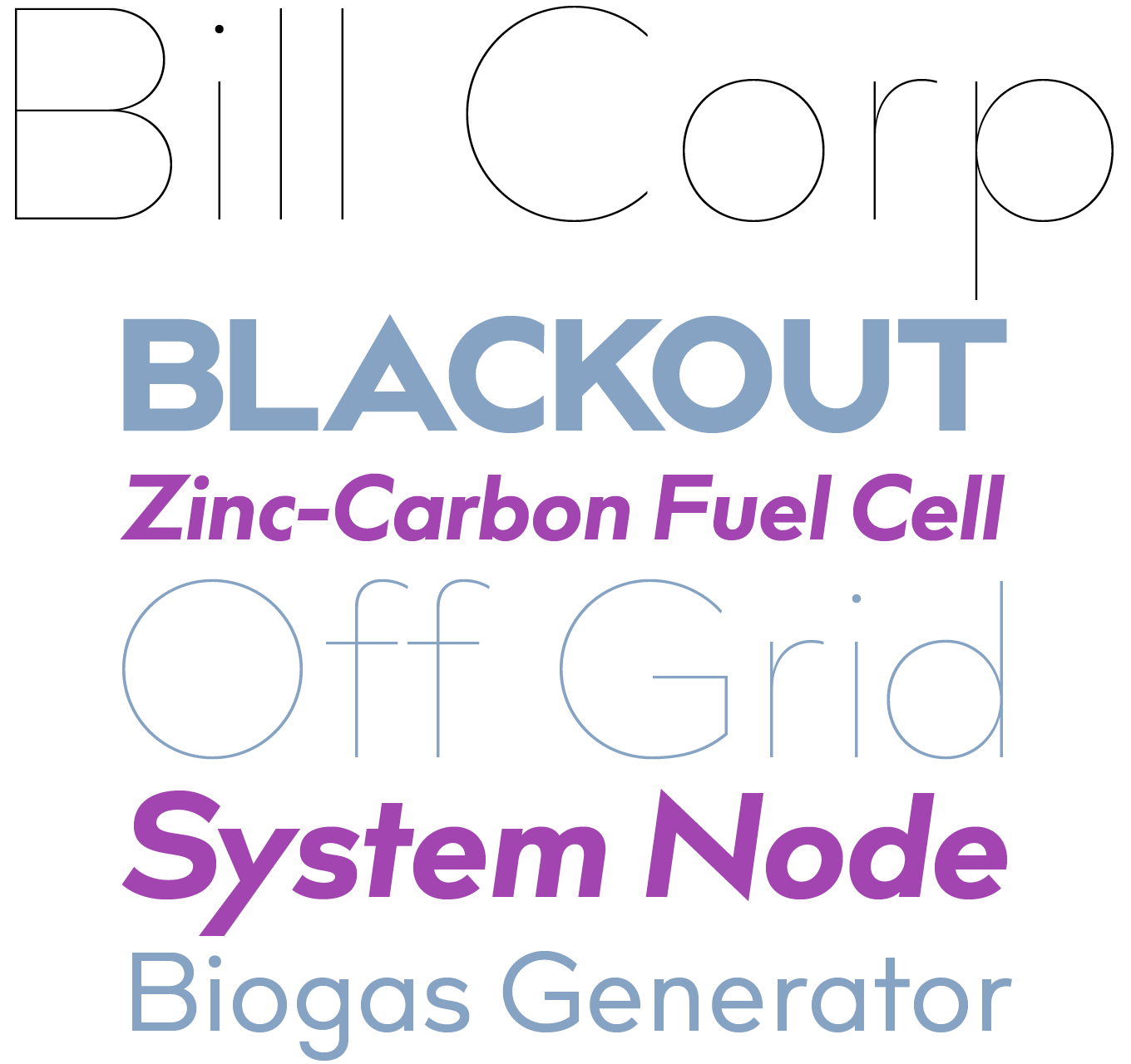
The Max Bill Font Library by Berlin-based Oliver Jeschke a.k.a. OGJ, released with the permission of the Max Bill Georges Vantongerloo Foundation, is based on the work of Swiss master Max Bill. This proponent of the Modern movement, who studied at the Bauhaus, is considered to have had the single most decisive influence on Swiss graphic design since the 1950s. While striving to be universal, the Bill Corporate typeface manages to remain distinctive. Its design follows the same geometric logic as that other icon of the 20th century, Paul Renner’s Futura, but with wider, more generous proportions in the capitals, a humanist ‘S’, and a larger x-height for increased legibility in smaller text sizes. The typeface combines tradition and legacy in a contemporary typeface. The three ultra thin weights Four, Six, Eight — all lighter than the ethereal Hairline — push the letter forms to their extreme. As its name implies, the Bill Corporate family is cut out for business communication and identity work. You can license this piece of Modernist legacy at an incredible discount before April 15, 2016.
|
|
|
Text Fonts of the month
Typesetting for books, magazines or annual reports requires font families with special qualities: excellent readability, a generous range of weights with italics and small caps, multiple figure sets (lining, oldstyle, table) and ample language coverage. Here is a selection of recent, high-quality text typefaces.
|
|
|
|
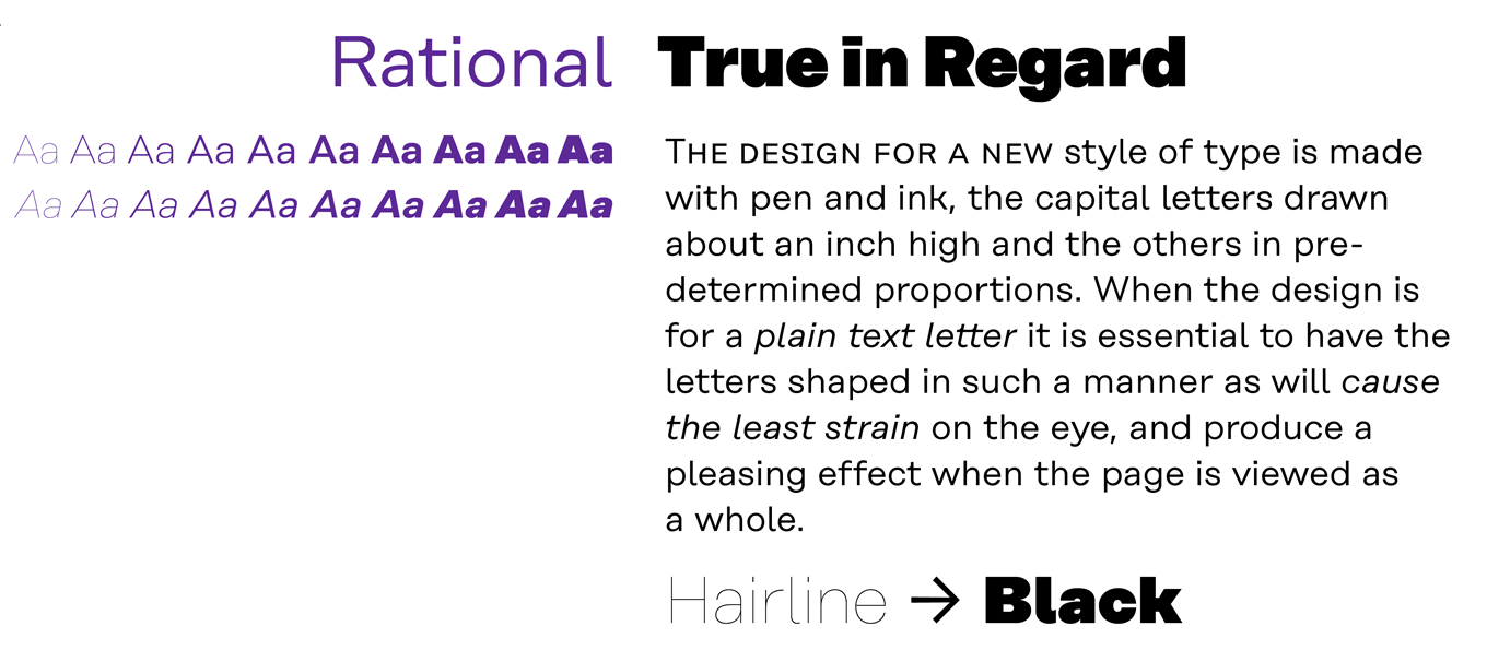
Rational, Rene Bieder’s contemporary representative of the Grotesk genre, is inspired by drawings dating back to the early 20th century. Horizontal terminals and uniform widths are juxtaposed with circular and subtle calligraphic elements, infusing the rational characters with a warm and approachable flavor. The feature-rich OpenType family of 10 weights with matching italics offers numerous alternate characters and special features like arrows and numerals in circles, making Rational an excellent choice for contemporary professional typography. The Rational introductory discount ends on May 5, 2016.
|
|
|
|
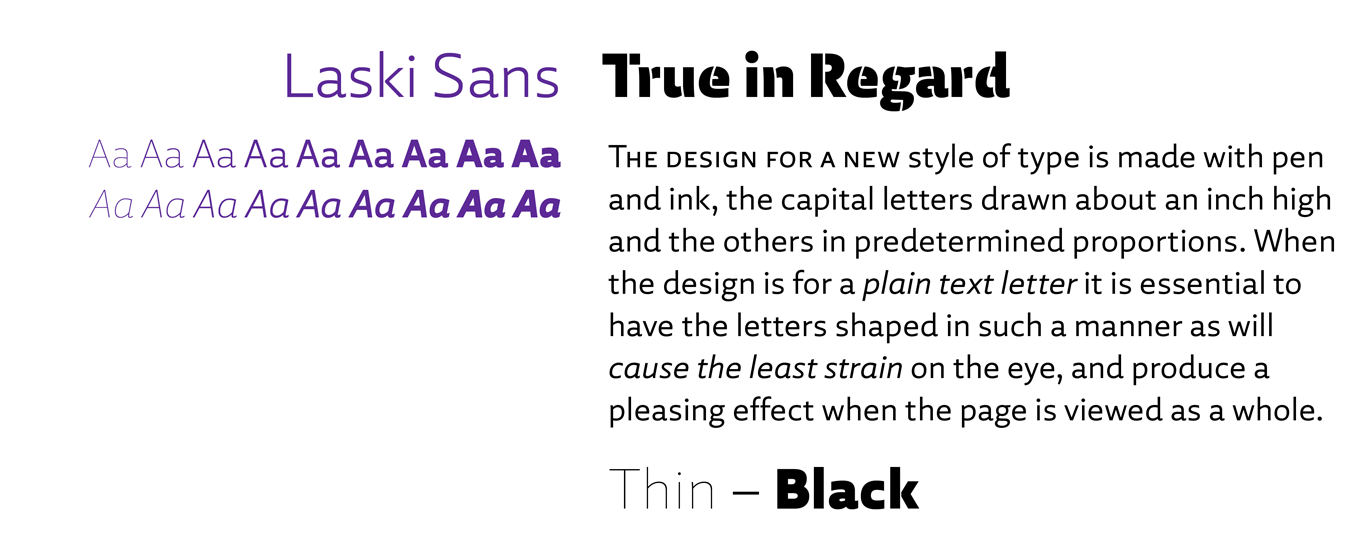
Laski Sans is based on Paula Mastrangelo’s graduation project, her first typeface Laski Slab, also published by Re-Type. Over the last year Ramiro Espinoza expanded the type family with the design of this refined humanistic sans serif companion face. The letters have a solid structure and open forms that promise excellent legibility both in print and on screen, while moderate proportions and a neutral appearance render Laski Sans well-suited for commercial communication needs. A striking stencil variant considerably increases Laski’s creative potential in display use. These two feature-rich families combine seamlessly thanks to all nine weights, along with their italics, being harmonized between the Sans and Slab versions. You can license Laski Sans at 30% off until May 4, 2016.
|
|
|
|
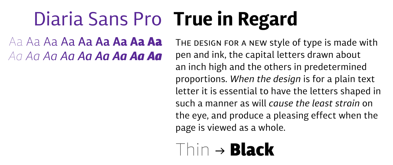
Diaria Sans Pro is the sans serif counterpart to Diaria Pro, Mint Type’s humanist slab serif. Designer Andriy Konstantynov has kept the large x-height and static exteriors, but changed the calligraphic counters to be more neutral. He also expanded the range of weights from six to nine along with its corresponding italics. This has resulted in a universally legible family for editorial design, engineered to build visual hierarchies of any detail and complexity. The typeface is ideal for both immersive reading and display applications like titles and headlines, and allows for comfortable reading of narrow columns in print as well as on screen. The introductory discount ends on April 20, 2016.
|
|
|
News Round-Up
In this section we pick out interesting news snippets from MyFonts’ own kitchen and from the greater world of fonts, lettering and typography.
|
|
Adrian Frutiger: A Tribute by Matthew Carter
The work of Adrian Frutiger At the end of month, there will be an irresistible talk by a type design giant, Matthew Carter, delivering a eulogy for another, his recently departed colleague Adrian Frutiger. This evening promises to be a rich and detailed typographic discussion, and has been organized by the Type Directors Club. April 26, 6:30pm. Tickets and more information.
|
|
100 years of Johnston’s London Underground lettering: an exhibition at Ditchling
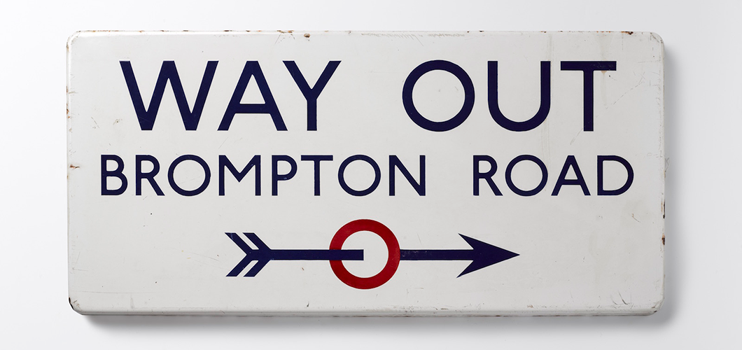
Edward Johnston's Way Out, Brompton Road, 1916. Photo by Sara Morris. The Ditchling Museum of Art + Craft has been a special place for typography fans since it opened in 1985. In the early 20th century both Edward Johnston and Eric Gill lived and worked in this charming East Sussex village, and it was here that Johnston drew his famous London Underground alphabet, which debuted in 1916 and would be a major influence on Gill Sans a few years later. An exhibition celebrating 100 years of the Underground alphabet has just opened, and is getting rave reviews. Also in the exhibition are examples of Johnston’s calligraphy, which resurrected and redefined calligraphy in the West, and original drawings for Gill Sans. If you’re in the Brighton area before September 11, 2016, don’t miss it!
|
|
Popular Designer of the Month
Each month, we add a new designer to the sidebar of popular designers on our homepage, based on their popularity with customers. This month, our new addition is Hannes von Döhren of HVD Fonts.
 Hannes von Döhren is a longstanding favorite on MyFonts. After a spell as an advertising art director in Hamburg, he had been quietly plugging away with a succession of decent font families for Linotype, ITC and his own fledgling foundry that were inventive, novel and intriguing without ever quite managing to set the world alight with commercial success.
That all changed in early 2010 with the release of his Brandon Grotesque, a family of tall, elegantly geometric faces that managed to be both classically eternal and right of its moment. It was an instant success, and has remained in the top five of our best sellers ever since, where it regularly jostles for top spot with typefaces like Proxima Nova and Helvetica®. A type designer who clearly understands his customers, von Döhren’s releases are frequently big hits with graphic designers, with expertly constructed promotional materials and marketing campaigns that combine compelling imagery with irresistible family pack pricing. His latest release is Fabrikat, featured above, a collaboration with Christoph Koeberlin, and is on introductory discount for just a few more days — check it out now!
|
|
|
MyFonts on Facebook, Tumblr, Twitter & Pinterest
Your opinions matter to us! Join the MyFonts community on Facebook, Tumblr, Twitter and Pinterest — feel free to share your thoughts and read other people’s comments. Plus, get tips, news, interesting links, personal favorites and more from MyFonts’ staff.
|
|
|
|
|
|
|
Comments?
We’d love to hear from you! Please send any questions or comments about this newsletter to [email protected]
|
|
|
|
|
|
MyFonts Inc. 600 Unicorn Park Drive, Woburn, MA 01801, USA
MyFonts and MyFonts.com are registered service marks of MyFonts Inc. Helvetica is a trademark of Monotype GmbH registered in the U.S. Patent and Trademark Office and may be registered in certain other jurisdictions. Other technologies, font names, and brand names are used for information only and remain trademarks or registered trademarks of their respective holders.
© 2016 MyFonts Inc
|
|
|
|