|
Right now it feels like half the world is captivated by the political electioneering of the other half — a process that will reach its climax next month. Here at MyFonts there’s another competition that enthusiastic typeface designers take just as seriously: the election every month of the four Rising Stars, thanks to purchases by our customers. Yet elections can be cruel, and sometimes (in the font world at least) we can make it less so. That’s why we’re keen to bring to the surface noteworthy releases that somehow remained under the radar — this month you’ll read about Futura Next, a reworking of the timeless classic among geometric sans serifs. We also spotlight a quality text face, specially designed for the Danish capital Copenhagen.
|
|
|
This Month’s Rising Stars
|
|
|
|
To commemorate the birth of the very first sans serif two centuries ago, the Uruguayan foundry TipoType releases the extensive Brother 1816 family that draws on the history of this typographic genre. Ignacio Corbo and Fernando Díaz constructed a versatile and multifaceted typeface combining geometric letter forms with humanistic strokes. The multitude of alternate characters turns the family into a true chameleon. They give a nod to different key designs in a long lineage of sans serif classics — a single-storey and a double-storey ‘a’ and ‘g’; a straight ‘j’, ‘l’, ‘t’, and ‘y’, and designs with a hook for increased legibility in smaller sizes; a connected and an unconnected ‘k’; a regular and a spurless ‘u’;… The proportions of the typeface are tailored for body copy and screen rendering, while sharp alternates for some capitals and a number of judiciously added swashes turn it into a great display face too.
|
|
|
|
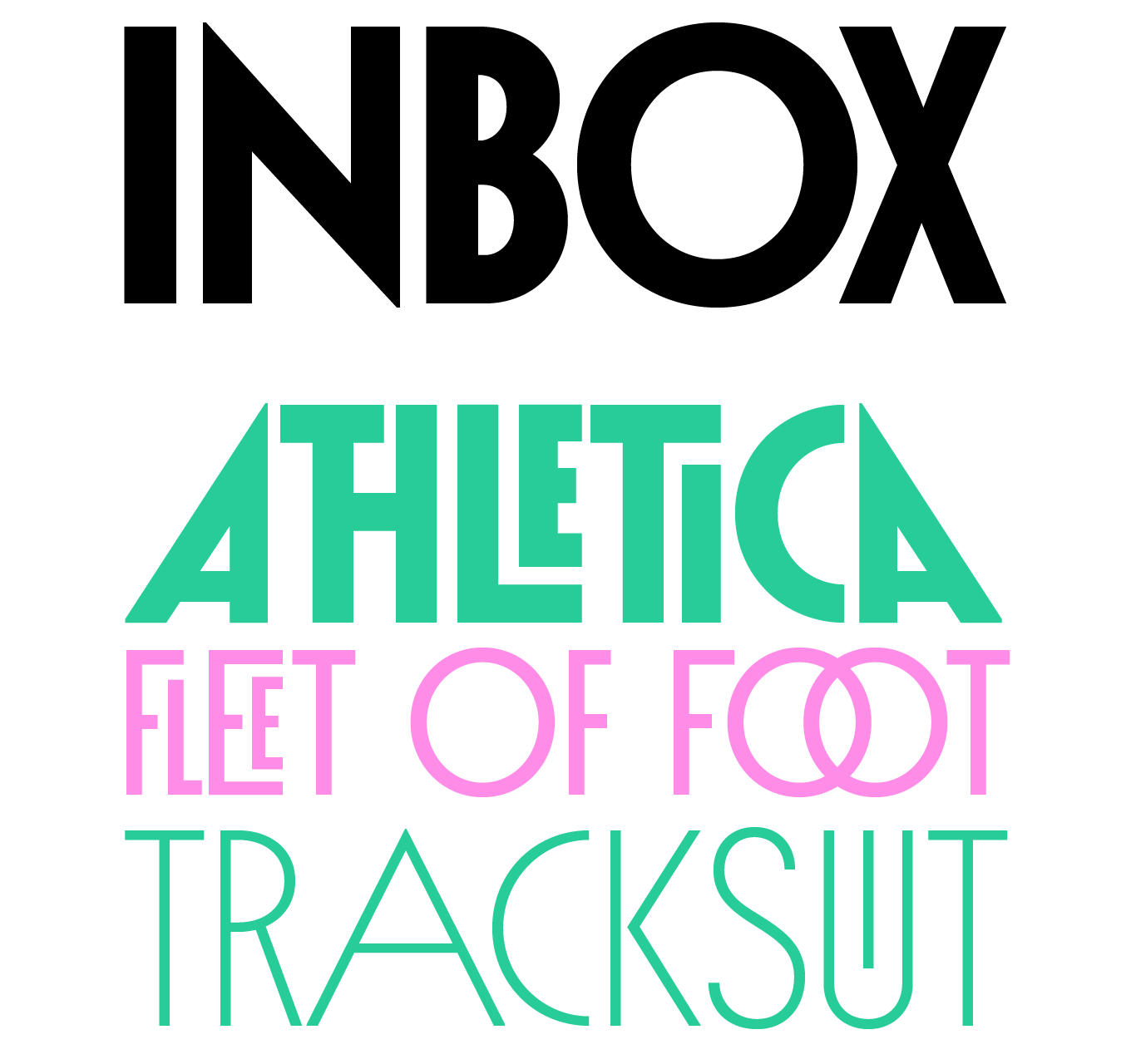
The work of the great Herb Lubalin continues to strike a chord with type designers, fascinating each new generation. After Lubaline just three months ago, this time Indian Type Foundry steals the spotlight with Inbox. The whimsical and decorative display face pays homage to Lubalin’s iconic 1970 design Avant Garde. More than merely a straight reworking, Alisa Nowak’s all caps geometric sans reinforces the link with Avant Garde’s Art Deco predecessors. The design also reintroduces the ligatures and alternates that made the original so satisfying to work with. Alternate forms create striking combos with preceding and subsequent letters, raised or lowered smaller variants allow letters to be nested into other letters, and readymade ligatures provide the best possible solution for any typographic challenge. With five upright weights from Thin to Black, this decorative family brings back the fun to typesetting.
|
|
|
|
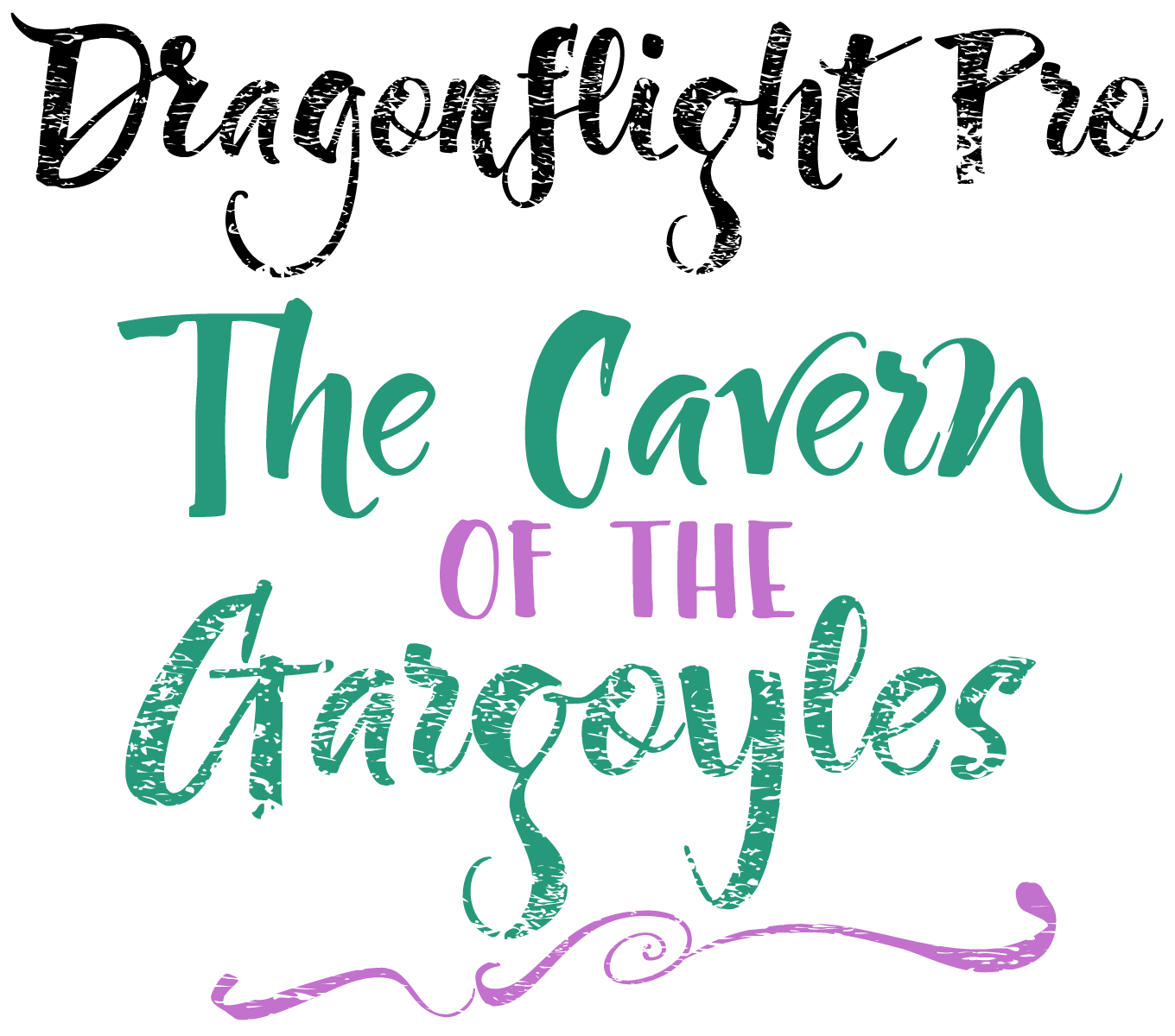
In the realm of brush scripts you often have to compromise. Expressive designs usually look unrefined, and stylized designs inevitably lack spontaneity. Dragonfly Pro by Fontforecast however manages to combine the best qualities of both options. Each glyph was hand-drawn with a brass folded pen dipped in ink — its shape inspired the name. By tilting the pen in different directions while writing the letters, Hanneke Classen achieved unexpected variations in line width. This imbued the script with a surprising, fun personality. Alternate characters and numerous ligatures keep the text image lively. The Rough version makes the letters look like they were written on textured paper, while Dragonfly Pro Sans was designed for all-caps setting that nicely complements the regular style. The Extra font offers swashes, doodles and ink splatters for the finishing touch.
|
|
|
|
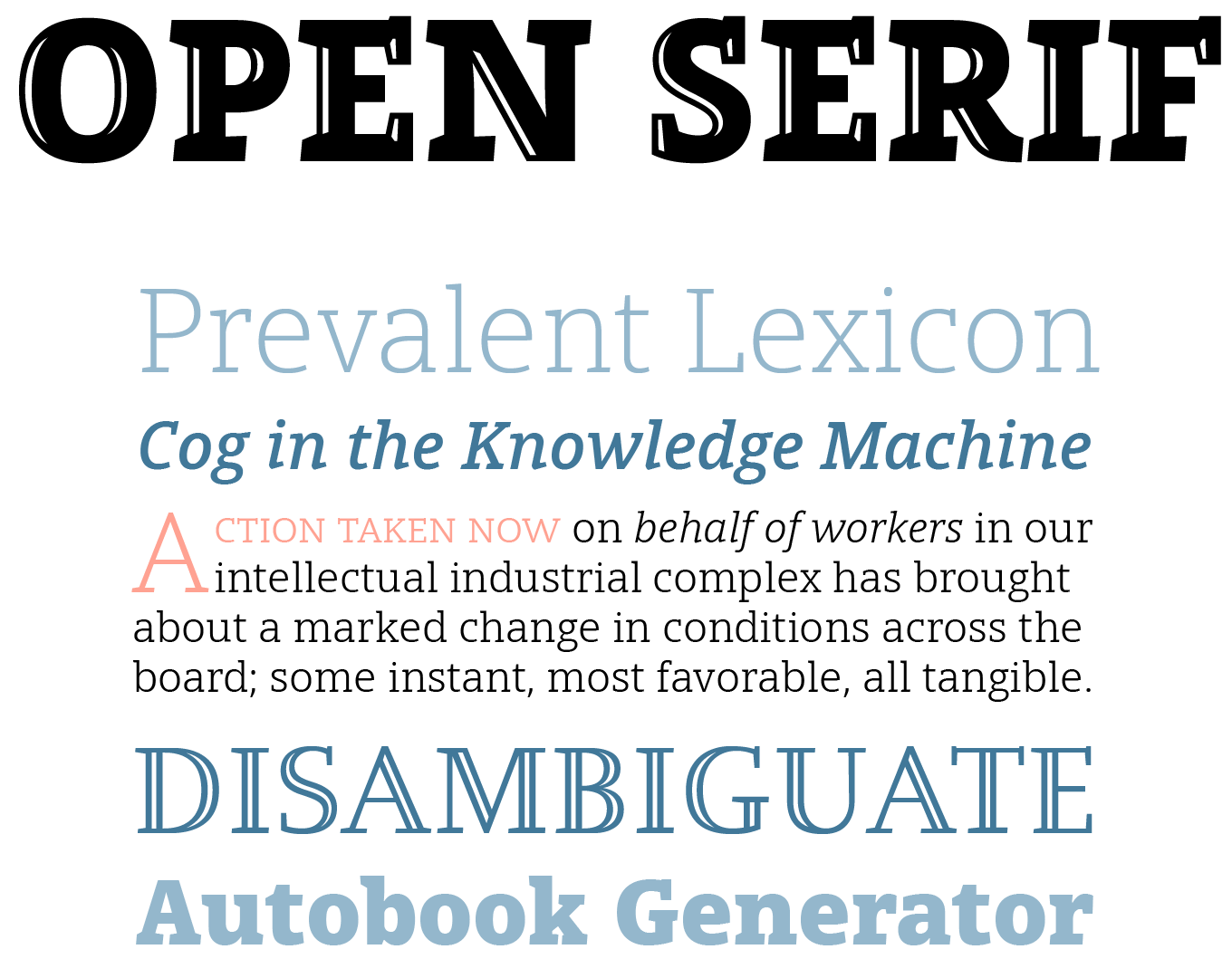
Steve Matteson’s Open Serif is an interesting hybrid, pairing the sturdy shapes and low contrast of a contemporary slab serif with the elegance of the classic Venetian style. This smooth yet energetic companion to the popular Open Sans family has open letter forms and a large x-height, lending it splendid legibility at text sizes and making it comfortable to read in print and on screen. The feature-rich family includes small caps for the Roman styles, swash capitals for the chancery-style italics, and old style figures. Two fonts of decorative capitals round out the collection — the Open and Inline faces are ideal for initial letters, mastheads, titles and decoration. Just like Open Sans, the extensive character set also supports Greek and Cyrillic.
|
|
|
Text Font of the month
Typesetting for books, magazines or annual reports requires font families with special qualities: excellent readability, a generous range of weights with italics and small caps, multiple figure sets (lining, oldstyle, table) and ample language coverage. Here is this month’s pick from the recent, high-quality text typefaces.
|
|
|
|
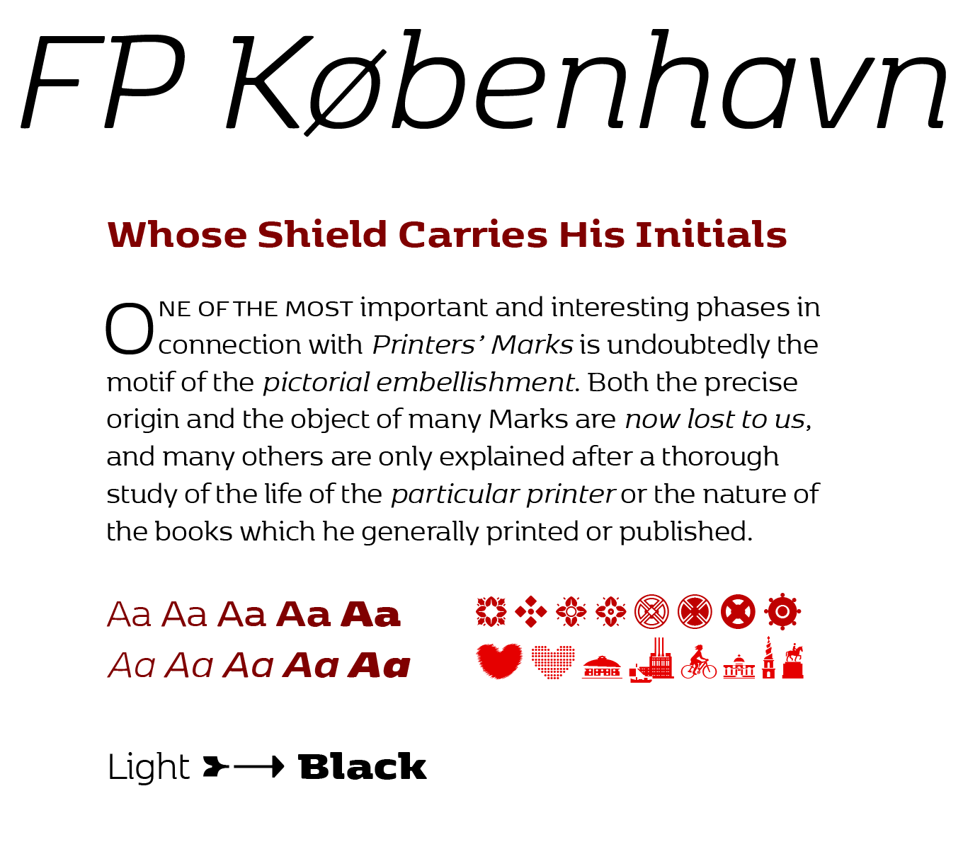
Copenhagen was in need of a typeface that unites the city’s many facets. Enter FP København, a collaboration between three designers—Fontpartners’ Morten Rostgaard Olsen and Ole Berntsen Søndergaard, and Henrik Birkvig—specifically created for the capital of Denmark. Inspired by Copenhagen’s culture and visual language, the design reflects Danish typographic tradition from the 20th century. The shapes are generous and wide. They exude a warm glow, with soft corners as if eroded by the surf of the Baltic Sea. Top serifs add balance to the letter forms, while the large x-height aids their legibility. The lowercase ‘a’ and signature ‘g’ with truncated loop also have single-story variants, and the extended ligature set and small caps for all five weights and matching italics will charm even the most exacting typographer. The extra Pictos font features arrows, ornaments, and a number of the city’s landmarks.
|
|
|
From under the radar
With so many new releases every month you might miss some noteworthy new typefaces. To help you discover them we shine a spotlight on a hidden gem.
|
|
|
|
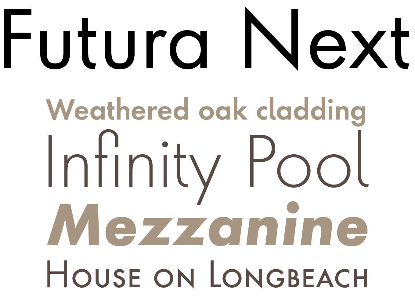
First presented by the Bauersche Giesserei in 1928, Futura is commonly considered the major typeface development to come out of the Constructivist orientation of the Bauhaus movement in Germany. Since its introduction almost a century ago the iconic geometric sans serif has never gone out of style. Now Marie-Thérèse Koreman has revisited and expanded Paul Renner’s brainchild for Neufville Digital. While remaining true to its origins, Koreman added alternates for a number of key characters, improving their legibility in small sizes and low resolution displays. The text weights in regular and condensed widths were outfitted with small caps and all the necessary figure sets for text use. The type family adds an elegant and distinguished touch to any print project, but also to user interfaces, information displays, smart watches, e-readers, television apps, technical appliances, and internet related uses.
|
|
|
News Round-Up
In this section we pick out interesting news snippets from MyFonts’ own kitchen and from the greater world of fonts, lettering and typography.
|
|
The End of Flash

The decline of Flash is a topic we’re following with some interest, since it means that dynamic, responsive web ads built with HTML5 and webfonts are finally within reach. Our colleagues over at Monotype have put together an eBook explaining some of the ins and outs — sign up at their site to receive the The End of Flash: Separating Fact from Fiction, which will help you to learn more about the end of Flash, and the exciting possibilities HTML5 offers for designing digital advertising.
|
|
Popular Designer of the Month
Each month, we add a new designer to the sidebar of popular designers on our homepage, based on their popularity with customers. This month, our new addition is Luciano Vergara of Latinotype.
 Luciano Vergara is one of Latinotype’s three founding designers (Danial Hernández and Miguel Hernández, not related, are the other two), and in the five years or so since their MyFonts debut, the prolific Chilean foundry is now responsible for around 120 families, thanks largely to an expanding network of associate designers working under Vergara and his colleagues’ creative direction. Vergara’s own contributions, such as the recent bestsellers Assemblage and Corporative, often explore the myriad possibilities of contemporary sans serif designs, although he has branched out into hand drawn and script work in a couple of collaborations with the Los Andes foundry.
|
|
|
MyFonts on Facebook, Tumblr, Twitter & Pinterest
Your opinions matter to us! Join the MyFonts community on Facebook, Tumblr, Twitter and Pinterest — feel free to share your thoughts and read other people’s comments. Plus, get tips, news, interesting links, personal favorites and more from MyFonts’ staff.
|
|
|
|
|
|
|
Comments?
We’d love to hear from you! Please send any questions or comments about this newsletter to [email protected]
|
|
|
|
|
|
MyFonts Inc. 600 Unicorn Park Drive, Woburn, MA 01801, USA
MyFonts and MyFonts.com are registered service marks of MyFonts Inc. Other technologies, font names, and brand names are used for information only and remain trademarks or registered trademarks of their respective holders.
© 2016 MyFonts Inc
|
|
|
|